
Lines of best fit by @ellis2013nz
Want to share your content on R-bloggers? click here if you have a blog, or here if you don't.
A couple of months ago my Twitter feed featured several mass-participation stern critiques laced with sneering and mockery (aka “Twitter pile-ons”) for some naive regression modelling in the form of lines of best fit through scatter plots. All of the examples I’ve seen deserved some degree of criticism, but not to the virulent degree that they received. And there is an interesting phenomenon of righteous anger in some of those who criticise others’ regression that is dependent on quite outdated views of what is and isn’t acceptable in a statistical model.
A controversial chart
Take this Australian example, which generated many virulent and scathing comments including the Twitter thread from which I saved this screenshot:
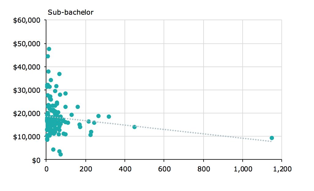
The horizontal axis is average number of students per subject; the vertical axis is the cost to the university per student (this is clearer from the original report, but yes, the graph should be self-sufficient enough to withstand being screen-snipped out of context).
The report in question was a summary of a data collection exercise to estimate costs of higher education delivery (and to a much lesser extent, the drivers of those costs). It was one of the key technical inputs into sweeping changes the Australian government has proposed for the funding of the higher education system. Judging from the Technical note for the Job-ready Graduates Package, the student and commonwealth contributions to funding are to remain based on field of education and this crude model of economies of scale does not feature directly in the proposals, even it influenced the thinking (correct me if I’m mistaken please, higher education experts, I know you are out there). However, tempers are running even hotter than usual on higher education funding at the moment so it is not surprising that a report from a consultancy firm (Deloitte in this case) would undergo extra scrutiny when known to be informing controversial policy changes.
My comment on Twitter at the time (25 June), which I still stand by, was:
“These analyses would be improved by using robust methods, reporting uncertainty, and log transforming both variables before the linear fit; but not by enough to justify the outrage they seem to have provoked.”
Some criticisms are fair
Here are the criticisms made that are fair, in what I see as descending order of importance:
- The presentation absolutely should have shown a shaded confidence or credibility interval for the position of the line.,
- A linear model does not make sense given what we know of the underlying data generating process. Cost per student will never be negative, as implied by a linear model with a sufficiently large number of students per class. While economies of scale are to be expected, costs cannot go below zero. An obvious model would be for total costs to equal a minimum fixed investment plus some function of the number of students that has a positive slope but declining with extra students. Divide both sides of that equation by the number of students, make a few more crude simplifications, and it seems a model that is linear (with negative slope) between “cost per student” and “students per subject” after taking log transformations of both variables would be a fair approximation of the likely data generating process, and certainly much better than one that is on the original scales.
- There is significant heteroskedasticity – the variance of the response variable increases as its mean increases. Not taking this into account will give too much weight to observations at the most varying/random part of the distribution. Either those points should be weighted (eg with the inverse of the expected variance) or some other means of addressing the issue found. As it happens, taking log transformations for the reasons stated above to get a better shape for the line will helpfully address the heteroskedasticity problem at the same time.
- The observations are grouped by university (each university in the sample had observations on the costs of multiple subjects), so the line should have been fit with a multi-level mixed effects model that took into effect that observations are not independent and don’t all provide completely new data.
- The model does not explain much of the variance in the data. The key conclusion should be that whatever drives the variation in subjects’ cost per student, the number of students is not the main driver. I think this point was made in the report but it could have been made much clearer; failing to do so exposed the charts’ authors to some excessive complaints about low R-squared values (but see next section).
If Deloitte had taken criticisms 1 and 2 (which also deals with 3) into account, and better explained 5, I doubt that 4 matters very much, and they could have saved themselves what I presume was an unpleasant couple of weeks on social media. Anyway, that’s certainly one lesson we have filed away for our own reference at my own work (which, to be clear for disclosure reasons, is at Nous Group, a management consultancy in competition with Deloitte for work like this).
Some misconceptions about regression estimated with ordinary least squares
I won’t try to summarise all the criticisms of this chart, but I will make some observations about why some of them were not as conclusive as the critics believed:
- it’s not the end of the world for the response variable not to be Normally distributed. Sure ideally it is normal, and some inference that requires a maximum likelihood estimator needs normal distribution, but it’s still ok (in fact the best linear unbiased estimator) to fit an OLS line through data if the Gauss-Markov assumptions apply – linear relationship, independence, homoskedasticity being the important ones. OK, the latter two did not apply in this case, but the point is that non-normality alone is not enough to make this the wrong analysis as some critics maintained.
- High leverage points aren’t necessarily high influence (and if you work with regression, it’s worth checking you understand these two very useful concepts). You don’t need to automatically exclude outliers in your explanatory variables; in fact they can be extremely important high information points. In this case a lot of people concluded erroneously that that point on the extreme right of the “sub-bachelor” chart was dictating the whole slope of the line, whereas in fact it was pulling the line up a bit. More importantly it was obviously very close to where the line was going to be even without it. Yes you’d test for robustness (ideally with a bootstrap and maybe with just doing the line with and without that point) but certainly you would not automatically exclude that data point just because its an outlier on the x scale.
- There’s absolutely no requirements for the distribution of explanatory variables. Some critics thought that the x had to be normally distributed to use this method, and that’s simply wrong. No distributional assumptions for x apply at all, even in a strict model framework.
- A relationship can be important even if not visible to the human eye. Yes visualisations are important, but as relationships get complex and data larger, we sometimes need statistics. In this case, I think the data all in a clump at the bottom end was probably following the model fairly neatly but this wasn’t obvious to the eye because all the points were overplotted on top of eachother. But some critics insisted that because of the lack of a clear trend there is no point in using statistics (wrong).
- A model doesn’t need to explain all or even most of the variance to be useful. Many people have apparently been trained to look at the R-squared and say if it’s less than 0.7 or some arbitrary number there’s something wrong with the model. This simply has no basis at all. Models don’t need to explain some proportion of the variance. The rest is randomness. Sure it’s a problem if variables have been omitted (which is why they should have done a model with field, level and uni on the right side of the formula), but it’s totally realistic sometimes for a huge amount of variance to be unexplained yet we still want to know the effect of this variable.
Simulating non-linear, heteroskedastic data with outliers and high leverage points
To understand whether my instinct was right about the criticisms of the data being too virulent, but in the absence of the original data (which would be confidential due to the universities’ cost data), I set out to simulate some data that might resemble the original. Here is my best go at data that I have synthesised to resemble the original in terms of the slope and intercept of the ordinary least squares line, and my visual estimate of the distribution of the x and y.
Here’s how I simulated that. As x is the number of students per course, I modelled it with a negative binomial distribution, always a good choice for counts that have more variable variance than a Poisson distribution. I truncated that x distribution at 350 and manually added x values of 460 and 1150 to match the two outliers in the original.
I used the approximate values of y on the original line of best fit at x=0 and at x=1000 to estimate that line as y = 19000 - 9.5x. Then, taking my x values as given, I set out to simulate data from a model log(y) ~ log(x) that , when you fit an OLS line to it, would come as close as possible to sloped of -9.5 and intercept of 19,000. In this model I let log(y) have a scaled t distribution with 13 degrees of freedom, so it has fatter tails than a Normal distribution. If x is less than 100 the variance gets further inflated by 1.8, needed to get data that resembled the original which has a particularly high variance at low values of x. The values of this inflator, the 13 degrees of freedom, and the scaling factor for the t distribution I determined on by trial and error.
To get the slope and intercept of the log(y) ~ log(x) relationship, I wrote a function that takes a set of parameters including that slope and intercept of that log-log regression as well as the characteristics of the t distribution, and returns an estimate of how well an OLS line fit to y ~ x matches the desired slope and intercept of -9.5 and 19,000. To increase the realism, I also added penalties for how far out the maximum, 5th and 50th percentile of the simulated y values were from my eyeball estimates of the original.
Simulating data to optimise for the above gives me a slope and intercept on the log-log scale (which I am claiming is the underlying relationship) of -0.041 and 9.84. Creating a synthetic dataset on this basis gets me the values of x and y in my chart above.
This may seem a lot of effort but is of potential use in more realistic situations, including creating synthetic data when confidentiality or privacy concerns stop us publishing the original. Here’s the R code that does all of that, as far as producing the chart above:
library(MASS)
library(tidyverse)
library(scales)

# axis breakpoints for use in charts
xbreaks <- 0:6 * 200
ybreaks <- 0:6 * 10000

n <- 100
set.seed(123)

# Synthesise one set of x values we will use throughout:
x <- MASS::rnegbin(n * 10, 70, .5) + 1
x <- sort(c(sample(x[x < 350], 98, replace = TRUE), 460, 1150))

# Density of the x variable (not shown in blog)
ggplot(data.frame(x = x), aes(x = x)) +
  geom_rug() +
  geom_density() +
  scale_x_continuous(breaks = xbreaks) +
  theme(panel.grid.minor = element_blank())

#' Simulate data and compare its OLS fit to a desired OLS fit
#'
#' @param par vector of slope and intercept of log(y) ~ log(x)
#' @param df degrees of freedom for the t distribution of residuals of y on the log scale
#' @param sigma scaling value for residuals
#' @param infl amount that residuals are inflated when x is less than 100
fn <- function(par, df, sigma, infl){

  log_b0 <- par[1]
  log_b1 <- par[2]


  set.seed(123)
  eps <- rt(n, df)
  eps <- eps / sd(eps) * sigma * ifelse(x < 100, infl, 1)
  y <- exp(log_b0 + log_b1 * log(x) +  eps)
  #y[c(n, n-1)] <- c(9700, 14000)

  mod <- lm(y ~ x)
  how_bad <-
    # intercept should be about 19000
    20 * ((coef(mod)[1] - 19000) / 19000) ^ 2 +
    # slope should be about -9.5
    20 * ((coef(mod)[2] - -9.5) / 9.5) ^ 2 +
    # maximum should be about 50000
    ((max(y) - 48000) / 48000) ^ 2  +
    # 5th percentile should be about 10000
    ((quantile(y, 0.05) - 10000) / 10000) ^ 2 +
    # median should be about 15000:
    ((quantile(y, 0.5) - 15000) / 15000) ^ 2

  return(how_bad)
}

infl <- 1.8
sigma = 0.20
df = 13
best <- optim(c(10, -2), fn = fn, df = df, sigma = sigma, infl = infl)

# simulate data with the best set of parameters
set.seed(123)
eps <- rt(n, df)
eps <- eps / sd(eps) * sigma * ifelse(x < 100, infl, 1)
y <- exp(best$par[1] + best$par[2] * log(x) + eps)
y[c(n, n-1)] <- c(9700, 14000)

the_data <- data.frame(x, y)

# Simple chart with OLS fit:
ggplot(the_data, aes(x = x, y = y)) +
  geom_point()  +
  geom_smooth(method = "lm", formula = "y ~ x", colour = "blue") +
  scale_x_continuous(breaks = xbreaks, label = comma) +
  scale_y_continuous(breaks = ybreaks, label = comma, limits = c(0, 60000)) +
  theme(panel.grid.minor = element_blank()) +
  labs(title = "Simulated data with various lines of best fit",
       subtitle = "Ordinary least squares")
OK, so now I have data that is definitely not generated from a simple homoskedastic, no-outliers, no-leverage, linear, normally distributed model. Instead, my data has extreme and non-continuous heteroskedasticity, x values with high leverage, a relationship that is linear in the logarithms not on the original scale, and residuals are from a fat-tailed t distribution with two distinct levels of variance. I think we can safely say we have violated lots of the usual assumptions for inference with OLS including the Gauss-Markov conditions.
However, I still maintain that the OLS line is not completely meaningless here. After all, it does tell us the most important thing - as x gets bigger, y gets smaller. Sure, not in any precise way, and indeed in an actively misleading way because of the non-linearity, but I still think it is something.
How different would alternative ways of estimating a line be with this data, which is plausibly like the higher education original?
Here is a line drawn with robus linear regression estimation of the slope and intercept, and in particular MASS::rlm() using “M-estimation with Tukey’s biweight initialized by a specific S-estimator”. This method selects an estimation algorithm with a high breakdown point. The breakdown point of an estimator is how much of the data needs to be replaced with arbitrarily extreme values to make the estimator useless. It can be illustrated by comparing a mean with a 20% trimmed mean as estimators of the average. The mean has a breakdown point of 1/n - change a single value to infinity and the mean also becomes infinity. Whereas the trimmed mean can cope with 20% of values being made infinity and another 20% minus infinity before it suffers. In summary, using this M estimator should be more robust to any high influence points, such as (according to criticism on Twitter), the high leverage point on the right. However, we see that the result looks pretty similar to the OLS line - reflecting the fact that high leverage does not imply high influence:
Thanks to the wonders of ggplot2, this sophisticated modelling method can be applied on the fly during the creation of the graphic:
ggplot(the_data, aes(x = x, y = y)) +
  geom_point()  +
  geom_smooth(method = "rlm", method.args = list(method = "MM"), colour = "white") +
  scale_x_continuous(breaks = xbreaks, label = comma) +
  scale_y_continuous(breaks = ybreaks, label = comma, limits = c(0, 60000)) +
  theme(panel.grid.minor = element_blank()) +
  labs(title = "Simulated data with various lines of best fit",
       subtitle = "MM-estimation of straight line")
So much for the leverage/influence problem. What about the non-linearity? There are several ways of approaching this, and one which I might have tried if dealing with this data in the wild would have been a generalized additive model:
This isn’t bad and I think is a good intuitive description of what is happening in this data. “At relatively low values of x, y decreases as x increases. For higher values of x there isn’t enough data to be sure.” R code for this model:
ggplot(the_data, aes(x = x, y = y)) +
  geom_point()  +
  geom_smooth(method = "gam", colour = "white") +
  scale_x_continuous(breaks = xbreaks, label = comma) +
  scale_y_continuous(breaks = ybreaks, label = comma, limits = c(0, 60000)) +
  theme(panel.grid.minor = element_blank()) +
  labs(title = "Simulated data with various lines of best fit",
       subtitle = "Generalized Additive Model")
Alternatively and more traditionally one could have taken log transforms of both the x and the y variables and fit the regression to those transformed values. This reduces the heteroskedasticity, leverage of x values, and non-linearity problems all at once, stops y ever becoming negative, and gives a nice interpretation to the slope as a standardised elasticity. There’s a reason why it’s such a common transformation!
Here’s how that would look, if shown on the original scale:
… or if we transform the x and y axes as well:
In this case I have fit the model explicitly before starting my ggplot2 pipeline; for anything beyond the basic these days I find it easier to keep track of what is going if I separate the modelling from the visualisation:
mod2 <- lm(log(y) ~ log(x), data = the_data)
pred2 <- predict(mod2, se.fit = TRUE)
the_data <- the_data %>%
  mutate(fit_log = exp(pred2$fit),
         lower_log = exp(pred2$fit - 1.96 * pred2$se.fit),
         upper_log = exp(pred2$fit + 1.96 * pred2$se.fit))

# visualised on original scales:
ggplot(the_data, aes(x = x, y = y)) +
  geom_ribbon(aes(ymin = lower_log, ymax = upper_log), fill = "grey60", alpha = 0.7) +
  geom_point()  +
  geom_line(aes(y = fit_log), colour = "white") +
  scale_x_continuous(breaks = xbreaks, label = comma) +
  scale_y_continuous(breaks = ybreaks, label = comma, limits = c(0, 60000)) +
  theme(panel.grid.minor = element_blank()) +
  labs(title = "Simulated data with various lines of best fit",
       subtitle = "Ordinary Least Squares after log transforms, shown on original scale")

svg_png(p4, "..http://freerangestats.info/img/0187-log")

# visualised on log scales:
ggplot(the_data, aes(x = x, y = y)) +
  geom_ribbon(aes(ymin = lower_log, ymax = upper_log), fill = "grey60", alpha = 0.7) +
  geom_point()  +
  geom_line(aes(y = fit_log), colour = "white") +
  scale_x_log10(breaks = xbreaks, label = comma) +
  scale_y_log10(breaks = ybreaks, label = comma) +
  theme(panel.grid.minor = element_blank()) +
  labs(title = "Simulated data with various lines of best fit",
       subtitle = "Ordinary Least Squares after log transforms, shown with log scales")
The model with log transforms is probably the best with this data, but we can’t be sure if that’s the case for the original data; my synthesised data was created with a linear relationship of the two log-transformed variables, so it’s not terribly surprising that the model has a nice fit.
So what’s the point of all this? I think there’s three key interesting points I’d make out of the whole exercise:
- Sometimes, when the conclusion to draw is as simple as “y goes down when x goes up”, an OLS model will illustrate the point adequately despite a whole bunch of assumptions being broken. And problems like heteroskedasticity, high leverage points, and non-normality are often not going to matter for broad brush purposes (non-linearity is probably more important). Also, there’s no such thing as a minimum R-squared for a regression to be useful.
- However, it’s not that hard to fit a much better model to this data and to visualise it properly including by showing a ribbon of uncertainty. Absolutely this should have been done if only to avoid a red herring, and focus the debate on what we know (and don’t know) about the actual drivers of costs per student.
- Synthesising data is fun and not that hard, and can be a useful way of exploring thought experiments.
R-bloggers.com offers daily e-mail updates about R news and tutorials about learning R and many other topics. Click here if you're looking to post or find an R/data-science job.
Want to share your content on R-bloggers? click here if you have a blog, or here if you don't.