
Anomaly Detection for Business Metrics with R
Want to share your content on R-bloggers? click here if you have a blog, or here if you don't.
The larger and more complex the business the more metrics and dimensions. One day you understand that it is impossible to track them with only your eyes.The larger and more complex the business the more metrics and dimensions. One day you understand that it is impossible to track them with only your eyes. Reducing the number of metrics and/or dimensions can prevent us from tracking all aspects of the business or analyzing aggregated data (for example, without dimensions), which can substantially smooth out or hide the anomalies. In such a situation, the detection of any anomalies after the actual occurrence can either be missed or have a significant time gap. Therefore, we have to react immediately in order to learn about the event as soon as possible, identify its causes, and understand what to do about it. For this, we can use the Anomaly Detection system and identify abnormal values, collect the corresponding events centrally, and monitor a much larger number of metrics and dimensions than what human capabilities allow.
In this article, by business metrics, we mean numerical indicators we regularly measure and use to track and assess the performance of a specific business process. There is a huge variety of business metrics in the industry: from conventional to unique ones. The latter are specifically developed for and used in one company or even just by one of its teams. I want to note that usually, a business metrics have dimensions, which imply the possibility of drilling down the structure of the metric. For instance, the number of sessions on the website can have dimensions: types of browsers, channels, countries, advertising campaigns, etc. where the sessions took place. The presence of a large number of dimensions per metric, on the one hand, provides a comprehensive detailed analysis, and, on the other, makes its conduct more complex.
Anomalies are abnormal values of business indicators. We cannot claim anomalies are something bad or good for business. Rather, we should see them as a signal that there have been some events that significantly influenced a business process and our goal is to determine the causes and potential consequences of such events and react immediately. Of course, from the business point of view, it is better to find such events than ignore them.
It is worth to say that such Anomaly Detection system will also signal the significant changes expected by the user, not the system. That is, the events you initiated in order to influence the business and the causes you are aware of. An example is running an irregular promo through an email campaign and expecting traffic to grow on a landing page from the same channel. Getting such a signal is also useful in terms of confirming that the promo works.
To date, a number of analytical tools have built-in systems for detecting anomalies. For example, Google Analytics has such a system.
However, in case you:
- collect raw data that does not transfer to an analytical tool with an integrated anomaly detection system,
- want to choose and combine algorithms in order to determine anomalies,
- want to tune the system parameters (for instance, setting a higher or lower threshold for values that will be defined as anomalies),
perhaps, you want to do something similar to the system I use.
Therefore, we will study four approaches for identifying anomalies in business metrics using the R language. I also will assume that we deal with unlabeled data, i.e. we did not know whether what historical values were anomalies.
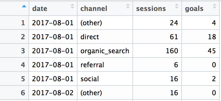
For a practical example, I have extracted web data that looks like the following table:
In addition, I have added the aggregated values for each date and the metric “number of goals per session”. Then, we can visualize the metrics on the time axis separately with the following code:
click to expand R code
library(tidyverse)
library(reshape2)
library(lubridate)
library(purrrlyr)
library(ggrepel)
# devtools::install_github("twitter/AnomalyDetection")
library(AnomalyDetection)
# install.packages("IsolationForest", repos="http://R-Forge.R-project.org")
library(IsolationForest)


# loading raw data
df <- read_csv('data.csv')

# summarizing metrics by dates
df_tot <- df %>%
        group_by(date) %>%
        summarise(sessions = sum(sessions),
                  goals = sum(goals)) %>%
        ungroup() %>%
        mutate(channel = 'total')

# bindind all together
df_all <- rbind(df, df_tot) %>%
        mutate(goals_per_session = ifelse(goals > 0, round(goals / sessions, 2), 0))

# visualizing metrics
ggplot(df_all, aes(x = date)) +
        theme_minimal() +
        facet_wrap(~ channel) +
        geom_line(aes(y = sessions), color = 'blue') +
        geom_line(aes(y = goals), color = 'red')

ggplot(df_all, aes(x = date, y = goals_per_session)) +
        theme_minimal() +
        facet_wrap(~ channel) +
        geom_line(color = 'darkgreen')
 As you can see, we have data from August to November and at the end of September, in general, there was a significant spike in three of the five channels and in total as well. There are less significant spikes in Social and Direct.
Below are the different patterns in the “goals_per_session” metric:

Ok, let’s see what we can do with this example:
#1 – Model approach
The idea is the following: we create a model based on historical data and observations on which the model is the most mistaken are anomalies.
In practice, we measure a business metrics on a regular basis, usually daily. This means that they have a time series nature. Therefore, we can use a time series model and if the predicted value is significantly different from the actual value, then we detect the anomaly. This approach is good for metrics with obvious seasonal fluctuations. In our example, these are numbers of sessions and goals for the main channels. For the “goals_per_session” metric, this approach may not be as effective.
There are a lot of packages for time series modeling in R but, considering our goal of finding anomalies, I recommend using one of the ready-made solutions, for instance, AnomalyDetection package.
Let’s start with the simple example of analyzing Direct traffic:
click to expand R code
##### time series modeling #####

# simple example
df_ts <- df_all %>%
        # the package works with POSIX date format
        mutate(date = as.POSIXct(date, origin = "1970-01-01", tz = "UTC"))

df_ts_ses <- df_ts %>%
        dcast(., date ~ channel, value.var = 'sessions')
df_ts_ses[is.na(df_ts_ses)] <- 0

# example with Direct channel
AnomalyDetectionTs(df_ts_ses[, c(1, 3)], max_anoms = 0.05, direction = 'both', e_value = TRUE, plot = TRUE) # 5% of anomalies
AnomalyDetectionTs(df_ts_ses[, c(1, 3)], max_anoms = 0.1, direction = 'both', e_value = TRUE, plot = TRUE) # 10% of anomalies


As you can see, we can change the number of anomalies by shifting a threshold of the percent of anomalies we are allowed to detect.
In order to scale this approach to all metrics, we can map the function to all of the dimensions of all of the metrics with the following code:
click to expand R code
# scaled example
df_ts <- df_all %>%

        # removing some metrics
        select(-goals_per_session) %>%

        # the package works with POSIX date format
        mutate(date = as.POSIXct(date, origin = "1970-01-01", tz = "UTC")) %>%

        # melting data frame
        melt(., id.vars = c('date', 'channel'), variable.name = 'metric') %>%
        mutate(metric_dimension = paste(metric, channel, sep = '_')) %>%

        # casting
        dcast(., date ~ metric_dimension, value.var = 'value')
df_ts[is.na(df_ts)] <- 0

# anomaly detection algorithm as a function
df_ts_anom <- map2(df_ts %>% select(1), df_ts %>% select(c(2:ncol(.))),
              function(df1, df2) {
                      AnomalyDetectionTs(data.frame(df1, df2), max_anoms = 0.1, direction = 'both', e_value = TRUE)
                      }
)

# extracting results
df_ts_anom <- lapply(df_ts_anom, function(x){
        data.frame(x[["anoms"]])
})

# adding metric names and binding all metrics into data frame
names(df_ts_anom) <- colnames(df_ts[, -1])
df_ts_anom <- do.call('rbind', df_ts_anom)
#2 – Statistical approach
From the statistical point of view, anomalies are extreme values or outliers. There is a number of ways and corresponding functions in R to identify such values. And, of course, the use of certain criteria should be made based on the properties of the sample.
I apply the statistical approach to analyze such indicators as “goals_per_session” in our example. This indicator has a close to normal distribution over the more popular channels and, accordingly, one, for example, can use an interquartile distance to determine the outliers.
click to expand R code
ggplot(df_all, aes(x = goals_per_session)) +
        theme_minimal() +
        facet_wrap(~ channel) +
        geom_histogram(binwidth = 0.01)

Often in practice, I am less concerned with whether the value is an outlier than whether it is too high or low compared to other days. For such a case, you can simply use the lower and upper, for example, 5% percentile (0-5% and 95-100% ranges). Both approaches can be implemented and the results are visualized with the following code:
click to expand R code
df_stat_anom <- df_all %>%

        # select the metrics
        select(-sessions, -goals) %>%

        group_by(channel) %>%
        mutate(is_low_percentile = ifelse(goals_per_session <= quantile(goals_per_session, probs = 0.05), TRUE, FALSE), is_high_percentile = ifelse(goals_per_session >= quantile(goals_per_session, probs = 0.95), TRUE, FALSE),

               is_outlier = case_when(
                       goals_per_session < quantile(goals_per_session, probs = 0.25) - 1.5 * IQR(goals_per_session) | goals_per_session > quantile(goals_per_session, probs = 0.75) + 1.5 * IQR(goals_per_session) ~
                               TRUE,
                       TRUE ~ FALSE)
        ) %>%
        ungroup()

ggplot(df_stat_anom, aes(x = date, y = goals_per_session)) +
        theme_minimal() +
        facet_wrap(~ channel) +
        geom_line(color = 'darkblue') +
        geom_point(data = df_stat_anom[df_stat_anom$is_outlier == TRUE, ], color = 'red', size = 5, alpha = 0.5) +
        geom_point(data = df_stat_anom[df_stat_anom$is_low_percentile == TRUE, ], color = 'blue', size = 2) +
        geom_point(data = df_stat_anom[df_stat_anom$is_high_percentile == TRUE, ], color = 'darkred', size = 2)

I have marked the 5% high and low percentiles with small red and blue dots and the outliers with bigger light red dots. You can shift a threshold of the percentile and interquartile distance as well (by changing the coefficient that equals 1.5 now).
#3 – The metric approach determines how far one observation is from the others in the space. Obviously, a typical observation is placed close to another, and the anomalous ones are farther. In this approach, the specific distance of the Mahalanobis works well for the business metrics analysis. A feature of the Mahalanobis distance approach different the from Euclidean one is that it takes into account the correlation between variables. From the anomaly detection point of view, this has the following effect: if for example the sessions from all channels synchronously grew twofold, then this approach can have the same anomaly estimation, as well as the case in which the number of sessions increased 1.5 times only from one channel.
In this case, observation is, for example, a day that is described by different metrics and their dimensions. Accordingly, we can look at these statistics from different angles. For example, whether the day was anomalous in terms of the structure of a certain metric, for instance, if the structure of traffic by the channels was typical. On the other hand, one can see whether the day was abnormal in terms of certain metrics, for example, the number of sessions and goals.
In addition, we need to apply a threshold of what distance will be used as an anomaly criterion. For this, we can use an exact value or combine it with the statistical approach but for distances this time. In the following example, I have analyzed the structure (dimensions) of sessions by dates and marked values that are in 95-100% percentile:
click to expand R code
##### 3 Metric approach #####

# Mahalanobis distance function
maha_func <- function(x) {
        x <- x %>% select(-1)
        x <- x[, which(
                round(colMeans(x), 4) != 0 &
                apply(x, MARGIN = 2, FUN = sd) != 0)
               ]
        round(mahalanobis(x, colMeans(x), cov(x)), 2)
}

df_ses_maha <- df_all %>%
        # select the metrics
        select(-goals, -goals_per_session) %>%
        # casting
        dcast(., date ~ channel, value.var = 'sessions') %>%
        # remove total values
        select(-total)
df_ses_maha[is.na(df_ses_maha)] <- 0

# adding Mahalanobis distances
df_ses_maha$m_dist <- maha_func(df_ses_maha)

df_ses_maha <- df_ses_maha %>%
        mutate(is_anomaly = ifelse(ecdf(m_dist)(m_dist) >= 0.95, TRUE, FALSE))

# visualization
df_maha_plot <- df_ses_maha %>% select(-m_dist, -is_anomaly) %>% melt(., id.vars = 'date')

df_maha_plot <- full_join(df_maha_plot, df_maha_plot, by = 'date') %>%
        left_join(., df_ses_maha %>% select(date, m_dist, is_anomaly), by = 'date')

# color palette
cols <- c("#4ab04a", "#eec73a", "#ffd73e", "#f05336", "#ce472e")
mv <- max(df_maha_plot$m_dist)

ggplot(df_maha_plot, aes(x = value.x, y = value.y, color = m_dist)) +
        theme_minimal() +
        facet_grid(variable.x ~ variable.y) +

        scale_color_gradientn(colors = cols, limits = c(min(df_maha_plot$m_dist), max(df_maha_plot$m_dist)),
                              breaks = c(0, mv),
                              labels = c("0", mv),
                              guide = guide_colourbar(ticks = T, nbin = 50, barheight = .5, label = T, barwidth = 10)) +

        geom_point(aes(color = m_dist), size = 2, alpha = 0.4) +

        geom_text_repel(data = subset(df_maha_plot, is_anomaly == TRUE),
                        aes(label = as.character(date)),
                        fontface = 'bold', size = 2.5, alpha = 0.6,
                        nudge_x = 200, direction = 'y', hjust = 1, segment.size = 0.2,
                        max.iter = 10) +
        theme(legend.position = 'bottom',
              legend.direction = 'horizontal',
              panel.grid.major = element_blank())

As you can see on the chart, which is a set of intersections of all dimensions, the dates that were detected as anomalies are located farther in the space at most intersections.
#4 – Machine learning methods are also good ways of detecting anomalies but may require more attention to parameters tuning. In this article, I want to mention the Isolation Forest algorithm, which is a variation of Random Forest and its idea is the following: the algorithm creates random trees until each object is in a separate leaf and if there are outliers in the data, they will be isolated in the early stages (at a low depth of the tree). Then, for each observation, we calculate the mean of the depths of the leaves it falls into, and, based on this value, we decide whether or not it is an anomaly.
Again, as in the Metrics approach, we can estimate observations (dates in our example) in different ways and need to choose a threshold of an anomaly. I have used the same method as for the Metrics approach:
click to expand R code
##### 4 Isolation Forest #####
df_ses_if <- df_all %>%
        # select the metrics
        select(-goals, -goals_per_session) %>%
        # casting
        dcast(., date ~ channel, value.var = 'sessions') %>%
        # remove total values
        select(-total)
df_ses_if[is.na(df_ses_if)] <- 0

# creating trees
if_trees <- IsolationTrees(df_ses_if[, -1])

# evaluating anomaly score
if_anom_score <- AnomalyScore(df_ses_if[, -1], if_trees)

# adding anomaly score
df_ses_if$anom_score <- round(if_anom_score$outF, 4)

df_ses_if <- df_ses_if %>%
        mutate(is_anomaly = ifelse(ecdf(anom_score)(anom_score) >= 0.95, TRUE, FALSE))

# visualization
df_if_plot <- df_ses_if %>% select(-anom_score, -is_anomaly) %>% melt(., id.vars = 'date')

df_if_plot <- full_join(df_if_plot, df_if_plot, by = 'date') %>%
        left_join(., df_ses_if %>% select(date, anom_score, is_anomaly), by = 'date')

# color palette
cols <- c("#4ab04a", "#eec73a", "#ffd73e", "#f05336", "#ce472e")
mv <- max(df_if_plot$anom_score)

ggplot(df_if_plot, aes(x = value.x, y = value.y, color = anom_score)) +
        theme_minimal() +
        facet_grid(variable.x ~ variable.y) +

        scale_color_gradientn(colors = cols, limits = c(min(df_if_plot$anom_score), max(df_if_plot$anom_score)),
                              breaks = c(0, mv),
                              labels = c("0", mv),
                              guide = guide_colourbar(ticks = T, nbin = 50, barheight = .5, label = T, barwidth = 10)) +

        geom_point(aes(color = anom_score), size = 2, alpha = 0.4) +

        geom_text_repel(data = subset(df_if_plot, is_anomaly == TRUE),
                        aes(label = as.character(date)),
                        fontface = 'bold', size = 2.5, alpha = 0.6,
                        nudge_x = 200, direction = 'y', hjust = 1, segment.size = 0.2,
                        max.iter = 10) +
        theme(legend.position = 'bottom',
              legend.direction = 'horizontal',
              panel.grid.major = element_blank())

The results are a bit different compared to the Metrics approach but almost the same.
In conclusion, I want to add a few thoughts that can be useful when you create your own system for detecting anomalies:
- Usually, business changes over time and this is why we do all this. But changes are reflected both in the values of metrics and the dimensions by which these metrics are being tracked (for example, the advertising campaigns, landings, etc. can be changed/added/removed). In order to be realistic, I recommend working with a shifting historical window (or even several windows), for instance, use the data for the last 30, 60, 90, etc. days.
- For quantitative indicators, the advice is not to feed them all together to an algorithm (e.g. Metric or Machine learning approaches) because, firstly, it can reduce the ability to identify an anomaly if only one dimension of a metric were affected. Secondly, it will be more difficult for us to understand why this day is considered anomalous and thus make a drill-down analysis.
- Some observations can be identified as anomalies through several approaches. Thus, we can apply many different algorithms for determining what observations are anomalies by voting. This can be done, for example, using this package.
The detection of anomalies in business metrics helps the business “be alert” and thus respond in a timely manner to unexpected events. And the automatic Anomaly Detection system, in turn, allows you to significantly expand the range of the metrics and their dimensions and track many aspects of the business. Of course, there is a huge variety of approaches, methods, and algorithms for detecting anomalies, and thus this article is intended to familiarize you with some of them, but I hope this will help you take the first steps to detecting anomalies for your business.
The post Anomaly Detection for Business Metrics with R appeared first on AnalyzeCore by Sergey Bryl' - data is beautiful, data is a story.
R-bloggers.com offers daily e-mail updates about R news and tutorials about learning R and many other topics. Click here if you're looking to post or find an R/data-science job.
Want to share your content on R-bloggers? click here if you have a blog, or here if you don't.