
Downstream Bioinformatics Analysis of Omics Data with edgeR
Want to share your content on R-bloggers? click here if you have a blog, or here if you don't.
Summary
A common task when working with transcriptomic data is the identification of differentially expressed (DE) genes or tags between groups. In this tutorial participants will learn how to perform biostatistical analysis with edgeR, including pairwise and analysis of variance (ANOVA) like comparisons to identify significantly DE genes.
Questions
- What data we will be working with?
- What types of comparisons can we make?
- How do I prepare expression data for pairwise comparisons?
- How do I prepare expression data for ANOVA like comparisons?
- What informative plots can I make to explore expression data and analysis results?
Objectives
- Become comfortable working with quantified transcriptomic data.
- Learn what comparisons are possible based on experimental design.
- Be able to perform pairwise comparisons with edgeR.
- Be able to perform ANOVA like comparisons with edgeR.
- Discover different types of plots for exploring expression data and analysis results.
Related
The analysis described in this tutorial is downstream of my previous tutorial on Bioinformatics Analysis of Omics Data with the Shell & R, in which I provide a walkthrough of a simple bioinformatics workflow for quantifying transcriptomic data.
The Data
In this workshop we will be using data from a study that investigates the effects of ultraviolet radiation (UVR) on the larvae of the red flour beetle, titled “Digital gene expression profiling in larvae of Tribolium castaneum at different periods post UV-B exposure”.

UVR is common to many environments and it varies widely in its intensity and composition, such as differing ratios of UV-A and UV-B radiation. The different forms of UVR have distinct, and frequently harmful effects on organisms and biological systems.
For example, the following diagram depicts the effects of different forms of UVR on skin.

There are three primary methods for organisms to defend against harmful levels of UVR:
- avoidance
- photoprotection
- repair
Since the red flour beetle (Tribolium castaneum) spends much of its life cycle in infested grains, the larvae does not typically experience high levels of UVR. Furthermore, the larvae of the red flour beetle is light in pigmentation and does not appear to employ photoprotective pigments (e.g., melanin).
So, how do red flour beetle larvae respond to UVR exposure?
Study Design & Bioinformatics Workflow
In their study, the authors investigated the defense strategy against UV-B radiation in red flour beetle larvae. The following graphical abstract illustrates how the transcriptomic (expression) data was generated, as well as the bioinformatics workflow of the authors.

The following steps were performed by the authors in their bioinformatics analysis, which is described in the “2.4. Bioinformatic analysis” section of the paper:
- Reads mapping to the reference genome – TopHat
- Quantification of gene expression level and differential expression analysis – RSEM & DESeq2
- Gene ontology and Kyoto encyclopedia of genes and genomes pathway enrichment analysis of differentially expressed genes – GOseq & KOBAS
- Validation by qRT-PCR
This tutorial is part of a series on bioinformatics and biostatistics analysis, and covers step 6 of the following workflow:
- data collection – SRA toolkit
- quality control – fastqc
- genomic data format conversion – gffread
- transcriptomic data alignment – hisat2
- quantify transcript alignments – featureCounts
- differential expression analysis – edgeR
- Pairwise comparisons
- ANOVA comparisons
Note that steps 1-5 of the above workflow are described in my previous post on Bioinformatics Analysis of Omics Data with the Shell & R.
In this tutorial we will be performing differential expression (DE) analysis using edgeR, rather than DESeq2. The DESeq2 and edgeR packages perform similarly and have the same underlying hypothesis that most genes are not DE, but use different normalization methods that may change the number of detected DE genes.
Further note that we will begin with the simpler pairwise comparisons, then move on to analysis of variance (ANOVA). However, it is typical to begin a statistical analysis with the ANOVA. After identifying any significant main effect associated with an explanatory variable, then pairwise comparisons are used to identify the groups that are different from one another.
Biostatistics Analysis
Pairwise comparisons are a good place to start with differential expression analysis of transcriptomic data sets. Exact tests are the classic edgeR approach to making pairwise comparisons between groups of samples in a data set.
We can use generalized linear models (GLMs) to detect differentially expressed genes associated with an explanatory variable (factor). These are another classic edgeR method for analyzing RNA sequencing expression data that parallels the ANOVA method.
In contrast to exact tests, GLMs allow for more general comparisons. Make sure to check out the edgeR user guide for detailed information about each of the commands we will be using.
Experimental Design
The experimental design of the expression data we are using in this workshop is as follows.
| sample | treatment | hours |
| SRR8288561 | cntrl | 4h |
| SRR8288562 | cntrl | 4h |
| SRR8288563 | cntrl | 4h |
| SRR8288564 | treat | 4h |
| SRR8288557 | treat | 4h |
| SRR8288560 | treat | 4h |
| SRR8288558 | cntrl | 24h |
| SRR8288567 | cntrl | 24h |
| SRR8288568 | cntrl | 24h |
| SRR8288559 | treat | 24h |
| SRR8288565 | treat | 24h |
| SRR8288566 | treat | 24h |
Notice that there are two factors of treatment and hours for each sample, and within each of these factors are two levels. The treatment factor has the levels of cntrl and treat, and the hours factors has the levels of 4h and 24h.
So, we are able to group our data using the different levels of each factor to specify subsets of samples (groups).
General Setup
With our transcriptomic sequence (expression) data aligned and quantified (counted), we can setup to perform some biostatistical analysis of the data.
The comma separated variable (CSV) file named TriboliumCounts.csv with the quantified transcript sequence data can be found -> here <-
To make the next steps more simple, set your working directory using the setwd command in R as follows. The TriboliumCounts.csv that we will be using should be accessible from, or located in this directory.
setwd("/YOUR/FILE/PATH")
Packages
Make sure to install the BiocManager package, if you do not already have it installed. Then you can use BiocManager to install the edgeR package.
if (!require("BiocManager", quietly = TRUE))
  install.packages("BiocManager")
BiocManager::install("edgeR")
We will also be using the ggplot2, ghibli, and ggVennDiagram packages, which may be installed as follows.
install.packages("ggplot2")
install.packages("ghibli")
install.packages("ggVennDiagram")
Remember to load the edgeR, ggplot2, ghibli, and ggVennDiagram libraries before proceeding.
library(edgeR)
library(ggplot2)
library(ghibli)
library(ggVennDiagram)
Plotting Palettes
Before moving on with the analysis, let’s also setup a couple of vectors with fun color palettes for plotting later.
First, the par command allows us to change the graphical parameters and create a single plot with all of the palettes displayed across 9 rows and 3 columns.
par(mfrow=c(9,3))
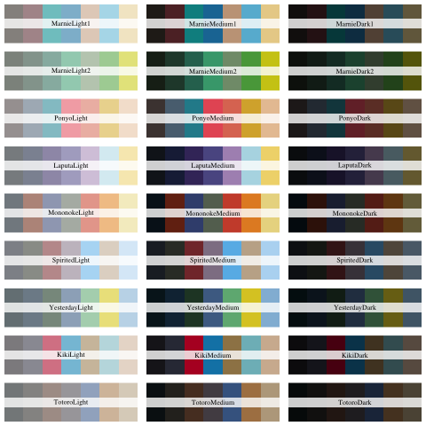
Next, we can view the available color palettes of the loaded ghibli library with a for loop, and the names and print commands like so.
for(i in names(ghibli_palettes)) print(ghibli_palette(i))
The dev.off command is needed to close the plot and return the display to the default graphical parameters.
dev.off()
The PonyoMedium palette has a nice range of cool (e.g., blues) and warm (e.g., reds) colors for plotting, so let’s retrieve the vector of colors associated with this palette using the ghibli_palette command.
ghibli_colors <- ghibli_palette("PonyoMedium", type = "discrete")
Note that we are using the “discrete” palette type here since we will only need a small range of colors for plotting.
We can view the selected range of palette colors by simply entering in the name of the vector as follows.
ghibli_colors
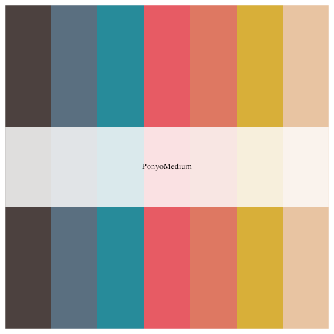
Next, let’s specify a vector of colors in a low, medium, and high range for use with our volcano plots later.
ghibli_subset <- c(ghibli_colors[3], ghibli_colors[6], ghibli_colors[4])
Count Data
Let’s use the read.csv command to import the file named TriboliumCounts.csv with the quantified (counted) transcript sequence data.
tribolium_counts <- read.csv("TriboliumCounts.csv", row.names="X")
Notice that we specified row.names=”X” in the read.csv command since the CSV file of quantified transcript sequence data has just a pair of empty quotes “” in the first cell, and R removes certain special characters (e.g., quotes) when the data is imported.
Pairwise Comparisons
In edgeR the exact test for the negative binomial distribution strongly parallels the Fisher’s exact test, and is applicable to experiments with a single factor. The Fisher’s exact test is used to determine if there is a significant association between two categorical variables.
Note that the exact test in edgeR is based on the qCML methods for experiments with a single factor. By knowing the conditional distribution for the sum of counts in a group, we can compute exact p-values by summing over all sums of counts that have a probability less than the probability under the null hypothesis of the observed sum of counts.
Pairwise Design
To perform pairwise analysis we need to specify the factors (treatment and hours) and levels associated with each of the samples using the factor command. Recall that the treatment factor has the levels of cntrl and treat, and the hours factor has the levels of 4h and 24h.
group <- factor(c(rep("cntrl_4h",3), rep("treat_4h",3), rep("cntrl_24h",3), rep("treat_24h",3)))
Note that the vector of factors named group needs to be arranged in the same order as the samples in the columns of the tribolium_counts data frame.
Now that we have the factors associated with each sample specified, we can use the DGEList command created a object with the table of counts.
list <- DGEList(counts=tribolium_counts,group=group)
Note that in the table of counts rows are features and columns are samples, including a group indicator for each column.
Normalization
After normalization of raw counts we will perform gene wise exact tests, which are pairwise tests of DE for each gene. Exact tests are used to identify differences in the means between two groups of gene counts.
First, let’s use the barplot command of base R to quickly plot and view the sizes of the sequencing libraries as follows.
barplot(list$samples$lib.size*1e-6, names=1:12, ylab="Library size (millions)")

Note that the default normalization method of edgeR is the Trimmed Mean of M-values (TMM), and TMM normalization factors do not take into account library sizes.
We need to filter the table of raw gene counts using the filterByExpr command before we proceed with normalization.
keep <- filterByExpr(list)
Let’s use the table command to view the number of filtered genes.
table(keep)
Now we should subset our data frame to remove genes that the previous filtering identified as not expressed in either experimental condition.
list <- list[keep, , keep.lib.sizes=FALSE]
We’ll use the calcNormFactors command next to calculate scaling factors to convert raw library sizes into effective by finding a set of scaling factors for the library sizes that minimizes the log-fold changes between the samples for most genes.
list <- calcNormFactors(list)
Next, we’ll compute counts per million (CPM) using normalized library sizes with the cpm command.
normList <- cpm(list, normalized.lib.sizes=TRUE)
Data Exploration
With the filtered count data we can start to explore the data using some common edgeR plots, such as multi-dimensional scaling (MDS) and heatmaps.
MDS Plot
With the filtered count data we can also create a multidimensional scaling (MDS) plot. The distances between samples in the MDS plot approximate the expression differences.
Make sure to check out the documentation for the plotMDS command to learn more about the different options. By default the expression differences are calculated as the the average of the largest (leading) absolute log-fold changes between each pair of samples.
First, we need to create a vector with symbol (shape) numbers to specify shapes based on the hours factor of each sample in the MDS plot. Remember that there are two levels to the hours factor, so we need two different shapes.
points <- c(0,1,15,16)
Note that the square symbol is specified using the numbers 0 and 15, where 0 is for open squares and 15 is for filled in squares. The circle symbol is specified using the numbers 1 and 16, where 1 is for open circles and 16 is for filled in circles.
We also need a vector of colors for coloring samples based on factor in the MDS plot. The rep command is used to twice replicate the vector of color values (codes) created in the nested c command. This results in a vector of four color codes, two teal and two yellow.
colors <- rep(c(ghibli_colors[3], ghibli_colors[6]), 2)
Note that the teal color is obtained from element 3 of the ghibli_colors vector we defined earlier. The yellow color is obtained from element 6 of the ghibli_colors vector.
Next, the par command is needed again here to adjust the graphical parameters and enlarge the plot display
par(mar=c(5.1, 4.1, 4.1, 8.1), xpd=TRUE)
Now we can create a detailed MDS plot of the samples as follows.
plotMDS(list, col=colors[group], pch=points[group])
Let’s add a legend to the MDS plot describing the points. The inset argument of the legend command is used to move the plot legend outside of the plotting area.
legend("topright", inset=c(-0.4,0), legend=levels(group), pch=points, col=colors)
Note that the inset argument places the legend in different positions depending on the display, such as the RStudio plot window in comparison with the jpeg command output.

Notice that the point shapes (symbols) are either square for 24h or circle for 4h samples. The control samples have open circles and squares, while treatment samples have filled in circles and squares. Also, notice that the points are colored teal for 24h and yellow for 4h samples.
The dev.off command is needed again here to close the plot and return the display to the default graphical parameters.
dev.off()
Heatmap
As a form of unsupervised clustering, let’s create a heatmap of individual RNA sequencing (transcriptomic) samples using moderated log counts per million (CPM).
First, we need to calculate the log2 CPM of the gene count data by setting the log argument of the cpm command to TRUE like so.
logcpm <- cpm(list, log=TRUE)
Note that by default this produces a matrix of log2 CPM that has undefined values avoided and poorly defined log fold changes (logFC) for low counts shrunk towards zero.
Now we can draw a heatmap clustering the individual samples with the heatmap command of base R.
heatmap(logcpm)
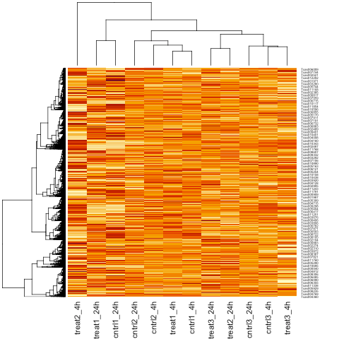
Note that by default the heatmap command performs hierarchical clustering of the individual samples using the calculated log2 CPM.
Model Fitting
Once negative binomial models are fitted and dispersion estimates are obtained, we can proceed with testing for the differential expression of genes.
We need to first estimate common dispersion and tagwise dispersions to produce a matrix of pseudo-counts using the estimateDisp command as follows.
list <- estimateDisp(list)
BCV Plot
Next, we will create a biological coefficient of variation (BCV) plot to explore our data before performing statistical tests.
Then, let’s plot dispersion estimates and biological coefficient of variation with the plotBCV command.
plotBCV(list)
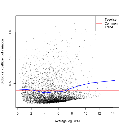
Note that the BCV is the square root of the dispersion parameter under the negative binomial model and is equivalent to estimating the dispersions of the negative binomial model.
Pairwise Contrasts
A contrast is a linear combination of means for a group. So, each of the following pairwise comparisons is a contrast that we will be performing to determine the differential expression of genes.
- treat_4h vs cntrl_4h
- treat_24h vs cntrl_24h
- treat_4h vs treat_24h
- cntrl_4h vs cntrl_24h
Note that the authors were focused on the comparison of differentially expressed genes at different times post UV-B exposure (treat) using the following contrasts.
- treat_4h vs cntrl_4h
- treat_24h vs cntrl_24h
Also keep in mind that the authors considered genes with adjusted P-values < 0.05 to be DE. We will consider genes with FDR adjusted P-values < 0.05 to be significantly DE in this tutorial.
treat_4h vs cntrl_4h
The first contrast we will make is with the groups of treat_4h and cntrl_4h, which are the subsets of samples associated with either the treat or cntrl levels of the treatment factor and the 4h level of the hours factor.
Let’s use the exactTest command to perform the treat_4h vs cntrl_4h contrast as follows.
tested_4h <- exactTest(list, pair=c("cntrl_4h", "treat_4h"))
Using the summary command with the decideTests command we can view the total number of DE genes at a FDR adjusted P-value of 0.05 like so.
summary(decideTests(tested_4h))
MD Plot
The first plot we’ll make is of log-fold change against log-counts per million using the plotMD command.
plotMD(tested_4h)
Now let’s add blue lines to indicate 2-fold changes in expression like so.
abline(h=c(-1, 1), col="blue")
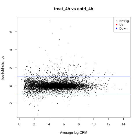
Notice that the legend indicates significantly DE genes are highlighted in red for positive change in expression (up), and blue for negative (down). So, in this contrast there are no significantly DE genes.
Volcano Plot
Another informative type of plot we can make is called a volcano plot, which is a type of scatterplot that can be used to display the association between statistical significance (P-value) and magnitude of gene expression (fold change).
First, let’s create a results table of DE genes and statistics using the topTags command.
resultsTbl_4h <- topTags(tested_4h, n=nrow(tested_4h$table), adjust.method="fdr")$table
Note that the default sorting method of topTags is by P-value, so we are using the adjust.method argument to sort by the FDR adjusted P-values.
Now, we need to identify the direction of expression (up or down) for significantly DE genes. Remember that we are considering genes with a FDR adjusted P-values < 0.05 to be significantly DE.
Let’s start by adding a column named topDE to our data frame of exact test results and fill each entry with the string “NA”.
resultsTbl_4h$topDE <- "NA"
We will identify genes that are significantly positively expressed (up) as those with a log FC > 1 and with a FDR adjusted P-values < 0.05 as follows.
resultsTbl_4h$topDE[resultsTbl_4h$logFC > 1 & resultsTbl_4h$FDR < 0.05] <- "UP"
Next, we will identify genes that are significantly negatively expressed (down) as those with a log FC < -1 and with a FDR adjusted P-values < 0.05 like so.
resultsTbl_4h$topDE[resultsTbl_4h$logFC < -1 & resultsTbl_4h$FDR < 0.05] <- "DOWN"
Now we can create our volcano plot using the ggplot command with the logFC, FDR, and topDE columns of the exact test results data frame. Note that the FDR is transformed using the negative – results of the log10 command.
ggplot(data=resultsTbl_4h, aes(x=logFC, y=-log10(FDR), color=topDE)) +
  geom_point() +
  theme_minimal() +
  scale_colour_discrete(type=ghibli_subset, breaks = c("Up", "Down"))
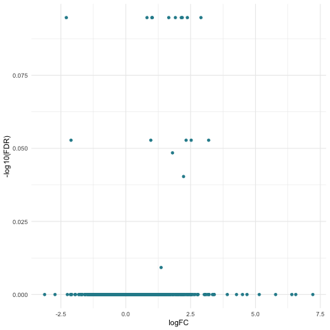
The specific colors for each of the directions of expression are set using the scale_colour_discrete command and the subset of ghibli palette colors that we previously stored in the ghibli_subset vector.
Notice that there is only one color of points in the above plot since we did not find any significantly DE genes.
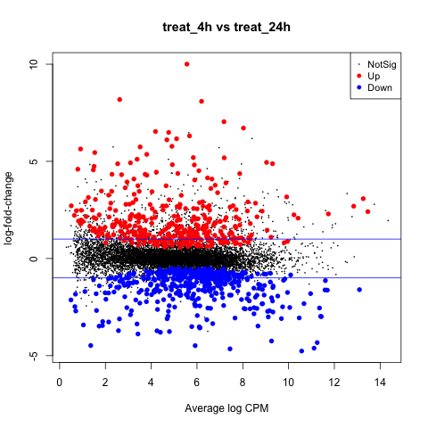
treat_24h vs cntrl_24h
The second contrast we will make is with the groups of treat_24h and cntrl_24h, which are the subsets of samples associated with either the treat or cntrl levels of the treatment factor and the 24h level of the hours factor.
Let’s use the exactTest command to perform the treat_24h vs cntrl_24h contrast as follows.
tested_24h <- exactTest(list, pair=c("cntrl_24h", "treat_24h"))
Using the summary command with the decideTests command we can view the total number of DE genes at a FDR adjusted P-value of 0.05 like so.
summary(decideTests(tested_24h))
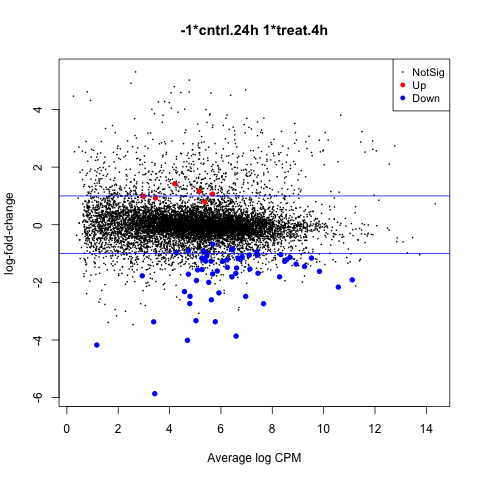
MD Plot
The first plot we’ll make is of log-fold change against log-counts per million using the plotMD command.
plotMD(tested_24h)
Now let’s add blue lines to indicate 2-fold changes in expression like so.
abline(h=c(-1, 1), col="blue")
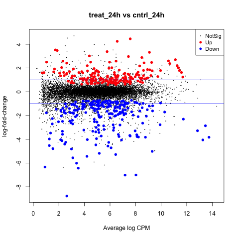
Notice that significantly DE genes are highlighted in red for positive change in expression (up), and blue for negative (down).
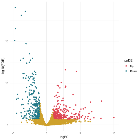
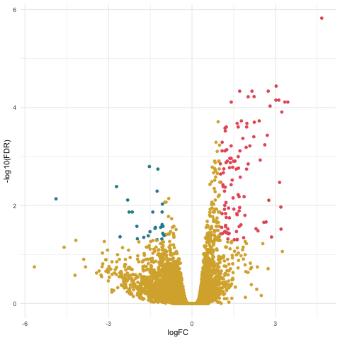
Volcano Plot
We will make a scatterplot to display the association between statistical significance (P-value) and magnitude of gene expression (fold change).
First, let’s create a results table of DE genes and statistics using the topTags command.
resultsTbl_24h <- topTags(tested_24h, n=nrow(tested_24h$table), adjust.method="fdr")$table
Now, we need to identify the direction of expression (up or down) for significantly DE genes.
Let’s start by adding a column named topDE to our data frame of exact test results and fill each entry with the string “NA”.
resultsTbl_24h$topDE <- "NA"
We will identify genes that are significantly positively expressed (up) as those with a log FC > 1 and with a FDR adjusted P-values < 0.05 as follows.
resultsTbl_24h$topDE[resultsTbl_24h$logFC > 1 & resultsTbl_24h$FDR < 0.05] <- "Up"
Next, we will identify genes that are significantly negatively expressed (down) as those with a log FC < -1 and with a FDR adjusted P-values < 0.05 like so.
resultsTbl_24h$topDE[resultsTbl_24h$logFC < -1 & resultsTbl_24h$FDR < 0.05] <- "Down"
Now we can create our volcano plot using the ggplot command with the logFC, FDR, and topDE columns of the exact test results data frame.
ggplot(data=resultsTbl_24h, aes(x=logFC, y=-log10(FDR), color = topDE)) +
  geom_point() +
  theme_minimal() +
  scale_colour_discrete(type = ghibli_subset, breaks = c("Up", "Down"))
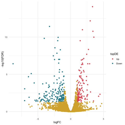
Notice that the significantly DE genes are colored by the topDE column in the aes command. The specific colors for each of the directions of expression are set using the scale_colour_discrete command and the subset of ghibli palette colors that we previously stored in the ghibli_subset vector.
We also set the breaks argument of the scale_colour_discrete command to specify that we only want the tags of “Up” and “Down” to be included in the legend.
Filtering
Let’s create a table filtered to contain the significantly DE genes for plotting later.
Recall that we will consider genes with FDR adjusted P-values < 0.05 to be DE. This means that we need to filter the list of DE genes by first retrieving all genes that meet the criteria of FDR < 0.05 like so.
resultsTbl_24h.keep <- resultsTbl_24h$FDR < 0.05
Then we can subset the data frame to remove all genes that do not have a FDR adjusted P-value < 0.05.
resultsTbl_24h_filtered <- resultsTbl_24h[resultsTbl_24h.keep,]
treat_4h vs treat_24h
The third contrast we will make is with the groups of treat_4h and treat_24h, which are the subsets of samples associated with either the 4h or 24h levels of the hours factor and the treat level of the treatment factor.
Let’s use the exactTest command to perform the treat_4h vs treat_24h contrast as follows.
tested_treat <- exactTest(list, pair=c("treat_24h", "treat_4h"))
Using the summary command with the decideTests command we can view the total number of DE genes at a FDR adjusted P-value of 0.05 like so.
summary(decideTests(tested_treat))
MD Plot
The first plot we’ll make is of log-fold change against log-counts per million using the plotMD command.
plotMD(tested_treat)
Now let’s add blue lines to indicate 2-fold changes in expression like so.
abline(h=c(-1, 1), col="blue")
Volcano Plot
We will make a scatterplot to display the association between statistical significance (P-value) and magnitude of gene expression (fold change).
First, let’s create a results table of DE genes and statistics using the topTags command.
resultsTbl_treat <- topTags(tested_treat, n=nrow(tested_treat$table), adjust.method="fdr")$table
Now, we need to identify the direction of expression (up or down) for significantly DE genes.
Let’s start by adding a column named topDE to our data frame of exact test results and fill each entry with the string “NA”.
resultsTbl_treat$topDE <- "NA"
We will identify genes that are significantly positively expressed (up) as those with a log FC > 1 and with a FDR adjusted P-values < 0.05 as follows.
resultsTbl_treat$topDE[resultsTbl_treat$logFC > 1 & resultsTbl_treat$FDR < 0.05] <- "Up"
Next, we will identify genes that are significantly negatively expressed (down) as those with a log FC < -1 and with a FDR adjusted P-values < 0.05 like so.
resultsTbl_treat$topDE[resultsTbl_treat$logFC < -1 & resultsTbl_treat$FDR < 0.05] <- "Down"
Now we can create our volcano plot using the ggplot command with the logFC, FDR, and topDE columns of the exact test results data frame.
ggplot(data=resultsTbl_treat, aes(x=logFC, y=-log10(FDR), color = topDE)) +
  geom_point() +
  theme_minimal() +
  scale_colour_discrete(type = ghibli_subset, breaks = c("Up", "Down"))
Filtering
Let’s create a table filtered to contain the significantly DE genes for plotting later.
We need to filter the list of DE genes by first retrieving all genes that meet the criteria of FDR < 0.05 like so.
resultsTbl_treat.keep <- resultsTbl_treat$FDR < 0.05
Then we can subset the data frame to remove all genes that do not have a FDR adjusted P-value < 0.05.
resultsTbl_treat_filtered <- resultsTbl_treat[resultsTbl_treat.keep,]
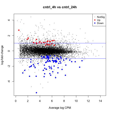
cntrl_4h vs cntrl_24h
The last pairwise contrast we will make is with the groups of cntrl_4h and cntrl_24h, which are the subsets of samples associated with either the 4h or 24h levels of the hours factor and the cntrl level of the treatment factor.
Let’s use the exactTest command to perform the cntrl_4h vs cntrl_24h contrast as follows.
tested_cntrl <- exactTest(list, pair=c("cntrl_24h", "cntrl_4h"))
Using the summary command with the decideTests command we can view the total number of DE genes at a FDR adjusted P-value of 0.05 like so.
summary(decideTests(tested_cntrl))
MD Plot
The first plot we’ll make is of log-fold change against log-counts per million using the plotMD command.
plotMD(tested_cntrl)
Now let’s add blue lines to indicate 2-fold changes in expression like so.
abline(h=c(-1, 1), col="blue")
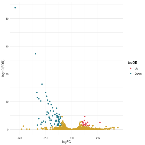
Volcano Plot
We will again make a scatterplot to display the association between statistical significance (P-value) and magnitude of gene expression (fold change).
First, let’s create a results table of DE genes and statistics using the topTags command.
resultsTbl_ncntrl <- topTags(tested_cntrl, n=nrow(tested_cntrl$table), adjust.method="fdr")$table
Now, we need to identify the direction of expression (up or down) for significantly DE genes.
Let’s start by adding a column named topDE to our data frame of exact test results and fill each entry with the string “NA”.
resultsTbl_ncntrl$topDE <- "NA"
We will identify genes that are significantly positively expressed (up) as those with a log FC > 1 and with a FDR adjusted P-values < 0.05 as follows.
resultsTbl_ncntrl$topDE[resultsTbl_ncntrl$logFC > 1 & resultsTbl_ncntrl$FDR < 0.05] <- "Up"
Next, we will identify genes that are significantly negatively expressed (down) as those with a log FC < -1 and with a FDR adjusted P-values < 0.05 like so.
resultsTbl_ncntrl$topDE[resultsTbl_ncntrl$logFC < -1 & resultsTbl_ncntrl$FDR < 0.05] <- "Down"
Now we can create our volcano plot using the ggplot command with the logFC, FDR, and topDE columns of the exact test results data frame.
ggplot(data=resultsTbl_ncntrl, aes(x=logFC, y=-log10(FDR), color = topDE)) +
  geom_point() +
  theme_minimal() +
  scale_colour_discrete(type = ghibli_subset, breaks = c("Up", "Down"))
Filtering
Let’s create a table filtered to contain the significantly DE genes for plotting later.
We need to filter the list of DE genes by first retrieving all genes that meet the criteria of FDR < 0.05 like so.
resultsTbl_cntrl.keep <- resultsTbl_ncntrl$FDR < 0.05
Then we can subset the data frame to remove all genes that do not have a FDR adjusted P-value < 0.05.
resultsTbl_cntrl_filtered <- resultsTbl_ncntrl[resultsTbl_cntrl.keep,]
Pairwise Results Exploration
We can start to explore the results of our DE analysis by comparing the sets of significantly DE genes for each of the pairwise contrasts.
First, let’s retrieve set of significantly DE gene names for the 24h groups contrast of treat_24h vs cntrl_24h as follows.
geneSet_24h <- rownames(resultsTbl_24h_filtered)
The set of significantly DE gene names for the treat groups contrast of treat_4h vs treat_24h.
geneSet_treat <- rownames(resultsTbl_treat_filtered)
And the set of significantly DE gene names for the treat groups contrast of treat_4h vs treat_24h.
geneSet_cntrl <- rownames(resultsTbl_cntrl_filtered)
Next, we need to create a combined list of the sets of significantly DE gene names like so.
list_venn <- list(h24 = geneSet_24h,
                  treat = geneSet_treat,
                  cntrl = geneSet_cntrl)
Now we can create a venn diagram comparing the sets of significantly DE genes for each of the pairwise contrasts using the ggVennDiagram command with the scale_color_brewer command.
ggVennDiagram(list_venn, label_alpha=0.25, category.names = c("24h","treat","cntrl")) +
  scale_color_brewer(palette = "Paired")
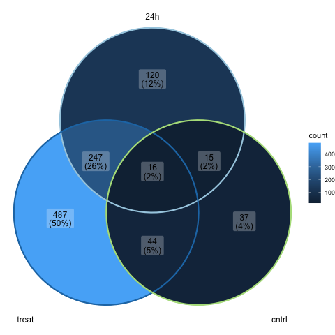
Recall that no significantly DE genes were found for the 4h groups contrast of treat_4h vs cntrl_4h, so it is not included in the above plot.
Note that we are using the category.names argument of the ggVennDiagram command to set the names of the groups on the plot. We also use the label_alpha argument to make the labels on the plot slightly transparent.
Further note that we set the palette argument of the scale_color_brewer command to “Paired”, which is one of the qualitative palettes that can be used to represent nominal or categorical data.
ANOVA Comparisons
Next we will use generalized linear models (GLMs) to detect differentially expressed genes associated with the factors of our experimental design. GLMs are an extension of classical linear models to non-normally distributed response data, and are used to specify probability distributions according to their mean-variance relationship.
Note that GLMs may be used for general experiments with multiple factors, and parallels the ANOVA method. Recall that exact tests are only applicable to experiments with a single factor.
The comma separated variable (CSV) file named groupingFactors_tribolium.csv with the grouping factors can be found -> here <-
ANOVA Design
First, we will import a CSV file named groupingFactors_tribolium.csv that describes the design of our experiment as follows.
glm_targets <- read.csv(file="groupingFactors_tribolium.csv", row.names="sample")
Let’s use the factor command with the paste command to create an object with the groupings for our samples.
glm_group <- factor(paste(glm_targets$treatment, glm_targets$hours, sep="."))
Again, we need to create a DGEList object as follows.
glm_list <- DGEList(counts=tribolium_counts, group=glm_group)
Here we should add the sample names from the row names of the glm_targets data frame with the design of our experiment.
colnames(glm_list) <- rownames(glm_targets)
Now we can setup the design matrix used for conducting contrasts with the generalized linear models using the model.matrix command.
glm_design <- model.matrix(~ 0 + glm_group)
We also need to add the group names to the columns of our design matrix using the levels of our object with the groupings for our sample named using the colnames and levels commands.
colnames(glm_design) <- levels(glm_group)
Normalization
Remember that we need to filter the table of raw gene counts using the filterByExpr command before we proceed with normalization.
glm_keep <- filterByExpr(glm_list)
Let’s again use the table command to view the number of filtered genes.
table(glm_keep)
Now we should subset our data frame to remove genes that the previous filtering identified as not expressed in either experimental condition.
glm_list <- glm_list[glm_keep, , keep.lib.sizes=FALSE]
We’ll again use the calcNormFactors command next to calculate scaling factors to convert raw library sizes into effective.
glm_list <- calcNormFactors(glm_list)
Next, we’ll compute counts per million (CPM) using normalized library sizes with the cpm command.
norm_glm_list <- cpm(glm_list, normalized.lib.sizes=TRUE)
Model Fitting
Once negative binomial models are fitted and dispersion estimates are obtained, we can proceed with testing for the differential expression of genes.
We need to first estimate common dispersion and tagwise dispersions to produce a matrix of pseudo-counts using the estimateDisp command as follows.
glm_list <- estimateDisp(glm_list, glm_design, robust=TRUE)
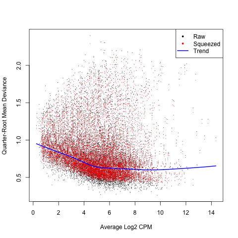
Now we need to fit the quasi-likelihood (QL) negative binomial generalized log-linear model to count data using the glmQLFit command.
glm_fit <- glmQLFit(glm_list, glm_design, robust=TRUE)
We can use the plotQLDisp command to plot the gene wise QL dispersions against the gene abundance in log2 CPM.
plotQLDisp(glm_fit)
ANOVA Contrasts
Recall that a contrast is a linear combination of means for a group. We will be performing each of the following contrasts to determine the differential expression of genes between the levels of each factor, and for any interaction effect.
- treatment
- hours
- interaction
Recall that the ANOVA let’s us identify any significant main effect associated with an explanatory variable, which are categorical factors like treatment and hours.
treatment
The first ANOVA like contrast we will make is between the treat and cntrl levels of the treatment factor.
Let’s use the makeContrasts command to setup the treatment contrast matrix as follows.
con.treatment <- makeContrasts(set.treatment =
                               (treat.4h + treat.24h)/2
                               - (cntrl.4h + cntrl.24h)/2,
                               levels=glm_design)
Now we’ll use the glmTreat command to conduct gene wise statistical tests for the treatment contrast.
anov.treatment <- glmTreat(glm_fit, contrast=con.treatment)
Using the summary command with the decideTests command we can view the total number of DE genes at a FDR adjusted P-value of 0.05 like so.
summary(decideTests(anov.treatment))
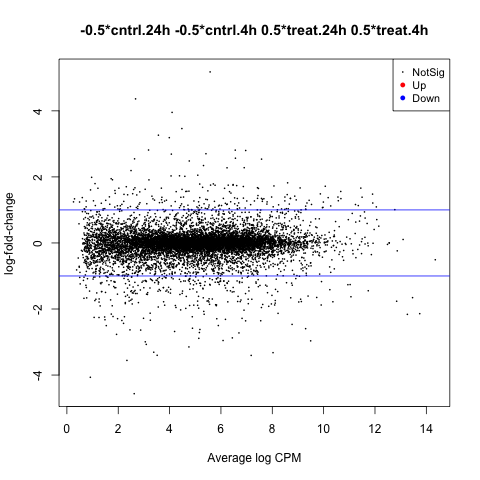
MD Plot
The first plot we’ll make is of log-fold change against log-counts per million using the plotMD command.
plotMD(anov.treatment)
Now let’s add blue lines to indicate 2-fold changes in expression like so.
abline(h=c(-1, 1), col="blue")
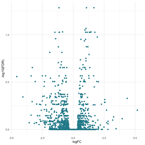
Volcano Plot
We will make a scatterplot to display the association between statistical significance (P-value) and magnitude of gene expression (fold change).
First, let’s create a results table of DE genes and statistics using the topTags command.
tagsTbl_treatment <- topTags(anov.treatment, n=nrow(anov.treatment$table), adjust.method="fdr")$table
Now, we need to identify the direction of expression (up or down) for significantly DE genes.
Let’s start by adding a column named topDE to our data frame of exact test results and fill each entry with the string “NA”.
tagsTbl_treatment$topDE <- "NA"
We will identify genes that are significantly positively expressed (up) as those with a log FC > 1 and with a FDR adjusted P-values < 0.05 as follows.
tagsTbl_treatment$topDE[tagsTbl_treatment$logFC > 1 & tagsTbl_treatment$FDR < 0.05] <- "UP"
Next, we will identify genes that are significantly negatively expressed (down) as those with a log FC < -1 and with a FDR adjusted P-values < 0.05 like so.
tagsTbl_treatment$topDE[tagsTbl_treatment$logFC < -1 & tagsTbl_treatment$FDR < 0.05] <- "DOWN"
Now we can create our volcano plot using the ggplot command with the logFC, FDR, and topDE columns of the exact test results data frame.
ggplot(data=tagsTbl_treatment, aes(x=logFC, y=-log10(FDR), color = topDE)) +
  geom_point() +
  theme_minimal() +
  scale_colour_discrete(type = ghibli_subset, breaks = c("Up", "Down"))
Filtering
Let’s create a table filtered to contain the significantly DE genes for plotting later.
We need to filter the list of DE genes by first retrieving all genes that meet the criteria of FDR < 0.05 like so.
tagsTbl_treatment.glm_keep <- tagsTbl_treatment$FDR < 0.05
Then we can subset the data frame to remove all genes that do not have a FDR adjusted P-value < 0.05.
tagsTbl_treatment_filtered <- tagsTbl_treatment[tagsTbl_treatment.glm_keep,]
hours
The first ANOVA like contrast we will make is between the 4h and 24h levels of the hours factor.
Let’s use the makeContrasts command to setup the treatment contrast matrix as follows.
con.hours <- makeContrasts(set.hours =
                           (cntrl.24h + treat.24h)/2
                           - (cntrl.4h + treat.4h)/2,
                           levels=glm_design)
Now we’ll use the glmTreat command to conduct gene wise statistical tests for the hours contrast.
anov.hours <- glmTreat(glm_fit, contrast=con.hours)
Using the summary command with the decideTests command we can view the total number of DE genes at a FDR adjusted P-value of 0.05 like so.
summary(decideTests(anov.hours))
MD Plot
The first plot we’ll make is of log-fold change against log-counts per million using the plotMD command.
plotMD(anov.hours)
Now let’s add blue lines to indicate 2-fold changes in expression like so.
abline(h=c(-1, 1), col="blue")

Volcano Plot
Again we will make a scatterplot to display the association between statistical significance (P-value) and magnitude of gene expression (fold change).
First, let’s create a results table of DE genes and statistics using the topTags command.
tagsTbl_hours <- topTags(anov.hours, n=nrow(anov.hours$table), adjust.method="fdr")$table
Now, we need to identify the direction of expression (up or down) for significantly DE genes.
Let’s start by adding a column named topDE to our data frame of exact test results and fill each entry with the string “NA”.
tagsTbl_hours$topDE <- "NA"
We will identify genes that are significantly positively expressed (up) as those with a log FC > 1 and with a FDR adjusted P-values < 0.05 as follows.
tagsTbl_hours$topDE[tagsTbl_hours$logFC > 1 & tagsTbl_hours$FDR < 0.05] <- "UP"
Next, we will identify genes that are significantly negatively expressed (down) as those with a log FC < -1 and with a FDR adjusted P-values < 0.05 like so.
tagsTbl_hours$topDE[tagsTbl_hours$logFC < -1 & tagsTbl_hours$FDR < 0.05] <- "DOWN"
Now we can create our volcano plot using the ggplot command with the logFC, FDR, and topDE columns of the exact test results data frame.
ggplot(data=tagsTbl_hours, aes(x=logFC, y=-log10(FDR), color = topDE)) +
  geom_point() +
  theme_minimal() +
  scale_colour_discrete(type = ghibli_subset, breaks = c("Up", "Down"))
Filtering
Let’s again create a table filtered to contain the significantly DE genes for plotting later.
We need to filter the list of DE genes by first retrieving all genes that meet the criteria of FDR < 0.05 like so.
tagsTbl_hours.glm_keep <- tagsTbl_hours$FDR < 0.05
Then we can subset the data frame to remove all genes that do not have a FDR adjusted P-value < 0.05.
tagsTbl_hours_filtered <- tagsTbl_hours[tagsTbl_hours.glm_keep,]
interaction
The first ANOVA like contrast we will make is between the treatment and hours factors to identify any interaction effect. This means that we need to consider the groupings based on the levels within each factor.
Let’s use the makeContrasts command to setup the treatment contrast matrix as follows.
con.interaction <- makeContrasts(set.interaction =
                                 ((treat.4h + treat.24h)/2
                                 - (cntrl.4h + cntrl.24h)/2)
                                 - ((cntrl.24h + treat.24h)/2
                                 - (cntrl.4h + treat.4h)/2),
                                 levels=glm_design)
Now we’ll use the glmTreat command to conduct gene wise statistical tests for the interaction contrast.
anov.interaction <- glmTreat(glm_fit, contrast=con.interaction)
Using the summary command with the decideTests command we can view the total number of DE genes at a FDR adjusted P-value of 0.05 like so.
summary(decideTests(anov.interaction))
MD Plot
The first plot we’ll make is of log-fold change against log-counts per million using the plotMD command.
plotMD(anov.interaction)
Now let’s add blue lines to indicate 2-fold changes in expression like so.
abline(h=c(-1, 1), col="blue")
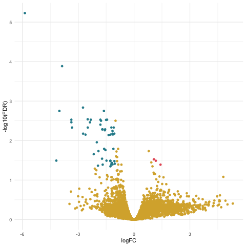
Volcano Plot
Again we will make a scatterplot to display the association between statistical significance (P-value) and magnitude of gene expression (fold change).
First, let’s create a results table of DE genes and statistics using the topTags command.
tagsTbl_inter <- topTags(anov.interaction, n=nrow(anov.interaction$table), adjust.method="fdr")$table
Now, we need to identify the direction of expression (up or down) for significantly DE genes.
Let’s start by adding a column named topDE to our data frame of exact test results and fill each entry with the string “NA”.
tagsTbl_inter$topDE <- "NA"
We will identify genes that are significantly positively expressed (up) as those with a log FC > 1 and with a FDR adjusted P-values < 0.05 as follows.
tagsTbl_inter$topDE[tagsTbl_inter$logFC > 1 & tagsTbl_inter$FDR < 0.05] <- "UP"
Next, we will identify genes that are significantly negatively expressed (down) as those with a log FC < -1 and with a FDR adjusted P-values < 0.05 like so.
tagsTbl_inter$topDE[tagsTbl_inter$logFC < -1 & tagsTbl_inter$FDR < 0.05] <- "DOWN"
Now we can create our volcano plot using the ggplot command with the logFC, FDR, and topDE columns of the exact test results data frame.
ggplot(data=tagsTbl_inter, aes(x=logFC, y=-log10(FDR), color = topDE)) +
  geom_point() +
  theme_minimal() +
  scale_colour_discrete(type = ghibli_subset, breaks = c("Up", "Down"))
Filtering
Let’s again create a table filtered to contain the significantly DE genes for plotting later.
We need to filter the list of DE genes by first retrieving all genes that meet the criteria of FDR < 0.05 like so.
tagsTbl_inter.glm_keep <- tagsTbl_inter$FDR < 0.05
Then we can subset the data frame to remove all genes that do not have a FDR adjusted P-value < 0.05.
tagsTbl_inter_filtered <- tagsTbl_inter[tagsTbl_inter.glm_keep,]
ANOVA Results Exploration
We can start to explore the results of our DE analysis by comparing the sets of significantly DE genes for each of the pairwise contrasts.
First, let’s retrieve set of significantly DE gene names for the hours contrast of as follows.
geneSet_hours <- rownames(tagsTbl_hours_filtered)
The set of significantly DE gene names for the interaction contrast.
geneSet_interaction <- rownames(tagsTbl_inter_filtered)
Next, we need to create a combined list of the sets of significantly DE gene names like so.
glm_list_venn <- list(hours = geneSet_hours,
                          interaction = geneSet_interaction)
Now we can create a venn diagram comparing the sets of significantly DE genes for each of the pairwise contrasts using the ggVennDiagram command with the scale_color_brewer command.
ggVennDiagram(glm_list_venn, label_alpha=0.25, category.names = c("hours","interaction")) +
  scale_color_brewer(palette = "Paired")
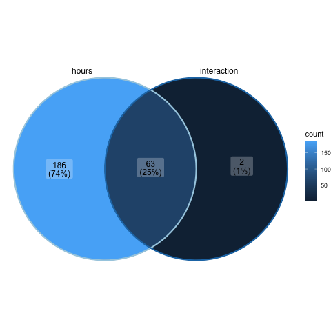
Recall that no significantly DE genes were found for the treatment contrast, so it is not included in the above plot.
Saving Plots
We can save plots as PNG files by placing the code for the plot in between the png command and dev.off command calls, for example.
png("glm_tribolium_venn.png")
ggVennDiagram(glm_list_venn, label_alpha=0.25, category.names = c("hours","interaction")) +
  scale_color_brewer(palette = "Paired")
dev.off()
Saving Tables
We can write table of data to a comma separated variable (CSV) file for downstream analysis using the write.table command, for example.
write.table(normList, file="Tribolium_normalizedCounts.csv", sep=",", row.names=TRUE)
Key Points & Tips
- Pairwise comparisons are a good starting point for biostatistical analysis.
- ANOVA comparisons are used for general experiments with multiple factors.
- Make sure to install any necessary software in advance.
- Use different types of plots to explore expression data and analysis results.
Code & Data
A R script with the code for all of the above analyses is provided -> here <-
The CSV file named TriboliumCounts.csv with the gene count data can be found -> here <-
The CSV file named groupingFactors_tribolium.csv with the grouping factors for GLM analysis can be found -> here <-
The CSV file named Tribolium_normalizedCounts.csv with the example output normalized gene count results can be found -> here <-
R-bloggers.com offers daily e-mail updates about R news and tutorials about learning R and many other topics. Click here if you're looking to post or find an R/data-science job.
Want to share your content on R-bloggers? click here if you have a blog, or here if you don't.