
Effect of normalization of data
Want to share your content on R-bloggers? click here if you have a blog, or here if you don't.
Clustering (distributed in particular) can be dependent on normalization of data. With usage of distance models, data – when clustered – can produce different results or even different clustering models.
A simple every day example can produce two different results. For example, measuring units. For this purpose we will create two R data-frames.
person <- c("1","2","3","4","5")
age <- c(30,50,30,50,30)
height_cm <- c(180,186,166,165,191)
height_feet <- c(5.91,6.1,5.45,5.42,6.26)
weight_kg <- c(70,90,60,74,104)
weight_stone <- c(11,14.1,9.4,11.6,16.3)

sample1 <- data.frame(person, age, height_cm, weight_kg)
sample2 <- data.frame(person, age, height_feet, weight_stone)
With a simple visualization, I have seen people arguing that even a simple scatter plot will produce different result. So let us try this:
# create two simple scatter plots
#sample1
plot(sample1$age, sample1$height_cm, main="Sample1", xlab="Age",
ylab="Height (cm)", pch=19)
textxy(sample1$age, sample1$height_cm,sample1$person, cex=0.9)

#sample2
plot(sample2$age, sample2$height_feet, main="Sample2", xlab="Age",
ylab="Height (feet)", pch=19)
textxy(sample2$age, sample2$height_feet,sample2$person, cex=0.9)
With result of:

One can see there is relative or no difference when height is centimeters or in feet. So what authors in book:Finding Groups in Data: An Introduction to Cluster Analysis are proposing in chapter on “changing the measurement units may even lead one to see a very different clustering” does not simply hold water.
Excert from their book:
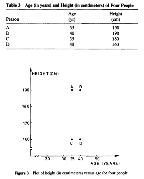
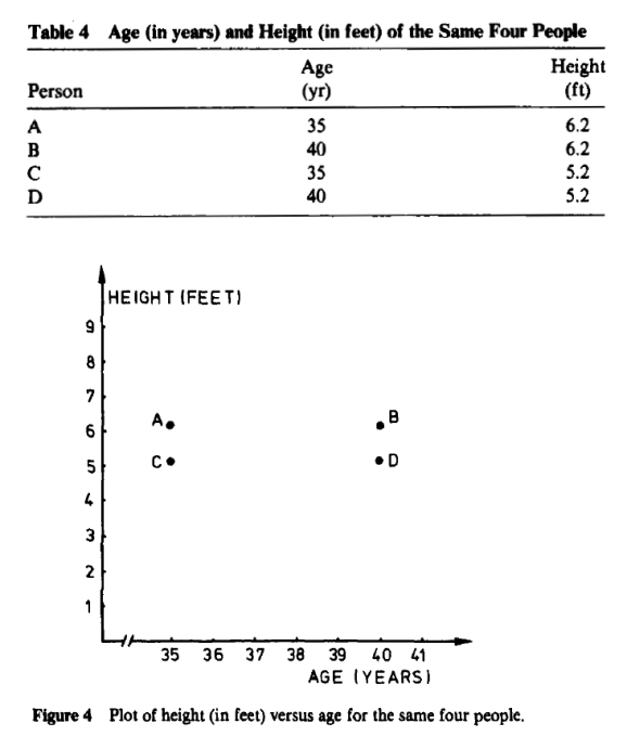
Both are perfectly manipulated scatter plots to support their theory. if you descale age between Figure 3 and Figure 4 and also keep proportions on height on both graphs, one should not get such “manipulated” graph.
Adding a line to both graphs and swapping X-axis with Y-axis, one still can not produce such a huge difference!
#what if we switch X with Y since with the conversion of height we get different ratio

#sample1
plot(sample1$height_cm, sample1$age, main="Sample1", xlab="Height (cm)",
ylab="Age", pch=19)
textxy(sample1$height_cm,sample1$age,sample1$person, cex=0.9)

#sample2
plot(sample2$height_feet,sample2$age, main="Sample2", xlab="Height (feet)",
ylab="Age", pch=19)
textxy(sample2$height_feet,sample2$age,sample2$person, cex=0.9)

#additional sample
scatterplot(age ~ height_cm, data=sample1,xlab="Height (cm)", ylab="age",
main="Sample 1", labels = person)
scatterplot(age ~ height_feet, data=sample2,xlab="Height (feet)", ylab="age",
main="Sample 2", labels = person)
Comparing again both graphs reveal same results:

So far so good. But what is we are doing distance based clustering? Well, story changes drastically. For sake of sample, I will presume there are two clusters and we will run kmeans, where n – observations will belong to cluster x based on their nearest mean. So for a given set of observation, a k-means cluster will partition observations into sets in order to minimize the distance between each point in cluster to its center. So minimization of sum of squares will be the WCSS function (which will maximize the distance between the cluster center K).
In step 1 we will be using columns Age and Height and observe the results. In step 2 we will add also Weight and observe the results.
##########
#step 1
##########
sample1 <- data.frame(age, height_cm)
sample2 <- data.frame(age, height_feet)

# sample1
fit1 <- kmeans(sample1, 2)
# sample2
fit2 <- kmeans(sample2, 2)

#compare
fit1
fit2

##########
#step 2
##########
sample1 <- data.frame(age, height_cm, weight_kg)
sample2 <- data.frame(age, height_feet, weight_stone)

# sample1
fit1 <- kmeans(sample1, 2)
# sample2
fit2 <- kmeans(sample2, 2)

#compare
fit1
fit2
In step 1; sum of squares within clusters for dataset Sample1 is 200 and 327, where for Sample2 is 0.33 and 0.23. Calculating Between_SumSqr / Total_SumSql, for Sample1 is 47% and for Sample2 is 99% which is a difference that would need a prio normalization.
In step 2; same difference is present, relatively smaller and calculating Between_SumSqr / Total_SumSql is for Sample1 63,1%, for Sample2 is 92,4%.
In both cases (step1 and step2) different observation would be belonging to different cluster center K.
Now we will introduce normalization of both weight and height, since both can be measured in different units.
#~~~~~~~~~~~~~~~~~~~
# normalizing data
# height & weight
#~~~~~~~~~~~~~~~~~~~
height_cm_z   <- data.Normalization(sample1$height_cm,type="n1",normalization="column")
height_feet_z <- data.Normalization(sample2$height_feet,type="n1",normalization="column")

weight_kg_z   <- data.Normalization(sample1$weight_kg,type="n1",normalization="column")
weight_stone_z <- data.Normalization(sample2$weight_stone,type="n1",normalization="column")

##########
#step 1
##########
sample1 <- data.frame(age, height_cm_z)
sample2 <- data.frame(age, height_feet_z)


# sample1
fit1 <- kmeans(sample1, 2)
# sample2
fit2 <- kmeans(sample2, 2)

#compare
fit1
fit2


##########
#step 2
##########
sample1 <- data.frame(age, height_cm_z, weight_kg_z)
sample2 <- data.frame(age, height_feet_z, weight_stone_z)

# sample1
fit1 <- kmeans(sample1, 2)
# sample2
fit2 <- kmeans(sample2, 2)

#compare
fit1
fit2
Now we have proven that both data samples will return the same result; when comparing cluster vector for both data samples (when normalized) will be relatively the same; some minor differences can occur. Fit function for cluster vector will at the end return same results.
Going back to original question that measuring unit can give different results. In terms of plotting data, we have proven this wrong. In terms of cluster analysis we have done only half of the proof. For reverse check, we will test – for example Sample1 – on original data and normalized data. Here we will see the importance of design size, test of variance and variance inequality.
#~~~~~~~~~~~~~~~~~~~
#
# comparing normalized
# and non-normalized
# data sample
#~~~~~~~~~~~~~~~~~~~

#sample1 with cm
sample1 <- data.frame(age, height_cm)
sample1_z <- data.frame(age, height_cm_z)

#sample1 with feet
sample2 <- data.frame(age, height_feet)
sample2_z <- data.frame(age, height_feet_z)

# design size
var(sample1$height_cm)
var(sample1_z$height_cm_z)

var(sample2$height_feet)
var(sample2_z$height_feet_z)

#test variance of sample1 height and sample2 height
var.test(sample1$height_cm, sample2$height_feet)

#test variance of sample1 height and sample2 height
var.test(sample1_z$height_cm_z, sample2_z$height_feet_z)
Test of equality of variance between non-normalized and normalized data shows normalized outperform the non-normalized. This reveals that in distance based clustering the data with smaller – when compared with bigger – values (here is feet vs. cm) will result in bigger design effect. Therefore a normalization is recommended, in second test the ratio of the variance = 1, meaning that variance are equal (also p-value = 1).

To finalize the test, let’s rerun the fit function for clustering with 2 clusters
#comparison of Fit function for clustering with 2 clusters (on Sample1)
# sample1
fit1 <- kmeans(sample1, 2)
fit1_z <- kmeans(sample1_z, 2)

#compare
fit1
fit1_z
The result is:
#non-normalized
Clustering vector: [1] 1 1 2 2 1
Within cluster sum of squares by cluster: [1] 327.3333 200.5000 (between_SS / total_SS = 48.7 %)
#normalized
Clustering vector: [1] 2 1 2 1 2
Within cluster sum of squares by cluster: [1] 1.605972 2.286963 (between_SS / total_SS = 99.2 %)
To summarize; the result of the normalized clustering is much better, since the WCSS is higher, resulting in total variance of data sets is explained for each cluster. We can assume that the belonging to each cluster when normalizing the height is much better when minimizing the differences within the group and maximizing it between the groups.
But to make things more complicated, you should normalize also age; and you will get completely different cluster centers![]()
Complete code is available here: Effect of normalization of data.

R-bloggers.com offers daily e-mail updates about R news and tutorials about learning R and many other topics. Click here if you're looking to post or find an R/data-science job.
Want to share your content on R-bloggers? click here if you have a blog, or here if you don't.