
The “best” proxies for temperature reconstruction
Want to share your content on R-bloggers? click here if you have a blog, or here if you don't.
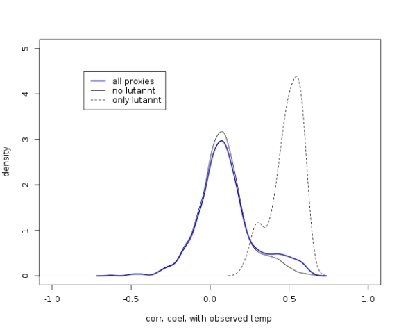
In the last post I presented the distribution of correlation coefficients of temperature proxies with the actual temperature observations during the past 150 years. One of the conclusions was that most proxies correlate weakly with temperature observations. However, there seemed to be some proxies that do have some significant positive correlation with the observations. These proxies are the topic of this post.
First of all, I follow the advice of McShane (2011) and remove all the “lutannt” proxies, where the acronym apparently stands for LUTerbacher (2004) ANNual Temperatures (or something like this). These “proxies” are no real proxies because they have been calibrated to match temperature observations already. That means they are in a way a function of the temperature observations and thus correlate strongly with the observations by construction. Indeed, when filtering out the 71 “lutannt” proxies and plotting the distribution of their correlation coefficients separately, we see that these proxies contribute significantly to the peak at high correlation coefficients:
The R code to produce the above plot is here:
##calculate all correlation coefficients between instrumental temperature data and proxy data
##plot distribution with and without "lutannt-proxies"
##LUTerbacher ANNual Tempertures (2004)

#read data, remove "year"-column from proxy data
load("../data/data_allproxy1209.Rdata")
load("../data/data_instrument.Rdata")
t.nh <- instrument$CRU_NH_reform
proxy.inst <- allproxy1209[paste(instrument$Year),-1]

#remove all proxies whose names contain "lutannt"
names <- allproxy1209info$Name
l <- strsplit(names,"lutannt")
lut.ind <- which(sapply(l,function(z) length(z)>1))
lut.names <- names[lut.ind]
lut.ind <- sapply(lut.names,function(z) which(colnames(proxy.inst)==z))
proxy.nolut <- proxy.inst[,-lut.ind]

#plot distribution of correlation coeffs of "normal" proxies
jpeg("cc-dist-lut.jpg",width=600,height=500,quality=100)
cc <- sapply(colnames(proxy.nolut), function(z) cor(t.nh,proxy.nolut[,z],use="complete.obs"))
plot(density(cc),xlim=c(-1,1),ylim=c(0,5),main=NA,ylab="density",xlab="corr. coef. with observed temp.")

#overlay density of corr coeffs of "lutannt" proxies
cc.lut <- sapply(lut.names,function(z) cor(t.nh,proxy.inst[,z],use="complete.obs"))
lines(density(cc.lut),lty=2)

#overlay density of all corr coeffs
cc.all <- sapply(colnames(proxy.inst),function(z) cor(t.nh,proxy.inst[,z],use="complete.obs"))
lines(density(cc.all),lwd=2,col="blue")

#legend
legend(x=-.8,y=4.5,c("all proxies","no lutannt","only lutannt"),lty=c(1,1,2),lwd=c(2,1,1),col=c("blue","black","black"))
dev.off()
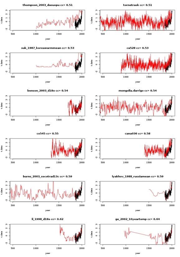
After removing the “lutannt” proxies, I want to have a look only at the 12 proxies with highest correlation coefficients. The proxy time series for the period 500-2000 AD are shown below. For reference, the temperature observations are shown as well. All time series have been scaled to have zero mean and unit variance. The proxy names and corresponding correlation coefficients are shown in the titles of the plots.
The R code for this plot is here:
##calculate all correlation coefficients between instrumental temperature data and proxy data
##plot time series of proxies with top 12 highest corr. coeffs.
##ignore LUTerbacher ANNual Tempertures (2004) (lutannt)

#read data, remove "year"-column from proxy data
load("../data/data_allproxy1209.Rdata")
load("../data/data_instrument.Rdata")
t.nh <- instrument$CRU_NH_reform
proxy.inst <- allproxy1209[paste(instrument$Year),-1]

#remove all proxies whose names contain "lutannt"
names <- allproxy1209info$Name
l <- strsplit(names,"lutannt")
lut.ind <- which(sapply(l,function(z) length(z)>1))
lut.names <- names[lut.ind]
lut.ind <- sapply(lut.names,function(z) which(colnames(proxy.inst)==z))
proxy.nolut <- proxy.inst[,-lut.ind]

#get correlation coeffs of "normal" proxies
cc <- sapply(colnames(proxy.nolut), function(z) cor(t.nh,proxy.nolut[,z],use="complete.obs"))

#what are the remaining proxies with very high correlation
cc.top30 <-  tail(cc[order(cc)],30)

#plot scaled top 12 vs scaled observations
jpeg("top10-proxies.jpg",width=700,height=1000,quality=100)
layout(t(matrix(seq(12),nrow=2)))
t.data <- (t.nh-mean(t.nh))/sd(t.nh)
for (n in 19:30) {
    proxy.name <- names(cc.top30[n])
    plot(instrument$Year,t.data,xlim=c(500,2005),type="l",lwd=2,xlab="year",main=paste(proxy.name,"cc=",round(cc.top30[n],digits=2)))
    data <- allproxy1209[,proxy.name]
    i.na <- which(is.na(data))
    data <- data.frame(d=(data-mean(data[-i.na]))/sd(data[-i.na]))
    rownames(data) <- rownames(allproxy1209)
    lines(as.numeric(rownames(data)),data$d,col="red")
}
dev.off()
A number of interesting things can be observed:
Only three of these proxies extend further than 1500 years into the past. Most of the “best” predictors of temperatures only allow for reconstructions of the past 500-1000 years.
All of these proxies show an increase during the past 150 years, which is probably the cause for them having the highest correlation.
Naively I would assume that, in order to argue that the temperature increase of the past 150 years is anomalously large, the increase of the proxy values should be anomalously large as well. However, for at least eight of the proxies the increase during the observation period does not seem to be that special. I really wonder how one arrives at the conclusion that the past increase was larger than anything we have seen at least during the past millenium.
To be fair, the proxies “thompson”,”suk”,”cana”, and “lyakhov” indeed have their largest increase during the observation period.
The above analysis is quite naive and very qualitative. Strong negative correlations were not taken into account at all. The origin of the proxies was not questioned. Some statements are based on simple “eyeballing” the data instead of sound statistical analysis. It is nonetheless nice to actually see some of the data on which the famous hockeystick curve is based.
R-bloggers.com offers daily e-mail updates about R news and tutorials about learning R and many other topics. Click here if you're looking to post or find an R/data-science job.
Want to share your content on R-bloggers? click here if you have a blog, or here if you don't.