
Genome-wide association studies in R
Want to share your content on R-bloggers? click here if you have a blog, or here if you don't.

This time I elaborate on a much more specific subject that will mostly concern biologists and geneticists. I will try my best to outline the approach as to ensure non-experts will still have a basic understanding. This tutorial illustrates the power of genome-wide association (GWA) studies by mapping the genetic determinants of cholesterol levels using three Southeast Asian populations.
Historical background
Early since Charles Darwin formulated the theories of natural and sexual selection in the late 1800s, the underlying role of genes, each represented by different alleles (i.e. variants) in different individuals was yet to be elucidated. His younger contemporary fellow Gregor Mendel scratched the surface after identifying the mechanism of trait inheritance, genetic segregation. In the years that followed, the genetic basis of phenotypes (i.e. observable traits) was gradually unraveled by classic geneticists pioneered by Ronald Fisher, who introduced key concepts such as genetic variance. The then emerging concept of genotype (i.e. genetic make-up) required the development of polymorphic genetic markers. In the early days, genotyping was based on determining the allelic composition of loci (loose definition of chromosomal regions), and later of copy number variations (CNVs), short-tandem repeats (STRs) and single nucleotide polymorphisms (SNPs). Humans and many other organisms including plants are diploid (i.e. carry two copies of each chromosome), which implies bi-allelic markers with alleles e.g. A and a distinguish individuals into AA (homozygous dominant), Aa (heterozygous) and aa (homozygous recessive).
The early discovery of the genetic basis for disorders such as sickle cell anemia and haemophilia owes much to their relatively simple genetic architectures – few mutations with high penetrance, thus more easily identified. Understandably then, more complex polygenic diseases that have been around for a long time, such as the neurodegenerative Alzheimer and Parkinson, are still currently under investigation. To characterize such traits, products of the interplay of many genes with small effects, it takes large genetic resources as well as flexible statistical methods, which is no problem in the current era of omics data and high-performance computing.
Genome-wide association studies
Genome-wide association (GWA) studies scan an entire species genome for association between up to millions of SNPs and a given trait of interest. Notably, the trait of interest can be virtually any sort of phenotype ascribed to the population, be it qualitative (e.g. disease status) or quantitative (e.g. height). Essentially, given p SNPs and n samples or individuals, a GWA analysis will fit p independent univariate linear models, each based on n samples, using the genotype of each SNP as predictor of the trait of interest. The significance of association (P-value) in each of the p tests is determined from the coefficient estimate 
")
Association mapping vs. linkage mapping
Too often, people cannot tell the difference between association and linkage mapping, or quantitative trait loci (QTL) mapping. Albeit conceptually similar, their are actually opposite in their workings. One of the key differences between the two is that association mapping relies on high-density SNP genotyping of unrelated individuals, whereas linkage mapping relies on the segregation of substantially fewer markers in controlled breeding experiments – unsurprisingly QTL mapping is seldom conducted in humans. Importantly, association mapping gives you point associations in the genome, whereas linkage mapping gives you QTL, chromosomal regions.
The present tutorial covers fundamental aspects to consider when conducting GWA analysis, from the pre-processing of genotype and phenotype data to the interpretation of results. We will use a mixed population of 316 Chinese, Indian and Malay that was recently characterized using high-throughput SNP-chip sequencing, transcriptomics and lipidomics (Saw et al., 2017). More specifically, we will search for associations between the >2.5 million SNP markers and cholesterol levels. Finally, we will explore the vicinity of candidate SNPs using the USCS Genome Browser in order to gain functional insights. The methodology shown here is largely based on the tutorial outlined in Reed et al., 2015. The R scripts and some of the data can be found in my repository, but you will still need to download the omics data from here. Please follow the instructions in the repo.
Let’s get started with R
Read data
Let’s first import the PLINK-converted .bed, .fam and .bim Illumina files from each of the three ethnic groups. We will use the function read.plink from the package snpStats and work on the resulting objects throughout the rest of the tutorial. This function reads .bed, .fam and .bim and creates a list of three elements – $genotypes, $fam and $map. The first contains all SNPs determined from all samples, the second contains information about pedigree and sex, and the third contains the genomic coordinates of the SNPs. At this point we have a total of 323 individuals (110 Chinese, 105 Indian and 108 Malay) and 2,527,458 SNPs. Next, we will change the Illumina SNP IDs stored in $genotype to the more conventional rs IDs, which will allow us to zoom in into the genomic regions that surround the candidate SNPs in the USCS Genome Browser. I prepared a table that establishes the correspondence between the two, so that we can easily switch the IDs.
library(snpStats)
load("conversionTable.RData")

pathM <- paste("Genomics/108Malay_2527458snps", c(".bed", ".bim", ".fam"), sep = "")
SNP_M <- read.plink(pathM[1], pathM[2], pathM[3])

pathI <- paste("Genomics/105Indian_2527458snps", c(".bed", ".bim", ".fam"), sep = "")
SNP_I <- read.plink(pathI[1], pathI[2], pathI[3])

pathC <- paste("Genomics/110Chinese_2527458snps", c(".bed", ".bim", ".fam"), sep = "")
SNP_C <- read.plink(pathC[1], pathC[2], pathC[3])

# Merge the three SNP datasets
SNP <- rbind(SNP_M$genotypes, SNP_I$genotypes, SNP_C$genotypes)

# Take one bim map (all 3 maps are based on the same ordered set of SNPs)
map <- SNP_M$map
colnames(map) <- c("chr", "SNP", "gen.dist", "position", "A1", "A2")

# Rename SNPs present in the conversion table into rs IDs
mappedSNPs <- intersect(map$SNP, names(conversionTable))
newIDs <- conversionTable[match(map$SNP[map$SNP %in% mappedSNPs], names(conversionTable))]
map$SNP[rownames(map) %in% mappedSNPs] <- newIDs
Next we import and merge the three lipid data sets (stored as .txt) and determine which samples are present in both SNP and lipid data sets. In the following analyses we will use the subset of samples profiled in both platforms, a total of 319. Finally, we create a list genData that stores the merged SNP data ($SNP), one of the three $map since they are all identical ($MAP) and the merged lipid data ($LIP). Finally, let’s save RAM for the subsequent steps and remove all files after saving genData into a .RData file.
# Load lipid datasets & match SNP-Lipidomics samples
lipidsMalay <- read.delim("Lipidomic/117Malay_282lipids.txt", row.names = 1)
lipidsIndian <- read.delim("Lipidomic/120Indian_282lipids.txt", row.names = 1)
lipidsChinese <- read.delim("Lipidomic/122Chinese_282lipids.txt", row.names = 1)
all(Reduce(intersect, list(colnames(lipidsMalay),
colnames(lipidsIndian),
colnames(lipidsChinese))) == colnames(lipidsMalay)) # TRUE
lip <- rbind(lipidsMalay, lipidsIndian, lipidsChinese)

matchingSamples <- intersect(rownames(lip), rownames(SNP))
SNP <- SNP[matchingSamples,]
lip <- lip[matchingSamples,]

genData <- list(SNP = SNP, MAP = map, LIP = lip)
save(genData, file = "PhenoGenoMap.RData")

# Clear memory
rm(list = ls())
Pre-processing
Let’s reload genData and clean it up. In a nutshell, the pre-processing of the data consists in
- discarding SNPs with call rate < 1 or MAF < 0.1
- discarding samples with call rate < 100%, IBD kinship coefficient > 0.1 or inbreeding coefficient |F| > 0.1
Call rate is the proportion of SNPs (or samples) that were genotyped. For example, a call rate of 0.95 for a particular SNP (sample) means 5% of the values are missing. Because we have so many SNPs, we can afford to have absolutely no missing values in the $SNP matrix by imposing a call rate threshold of 1 for both SNPs and samples. If you want to relax the threshold and tolerate missing values, bear in mind you need to run a whole procedure for imputing those. Reed et al., 2015 describe a PCA-based imputation method that utilizes the 1,000 Genome Project as a proxy, in case you are interested.
Minor-allele frequency (MAF) denotes the proportion of the least common allele for each SNP. Of course, it is harder to detect associations with rare variants and this is why we select against low MAF values. Most GWA studies I have read typically report MAF thresholds of 0.05. Here, I opt for a more stringent 0.1 because again, we have plenty of data and since all this is for illustrative purposes we want to conduct a fast GWA analysis.
library(snpStats)
library(doParallel)
library(SNPRelate)
library(GenABEL)
library(dplyr)
source("GWASfunction.R")
load("PhenoGenoMap.RData")

# Use SNP call rate of 100%, MAF of 0.1 (very stringent)
maf <- 0.1
callRate <- 1
SNPstats <- col.summary(genData$SNP)

maf_call <- with(SNPstats, MAF > maf & Call.rate == callRate)
genData$SNP <- genData$SNP[,maf_call]
genData$MAP <- genData$MAP[maf_call,]
SNPstats <- SNPstats[maf_call,]
Next, we need to consider samples that exhibit excessive heterozygosity – technically speaking, deviations from the Hardy-Weinberg equilibrium (HWE),

where 


where H and
# Sample call rate & heterozygosity
callMat <- !is.na(genData$SNP)
Sampstats <- row.summary(genData$SNP)
hetExp <- callMat %*% (2 * SNPstats$MAF * (1 - SNPstats$MAF)) # Hardy-Weinberg heterozygosity (expected)
hetObs <- with(Sampstats, Heterozygosity * (ncol(genData$SNP)) * Call.rate)
Sampstats$hetF <- 1-(hetObs/hetExp)
# Use sample call rate of 100%, het threshold of 0.1 (very stringent)
het <- 0.1 # Set cutoff for inbreeding coefficient;
het_call <- with(Sampstats, abs(hetF) < het & Call.rate == 1)
genData$SNP <- genData$SNP[het_call,]
genData$LIP <- genData$LIP[het_call,]
Finally, we will investigate relatedness among samples using the kinship coefficient based on identity by descent (IBD). Please note that these functions from the package SNPRelate require GDS files. For this reason we first need to aggregate the .bed, .fam and .bim files from the three populations into convertGDS. The function snpgdsBED2GDS2 creates the GDS necessary for this part of the analysis. To determine the kinship coefficient between pairs of samples we will use a subset of uncorrelated SNPs in order to have unbiased estimates. For this purpose, we will use linkage disequilibrium (LD) as a measure of correlation between markers. LD ranges from 0 to 1, the higher its value the more likely two SNPs co-segregate and therefore correlate. Here, we will utilize the subset of SNPs with LD < 0.2 (p ~ 12,000) to determine the IBD kinship coefficient. It took me about 2 hours to calculate the LD with the function snpgdsLDpruning, so be patient. Next, following Reed et al., 2015, we will exclude all samples with kinship coefficients > 0.1.
# LD and kinship coeff
ld <- .2
kin <- .1
snpgdsBED2GDS(bed.fn = "convertGDS.bed", bim.fn = "convertGDS.bim",
fam.fn = "convertGDS.fam", out.gdsfn = "myGDS", cvt.chr = "char")
genofile <- snpgdsOpen("myGDS", readonly = F)
gds.ids <- read.gdsn(index.gdsn(genofile, "sample.id"))
gds.ids <- sub("-1", "", gds.ids)
add.gdsn(genofile, "sample.id", gds.ids, replace = T)
geno.sample.ids <- rownames(genData$SNP)
# First filter for LD
snpSUB <- snpgdsLDpruning(genofile, ld.threshold = ld,
sample.id = geno.sample.ids,
snp.id = colnames(genData$SNP))
snpset.ibd <- unlist(snpSUB, use.names = F)
# And now filter for MoM
ibd <- snpgdsIBDMoM(genofile, kinship = T,
sample.id = geno.sample.ids,
snp.id = snpset.ibd,
num.thread = 1)
ibdcoef <- snpgdsIBDSelection(ibd)
ibdcoef <- ibdcoef[ibdcoef$kinship >= kin,]

# Filter samples out
related.samples <- NULL
while (nrow(ibdcoef) > 0) {
# count the number of occurrences of each and take the top one
sample.counts <- arrange(count(c(ibdcoef$ID1, ibdcoef$ID2)), -freq)
rm.sample <- sample.counts[1, 'x']
cat("Removing sample", as.character(rm.sample), 'too closely related to', sample.counts[1, 'freq'],'other samples.\n')

# remove from ibdcoef and add to list
ibdcoef <- ibdcoef[ibdcoef$ID1 != rm.sample & ibdcoef$ID2 != rm.sample,]
related.samples <- c(as.character(rm.sample), related.samples)
}
genData$SNP <- genData$SNP[!(rownames(genData$SNP) %in% related.samples),]
genData$LIP <- genData$LIP[!(rownames(genData$LIP) %in% related.samples),]
After pre-processing, we are left with 316 samples (110 Chinese, 100 Indian and 106 Malay) characterised by 795,668 SNP markers and 282 lipid species. Note that your sample size might differ slightly as the LD pruning procedure is stochastic.
Analysis
Principal Component Analysis
Now that we are done with the pre-processing, it might be a good idea to examine the largest sources of variation in the genotype data and look out for outliers or clustering patterns, using Principal Component Analysis (PCA). Because we are working with S4 objects, we will be using the PCA function from SNPRelate, snpgdsPCA. Let’s plot the first two principal components (PCs).
# PCA
pca <- snpgdsPCA(genofile, sample.id = geno.sample.ids, snp.id = snpset.ibd, num.thread = 1)
pctab <- data.frame(sample.id = pca$sample.id,
PC1 = pca$eigenvect[,1],
PC2 = pca$eigenvect[,2],
stringsAsFactors = F)

origin <- read.delim("countryOrigin.txt", sep = "\t")
origin <- origin[match(pca$sample.id, origin$sample.id),]

pcaCol <- rep(rgb(0,0,0,.3), length(pca$sample.id)) # Set black for chinese
pcaCol[origin$Country == "I"] <- rgb(1,0,0,.3) # red for indian
pcaCol[origin$Country == "M"] <- rgb(0,.7,0,.3) # green for malay

png("PCApopulation.png", width = 500, height = 500)
plot(pctab$PC1, pctab$PC2, xlab = "PC1", ylab = "PC2", col = pcaCol, pch = 16)
abline(h = 0, v = 0, lty = 2, col = "grey")
legend("top", legend = c("Chinese", "Indian", "Malay"), col = 1:3, pch = 16, bty = "n")
dev.off()
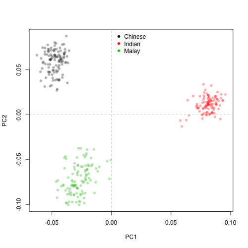
As expected, the 795,668 SNP markers clearly delineate the three populations. The results also suggest that Chinese and Malay are closer to each other than to Indian (this observation would be much better addressed with e.g. hierarchical clustering). Also, no obvious outliers are identified with the first two PCs. All good to proceed to GWA.
Genome-Wide Association
Finally, the pièce de résistance. From the set of 282 lipids species I chose cholesterol, one of the most familiar, as the trait of interest. You are completely free to select a different lipid species and proceed. We are going to use the GWA function provided in Reed et al., 2015 with some minor modifications. I recommend you to open the script GWASfunction.R and skim through. This is an excellent, well documented parallelized implementation. Note that the glm function is used to determine the significance of association between each SNP and the trait of interest. In case you are wondering, glm is much more versatile than lm since it conducts Gaussian, Poisson, binomial and multinomial regression / classification, depending on how your trait of interest is distributed (all lipids in the phenotype file are Gaussian). This GWA function will not create a variable, but rather write a .txt summary table listing the coefficient estimate
# Choose trait for association analysis, use colnames(genData$LIP) for listing
# NOTE: Ignore the first column of genData$LIP (gender)
target <- "Cholesterol"

phenodata <- data.frame("id" = rownames(genData$LIP),
"phenotype" = scale(genData$LIP[,target]), stringsAsFactors = F)

# Conduct GWAS (will take a while)
start <- Sys.time()
GWAA(genodata = genData$SNP, phenodata = phenodata, filename = paste(target, ".txt", sep = ""))
Sys.time() - start # benchmark
Once finished, we can visualize the results using the so-called Manhattan plots. All we need is to load the .txt summary table written in the previous step, add a column with ")
# Manhattan plot
GWASout <- read.table(paste(target, ".txt", sep = ""), header = T, colClasses = c("character", rep("numeric",4)))
GWASout$type <- rep("typed", nrow(GWASout))
GWASout$Neg_logP <- -log10(GWASout$p.value)
GWASout <- merge(GWASout, genData$MAP[,c("SNP", "chr", "position")])
GWASout <- GWASout[order(GWASout$Neg_logP, decreasing = T),]

png(paste(target, ".png", sep = ""), height = 500,width = 1000)
GWAS_Manhattan(GWASout)
dev.off()
In addition, a full (resp. dashed) line indicate the levels of Bonferroni-adjusted 
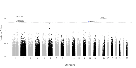
We see that a total of four SNPs pass the ‘relaxed’ Bonferroni threshold (none passes the ‘hard’ threshold). These are SNPs rs7527051 (Chr. 1), rs12140539 (co-localized with the first, Chr. 1), rs9509213 (Chr. 13) and rs2250402 (Chr. 15).
Before proceeding with these four hits, it is helpful to constrast the distribution of the resulting P-values against that expected by chance, as to ensure there is no confounding systemic bias. This is easily addressed with a quantile-quantile (Q-Q) plot. As the name suggests, it compares two distributions based on their quantiles. In the present case, we want to contrast the distribution of our t statistics against that obtained by chance. If two distributions are identical in shape, the Q-Q plot will display a 
# QQ plot using GenABEL estlambda function
png(paste(target, "_QQplot.png", sep = ""), width = 500, height = 500)
lambda <- estlambda(GWASout$t.value**2, plot = T, method = "median")
dev.off()
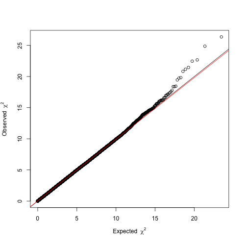
The resulting Q-Q plot clearly depicts a trend line (
Functional insights into candidate markers
Finally, we will try to find the functional relevance of these four candidate SNPs by searching for genes in their vicinity, using the USCS Genome Browser (enter Genome Browser, insert the SNP ID in the text box, enter and zoom out). I found that rs9509213 (Chr. 13) lands right on CRYL1 (crystalline lambda 1, intron sequence), rendering it an interesting candidate for follow-up studies.
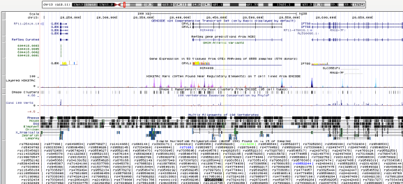
The SNP rs9509213 is shown as a black text box in the bottom of the figure, and its coordinates are highlighted by a vertical yellow line. The CRYL1 gene model is shown on top, below the chromosome model (topmost).
Interestingly, there is a recent publication that found ‘POE, HP, and CRYL1 have all been associated with Alzheimer’s Disease, the pathology of which involves lipid and cholesterol pathways.’.
Finally, I would like to remark on the need of experimental validation of gene candidates to validate the resulting SNP-trait associations. In this particular case, one could test the effect of overexpressing or knocking-out the ortholog of CRYL1 in cholesterol levels of mice.
Wrap-up
To sum up, we have covered some of the most fundamental aspects of GWA analysis:
- Pre-processing of genotype data based on call rates, MAF, kinship and heterozygosity
- Investigation of population structure with PCA of the genotype data
- GWA and visualisation with Manhattan plots
- Q-Q plots
- Functional insights into the resulting candidate SNPs
I did not cover many other aspects of GWA, such as fine-mapping using LD plots. I encourage you to choose a different lipid species from the phenotype data, run the analysis and interpret the results. Also noteworthy, the state-of-the-art of GWA is now almost-fully based on mixed-effect linear models (MLM) that consider kinship and cryptic relatedness as random factors, hence much more powerful that glm. My next post might cover MLM.
I would like to thank Saw et al., 2017 for providing unrestricted access to their omics data. If it wasn’t for such conscientious scientists and their transparent research endeavours this whole tutorial would simply not exist. I also reiterate that this tutorial is largely based on the guide outlined in Reed et al., 2015, an excellent reference along with Sikorska et al., 2013.
Have fun and keep your cholesterol in check. Any feedback or suggestions are welcome!

R-bloggers.com offers daily e-mail updates about R news and tutorials about learning R and many other topics. Click here if you're looking to post or find an R/data-science job.
Want to share your content on R-bloggers? click here if you have a blog, or here if you don't.