
Feels like a dry winter – but what does the data say?
Want to share your content on R-bloggers? click here if you have a blog, or here if you don't.
 A reminder that when idle queries pop into your head, the answer can often be found using R + online data. And a brief excursion into accessing the Weather Underground.
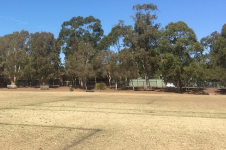
One interesting aspect of Australian life, even in coastal urban areas like Sydney, is that sometimes it just stops raining. For weeks or months at a time. The realisation hits slowly: at some point you look around at the yellow-brown lawns, ovals and “nature strips” and say “gee, I don’t remember the last time it rained.”
Thankfully in our data-rich world, it’s relatively easy to find out whether the dry spell is really as long as it feels. In Australia, meteorological data is readily available via the Bureau of Meteorology (known as BoM). Another source is the Weather Underground (WU), which has the benefit that there may be data from a personal weather station much closer to you than the BoM stations.
Here’s how you can access WU data using R and see whether your fuzzy recollection is matched by reality.
First, you need to create an account at Weather Underground and sign up for an API key. The free plan gives you 500 calls a day and a maximum rate of 10 calls per minute. I had issues with the confirmation email; you may need to login again after account creation and sign up for the API a second time to get there.
There’s an R package of course, rwunderground, which you can install from Github. You can then include the line:
WUNDERGROUNDID=myAPIKey
in your .Renviron file, replacing with the real value of your key.
The history_daily() function works quite nicely; you give it a location identifier and a date, data summarised by day comes back in a tibble:
history_daily(set_location(PWS_id = "INEWSOUT879"), date = "20171010")
You could also use history() or history_range(), which return all observations taken on a date or within a date range, respectively. I figured the latter was the way to go as it automatically takes care of the API rate limit. Unfortunately “in my hands”, much of the data returned (including rainfall) consists of NA values, even though the raw JSON does contain numeric data. I’ve filed an issue so we’ll see what happens.
In the meantime I did what any self-respecting data scientist does when they require a small dataset precisely once and quickly: ran the query at the website, then copy-paste-edit in a text file.
The rest is pretty straightforward: code and output are at Github and the rainfall graph for 2017 to date looks like this.

Aside from a heavy shower in August, this weather station has seen barely any significant rainfall events since April. Some notable numbers include: a total of 0.5 mm for September, 35.4 mm in total for May – September and two long periods (27 and 21 days) with no rain at all.
I may not remember the last time it rained, but it’s easy to find out. And this time, my feeling was correct. It’s been one long, dry winter.
Filed under: australia, R, statistics Tagged: ggplot2, rainfall, sydney, underground, weather

R-bloggers.com offers daily e-mail updates about R news and tutorials about learning R and many other topics. Click here if you're looking to post or find an R/data-science job.
Want to share your content on R-bloggers? click here if you have a blog, or here if you don't.