
Euro 2016 Squads Part Deux
Want to share your content on R-bloggers? click here if you have a blog, or here if you don't.
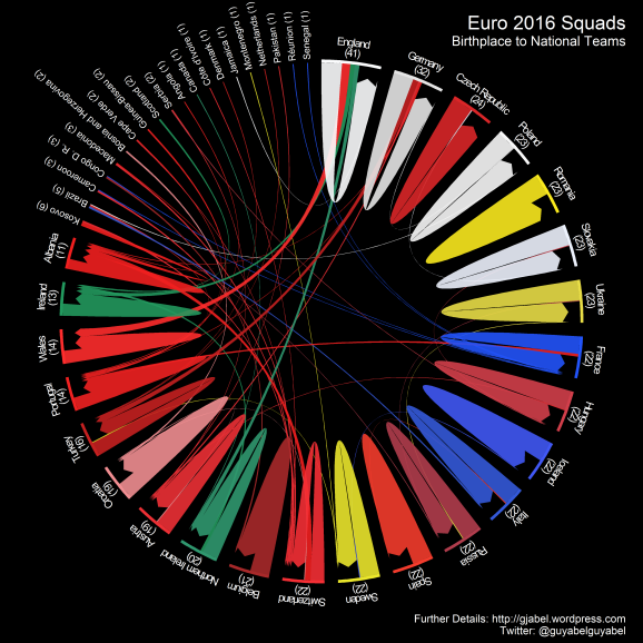
Between some of the games I had a go at replicating a plot from liberation.fr on the connections between Euro 2016 players and the country of birth using the circlize package in R. As with the previous post, the colours are based on the home shirt of each team and data scraped from Wikipedia. The values in the parenthesis represent the total number of players born in the respective country, which dictates their ordering around the circle. It is interesting to see just how many players represent countries that they were not born in. Only Romania has a 23 man squad completely full of players born in the country and no other Romanian born players representing other nations.
I also modified some the my ggplot2 mapping code in my previous post to plot the links between players place of birth and the capital city of their national team: 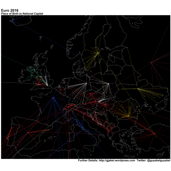 Click on the images if you want to explore. Here is an expanded view to illustrate all the longer distance relationships:
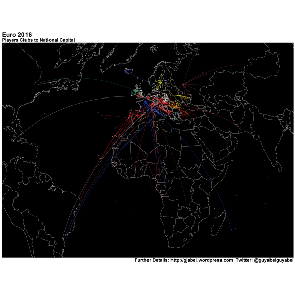 All the code is up on my Github.

R-bloggers.com offers daily e-mail updates about R news and tutorials about learning R and many other topics. Click here if you're looking to post or find an R/data-science job.
Want to share your content on R-bloggers? click here if you have a blog, or here if you don't.