
Cohort analysis with R – Retention charts
Want to share your content on R-bloggers? click here if you have a blog, or here if you don't.
When we spend more money for attracting new customers then they bring us by the first but, usually, by the next purchases, we appeal to customer’s life-time value (CLV). We expect that customers will spend with us for years and it means we expect to earn some profit finally. In this case retention is vital parameter. Most of our customers are fickle and some of them make one purchase only. So, the retention ratio should be controlled and managed as well as possible.
Cohort analysis gives us food for thought. In this case we will use data we have from the previous post. Just to recall, we have the following number of customers who purchased in a particular month of their life-time:
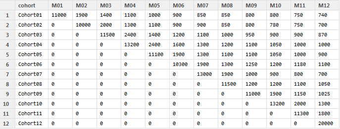
For testing you can create this data frame using the code:
cohort.clients <- data.frame(cohort=c('Cohort01','Cohort02',
'Cohort03','Cohort04','Cohort05','Cohort06','Cohort07',
 'Cohort08','Cohort09','Cohort10','Cohort11','Cohort12'),
 M01=c(11000,0,0,0,0,0,0,0,0,0,0,0),
 M02=c(1900,10000,0,0,0,0,0,0,0,0,0,0),
 M03=c(1400,2000,11500,0,0,0,0,0,0,0,0,0),
 M04=c(1100,1300,2400,13200,0,0,0,0,0,0,0,0),
 M05=c(1000,1100,1400,2400,11100,0,0,0,0,0,0,0),
 M06=c(900,900,1200,1600,1900,10300,0,0,0,0,0,0),
 M07=c(850,900,1100,1300,1300,1900,13000,0,0,0,0,0),
 M08=c(850,850,1000,1200,1100,1300,1900,11500,0,0,0,0),
 M09=c(800,800,950,1100,1100,1250,1000,1200,11000,0,0,0),
 M10=c(800,780,900,1050,1050,1200,900,1200,1900,13200,0,0),
 M11=c(750,750,900,1000,1000,1180,800,1100,1150,2000,11300,0),
 M12=c(740,700,870,1000,900,1100,700,1050,1025,1300,1800,20000))
Firstly, we need to process data to the following view:
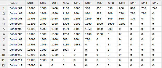
That is because we want to compare cohorts’ behavior for the same months of life-time. If months M01, M02, …, M12 mean calendar months as January, February, …, December in the first table, that they are sequence numbers of life-time month in the second table.
Suppose data set with customers is in cohort.clients data frame. R code for processing data can be the next:
#connect libraries
library(dplyr)
library(ggplot2)
library(reshape2)

cohort.clients.r <- cohort.clients #create new data frame
totcols <- ncol(cohort.clients.r) #count number of columns in data set for (i in 1:nrow(cohort.clients.r)) { #for loop for shifting each row
      df <- cohort.clients.r[i,] #select row from data frame
      df <- df[ , !df[]==0] #remove columns with zeros
      partcols <- ncol(df) #count number of columns in row (w/o zeros)
      #fill columns after values by zeros
      if (partcols < totcols) df[, c((partcols+1):totcols)] <- 0
      cohort.clients.r[i,] <- df #replace initial row by new one
}
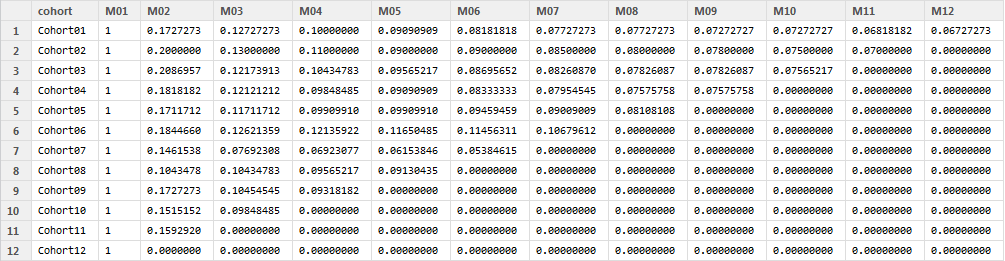
Furthermore we should calculate retention ratio. I use formula:
Retention ratio = # clients in particular month / # clients in 1st month of life-time
Here are two alternative codes in R you can use:
#calculate retention (1)
x <- cohort.clients.r[,c(2:13)]
y <- cohort.clients.r[,2]
reten.r <- apply(x, 2, function(x) x/y )
reten.r <- data.frame(cohort=(cohort.clients.r$cohort), reten.r)
or:
#calculate retention (2)
c <- ncol(cohort.clients.r)
reten.r <- cohort.clients.r
for (i in 2:c) {
     reten.r[, (c+i-1)] <- reten.r[, i] / reten.r[, 2]
}
reten.r <- reten.r[,-c(2:c)]
colnames(reten.r) <- colnames(cohort.clients.r)
Here is the result of calculation (reten.r data frame):
And finally I propose to create 3 useful charts for visualizing retention ratio.
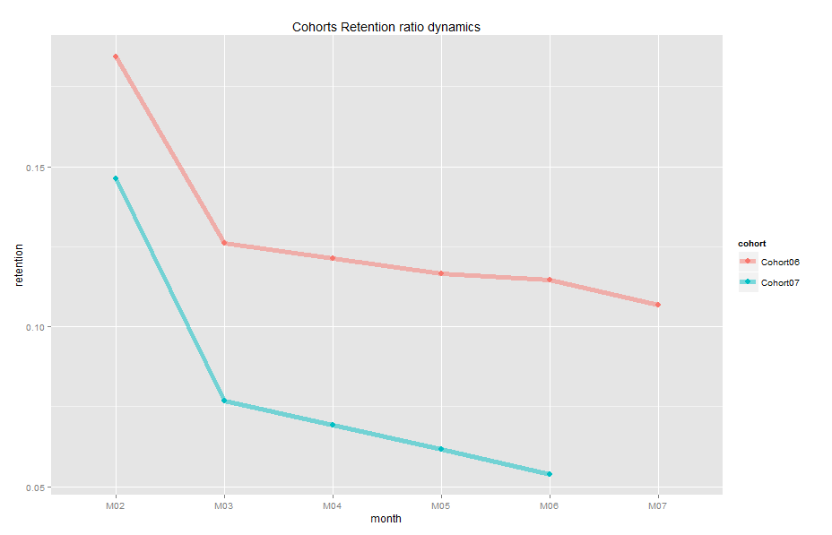
1. Cohort retention ratio dynamics:
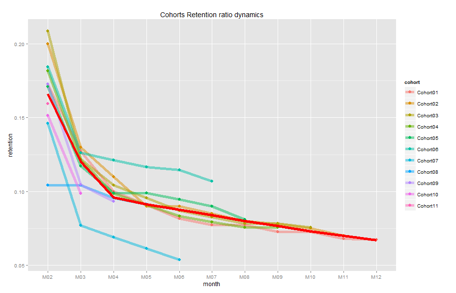
Note: I’ve removed the first (M01) month from charts because it is always equal 1.0 (100%). The red line on the plot is the average ratio. It is easy to identify cohorts which are above and below. So, the first thought that I have is to compare them and find reasons of such difference. For example, look at Cohort07 and Cohort06:
2. Chart for analyzing how many customers stick around for the second month:
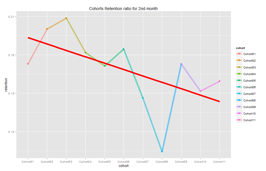
Our retention ratio decreased from 1.0 (100%) in the first month to 0.1-0.21 (10-21%) in the second month, this is the biggest drop in our example. That is why it is important to see how our dynamic changes (and its trend) from one cohort to another for second month only. Also, this chart shows month to month dynamic because the second month for Cohort01 is February, for Cohort02 – March, ect. We see negative trend (red line) and we should find insights. Also, you can choose any other month you want (follow the notes in the code).
3. And for the dessert – here is my favorite one – Cycle plot:
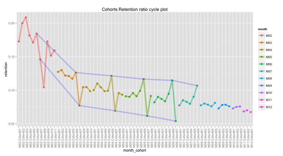
This plot is a mix of the first and the second charts. It presents sequence of 2nd chart for each month and gives us an interesting view. The first (red) curve is retention of 2nd month (M02) of cohorts from 01 to 11 (it is the same with 2nd chart), the second (yellow) curve is retention of 3rd month (M03) of cohorts from 01 to 10, etc. Here we can see total trend from month to month as well, as cohorts’ comparison within each month. Furthermore, I’ve added two blue lines for cohort07 and cohort06 to show difference between them (you can choose any other cohorts – follow the notes in the code). So, we can see cycles of each cohort in each month.
The code for these charts is:
#charts
reten.r <- reten.r[,-2] #remove M01 data because it is always 100%
#dynamics analysis chart
cohort.chart1 <- melt(reten.r, id.vars = 'cohort')
colnames(cohort.chart1) <- c('cohort', 'month', 'retention')
cohort.chart1 <- filter(cohort.chart1, retention != 0)
p <- ggplot(cohort.chart1, aes(x=month, y=retention, group=cohort, colour=cohort))
p + geom_line(size=2, alpha=1/2) +
    geom_point(size=3, alpha=1) +
    geom_smooth(aes(group=1), method = 'loess', size=2, colour='red', se=FALSE) +
    labs(title="Cohorts Retention ratio dynamics")

#second month analysis chart
cohort.chart2 <- filter(cohort.chart1, month=='M02') #choose any month instead of M02
p <- ggplot(cohort.chart2, aes(x=cohort, y=retention, colour=cohort))
p + geom_point(size=3) +
    geom_line(aes(group=1), size=2, alpha=1/2) +
    geom_smooth(aes(group=1), size=2, colour='red', method = 'lm', se=FALSE) +
    labs(title="Cohorts Retention ratio for 2nd month")
#cycle plot
cohort.chart3 <- cohort.chart1
cohort.chart3 <- mutate(cohort.chart3, month_cohort = paste(month, cohort))
p <- ggplot(cohort.chart3, aes(x=month_cohort, y=retention, group=month, colour=month))
#choose any cohorts instead of Cohort07 and Cohort06
m1 <- filter(cohort.chart3, cohort=='Cohort07')
m2 <- filter(cohort.chart3, cohort=='Cohort06')
p + geom_point(size=3) +
  geom_line(aes(group=month), size=2, alpha=1/2) +
  labs(title="Cohorts Retention ratio cycle plot") +
  geom_line(data=m1, aes(group=1), colour='blue', size=2, alpha=1/5) +
  geom_line(data=m2, aes(group=1), colour='blue', size=2, alpha=1/5) +
  theme(axis.text.x = element_text(angle = 90, hjust = 1))
I wish you find insight of your data! If you have any questions, opinions, etc., feel free to contact me.
R-bloggers.com offers daily e-mail updates about R news and tutorials about learning R and many other topics. Click here if you're looking to post or find an R/data-science job.
Want to share your content on R-bloggers? click here if you have a blog, or here if you don't.