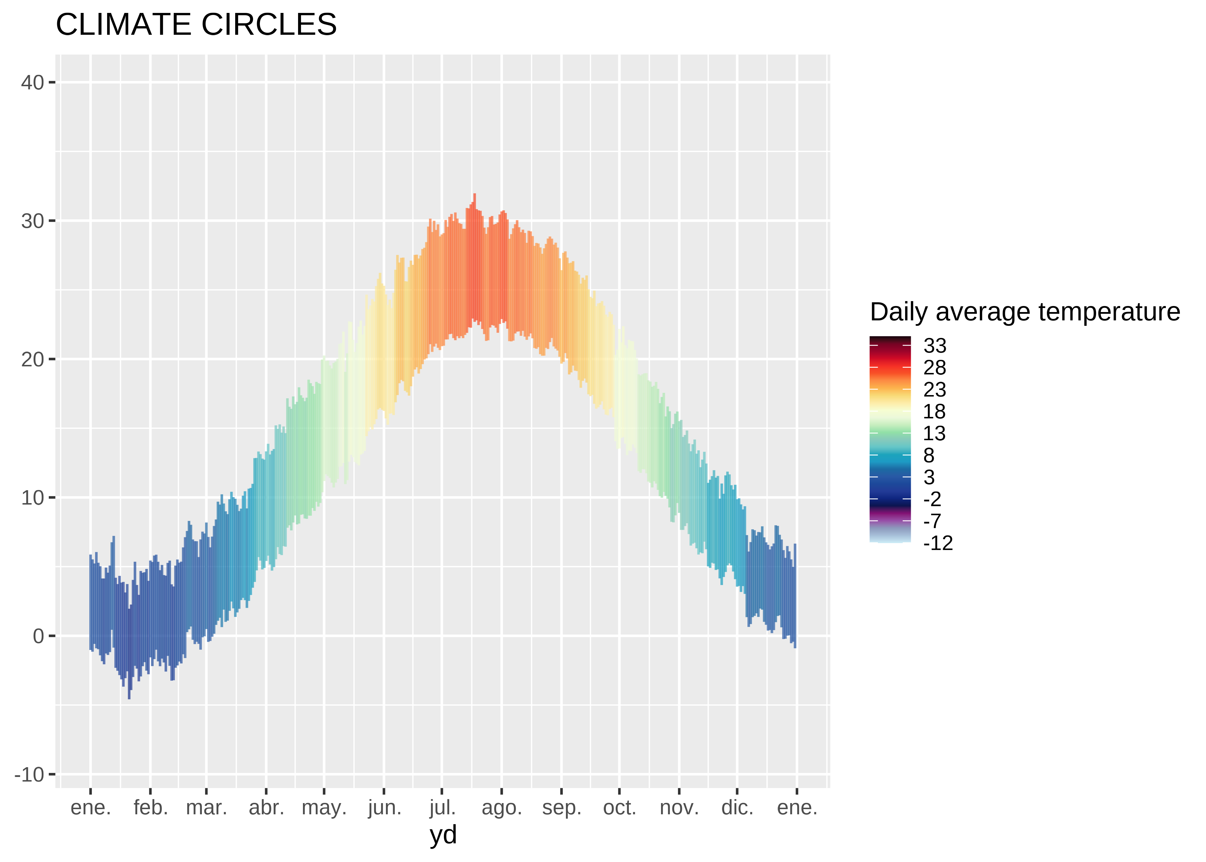
Articles by R on Dominic Royé

Climate circles

September 3, 2021 | R on Dominic Royé

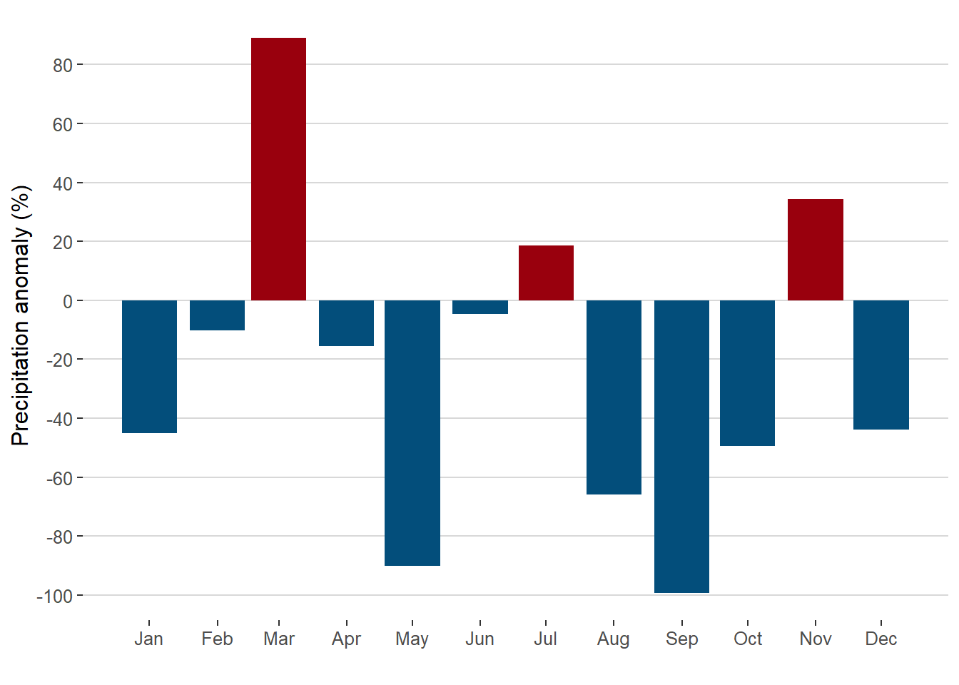
The climate of a place is usually presented through climographs that combine monthly precipitation and temperature in a single chart. However, it is also interesting to visualize the climate on a daily scale showing the thermal amplitude and the daily average temperature. To do this, the averages for each day ...
[Read more...]

Firefly cartography

May 31, 2021 | R on Dominic Royé

Cartography firefly Firefly maps are promoted and described by John Nelson who published a post in 2016 about its characteristics. However, these types of maps are linked to ArcGIS, which has led me to try to recreate them in R. The recent ggplot2...
[Read more...]

Bivariate dasymetric map

February 28, 2021 | R on Dominic Royé

Initial considerations A disadvantage of choropleth maps is that they tend to distort the relationship between the true underlying geography and the represented variable. It is because the administrative divisions do not usually coincide with the ...
[Read more...]

A heatmap as calendar

December 19, 2020 | R on Dominic Royé

Recently I was looking for a visual representation to show the daily changes of temperature, precipitation and wind in an application xeo81.shinyapps.io/MeteoExtremosGalicia (in Spanish), which led me to use a heatmap in the form of a calendar. The ...
[Read more...]

Climate animation of maximum temperatures

October 10, 2020 | R on Dominic Royé

In the field of data visualization, the animation of spatial data in its temporal dimension can show fascinating changes and patterns. As a result of one of the last publications in the social networks that I have made, I was asked to make a post about how I created it. ...
[Read more...]

River flow directions

July 23, 2020 | R on Dominic Royé

I recently created a visualization of the distribution of river flow directions and also of coastal orientations. Following its publication in social networks (here), I was asked to make a post about how I did it. Well, here we go to start with an example of rivers, coastal orientation is ...
[Read more...]

A very short introduction to Tidyverse

June 5, 2020 | R on Dominic Royé

1 Tiyverse 2 Style guide 3 Pipe %__% 4 Tidyverse packages 4.1 Read and write data 4.2 Character manipulations 4.3 Management of dates and times 4.4 Table and vector manipulation 4.4.1 Select and rename 4.4.2 Filter and sort 4.4.3 Group and summarize 4.4.4 Join tables 4.4.5 Long and wide tables 4.5 Visualize data 4.5.1 Line and scatter plot 4.5.2 Boxplot 4.5.3 Heatmap 4.6 Apply functions on vectors or lists 1 ...
[Read more...]

Visualize climate anomalies

March 28, 2020 | R on Dominic Royé

When we visualize precipitation and temperature anomalies, we simply use time series as bar graph indicating negative and positive values in red and blue. However, in order to have a better overview we need both anomalies in a single graph. In this ...
[Read more...]

Visualize climate anomalies

March 28, 2020 | R on Dominic Royé

When we visualize precipitation and temperature anomalies, we simply use time series as bar graph indicating negative and positive values in red and blue. However, in order to have a better overview we need both anomalies in a single graph. In this way we could more easly answer the question ...
[Read more...]

Geographic distance

January 18, 2020 | R on Dominic Royé

The first post of this year 2020, I will dedicate to a question that I was recently asked. The question was how to calculate the shortest distance between different points and how to know which is the closest point. When we work with spatial data in R, currently the easiest thing ...
[Read more...]

Geographic distance

January 18, 2020 | R on Dominic Royé

The first post of this year 2020, I will dedicate to a question that I was recently asked. The question was how to calculate the shortest distance between different points and how to know which is the closest point. When we work with spatial data in...
[Read more...]

Geographic distance

October 31, 2019 | R on Dominic Royé

The first post of this year 2020, I will dedicate to a question that I was recently asked. The question was how to calculate the shortest distance between different points and how to know which is the closest point. When we work with spatial data in R, currently the easiest thing ...
[Read more...]

Visualize urban growth

October 31, 2019 | R on Dominic Royé

The General Directorate for the Cadastre of Spain has spatial information of the all buildings except for the Basque Country and Navarra. This data set is part of the implementation of INSPIRE, the Space Information Infrastructure in Europe. More information can be found here. We will use the links (urls) ...
[Read more...]

Visualize urban growth

October 31, 2019 | R on Dominic Royé

The General Directorate for the Cadastre of Spain has spatial information of the all buildings except for the Basque Country and Navarra. This data set is part of the implementation of INSPIRE, the Space Information Infrastructure in Europe. More in...
[Read more...]

Visualize monthly precipitation anomalies

July 6, 2019 | R on Dominic Royé

Normally when we visualize monthly precipitation anomalies, we simply use a bar graph indicating negative and positive values with red and blue. However, it does not explain the general context of these anomalies. For example, what was the highest or lowest anomaly in each month? In principle, we could use ...
[Read more...]

Tidy correlation tests in R

April 16, 2019 | R on Dominic Royé

When we try to estimate the correlation coefficient between multiple variables, the task is more complicated in order to obtain a simple and tidy result. A simple solution is to use the tidy() function from the {broom} package. In this post we are going to estimate the correlation coefficients between ...
[Read more...]
1 2

Never miss an update!
Subscribe to R-bloggers to receive
e-mails with the latest R posts.
(You will not see this message again.)

Click here to close (This popup will not appear again)