Articles by nsaunders

Price’s Protein Puzzle: 2019 update

January 30, 2019 | nsaunders

Chains of amino acids strung together make up proteins and since each amino acid has a 1-letter abbreviation, we can find words (English and otherwise) in protein sequences. I imagine this pursuit began as soon as proteins were first sequenced, but the first reference to protein word-finding as a sport ... [Read more...]

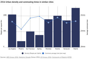
Just use a scatterplot. Also, Sydney sprawls.

July 17, 2018 | nsaunders

Sydney’s congestion at ‘tipping point’ blares the headline and to illustrate, an interactive chart with bars for city population densities, points for commute times and of course, dual-axes. Yuck. OK, I guess it does show that Sydney is one of three cities that are low density, but have comparable ...
[Read more...]

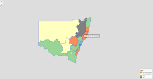
Using leaflet, just because

July 17, 2018 | nsaunders

I love it when researchers take the time to share their knowledge of the computational tools that they use. So first, let me point you at Environmental Computing, a site run by environmental scientists at the University of New South Wales, which has a good selection of R programming tutorials. ...
[Read more...]

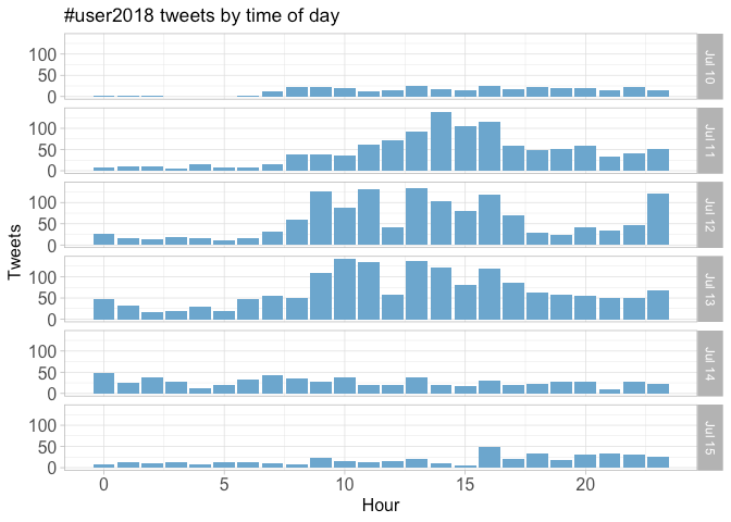
Twitter coverage of the useR! 2018 conference

July 16, 2018 | nsaunders

In summary: useR! the conference for users of R was held in Brisbane earlier this month it sounded like a lot of fun and here’s an analysis of tweets that used the #useR2018 hashtag during the week The code that generated the report (which I’ve used heavily and ...
[Read more...]

PubMed retractions report has moved

May 22, 2018 | nsaunders

A brief message for anyone who uses my PubMed retractions report. It’s no longer available at RPubs; instead, you will find it here at Github. Github pages hosting is great, once you figure out that docs/ corresponds to your web root :) Now I really must update the code and ... [Read more...]

Moving from RPubs to Github documents

April 4, 2018 | nsaunders

If you still follow my Twitter feed – I pity you, as it’s been rather boring of late. Consisting largely of Github commit messages, many including the words “knit to github document”. Here’s why. RPubs, an early offering from RStudio, has been a great platform for easy and free ... [Read more...]

Farewell then, PubMed Commons

March 14, 2018 | nsaunders

PubMed Commons, the NCBI’s experiment in comments for PubMed articles, has been discontinued. Thoroughly too, with all traces of it expunged from the NCBI website. Last time I wrote about the service, I concluded “all it needs now is more active users, more comments per user and a real ...
[Read more...]

Mapping data using R and leaflet

November 14, 2017 | nsaunders

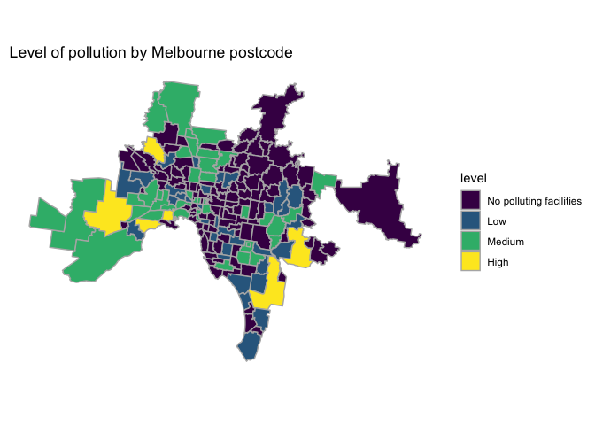
The R language provides many different tools for creating maps and adding data to them. I’ve been using the leaflet package at work recently, so I thought I’d provide a short example here. Whilst searching for some data that might make a nice map, I came across this ...
[Read more...]

XML parsing made easy: is that podcast getting longer?

October 12, 2017 | nsaunders

Sometime in 2009, I began listening to a science podcast titled This Week in Virology, or TWiV for short. I thought it was pretty good and listened regularly up until sometime in 2016, when it seemed that most episodes were approaching two hours in duration. I listen to several podcasts when commuting ...
[Read more...]

Feels like a dry winter – but what does the data say?

October 11, 2017 | nsaunders

A reminder that when idle queries pop into your head, the answer can often be found using R + online data. And a brief excursion into accessing the Weather Underground. One interesting aspect of Australian life, even in coastal urban areas like Sydney, is that sometimes it just stops raining. For ...
[Read more...]

Infographic-style charts using the R waffle package

September 7, 2017 | nsaunders

Infographics. I’ve seen good examples. I’ve seen more bad examples. In general, I prefer a good chart to an infographic. That said, there’s a “genre” of infographic that I do think is useful, which I’ll call “if X were 100 Y”. A good example: if the world ...
[Read more...]

Years as coloured bars

August 5, 2017 | nsaunders

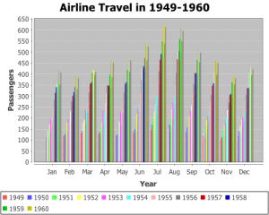
I keep seeing years represented by coloured bars. First it was that demographic tsunami chart. Then there are examples like the one on the right, which came up in a web search today. I even saw one (whispers) at work today. I get what they are trying to do – illustrate ...
[Read more...]

Twitter Coverage of the ISMB/ECCB Conference 2017

August 2, 2017 | nsaunders

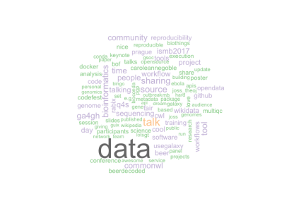
ISMB (Intelligent Systems for Molecular Biology – which sounds rather old-fashioned now, doesn’t it?) is the largest conference for bioinformatics and computational biology. It is held annually and, when in Europe, jointly with the European Conference on Computational Biology (ECCB). I’ve had the good fortune to attend twice: in ...
[Read more...]

Hacking Highcharter: observations per group in boxplots

July 24, 2017 | nsaunders

Highcharts has long been a favourite visualisation library of mine, and I’ve written before about Highcharter, my preferred way to use Highcharts in R. Highcharter has a nice simple function, hcboxplot(), to generate boxplots. I recently generated some for a project at work and was asked: can we see ...
[Read more...]

Chart golf: the “demographic tsunami”

July 20, 2017 | nsaunders

“‘Demographic tsunami’ will keep Sydney, Melbourne property prices high” screams the headline. While the census showed Australia overall is aging, there’s been a noticeable lift in the number of people aged between 25 to 32. As the accompanying graph shows… Whoa, that is one ugly chart. First thought: let’s not ...
[Read more...]
1 2 3 4 7

Never miss an update!
Subscribe to R-bloggers to receive
e-mails with the latest R posts.
(You will not see this message again.)

Click here to close (This popup will not appear again)