
Just use a scatterplot. Also, Sydney sprawls.
Want to share your content on R-bloggers? click here if you have a blog, or here if you don't.

Dual-axes at tipping-point
Yuck. OK, I guess it does show that Sydney is one of three cities that are low density, but have comparable average commute times to higher-density cities. But if you’re plotting commute time versus population density…doesn’t a different kind of chart come to mind first? y versus x. C’mon.
Let’s explore.
First: do we even believe the numbers? Comments on the article point out that the population density for Phoenix was corrected after publication, and question the precise meaning of city area. Hovering over the graphic to obtain the values, then visiting Wikipedia’s city pages, we can create a Google spreadsheet which I hope is publicly-visible at this link. Here’s a graphical summary.

It looks like the figures for population density used in the article (smh_density) correspond roughly to metro population divided by metro area (metro_density). We’ll come back to whether population density is a good predictor or comparator later.
Let’s think about how this data was visualised in the article. We have cities, each of which has two measurements: population density and average commute time. Bars for density, labelled with city name. Points for commute time, aligned with the bars. A y-axis for each measurement. Result: ugly.
Presumably the authors wanted to answer the question “how is commute time related to population density?” So why not just plot one versus the other?
- Plot population density (x) versus average commute time as a scatterplot
- Label each point with the city name
- Optionally: draw attention to the values using size and/or colour
- Optionally: add a summary statistic (mean, median)
Let’s do that and in addition, showcase the wonderful googlesheets R package, to import the Google sheet straight into R.
library(googlesheets)
library(tidyverse)

city_commutes <- gs_url("https://docs.google.com/spreadsheets/d/1JrOYsHx4fJAEVA8XvO5ey-Ud-tumX9RA-xiAvLyPFWM/edit?usp=sharing") %>%
  gs_read()

city_commutes %>%
  ggplot(aes(smh_density, smh_commute)) +
  geom_point(aes(size = smh_commute, color = smh_density)) +
  guides(size = FALSE, color = FALSE) +
  geom_text(aes(label = city), vjust = -0.9, hjust = 0.74) +
  labs(x = "Density (people per sq. km)",
       y = "Average commute time (min)",
       title = "Average one-way commute time versus population density",
       subtitle = "Dashed lines indicate median values for the dataset") +
  geom_hline(aes(yintercept = median(smh_commute)),
             linetype = "dashed",
             color = "darkred") +
  geom_vline(aes(xintercept = median(smh_density)),
             linetype = "dashed",
             color = "darkred") +
  theme_bw() +
  scale_color_viridis_c()
Result. I’d argue that Sydney’s position as “low-density, high commute time” is apparent. You might also make statements such as “Sydney and San Francisco have comparable commute times to Toronto, despite having much lower population densities.”
Phoenix is just a weird outlier; I don’t know why it was even included in the original article.

But wait. Back to the table of values. Note that Wikipedia provides population density figures for all cities (wp_density). For most of the cities, this value is calculated as city_pop / city_area. Except for Sydney, where it is calculated as metro_pop / metro_area. If we plot commute time versus wp_density, things look rather different.

And if we drop Phoenix from the dataset, Sydney stands all alone – but note that the range of average commute time is only about 5 minutes.

What I think the data are really telling us is that Sydney thinks its city area is “all of Sydney”, whereas European and North American cities define city area differently. It’s not surprising then, that commute time compares unfavourably, since the population density value for Sydney is artificially low and not comparable with the other cities. We can make this apparent by plotting against metro area instead.
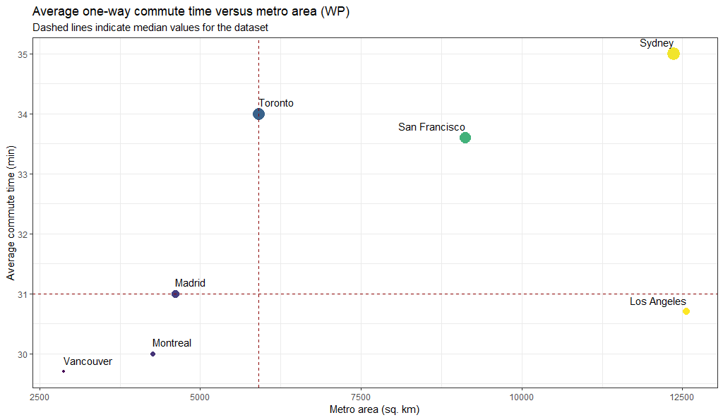
This makes more intuitive sense. If you’re further away your commute takes longer. Unless you’re in Los Angeles, which is all big roads.
In conclusion:
- Scatterplots – good
- News article’s interpretation of factors affecting commute time – poor
R-bloggers.com offers daily e-mail updates about R news and tutorials about learning R and many other topics. Click here if you're looking to post or find an R/data-science job.
Want to share your content on R-bloggers? click here if you have a blog, or here if you don't.