
Understanding the Effect of Subsidies on Agriculture with Neural Networks
Want to share your content on R-bloggers? click here if you have a blog, or here if you don't.
Today, subsidies are the most common method of encouraging countries to deal with global warming; but it is debatable how effective they are. For instance, agriculture subsidies cause farmers to violate forest frontier and make them responsible for 14% of global deforestation every year. Not to mention excessive use of fertilizers degrades the soil and water and eventually damages human health.
In this article, we will analyze whether subsidies are effective for crop yields in agriculture. First, we will build our datasets.
library(tidyverse)
library(countrycode)
library(openxlsx)

#Crop yields
df_yields <-
  openxlsx::read.xlsx("https://github.com/mesdi/blog/raw/main/agg_sub.xlsx",
                      sheet = "yields") %>%
  as_tibble() %>%
  janitor::clean_names() %>%
  group_by(location, time) %>%
  summarise(yields = sum(value))

#Agricultural support
df_supp <-
  openxlsx::read.xlsx("https://github.com/mesdi/blog/raw/main/agg_sub.xlsx",
                      sheet = "support") %>%
  as_tibble() %>%
  janitor::clean_names() %>%
  rename(supp = value)

#Merging and tidying both datasets
df_tidy <-
  df_yields %>%
  left_join(df_supp, by = c("location","time")) %>%
  mutate(region = countrycode(location,
                              "genc3c",
                              "un.region.name")) %>%
  drop_na() %>%
  mutate(region = factor(region),
         id = as.numeric(region))
We will first examine the distribution of agricultural support for producers in millions of US dollars in a box plot and the line chart of crop yields in thousand hectares by continent (region). We will interactively do this by using the ggiraph package.
#theme settings
color_palette <- thematic::okabe_ito(5)
names(color_palette) <- unique(df_tidy$region)
base_size <- 32

#Google font setting
library(systemfonts)
library(showtext)

font_add_google("Montserrat Alternates","ma")
showtext_auto()

base_family <- "ma"

#Interactive plots
library(ggiraph)
library(patchwork)
library(scales)
#Boxplot
box_graph <-
  df_tidy %>%
  group_by(region, time, id) %>%
  summarise(mean_supp = mean(supp)) %>%
  ungroup() %>%
  group_by(region, id) %>%
  mutate(median_supp = median(mean_supp)) %>%
  ggplot(aes(x = mean_supp,
             y = fct_reorder(region, median_supp, .desc = TRUE),# for ranking
             fill = region,
             data_id = id)) +
  geom_boxplot_interactive(
    aes(
      tooltip = glue::glue("Median: {scales::number(median_supp,
                                                    scale_cut = cut_short_scale(),
                                                    accuracy = 0.01)}")
    ),
    position = position_nudge(y = 0.25),
    width = 0.5
  ) +
  geom_point_interactive(
    aes(col = region),
    position = position_nudge(y = -0.2),
    size = 5,
    shape = '|',
    alpha = 0.75
  ) +
  scale_fill_manual(values = color_palette) +
  scale_color_manual(values = color_palette) +
  scale_x_log10(labels = label_number(scale_cut = cut_short_scale())) +
  labs(
    x = "",
    y = "",
    title = glue::glue('Distribution of Agricultural Support (million US dollars)')
  ) +
  theme_minimal(base_size = base_size,
                base_family = base_family) +
  theme(
    text = element_text(
      color = 'grey20'
    ),
    legend.position = 'none',
    panel.grid.minor = element_blank(),
    plot.title.position = 'plot',
    plot.title = element_text(size = 19,
                              hjust = 0.5,
                              face = "bold")
  )

#Line chart
line_graph <-
  df_tidy %>%
  group_by(region, time,id) %>%
  summarise(mean_yields = sum(yields)) %>%
  mutate(line_text = glue::glue('{region}\n{time}\n{scales::number(mean_yields,
                                                                   scale_cut = cut_short_scale(),
                                                                   accuracy = 0.01)}')
  ) %>%
  ggplot(aes(x = time,
             y = mean_yields,
             col = region,
             data_id = id)) +
  geom_line_interactive(linewidth = 2.5) +
  geom_point_interactive(aes(tooltip = line_text),
                         size = 6) +
  scale_y_log10(labels = label_number(scale_cut = cut_short_scale())) +
  theme_minimal(base_size = base_size,
                base_family = base_family) +
  labs(
    x = "",
    y = "",
    title = 'Crop yields over time (thousand hectares)'
  ) +
  theme(
    text = element_text(
      color = 'grey20'
    ),
    legend.position = 'none',
    panel.grid.minor = element_blank(),
    plot.title.position = 'plot'
  ) +
  scale_color_manual(values = color_palette) +
  theme(
    plot.title = element_text(size = 19,
                              hjust = 0.5,
                              face = "bold")
  )


#Merging the two plots in an interactive way
girafe(
  ggobj =
    box_graph +
    plot_spacer() +
    line_graph +
    plot_layout(widths = c(0.45, 0.1, 0.45)),
  options = list(
    opts_hover(css = ''),
    opts_hover_inv(css = "opacity:0.1;"),
    opts_sizing(width = 0.7),
    opts_tooltip(
      offx = 25,
      offy = 0,
      use_fill = TRUE,
      css = 'font-size:larger;padding:5px;font-family:Montserrat Alternates;'
    )
  ),
  width_svg = 16,
  height_svg = 9
)
When we look at the box plot, we can say that Europe is left skewed which means the majority of observations are above the mean; on the contrary, we can see that the Americas is right skewed which means the majority of the observations are below the mean.
If we view the crop yields graph, we see that Europe and Asia had a tremendous increase between 1994-1995. Besides that, Asia and America look dominantly the leading continents regarding agricultural support and crop yields.
Let’s get back to the main purpose we mentioned earlier in this article. To achieve this, we will use the bagged neural network algorithm to model our data set. But we have to transform all numeric data to the same scale and also convert categorical data to numeric values so that the model works.
#Modeling
library(tidymodels)
#Splitting the data by 80/20
set.seed(12345)
df_split <- initial_split(df_tidy,
                          strata = region,
                          prop = 0.8)

df_train <- training(df_split)
df_test <- testing(df_split)

#Preprocessing
df_rec <-
  recipe(yields ~ region + supp + time,
         data = df_train) %>%
  step_normalize(all_numeric()) %>%
  step_dummy(region, one_hot = TRUE)


#Bagged neural networks via nnet
library(baguette)
#cross-validation for resamples
set.seed(12345)
df_folds <- vfold_cv(df_train,
                     strata = region)

spec_bag_nn <-
  bag_mlp() %>%
  set_engine("nnet") %>%
  set_mode("regression")

wflw_bag_nn <-
  workflow() %>%
  add_recipe(df_rec) %>%
  add_model(spec_bag_nn)


set.seed(98745)
nn_fit <-
  wflw_bag_nn %>%
  last_fit(df_split)
#Computes final the accuracy metrics
collect_metrics(nn_fit)
# A tibble: 2 × 4
  .metric .estimator .estimate .config
  <chr>   <chr>          <dbl> <chr>
1 rmse    standard       0.613 Preprocessor1_Model1
2 rsq     standard       0.721 Preprocessor1_Model1
The R-Squared value (rsq) looks fine; we can now create an explainer object based on that. We will build two explainer objects. First, we will use the permutation feature importance.
#vip
library(DALEXtra)
#Creating a preprocessed data frame
df_proc <-
  df_rec %>%
  prep() %>%
  bake(new_data = NULL)

#building the explainer-object
explainer_nn <-
  explain_tidymodels(
    spec_bag_nn %>%
      fit(yields ~ ., data = df_proc),
    data = df_proc %>% select(-yields),
    y = df_train$yields,
    verbose = FALSE
  )

set.seed(12345)
#Calculates the feature-importance over 100 permutations
vip_nn <-
  model_parts(
    explainer = explainer_nn,
    loss_function = loss_root_mean_square,
    B = 100, #the number of permutations
    type = "difference",
    label =""
  )
As a second, we will build a partial dependence portfolio object.
#Partial dependence portfolio
pdp_supp <- model_profile(explainer_nn,
                          N = 500,
                          variables = "supp")
Finally, we have the ability to plot both of the explainer plots.
#Plotting ranking by the feature importance scores
p_feature <-
  plot(vip_nn) +
  ggtitle("Feature Importance over 100 Permutations", "")+
  theme(plot.title = element_text(hjust = 0.5,
                                  face = "bold",
                                  size = 18),
        text = element_text(family = "ma"),
        axis.text.y = element_text(size = 18),
        axis.title.x = element_text(size = 14))


#Plotting partial dependence of yields to subsidies(supp)
p_pdp <-
  as_tibble(pdp_supp$agr_profiles) %>%
  ggplot(aes(`_x_`,
             `_yhat_`)) +
  geom_line(data = as_tibble(pdp_supp$cp_profiles),
            aes(x = supp,
                group = `_ids_`),
            size = 0.5,
            alpha = 0.05,
            color = "gray50") +
  geom_line(color = "midnightblue",
            size = 1.2,
            alpha = 0.8) +
  labs(x="",
       y="")+
  theme_minimal(base_family = "ma",
                base_size = 15)+
  labs(title= "Partial Dependence of Yields to Subsidies")+
  theme(plot.title = element_text(hjust = 0.5,
                                  face = "bold"),
        panel.grid.minor = element_blank())

#Merging the plots
p_feature + p_pdp
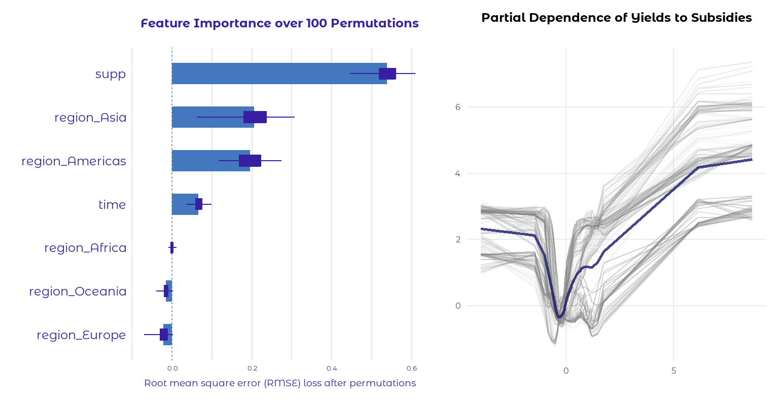
Based on the feature importance graph, it appears that the variables with the most significance for predicting results are supp, region_Asia, and region_America. The other variables look like nearly no effect on the prediction; in fact, the variables with negative scores may even hurt the model.
We created a partial dependence graph for the feature importance graph’s most effective variable (supp), which is shown on the right-hand graph. In most cases, there’s a positive linear relationship between subsidies and crop yields on the positive side of the graph. However, it tends to flatten out towards the end. So maybe we can conclude that the effect of subsidies is fading in terms of agricultural yields. Don’t forget that the values are normalized for the modeling.
R-bloggers.com offers daily e-mail updates about R news and tutorials about learning R and many other topics. Click here if you're looking to post or find an R/data-science job.
Want to share your content on R-bloggers? click here if you have a blog, or here if you don't.