
How to make a plot with two different y-axis in R with ggplot2? (a secret ggplot2 hack)
Want to share your content on R-bloggers? click here if you have a blog, or here if you don't.
I can’t tell you how painful it is to be better at something in Excel than in R. And one of the gripes I still have (10 years after making the switch from Excel to R) is that it’s still tough to make dual-axis plots in R.
Guess what, today is the day. I’m going to show you how to make more professional dual-axis plots in R than what I could do in Excel in my prime. Here’s what you’re learning today:
- How to make a dual-axis plot in R (my secret dual-plotting hack)
- Bonus: My 3 steps to dual-axis plot customizations (that will make your boss squeal with excitement)

Dual Axis Plots
R-Tips Weekly
This article is part of R-Tips Weekly, a weekly video tutorial that shows you step-by-step how to do common R coding tasks. Pretty cool, right?
Here are the links to get set up. 👇
Video Tutorial
I have a companion video tutorial that shows even more cool automation stuff (plus mistakes to avoid). You can check it out here.
Make a dual-axis plot
Here’s the dual-axis plot you’re going to make in this tutorial from R. 👇

When do you need a dual-axis plot?
You might not know when to use a dual-axis plot. I used these all the time for presentations to leadership. Here’s when I use dual-axis plots most commonly:
- When I want to compare two variables (Like Sales measured in dollars $ and Profit Margin measured in percentage %)
- The two variables are on different scales (commonly one might be a percentage and the other is a dollar value or quantity in units)
Before we get started, get the R Cheat Sheet
You’ll need to learn ggplot2 to take full advantage of this tutorial. For these topics, I’ll use the Ultimate R Cheat Sheet to refer to ggplot2 code in my workflow.
Step 1: Download the Ultimate R Cheat Sheet.

Step 2: Click the “CS” hyperlink to “ggplot2”.
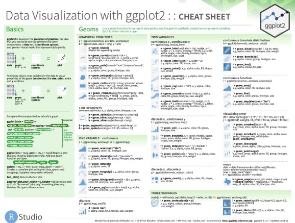
Now you’re ready to quickly reference the ggplot2 cheat sheet. This shows you the core plotting functions available in the ggplot library.
Onto the tutorial.
How to make a dual-axis plot in R? (full tutorial)
Here’s how to make your first dual-axis plot in R.
Get the data in the right format
First, load libraries tidyverse and tidyquant. Then get the mpg data set.

Data Transformation
I want to compare the median highway fuel economy and the proportion of vehicles in this list. To do so I need to take my raw data, which is 234 vehicles, and apply the median, count, and get a proportion of counts to show the vehicle representation.

Here’s the code to do this transformation.

Now that the data has been transformed, let’s see how to make this plot in 3 steps.
Problem: Different scales
I have a problem. If I try to plot the two variables (prop and hwy_median) on a ggplot, then my plot looks like crap.

This happens because the two variables are on different scales.

Solution: Transformer function to rescale the 2nd axis
The solution is just to copy my transformer code and we can use this to make a secondary axis that is re-scaled to the first axis.
![]()
Next, apply the transformer_dual_y_axis() function to the data. Set the primary column as prop and the secondary column as hwy_median. The include_y_zero = TRUE makes sure both y-axis include zero.
![]()
3-steps to dual-axis plots
Ok, now we are ready to rock and roll. Let’s make the dual axis plot.
Step 1: Set up the primary y-axis
Run this code to set up the primary y-axis. This creates the first plot (g1).

This returns a salmon-colored plot with the proportions. (Don’t worry, we’ll fix the color in a minute)

Step 2: Apply the transformer
Next, I’m creating a 2nd plot (g2) that extends the first plot (g1).
![]()
We now have the dual y-axis set up. It still looks too salmon-ey. But we’re onto something.

Now, let’s make it look like a professional plot.
Step 3: Pro-customizations (that’ll make your boss squeal)
Next, run this code to upgrade the appearance of the g2 plot (returning g3, the plot you’ll want to show your boss).


💡 Conclusions
You learned how to create a dual-axis plot that is about 100X better than anything I can create in Excel. Great work! But, there’s a lot more to becoming a Business Scientist (a highly saught-after data scientist that knows the secrets to generating business value).
If you’d like to become a Business Scientist (and have an awesome career, improve your quality of life, enjoy your job, and all the fun that comes along), then I can help with that.
My Struggles with Learning Data Science
It took me a long time to learn how to apply data science to business. And I made a lot of mistakes as I fumbled through learning R.
I specifically had a tough time navigating the ever-increasing landscape of tools and packages, trying to pick between R and Python, and getting lost along the way.
If you feel like this, you’re not alone.
In fact, that’s the driving reason that I created Business Science and Business Science University (You can read about my personal journey here).
What I found out is that:
- Data Science does not have to be difficult, it just has to be taught from a business perspective
- Anyone can learn data science fast provided they are motivated.
How I can help
If you are interested in learning R and the ecosystem of tools at a deeper level, then I have a streamlined program that will get you past your struggles and improve your career in the process.
It’s my 5-Course R-Track System. It’s an integrated system containing 5 courses that work together on a learning path. Through 8 projects, you learn everything you need to help your organization: from data science foundations, to advanced machine learning, to web applications and deployment.
The result is that you break through previous struggles, learning from my experience & our community of 2653 data scientists that are ready to help you succeed.
Ready to take the next step? Then let’s get started.

Join My 5-Course R-Track Program
(Become A 6-Figure Data Scientist)
R-bloggers.com offers daily e-mail updates about R news and tutorials about learning R and many other topics. Click here if you're looking to post or find an R/data-science job.
Want to share your content on R-bloggers? click here if you have a blog, or here if you don't.