CO2 Emissions Comparing and Modeling for Global Warming
Want to share your content on R-bloggers? click here if you have a blog, or here if you don't.
Recently, I watched the new Predator movie, Pray, and I loved it. Hence, I’ve fallen into the Predators series, especially the first two movies, again. The Predators in the movie would choose warm planets to hunt because their vision capabilities are based on infrared thermal, which allows them to see heat signatures.
Carbon dioxide emissions are the primary driver of global warming on Earth. So, I decided to check what is responsible for that to avoid the Predators coming to the Earth:)
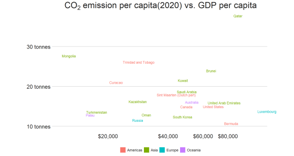
We will examine the countries in terms of the annual carbon emissions per capita vs. GDP per capita.
#Building a dataset
library(tidyverse)
library(tidymodels)
library(janitor)
library(countrycode)
library(randomForest)
library(vip)
library(bbplot)#remotes::install_github("bbc/bbplot")

df_co <- read_csv("https://raw.githubusercontent.com/mesdi/blog/main/co-emissions-per-capita.csv")
df_gdp <- read_csv("https://raw.githubusercontent.com/mesdi/blog/main/gdp-per-capita-worldbank.csv")

df <-
  df_gdp %>%
  left_join(df_co) %>%
  group_by(Entity) %>%
  #the last value of each group
  top_n(n=1, wt= Year) %>%
  clean_names() %>%
  #continent names
  mutate(region = countrycode(sourcevar = entity,
                              origin = "country.name",
                              destination = "un.region.name")) %>%
  ungroup() %>%
  select(
    entity,
    region,
    co2= annual_co2_emissions_per_capita,
    gdp= gdp_per_capita_ppp_constant_2017_international) %>%
  na.omit()
We will compare the top 20 countries ranked by carbon emissions.
#Comparing the top 20 countries ranked by carbon emissions
df %>%
  slice_max(order_by= co2, n=21) %>%
  ggplot(aes(x= gdp, y= co2, color= region))+
  geom_text(aes(label= entity),
            hjust= 0,
            vjust= -0.5,
            size=4,
            check_overlap = TRUE,#removes one of the overlapped texts
            #legend key type
            key_glyph= "rect")+
  #Using scale_*_log10 to zoom in data on the plot
  scale_x_log10(breaks=seq(0,80000,20000),
                labels = scales::label_dollar(accuracy = 2))+
  scale_y_continuous(labels = scales::label_number(scale_cut = cut_si("tonnes")))+
  labs(title= bquote(''* ~CO[2]~'emission per capita(2020) vs. GDP per capita' *''))+
  coord_fixed(ratio = 0.02, clip = "off")+#fits the text labels to the panel
  bbc_style()+
  theme(
    legend.position = "bottom",
    legend.text = element_text(size=12),
    plot.title = element_text(hjust=0.5)#centers the plot title
  )

According to the above graphic, Asian countries seem to dominate the list despite Bahrain being removed from the chart for overlapping Kuwait. It is rather interesting that China is not on the list. Probably it is caused by its massive amount of population.
Now, we will try to find some variables that explain the change in carbon emissions. In order to do that we will apply a permutation-based variable importance method.
#Preprocessing the data
df_rec <-
  recipe(formula = co2 ~ region + gdp, data = df) %>%
  step_dummy(all_nominal()) %>%
  step_log(gdp, base = 10)


#Creating a tibble of the preprocessed data for modeling
imp_df <-
  df_rec %>%
  prep() %>%
  bake(new_data = NULL)


#Building a random forest model
set.seed(1234)
p_rf<-
  randomForest(co2 ~ .,
               ntree = 500,
               mtry=2,
               data = imp_df)

#Permutation-based variable importance plot
set.seed(1234)
vip(p_rf,
    method = "permute",
    target = "co2",
    metric = "rsquared",
    nsim = 100,
    pred_wrapper = predict,
    geom = "boxplot",
    mapping = aes_string(fill = "Variable"),
    aesthetics = list(color = "grey35"))+
  theme_minimal()+
  theme(legend.position = "none")

When we look at the random forest model, we see that the model explains %36 of change of carbon emissions. In this context, GDP is the most dominant component according to the above graph. Being in Asia seems to be the second most important variable and which explains the first chart we made.
R-bloggers.com offers daily e-mail updates about R news and tutorials about learning R and many other topics. Click here if you're looking to post or find an R/data-science job.
Want to share your content on R-bloggers? click here if you have a blog, or here if you don't.
