Improving a Visualization
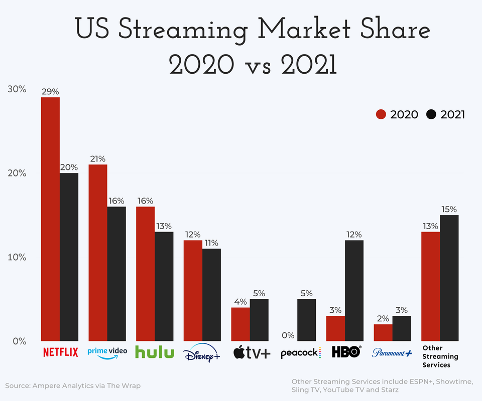
I saw this post
on Reddit’s r/dataisbeautiful showing this plot of streaming services market
share, comparing 2020 to 2021
US Streaming Services Market Share, 2020 vs 2021
and thought it looked like a good candidate for trying out some plot improvem...