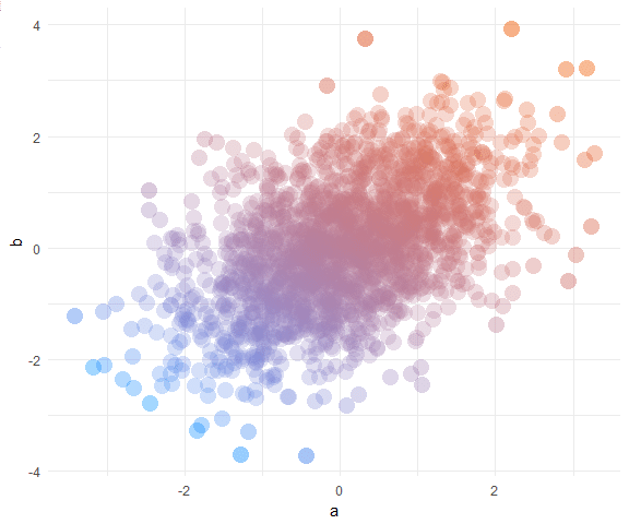
Pretty scatter plots with ggplot2
@drsimonj here to make pretty scatter plots of correlated variables with ggplot2!
We’ll learn how to create plots that look like this:
Data
In a data.frame d, we’ll simulate two correlated variables a and b of length n:
set.seed(170513)
n 2 0.9133158 0.21116682
#__ 3 1.4516084 0.69060249
#__ 4 0.5264596 0.22471694
#__ 5 -1.9412516 -1.70890512
#__ 6 1.4198574 0.30805526
Basic scatter plot
Using ...