Visualizing Arkansas traffic fatalities, Part 2
Want to share your content on R-bloggers? click here if you have a blog, or here if you don't.
A couple of weeks ago, I posted a map of the traffic fatalities in Arkansas in 2015. The data came from the NHTSA, and the graphic I posted was just scratching the surface. I’ve sliced the data a couple of different ways and created three more sets of visualizations about that data. For the next three posts, I’ll show the visualizations, my interpretation, and then the code so that non-programmers will get the goods on the front end.
The Visualizations
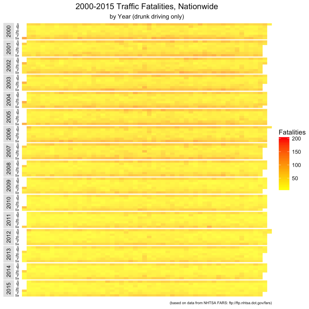
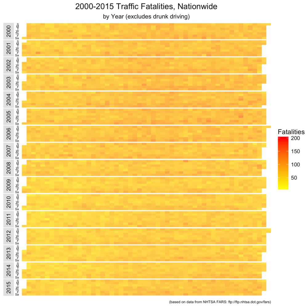
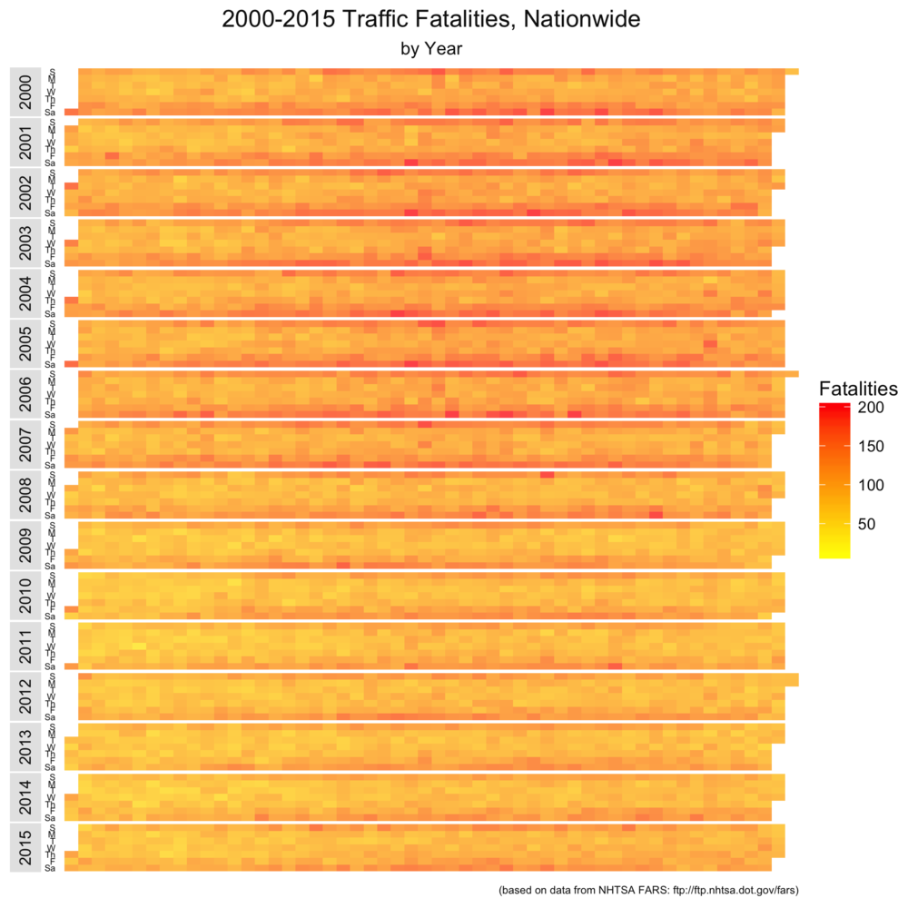
The first set of visualizations maps the raw number of traffic fatalities in the US. You can click to zoom the image. Each band represents a single year between 2000 and 2015. Each row within the band is a day of the week. From left to right (or top to bottom on small devices), you have drunk driving fatalities, non-drunk driving fatalities, and total fatalities. We’ll repeat this comparison a number of times, and the color coding in each set of graphs uses the same scale (so we compare apples to apples across the three visualizations).


For me, there are two things that stand out in this set of visualizations. First, drunk driving fatalities are heavily weighted towards weekends. Second, New Years’ Day (the left- and top-most block) is an especially dangerous time to be in the road.
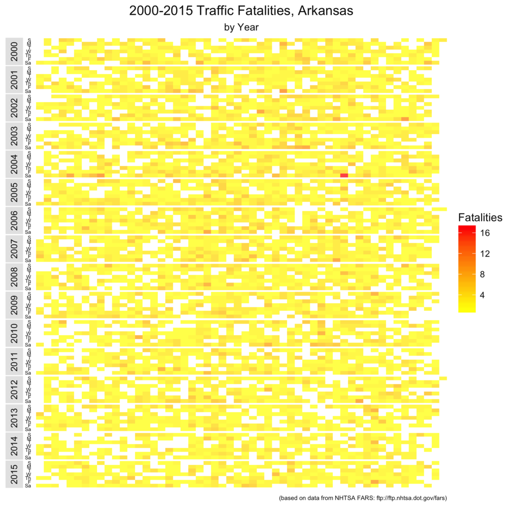
As I will with the remaining posts, I repeated the same analysis on Arkansas-specific wreck information (this requires a single line of R code given below). The data is a little noisier, but the same results appear to hold. Note that this scale is different than the nationwide set. The scale is a little skewed towards lighter colors by one extremely bad Arkansas traffic Saturday in the fall of 2004.


The Code
Now to the code. First, we’ll load in all the data from the NHTSA (available at ftp.nhtsa.dot.gov/fars/). Because the files added data points over time, we’ll need to select just what we need for the visualization so we can combine them all.
# Read data elements
accidents_2015 <- read.dbf("Data/FARS2015NationalDBF/accident.dbf")[,c("STATE", "COUNTY", "DAY", "MONTH", "YEAR", "FATALS", "DRUNK_DR")]
accidents_2014 <- read.dbf("Data/FARS2014NationalDBF/accident.dbf")[,c("STATE", "COUNTY", "DAY", "MONTH", "YEAR", "FATALS", "DRUNK_DR")]
accidents_2013 <- read.dbf("Data/FARS2013NationalDBF/accident.dbf")[,c("STATE", "COUNTY", "DAY", "MONTH", "YEAR", "FATALS", "DRUNK_DR")]
accidents_2012 <- read.dbf("Data/FARS2012/accident.dbf")[,c("STATE", "COUNTY", "DAY", "MONTH", "YEAR", "FATALS", "DRUNK_DR")]
accidents_2011 <- read.dbf("Data/FARS2011/accident.dbf")[,c("STATE", "COUNTY", "DAY", "MONTH", "YEAR", "FATALS", "DRUNK_DR")]
accidents_2010 <- read.dbf("Data/FARS2010/accident.dbf")[,c("STATE", "COUNTY", "DAY", "MONTH", "YEAR", "FATALS", "DRUNK_DR")]
accidents_2009 <- read.dbf("Data/FARS2009/accident.dbf")[,c("STATE", "COUNTY", "DAY", "MONTH", "YEAR", "FATALS", "DRUNK_DR")]
accidents_2008 <- read.dbf("Data/FARS2008/accident.dbf")[,c("STATE", "COUNTY", "DAY", "MONTH", "YEAR", "FATALS", "DRUNK_DR")]
accidents_2007 <- read.dbf("Data/FARS2007/accident.dbf")[,c("STATE", "COUNTY", "DAY", "MONTH", "YEAR", "FATALS", "DRUNK_DR")]
accidents_2006 <- read.dbf("Data/FARS2006/accident.dbf")[,c("STATE", "COUNTY", "DAY", "MONTH", "YEAR", "FATALS", "DRUNK_DR")]
accidents_2005 <- read.dbf("Data/FARS2005/accident.dbf")[,c("STATE", "COUNTY", "DAY", "MONTH", "YEAR", "FATALS", "DRUNK_DR")]
accidents_2004 <- read.dbf("Data/FARS2004/accident.dbf")[,c("STATE", "COUNTY", "DAY", "MONTH", "YEAR", "FATALS", "DRUNK_DR")]
accidents_2003 <- read.dbf("Data/FARS2003/accident.dbf")[,c("STATE", "COUNTY", "DAY", "MONTH", "YEAR", "FATALS", "DRUNK_DR")]
accidents_2002 <- read.dbf("Data/FARS2002/accident.dbf")[,c("STATE", "COUNTY", "DAY", "MONTH", "YEAR", "FATALS", "DRUNK_DR")]
accidents_2001 <- read.dbf("Data/FARS2001/accident.dbf")[,c("STATE", "COUNTY", "DAY", "MONTH", "YEAR", "FATALS", "DRUNK_DR")]
accidents_2000 <- read.dbf("Data/FARSDBF00/ACCIDENT.dbf")[,c("STATE", "COUNTY", "DAY", "MONTH", "YEAR", "FATALS", "DRUNK_DR")]

# Combine annual data
accidents <- rbind(accidents_2015, accidents_2014, accidents_2013, accidents_2012, accidents_2011, accidents_2010, accidents_2009, accidents_2008, accidents_2007, accidents_2006, accidents_2005, accidents_2004, accidents_2003, accidents_2002, accidents_2001, accidents_2000)
Next, if we're looking at just Arkansas data, we need this line of code:
# Subset Arkansas wrecks
accidents <- subset(accidents, STATE == 5)
We have to add an R-specific date column to be able to use date functions later on, as follows:
# Add date column
accidents$date <- as.Date(paste(accidents$YEAR, accidents$MONTH, accidents$DAY, sep='-'), "%Y-%m-%d")
Next, we need to write the code that will let us parse the data by whether or not any driver involved in the wreck was drunk. We do this by creating R vectors. The vectors allow us to aggregate the raw wreck data by day and then subset it by whether or not it is alcohol-related, as follows:
# Subset and aggregate wrecks by drunk/not drunk
accidents_drunk <- accidents$DRUNK_DR > 0
accidents_not_drunk <- accidents$DRUNK_DR == 0
summary <- aggregate(FATALS ~ date, accidents, sum)
summary_not_drunk <- aggregate(FATALS ~ date, accidents, sum, subset=accidents_not_drunk)
summary_drunk <- aggregate(FATALS ~ date, accidents, sum, subset=accidents_drunk)
Now, we need to create empty entries for those dates that don't have any fatal wrecks (not necessary for nationwide plots, but necessary for Arkansas-specific ones). We'll add this to the data we created earlier.
# get vector of all days in relevant data range
start_year <- format(min(summary_not_drunk$date), "%Y") # Calculate start_year from data
firstday <- format(Sys.Date(), paste(start_year, "-01-01", sep=""))
lastday <- format(Sys.Date(), "2015-12-31")
alldays <- seq(c(ISOdate(start_year,01,01)), by="day", length.out=as.Date(lastday) - as.Date(firstday) + 1)

alldays <- as.data.frame(alldays)
alldays <- rename(alldays, c("alldays"="date"))
alldays[["date"]] <- as.Date(alldays[["date"]], "%Y-%m-%d")

# Uses 53-week year when week 1 has < 4 days
alldays <- transform(alldays,
week = as.numeric(format(date, "%U")),
day = as.numeric(format(date, "%d")),
wday = as.numeric(format(date, "%w"))+1,
month = as.POSIXlt(date)$mon + 1,
year = as.POSIXlt(date)$year + 1900)

# initialize date vector columns to match data columns
alldays[,"FATALS"] <- NA

data <- rbind(summary, alldays)
data_drunk <- rbind(summary_drunk, alldays)
data_not_drunk <- rbind(summary_not_drunk, alldays)
Next, we'll create some additional columns to give us the week of the year, which is how we plot the bands. This code is adapted from the very helpful r-bloggers post I mentioned in the last visualization post. As an aside, if you're interested in data visualization, you should subscribe to r-bloggers, as those guys are always posting fascinating stuff.
data$yearmonth<-as.yearmon(data$date)
data$yearmonthf<-factor(data$yearmonth)
data <- ddply(data,.(yearmonthf),transform,monthweek=1+week-min(week)) # and now for each monthblock we normalize the week to start at 1
data <- subset(data, select = -c(yearmonth, yearmonthf)) # Then, drop extra columns
data$monthf<-factor(data$month,levels=as.character(1:12),labels=c("Jan","Feb","Mar","Apr","May","Jun","Jul","Aug","Sep","Oct","Nov","Dec"),ordered=TRUE)
data$weekdayf<-factor(data$wday,levels=rev(1:7),labels=rev(c("S","M","T","W","Th","F","Sa")),ordered=TRUE)

data_drunk$yearmonth<-as.yearmon(data_drunk$date)
data_drunk$yearmonthf<-factor(data_drunk$yearmonth)
data_drunk <- ddply(data_drunk,.(yearmonthf),transform,monthweek=1+week-min(week)) # and now for each monthblock we normalize the week to start at 1
data_drunk <- subset(data_drunk, select = -c(yearmonth, yearmonthf)) # Then, drop extra columns
data_drunk$monthf<-factor(data_drunk$month,levels=as.character(1:12),labels=c("Jan","Feb","Mar","Apr","May","Jun","Jul","Aug","Sep","Oct","Nov","Dec"),ordered=TRUE)
data_drunk$weekdayf<-factor(data_drunk$wday,levels=rev(1:7),labels=rev(c("S","M","T","W","Th","F","Sa")),ordered=TRUE)

data_not_drunk$yearmonth<-as.yearmon(data_not_drunk$date)
data_not_drunk$yearmonthf<-factor(data_not_drunk$yearmonth)
data_not_drunk <- ddply(data_not_drunk,.(yearmonthf),transform,monthweek=1+week-min(week)) # and now for each monthblock we normalize the week to start at 1
data_not_drunk <- subset(data_not_drunk, select = -c(yearmonth, yearmonthf)) # Then, drop extra columns
data_not_drunk$monthf<-factor(data_not_drunk$month,levels=as.character(1:12),labels=c("Jan","Feb","Mar","Apr","May","Jun","Jul","Aug","Sep","Oct","Nov","Dec"),ordered=TRUE)
data_not_drunk$weekdayf<-factor(data_not_drunk$wday,levels=rev(1:7),labels=rev(c("S","M","T","W","Th","F","Sa")),ordered=TRUE)
Next, we'll look at the maximum and minimum number of fatalities across the three sets of data we'll be plotting. This will allow us to keep the same scale across all three plots.
max <- max(c(max(data["FATALS"], na.rm=TRUE), max(data_not_drunk["FATALS"], na.rm=TRUE), max(data_drunk["FATALS"], na.rm=TRUE)))
min <- min(c(min(data["FATALS"], na.rm=TRUE), min(data_not_drunk["FATALS"], na.rm=TRUE), min(data_drunk["FATALS"], na.rm=TRUE)))
We're finally done with our data processing. The next step is to set up a theme for the visualization. To do this, I installed the development version of ggplot2 from github to use some of the newer features like subtitles and moving the facets (year labels) around.
# Define theme
heat_map_theme <- theme(
panel.grid.major.y = element_blank(),
panel.grid.minor.y = element_blank(),
panel.grid.minor.x = element_blank(),
panel.grid.major.x = element_blank(),
panel.spacing.x = unit(0, "points"),
panel.spacing.y = unit(1, "points"),
strip.placement = "outside",
strip.switch.pad.grid = unit(2,"points"),
strip.background = element_rect(fill="gray90", color=NA),
strip.text = element_text(color="gray5"),
axis.ticks = element_blank(),
axis.text.x = element_blank(),
axis.text.y = element_text(color="gray5", size=5),
axis.title.x = element_blank(),
axis.title.y = element_blank(),
legend.text = element_text(color="gray5"),
legend.title = element_text(color="gray5"),
plot.title = element_text(color="gray5", hjust=0.5),
plot.subtitle = element_text(color="gray5", hjust=0.5),
plot.caption = element_text(color="gray5", hjust=1, size=6),
panel.background = element_rect(fill="transparent", color=NA),
legend.background = element_rect(fill="transparent", color=NA),
plot.background = element_rect(fill="transparent", color=NA),
legend.key = element_rect(fill=alpha("white", 0.33), color=NA)
)
Finally, we'll perform the plot on the three datasets and save the output. The important things here are:
- The switch command in facet_grid function puts the years on the left, not the right
- the limits in the scale_fill_gradient function keeps the scale the same across all three plots
- the expand=c(0,0) function in scale_x_continuous() eliminates the padding around the plot area
# Plot and save all
ggplot(data, aes(week, weekdayf)) +
geom_tile(aes(fill=FATALS), na.rm = FALSE) +
facet_grid(year ~ ., drop = FALSE, switch="y") +
scale_fill_gradient(name="Fatalities", low="yellow", high="red", na.value = alpha("white", 0.25), limits=c(min,max)) +
scale_x_continuous(expand=(c(0,0))) +
labs(title = "2000-2015 Traffic Fatalities, Arkansas", x="", y="", subtitle="by Year", caption = "(based on data from NHTSA FARS: ftp://ftp.nhtsa.dot.gov/fars)") +
heat_map_theme

filename <- paste(c("Images/2000-2015_fatalities_calendar (AR, all).png"), collapse="")
ggsave(filename, bg = "transparent")

# Plot and save drunk
ggplot(data_drunk, aes(week, weekdayf)) +
geom_tile(aes(fill=FATALS), na.rm = FALSE) +
facet_grid(year ~ ., drop = FALSE, switch="y") +
scale_fill_gradient(name="Fatalities", low="yellow", high="red", na.value = alpha("white", 0.25), limits=c(min,max)) +
scale_x_continuous(expand=(c(0,0))) +
labs(title = "2000-2015 Traffic Fatalities, Arkansas", x="", y="", subtitle="by Year (drunk driving only)", caption = "(based on data from NHTSA FARS: ftp://ftp.nhtsa.dot.gov/fars)") +
heat_map_theme

filename <- paste(c("Images/2000-2015_fatalities_calendar (AR, drunk).png"), collapse="")
ggsave(filename, bg = "transparent")

# Plot and save not drunk
ggplot(data_not_drunk, aes(week, weekdayf)) +
geom_tile(aes(fill=FATALS), na.rm = FALSE) +
facet_grid(year ~ ., drop = FALSE, switch="y") +
scale_fill_gradient(name="Fatalities", low="yellow", high="red", na.value = alpha("white", 0.25), limits=c(min,max)) +
scale_x_continuous(expand=(c(0,0))) +
labs(title = "2000-2015 Traffic Fatalities, Arkansas", x="", y="", subtitle="by Year (excludes drunk driving)", caption = "(based on data from NHTSA FARS: ftp://ftp.nhtsa.dot.gov/fars)") +
heat_map_theme

filename <- paste(c("Images/2000-2015_fatalities_calendar (AR, not drunk).png"), collapse="")
ggsave(filename, bg = "transparent")
Conclusion
I hope you found these visualizations useful. I'd love your feedback on what you insight you gathered from the visualizations, or any critiques on how to make them more useful.
I'm new to R, so if you're seeing these and have suggestions for how to do things more efficiently, I'd love to see you comment.
R-bloggers.com offers daily e-mail updates about R news and tutorials about learning R and many other topics. Click here if you're looking to post or find an R/data-science job.
Want to share your content on R-bloggers? click here if you have a blog, or here if you don't.
