[social4i size=”large” align=”float-right”]
Guest post by Kirill Eremenko
Hi there!
My name is Kirill Eremenko and I teach R on Udemy. In this quick article I wanted to share with you a valuable tip we cover off in my course R Programming A-Z™ on Udemy (click here to get a 30% discount on the course).
Many R users are familiar with the ggplot2 package by Hadley Wickham. Though ggplot2 is extremely logical, and therefore easy to learn, there are certain challenges associated with getting your head even around this package. Today we will talk about one of these specific challenges: mapping vs setting aesthetics.
Let’s look at an example:
library(ggplot2)p <- ggplot(data=diamonds, aes(x=carat, y=price))p + geom_point()
Here we’re visualizing the diamonds dataset, which comes with ggplot2. Running the code creates the following chart:
This chart illustrates the sales prices (y axis) for over 50,000 diamonds over their weight in carats (x axis). Already an interesting peek into our data, however let’s now say that we want to make this visual even more insightful by adding colour to it.
How would we do that? Perhaps by adding a bit of code into the last line like this:
library(ggplot2)p <- ggplot(data=diamonds, aes(x=carat, y=price))p + geom_point(aes(colour=clarity))
Here we are using colour to categorize the observations by the clarity of each diamond:
Beautiful! As we see, ggplot2 has even automatically created a legend for us on the right.
Even without knowing anything about diamonds we can tell that the IF-graded clarity rocks sell at the highest price at a given size. This makes sense, because IF stands for internally flawless – only about 3% of diamonds ever receive this grading.
But we are getting side-tracked.
“What’s was so complicated about this?” – you might ask.
Indeed, all we did in that last bit of code is mapped the colour aesthetic of the plot to the clarity variable in our dataset. But let’s now look at a slightly different example. Let’s say we don’t want to use colour to help us see different categories – instead, we just want all of the observations to be red.
How would the code for such plot look? Maybe like this:
library(ggplot2)p <- ggplot(data=diamonds, aes(x=carat, y=price))p + geom_point(aes(colour=“Red”))
That looks about right… But is it?
The first thing that stands out is that the red doesn’t look exactly like red. It looks more orange than red.
The other unexpected thing you might notice is the legend on the right. Why is there a legend – we only wanted one colour, so there should not be a need for a legend. Right?
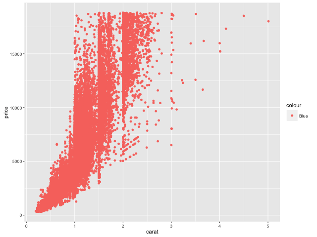
It all becomes clear if we try replace red with a different colour. Let’s say blue, for example:
library(ggplot2)p <- ggplot(data=diamonds, aes(x=carat, y=price))p + geom_point(aes(colour=“Blue”))
Now isn’t that interesting?
Nothing has changed about the chart – the only difference is that the legend now says “Blue”. However, the colour is still the same! What’s happening here?
What happened is that because of the way our code is structured ggplot is completely ignoring the meaning of the word “Blue” and rather using it for categorization of the points – just like it did with clarity in the earlier example.
But this makes no sense! We want ggplot to use the meaning of the word “Blue”.
The correct way to achieve that is like this:
library(ggplot2)p <- ggplot(data=diamonds, aes(x=carat, y=price))p + geom_point(color=”Blue”)
Now the colour is correct and there is no legend on the right. Everything is working, but let’s discuss in a little bit more detail what we changed.
First, we need to understand that any aesthetic in ggplot2 (such as colour, size, shape, etc.) can be used in two distinct ways in your plots:
Option 1 – you can use the aesthetic to reflect some properties of your data. For example, clarity of the diamonds, like we did in the first example. This is called MAPPING an aesthetic.
Option 2 – you can choose a certain value for an aesthetic. For example, make the colour blue for ALL points or make the shape a square for ALL points. This is called SETTING an aesthetic and the keyword here is ALL.
The choice between mapping and setting is a trade-off. When mapping you can convey more insights, whereas when setting you get more control of how your chart looks.
If we look at the code in our examples, we will see that difference is trivial. To map an aesthetic you need to use the aes() function, to set an aesthetic – simply omit the aes() altogether.
Compare:
p + geom_point(aes(colour=clarity))
Versus:
p + geom_point(colour=”Blue”)
The way I remembered it when I was learning R was that setting is a “simple” process – you just choose a value for everything. Whereas mapping is more “complex” – elements of your plot will end up having different visual properties. The aes() function is only needed to help out with the more “complex” mapping and not the “simple” setting 🙂
Bonus
We could have ended the article here. However, I know ggplot2 can get addictive so I’m going to throw in a little bonus. Let’s learn how we can specify certain colours which we want to be used in mapping.
Try this code:
library(ggplot2)p <- ggplot(data=diamonds, aes(x=carat, y=price))p + geom_point(aes(colour=clarity)) +scale_colour_manual(values=c(“Blue”,”Blue”,”Purple”,”Purple”,”Purple”,”Red”,”Red”,”Red”))
As you can see, the colour on the plot is still representing clarity of the diamonds (refer to the legend on the right). This means that we are using Option 1: Mapping.
This might seem a bit complex, but it really isn’t. The only difference to the previous Mapping example is that this time we are also specifying the range of colours to which the aesthetic should be mapped to.
And one final trick for today – let’s add some transparency:
library(ggplot2)p <- ggplot(data=diamonds, aes(x=carat, y=price))p + geom_point(aes(colour=clarity), alpha=0.3) +scale_colour_manual(values=c(“Blue”,”Blue”,”Purple”,”Purple”,”Purple”,”Red”,”Red”,”Red”))
Alpha sets how transparent the points will be on a scale from 0 to 1 (with 0 being most transparent). This allows us to better see points which are behind each other as well as to better identify clusters of observations.
I hope you enjoyed these quick tips on ggplot(). And if you did, then I welcome you into my course R Programming A-Z™ on Udemy which is full of R tips, tricks and hacks.
If you are just starting out into R this course will help you get over the steep learning curve while having fun and completing five meaningful real-life analytics projects. Don’t miss the opportunity to secure your spot in this 10+ hour monster course!
I look forward to seeing you inside,
Sincerely,
Kirill Eremenko


 This chart illustrates the sales prices (y axis) for over 50,000 diamonds over their weight in carats (x axis). Already an interesting peek into our data, however let’s now say that we want to make this visual even more insightful by adding colour to it.
How would we do that? Perhaps by adding a bit of code into the last line like this:
library(ggplot2)
p <- ggplot(data=diamonds, aes(x=carat, y=price))
p + geom_point(aes(colour=clarity))
Here we are using colour to categorize the observations by the clarity of each diamond:
This chart illustrates the sales prices (y axis) for over 50,000 diamonds over their weight in carats (x axis). Already an interesting peek into our data, however let’s now say that we want to make this visual even more insightful by adding colour to it.
How would we do that? Perhaps by adding a bit of code into the last line like this:
library(ggplot2)
p <- ggplot(data=diamonds, aes(x=carat, y=price))
p + geom_point(aes(colour=clarity))
Here we are using colour to categorize the observations by the clarity of each diamond:
 Beautiful! As we see, ggplot2 has even automatically created a legend for us on the right.
Even without knowing anything about diamonds we can tell that the IF-graded clarity rocks sell at the highest price at a given size. This makes sense, because IF stands for internally flawless – only about 3% of diamonds ever receive this grading.
But we are getting side-tracked.
“What’s was so complicated about this?” – you might ask.
Indeed, all we did in that last bit of code is mapped the colour aesthetic of the plot to the clarity variable in our dataset. But let’s now look at a slightly different example. Let’s say we don’t want to use colour to help us see different categories – instead, we just want all of the observations to be red.
How would the code for such plot look? Maybe like this:
library(ggplot2)
p <- ggplot(data=diamonds, aes(x=carat, y=price))
p + geom_point(aes(colour=“Red”))
Beautiful! As we see, ggplot2 has even automatically created a legend for us on the right.
Even without knowing anything about diamonds we can tell that the IF-graded clarity rocks sell at the highest price at a given size. This makes sense, because IF stands for internally flawless – only about 3% of diamonds ever receive this grading.
But we are getting side-tracked.
“What’s was so complicated about this?” – you might ask.
Indeed, all we did in that last bit of code is mapped the colour aesthetic of the plot to the clarity variable in our dataset. But let’s now look at a slightly different example. Let’s say we don’t want to use colour to help us see different categories – instead, we just want all of the observations to be red.
How would the code for such plot look? Maybe like this:
library(ggplot2)
p <- ggplot(data=diamonds, aes(x=carat, y=price))
p + geom_point(aes(colour=“Red”))
 That looks about right… But is it?
The first thing that stands out is that the red doesn’t look exactly like red. It looks more orange than red.
The other unexpected thing you might notice is the legend on the right. Why is there a legend – we only wanted one colour, so there should not be a need for a legend. Right?
It all becomes clear if we try replace red with a different colour. Let’s say blue, for example:
library(ggplot2)
p <- ggplot(data=diamonds, aes(x=carat, y=price))
p + geom_point(aes(colour=“Blue”))
That looks about right… But is it?
The first thing that stands out is that the red doesn’t look exactly like red. It looks more orange than red.
The other unexpected thing you might notice is the legend on the right. Why is there a legend – we only wanted one colour, so there should not be a need for a legend. Right?
It all becomes clear if we try replace red with a different colour. Let’s say blue, for example:
library(ggplot2)
p <- ggplot(data=diamonds, aes(x=carat, y=price))
p + geom_point(aes(colour=“Blue”))
 Now isn’t that interesting?
Nothing has changed about the chart – the only difference is that the legend now says “Blue”. However, the colour is still the same! What’s happening here?
What happened is that because of the way our code is structured ggplot is completely ignoring the meaning of the word “Blue” and rather using it for categorization of the points – just like it did with clarity in the earlier example.
But this makes no sense! We want ggplot to use the meaning of the word “Blue”.
The correct way to achieve that is like this:
library(ggplot2)
p <- ggplot(data=diamonds, aes(x=carat, y=price))
p + geom_point(color=”Blue”)
Now isn’t that interesting?
Nothing has changed about the chart – the only difference is that the legend now says “Blue”. However, the colour is still the same! What’s happening here?
What happened is that because of the way our code is structured ggplot is completely ignoring the meaning of the word “Blue” and rather using it for categorization of the points – just like it did with clarity in the earlier example.
But this makes no sense! We want ggplot to use the meaning of the word “Blue”.
The correct way to achieve that is like this:
library(ggplot2)
p <- ggplot(data=diamonds, aes(x=carat, y=price))
p + geom_point(color=”Blue”)
 Now the colour is correct and there is no legend on the right. Everything is working, but let’s discuss in a little bit more detail what we changed.
First, we need to understand that any aesthetic in ggplot2 (such as colour, size, shape, etc.) can be used in two distinct ways in your plots:
Option 1 – you can use the aesthetic to reflect some properties of your data. For example, clarity of the diamonds, like we did in the first example. This is called MAPPING an aesthetic.
Option 2 – you can choose a certain value for an aesthetic. For example, make the colour blue for ALL points or make the shape a square for ALL points. This is called SETTING an aesthetic and the keyword here is ALL.
The choice between mapping and setting is a trade-off. When mapping you can convey more insights, whereas when setting you get more control of how your chart looks.
If we look at the code in our examples, we will see that difference is trivial. To map an aesthetic you need to use the aes() function, to set an aesthetic – simply omit the aes() altogether.
Compare:
p + geom_point(aes(colour=clarity))
Versus:
p + geom_point(colour=”Blue”)
The way I remembered it when I was learning R was that setting is a “simple” process – you just choose a value for everything. Whereas mapping is more “complex” – elements of your plot will end up having different visual properties. The aes() function is only needed to help out with the more “complex” mapping and not the “simple” setting 🙂
Bonus
We could have ended the article here. However, I know ggplot2 can get addictive so I’m going to throw in a little bonus. Let’s learn how we can specify certain colours which we want to be used in mapping.
Try this code:
library(ggplot2)
p <- ggplot(data=diamonds, aes(x=carat, y=price))
p + geom_point(aes(colour=clarity)) +
scale_colour_manual(values=c(“Blue”,”Blue”,”Purple”,”Purple”,”Purple”,”Red”,”Red”,”Red”))
Now the colour is correct and there is no legend on the right. Everything is working, but let’s discuss in a little bit more detail what we changed.
First, we need to understand that any aesthetic in ggplot2 (such as colour, size, shape, etc.) can be used in two distinct ways in your plots:
Option 1 – you can use the aesthetic to reflect some properties of your data. For example, clarity of the diamonds, like we did in the first example. This is called MAPPING an aesthetic.
Option 2 – you can choose a certain value for an aesthetic. For example, make the colour blue for ALL points or make the shape a square for ALL points. This is called SETTING an aesthetic and the keyword here is ALL.
The choice between mapping and setting is a trade-off. When mapping you can convey more insights, whereas when setting you get more control of how your chart looks.
If we look at the code in our examples, we will see that difference is trivial. To map an aesthetic you need to use the aes() function, to set an aesthetic – simply omit the aes() altogether.
Compare:
p + geom_point(aes(colour=clarity))
Versus:
p + geom_point(colour=”Blue”)
The way I remembered it when I was learning R was that setting is a “simple” process – you just choose a value for everything. Whereas mapping is more “complex” – elements of your plot will end up having different visual properties. The aes() function is only needed to help out with the more “complex” mapping and not the “simple” setting 🙂
Bonus
We could have ended the article here. However, I know ggplot2 can get addictive so I’m going to throw in a little bonus. Let’s learn how we can specify certain colours which we want to be used in mapping.
Try this code:
library(ggplot2)
p <- ggplot(data=diamonds, aes(x=carat, y=price))
p + geom_point(aes(colour=clarity)) +
scale_colour_manual(values=c(“Blue”,”Blue”,”Purple”,”Purple”,”Purple”,”Red”,”Red”,”Red”))
 As you can see, the colour on the plot is still representing clarity of the diamonds (refer to the legend on the right). This means that we are using Option 1: Mapping.
This might seem a bit complex, but it really isn’t. The only difference to the previous Mapping example is that this time we are also specifying the range of colours to which the aesthetic should be mapped to.
And one final trick for today – let’s add some transparency:
As you can see, the colour on the plot is still representing clarity of the diamonds (refer to the legend on the right). This means that we are using Option 1: Mapping.
This might seem a bit complex, but it really isn’t. The only difference to the previous Mapping example is that this time we are also specifying the range of colours to which the aesthetic should be mapped to.
And one final trick for today – let’s add some transparency:
 library(ggplot2)
p <- ggplot(data=diamonds, aes(x=carat, y=price))
p + geom_point(aes(colour=clarity), alpha=0.3) +
scale_colour_manual(values=c(“Blue”,”Blue”,”Purple”,”Purple”,”Purple”,”Red”,”Red”,”Red”))
Alpha sets how transparent the points will be on a scale from 0 to 1 (with 0 being most transparent). This allows us to better see points which are behind each other as well as to better identify clusters of observations.
I hope you enjoyed these quick tips on ggplot(). And if you did, then I welcome you into my course R Programming A-Z™ on Udemy which is full of R tips, tricks and hacks.
If you are just starting out into R this course will help you get over the steep learning curve while having fun and completing five meaningful real-life analytics projects. Don’t miss the opportunity to secure your spot in this 10+ hour monster course!
I look forward to seeing you inside,
Sincerely,
Kirill Eremenko
library(ggplot2)
p <- ggplot(data=diamonds, aes(x=carat, y=price))
p + geom_point(aes(colour=clarity), alpha=0.3) +
scale_colour_manual(values=c(“Blue”,”Blue”,”Purple”,”Purple”,”Purple”,”Red”,”Red”,”Red”))
Alpha sets how transparent the points will be on a scale from 0 to 1 (with 0 being most transparent). This allows us to better see points which are behind each other as well as to better identify clusters of observations.
I hope you enjoyed these quick tips on ggplot(). And if you did, then I welcome you into my course R Programming A-Z™ on Udemy which is full of R tips, tricks and hacks.
If you are just starting out into R this course will help you get over the steep learning curve while having fun and completing five meaningful real-life analytics projects. Don’t miss the opportunity to secure your spot in this 10+ hour monster course!
I look forward to seeing you inside,
Sincerely,
Kirill Eremenko