
Some Light Image Processing & Creation With R
Want to share your content on R-bloggers? click here if you have a blog, or here if you don't.
A friend, we’ll call him Alen put a call out for some function that could take an image and produce a per-row “histogram” along the edge for the number of filled-in points. That requirement eventually scope-creeped to wanting “histograms” on both the edge and bottom. In, essence there was a desire to be able to compare the number of pixels in each row/line to each other.
Now, you’re all like “Well, you used ggplot to make the image so…” Yeah, not so much. They had done some basic charting in D3. And, it turns out, that it would be handy to compare the data between different images since they had different sets of data they were charting in the same place.
I can’t show you their images as they are part of super seekrit research which will eventually solve world hunger and land a family on Mars. But, I can do a minor re-creation. I made a really simple D3 page that draws random lines in a specified color. Like this:
You can view the source of http://rud.is/projects/randomlines.html?linecol=f6743d to see the dead-simple D3 that generates that. You’ll see something different in that image every time since it’s javascript and js has no decent built-in random routines (well it does now but the engine functionality in browsers hasn’t caught up yet). So, you won’t be able to 100% replicate the results below but it will work.
First, we need to be able to get the image from the div into a bitmap so we can do some pixel counting. We’ll use the new webshot package for that.
library(webshot)

tmppng1 <- tempfile(fileext=".png")
webshot("http://rud.is/projects/randomlines.html?linecol=f6743d",
        file=tmppng1,
selector="#vis") |
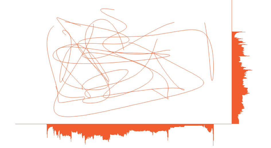
The image that produced looks like this:
 To make the “histograms” on the right and bottom, we’ll use the
 raster capabilities in R to let us treat the data like a matrix so we can easily add columns and rows. I made a function (below) that takes in a png file and either a list of colors to look for or a list of colors to exclude and the color you want the “histograms” to be drawn in. This way you can just exclude the background and annotation colors or count specific sets of colors. The counting is fueled by fastmatch which makes for super-fast comparisons.
#' Make a "row color density" histogram for an image file
#'
#' Takes a file path to a png and returns displays it with a histogram of
#' pixel density
#'
#' @param img_file path to png file
#' @param target_colors,ignore_colors colors to count or ignore. Either one should be
#'        code{NULL} or code{ignore_colors} should be code{NULL}. Whichever is
#'        not code{NULL} should be a vector of hex strings (can be huge vector of
#'        hex strings as it uses code{fastmatch}). The alpha channel is thrown away
#'        if any, so you only need to specify code{#rrggbb} hex strings
#' @param color to use for the density histogram line
selective_image_color_histogram <- function(img_file,
                                            target_colors=NULL,
                                            ignore_colors=c("#ffffff", "#000000"),
                                            hist_col="steelblue",
                                            plot=TRUE) {

  require(png)
  require(grid)
  require(raster)
  require(fastmatch)
  require(gridExtra)

  "%fmin%" <- function(x, table) { fmatch(x, table, nomatch = 0) > 0 }
  "%!fmin%" <- function(x, table) { !fmatch(x, table, nomatch = 0) > 0 }

  if (is.null(target_colors) & is.null(ignore_colors)) {
    stop("Only one of 'target_colors' or 'ignore_colors' can be 'NULL'", call.=FALSE)
  }

  # clean up params
  target_colors <- tolower(target_colors)
  ignore_colors <- tolower(ignore_colors)

  # read in file and convert to usable data structure
  png_file <- readPNG(img_file)
  img <- substr(tolower(as.matrix(as.raster(png_file))), 1, 7)

  # count ALL THE THINGS by row
  if (length(target_colors)==0) {
    wvals <- rowSums(apply(img, 1, function(x) { x %!fmin% ignore_colors }))
  } else {
    wvals <- rowSums(apply(img, 1, function(x) { x %fmin% target_colors }))
  }

  # add a slight right margin
  wdth <- max(wvals) + round(0.1*max(wvals))

  # create the "histogram"
  hmat <- matrix(rep("#ffffff", wdth*nrow(img)), nrow=nrow(img), ncol=wdth)
  for (i in 1:nrow(img)) { hmat[i, 1:wvals[i]] <- hist_col }

  # make bigger image
  new_img <- cbind(img, hmat)

  # count ALL THE THINGS by column
  if (length(target_colors)==0) {
    hvals <- colSums(apply(img, 2, function(x) { x %!fmin% ignore_colors }))
  } else {
    hvals <- colSums(apply(img, 2, function(x) { x %fmin% target_colors }))
  }

  # add a slight bottom margin
  hght <- max(hvals) + round(0.1*max(hvals))

  # create the "histogram"
  vmat <- matrix(rep("#ffffff", hght*ncol(new_img)), ncol=ncol(new_img), nrow=hght)
  for (i in 1:ncol(img)) { vmat[1:hvals[i], i] <- hist_col }

  # make a new bigger image and turn it into something we can use with
  # grid since we can also use it with ggplot this way if we really wanted to
  # and friends don't let friends use base graphics
  rg1 <- rasterGrob(rbind(new_img, vmat))

  # if we want to plot it, now is the time
  if (plot) grid.arrange(rg1)

  # return a list with each "histogram"
  return(list(row_hist=wvals, col_hist=hvals))

} |
After reading in the png as a raster, the function counts up all the specified pixels by row and extends the matrix width-wise. Then it does the same by column and extends the matrix height-wise. Finally, it makes a rasterGrob (b/c friends don’t let friends use base graphics) and optionally plots the output. It also returns the counts by row and by column. That will let us compare between images.
Now we can do:
a <- selective_image_color_histogram(tmppng, hist_col="#f6743d", plot=TRUE) |
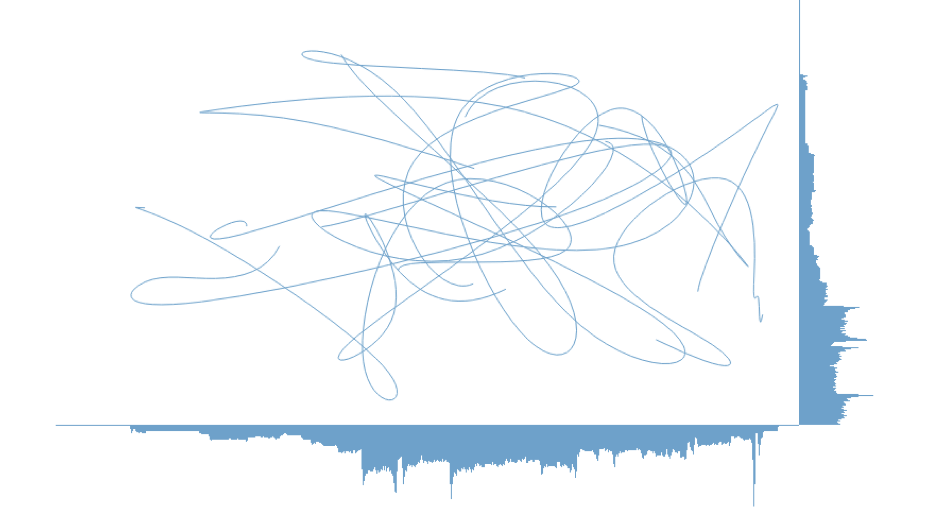
And, make a counterpart image for it:
tmppng2 <- tempfile(fileext=".png")
webshot("http://rud.is/projects/randomlines.html?linecol=80b1d4",
        file=tmppng2,
        selector="#vis")

b <- selective_image_color_histogram(tmppng2, hist_col="#80b1d4", plot=TRUE) |
You can definitely visually compare to see which ones had more “activity” in which row(s) (or column(s)) but why not let R do that for you (you’ll probably need to change the font to something boring like "Helvetica")?
library(ggplot2)
library(dplyr)

gg <- ggplot(data_frame(x=1:length(a$row_hist),
                        diff=a$row_hist - b$row_hist,
                        `A vs B`=factor(sign(diff), levels=c(-1, 0, 1),
                                        labels=c("A", "Neutral", "B"))))
gg <- gg + geom_segment(aes(x=x, xend=x, y=0, yend=diff, color=`A vs B`))
gg <- gg + scale_x_continuous(expand=c(0,0))
gg <- gg + scale_y_continuous(expand=c(0,0))
gg <- gg + scale_color_manual(values=c("#f6743d", "#2b2b2b", "#80b1d4"))
gg <- gg + labs(x="Row", y="Difference")
gg <- gg + coord_flip()
gg <- gg + ggthemes::theme_tufte(base_family="URW Geometric Semi Bold")
gg <- gg + theme(panel.grid=element_line(color="#2b2b2b", size=0.15))
gg <- gg + theme(panel.grid.major.y=element_blank())
gg <- gg + theme(panel.grid.minor=element_blank())
gg <- gg + theme(axis.ticks=element_blank())
gg <- gg + theme(axis.text.y=element_blank())
gg <- gg + theme(axis.title.x=element_text(hjust=0))
gg <- gg + theme(axis.title.y=element_text(hjust=0))
gg |
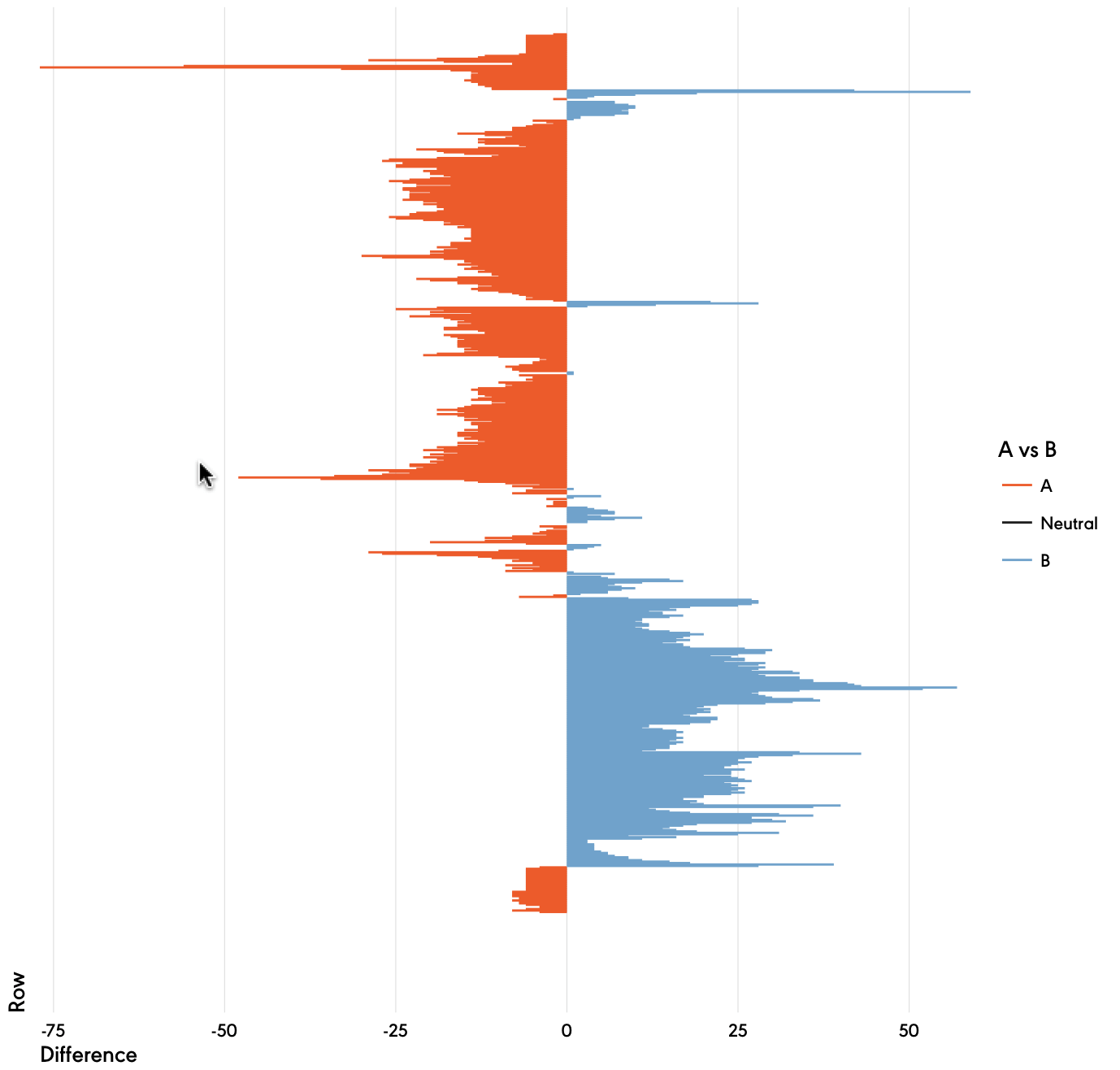
This way, you let the power of data science show you the answer. (The column processing chart is an exercise left to the reader).
The code may only be useful to Alen, but it was a fun and quick enough exercise that I thought it might be useful to the broader community.
Poke holes or improve upon it at will and tell me how horrible my code is in the comments (I have not looked to see if I subtracted in the right direction as I’m on solo dad duty for a cpl days and #4 is hungry).
R-bloggers.com offers daily e-mail updates about R news and tutorials about learning R and many other topics. Click here if you're looking to post or find an R/data-science job.
Want to share your content on R-bloggers? click here if you have a blog, or here if you don't.