
Shopping cart analysis with R – Multi-layer pie chart
Want to share your content on R-bloggers? click here if you have a blog, or here if you don't.
In this post, we will review a very interesting type of visualization – the multi-layer pie chart – and use it for one marketing analytics task – the shopping cart analysis. We will go from the initial data preprocessing to the shopping cart analysis visualization. I will share the R code in that you shouldn’t write R code for every layer of chart. You can also find an example about how to create a multi-layer pie chart here.
So, suppose we have a list of 1st orders/carts that were bought by our clients. Each order consists one or several products/category of products. Also, we want to visualise a relationship between products and see the share of orders that includes each product or combination of products. The multi-layer pie chart can help us draw each product and its intersections with others.
After we loaded the necessary libraries with the following code:
# loading libraries
library(dplyr)
library(reshape2)
library(plotrix)
we will simulate an example of the data set. Suppose we sell 4 products (or product categories): a, b, c and d and each product can be sold with a different probability. Also, a client can purchase any combinations of products, e.g. only “a” or “a,b,a,d” and so on. Let’s do this with the following code:
# creating an example of orders
set.seed(15)
df <- data.frame(orderId=sample(c(1:1000), 5000, replace=TRUE),
product=sample(c('NULL','a','b','c','d'), 5000, replace=TRUE,
prob=c(0.15, 0.65, 0.3, 0.15, 0.1)))
df <- df[df$product!='NULL', ]
After this, we remove the duplicates. For example, if the order consists of more than one similar product (“a,b,a,d”), we want to exclude the effect of quantity.
# removing duplicates
df <- df[!duplicated(df), ]

# arranging data set
df <- df %>%
arrange(orderId, product)
Let’s see on our data set:
head(df)

 ##   orderId product
 ## 1       1       a
 ## 2       1       b
 ## 3       2       a
 ## 4       2       c
 ## 5       3       a
 ## 6       4       a
In case you use real data, you should start with the following code (don’t forget to load libraries):
# creating product's matrix
prod.matrix <- dcast(df, orderId ~ product, fun.aggregate = NULL)

prod.matrix <- prod.matrix %>%
mutate(cart = paste(a, b, c, d, sep='')) # check all product names

prod.matrix$cart <- gsub('NA', '', prod.matrix$cart)
We have just created a product matrix. Note that, if you have more or fewer than 4 products, you should specify all of them instead of a, b, c and d in the mutate() function.
The head of product matrix we obtain is:
head(prod.matrix)

 ##   orderId a   b    c    d    cart
 ## 1       1 a   b   <NA> <NA>  ab
 ## 2       2 a  <NA>  c   <NA>  ac
 ## 3       3 a  <NA> <NA> <NA>  a
 ## 4       4 a   b   <NA> <NA>  ab
 ## 5       5 a   b   <NA>  d    abd
 ## 6       6 a   b    c   <NA>  abc
After this, we need to calculate the total number of combinations:
# calculating number of product's combinations
comb <- prod.matrix %>%
group_by(cart) %>%
summarise(num=n())

head(comb)

 ## Source: local data frame [6 x 2]
 ##
 ##   cart num
 ## 1 a    123
 ## 2 ab   241
 ## 3 abc  168
 ## 4 abcd  71
 ## 5 abd  125
 ## 6 ac   105
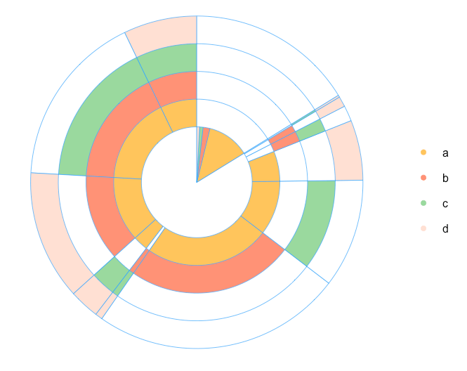
From this point we start working on our multi-layer pie chart. My idea is to place one-product order inside the chart. Therefore, we are calculating the total number of products in every combination. Note: I will do this by using the simple nchar() function, because we used a, b, c, and d as product names. In case you use real names, you can combine the names with a symbol. For example, “a-b-c-d” and count the number of “-” symbols.
# calculating number of products in combinations
comb$l <- sapply(comb$cart, nchar)

# calculating total number of orders/carts
tot <- sum(comb$num)

# spliting orders for sets with 1 product and more than 1 product
one.prod <- comb[comb$l==1,]
sev.prod <- comb[comb$l!=1,]

# arranging several products' data set
sev.prod <- arrange(sev.prod, desc(l))
Because I want a chart to start from the maximum combination of products, I arranged the sev.prod data set with the last function. Therefore, the data is ready for plotting. We are defining parameters for the chart:
# defining parameters for pie chart
iniR <- 0.2 # initial radius
all.colors <- list(NO='white', a='#fec44f', b='#fc9272', c='#a1d99b', d='#fee0d2') # palette
colors <- all.colors[ c(1:(nrow(one.prod)+1))] # set of colors
Note: if you have more than 4 products, you should add extra colors into the palette all.colors. Finally, our chart:
# 0 circle: blank
pie(1, radius=iniR, init.angle=90, col=c('white'), border = NA, labels='', edges=300)

# drawing circles from last to 2nd
for (i in nrow(one.prod):1) {
p <- grep(one.prod$cart[i], sev.prod$cart)
col <- rep('NO', times=nrow(sev.prod))
col[p] <- one.prod$cart[i]
floating.pie(0,0,c(sev.prod$num, tot-sum(sev.prod$num)), radius=(2+i)*iniR, startpos=pi/2, col=as.character(colors[ c(col, 'NO')]), border="#44aaff")
}

# 1 circle: orders with 1 product
floating.pie(0,0,c(tot-sum(one.prod$num),one.prod$num), radius=2*iniR, startpos=pi/2, col=as.character(colors[ c('NO',one.prod$cart)]), border="#44aaff")

# legend
legend(1.5, 2*iniR, gsub("_"," ",names(colors)[-1]), col=as.character(colors[-1]), pch=19, bty='n', ncol=1)
In case you want to add some statistics on plot, e.g. total number of each combination or share of combinations in total amount, we just need to create this table and add it on plot with the following code:
# creating a table with the stats
stat.tab <- comb %>%
select(-l) %>%
mutate(share=num/tot) %>%
arrange(desc(num))

library(scales)
stat.tab$share <- percent(stat.tab$share) # converting values to percents

# adding a table with the stats
addtable2plot(-2.5, -1.5, stat.tab, bty="n", display.rownames=FALSE,
hlines=FALSE, vlines=FALSE, title="The stats")
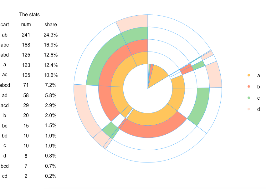
Therefore, we visualized the relationship between the products in the orders. However, this is just an example of using multi-layer pie chart. Feel free to share your ideas or comments!
R-bloggers.com offers daily e-mail updates about R news and tutorials about learning R and many other topics. Click here if you're looking to post or find an R/data-science job.
Want to share your content on R-bloggers? click here if you have a blog, or here if you don't.