
Cohort analysis with R – “layer-cake graph” (part 2)
Want to share your content on R-bloggers? click here if you have a blog, or here if you don't.
Continue to exploit great idea of ‘layer-cake’ graph.
If you like approach I shared in previous topic, perhaps you have one or two questions we should answer. Recall “Total revenue by Cohort” chart :
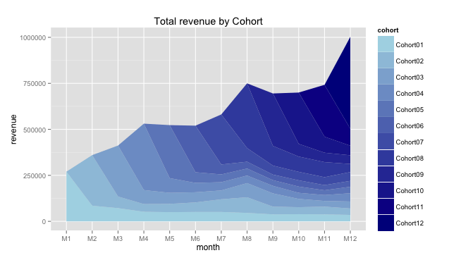
As total revenue depends on number of customers we attracted and on amount of money each of them spent with us, it has sense to dig deeply.
The number of active customers can be visualized via algorithm we used for total revenue. Again, after we processed a large amount of data it should be on following structure. There are Cohort01, Cohort02, etc. – cohort’s name due to customer signup date or first purchase date and M1, M2, etc. – period of cohort’s life-time (first month, second month, etc.):
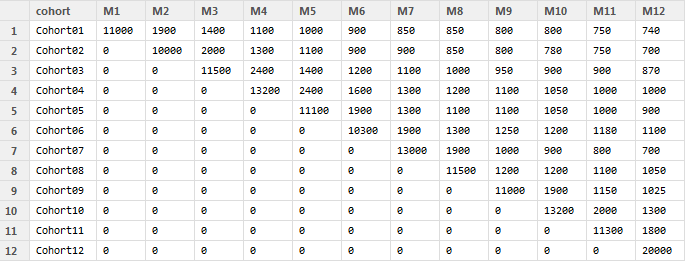
For example, Cohort-1 was signed up in January (M1) and included 11,000 clients who made purchases during the first month (M1). Cohort-5 was signed up in May (M5) and there were 1,100 active clients in September (M9).
Ok. Suppose you’ve done data process and got cohort.clients data frame as a result and it looks like the table above. You can replicate this data with the following code:
cohort.clients <- data.frame(cohort=c('Cohort01', 'Cohort02', 'Cohort03', 'Cohort04', 'Cohort05', 'Cohort06', 'Cohort07', 'Cohort08', 'Cohort09', 'Cohort10', 'Cohort11', 'Cohort12'),
 M1=c(11000,0,0,0,0,0,0,0,0,0,0,0),
 M2=c(1900,10000,0,0,0,0,0,0,0,0,0,0),
 M3=c(1400,2000,11500,0,0,0,0,0,0,0,0,0),
 M4=c(1100,1300,2400,13200,0,0,0,0,0,0,0,0),
 M5=c(1000,1100,1400,2400,11100,0,0,0,0,0,0,0),
 M6=c(900,900,1200,1600,1900,10300,0,0,0,0,0,0),
 M7=c(850,900,1100,1300,1300,1900,13000,0,0,0,0,0),
 M8=c(850,850,1000,1200,1100,1300,1900,11500,0,0,0,0),
 M9=c(800,800,950,1100,1100,1250,1000,1200,11000,0,0,0),
 M10=c(800,780,900,1050,1050,1200,900,1200,1900,13200,0,0),
 M11=c(750,750,900,1000,1000,1180,800,1100,1150,2000,11300,0),
 M12=c(740,700,870,1000,900,1100,700,1050,1025,1300,1800,20000))
Let’s create the “layer-cake” chart with the following R code:
#connect necessary libraries
library(ggplot2)
library(reshape2)
#we need to melt data
cohort.chart.cl <- melt(cohort.clients, id.vars = 'cohort')
colnames(cohort.chart.cl) <- c('cohort', 'month', 'clients')

#define palette
reds <- colorRampPalette(c('pink', 'dark red'))

#plot data
p <- ggplot(cohort.chart.cl, aes(x=month, y=clients, group=cohort))
p + geom_area(aes(fill = cohort)) +
 scale_fill_manual(values = reds(nrow(cohort.clients))) +
 ggtitle('Active clients by Cohort')
And we take the second amazing chart:
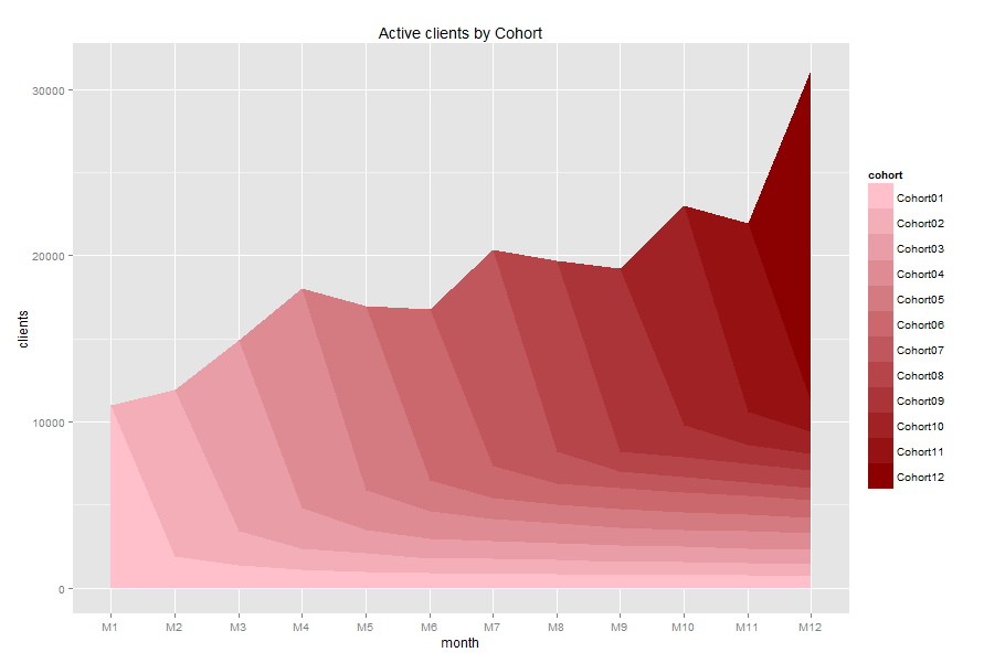
It seems like a lot of customers purchased once and gone. It can be a reason why total revenue is mainly provided by new customers.
And finally we can calculate and visualize the average revenue per client. The R code can be as the following:
#we need to divide the data frames (excluding cohort name)
rev.per.client <- cohort.sum[,c(2:13)]/cohort.clients[,c(2:13)]
rev.per.client[is.na(rev.per.client)] <- 0
rev.per.client <- cbind(cohort.sum[,1], rev.per.client)

#define palette
greens <- colorRampPalette(c('light green', 'dark green'))

#melt and plot data
cohort.chart.per.cl <- melt(rev.per.client, id.vars = 'cohort.sum[, 1]')
colnames(cohort.chart.per.cl) <- c('cohort', 'month', 'average_revenue')
p <- ggplot(cohort.chart.per.cl, aes(x=month, y=average_revenue, group=cohort))
p + geom_area(aes(fill = cohort)) +
 scale_fill_manual(values = greens(nrow(cohort.clients))) +
 ggtitle('Average revenue per client by Cohort')
And we take the third chart:
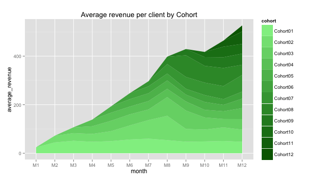
It seems like Cohort02 customers increased their average purchases during M5-M8 months. It can be a sign.
Note: The last chart shows average revenue per customer of each cohort, but it isn’t cumulative value as in previous two charts, it doesn’t show total average revenue for all clients. It seems like total average revenue per customer in M12 is about $500, but it isn’t. This chart should be used for comparing cohorts, not for summarizing. Please, don’t be confused.
Have questions? Don’t hesitate!
R-bloggers.com offers daily e-mail updates about R news and tutorials about learning R and many other topics. Click here if you're looking to post or find an R/data-science job.
Want to share your content on R-bloggers? click here if you have a blog, or here if you don't.