
A nifty area plot (or a bootleg of a ggplot geom)
Want to share your content on R-bloggers? click here if you have a blog, or here if you don't.
The ideas for most of my blogs usually come from half-baked attempts to create some neat or useful feature that hasn’t been implemented in R. These ideas might come from some analysis I’ve used in my own research or from some other creation meant to save time. More often than not, my blogs are motivated by data visualization techniques meant to provide useful ways of thinking about analysis results or comparing pieces of information. I was particularly excited (anxious?) after I came across this really neat graphic that ambitiously portrays the progression of civilization since ca. BC 2000. The original image was created John B. Sparks and was first printed by Rand McNally in 1931.1 The ‘Histomap’ illustrates the rise and fall of various empires and civilizations through an increasing time series up to present day. Color-coded chunks at each time step indicate the relative importance or dominance of each group. Although the methodology by which ‘relative dominance’ was determined is unclear, the map provides an impressive synopsis of human history.

Historical significance aside, I couldn’t help but wonder if a similar figure could be reproduced in R (I am not a historian). I started work on a function to graphically display the relative importance of categorical data across a finite time series. After a few hours of working, I soon realized that plot functions in the ggplot2 package can already accomplish this task. Specifically, the geom_area ‘geom’ provides a ‘continuous analog of a stacked bar chart, and can be used to show how composition of the whole varies over the range of x’.2 I wasn’t the least bit surprised that this functionality was already available in ggplot2. Rather than scrapping my function entirely, I decided to stay the course in the naive hope that a stand-alone function that was independent of ggplot2 might be useful. Consider this blog my attempt at ripping-off some ideas from Hadley Wickham.
The first question that came to mind when I started the function was the type of data to illustrate. The data should illustrate changes in relative values (abundance?) for different categories or groups across time. The only assumption is that the relative values are all positive. Here’s how I created some sample data:
#create data
set.seed(3)

#time steps
t.step<-seq(0,20)

#group names
grps<-letters[1:10]

#random data for group values across time
grp.dat<-runif(length(t.step)*length(grps),5,15)

#create data frame for use with plot
grp.dat<-matrix(grp.dat,nrow=length(t.step),ncol=length(grps))
grp.dat<-data.frame(grp.dat,row.names=t.step)
names(grp.dat)<-grps
The code creates random data from a uniform distribution for ten groups of variables across twenty time steps. The approach is similar to the method used in my blog about a nifty line plot. The data defined here can also be used with the line plot as an alternative approach for visualization. The only difference between this data format and the latter is that the time steps in this example are the row names, rather than a separate column. The difference is trivial but in hindsight I should have kept them the same for compatibility between plotting functions. The data have the following form for the first four groups and first three time steps.
| a | b | c | d | |
|---|---|---|---|---|
| 0 | 6.7 | 5.2 | 6.7 | 6.0 |
| 1 | 13.1 | 6.3 | 10.7 | 12.7 |
| 2 | 8.8 | 5.9 | 9.2 | 8.0 |
| 3 | 8.3 | 7.4 | 7.7 | 12.7 |
The plotting function, named plot.area, can be imported and implemented as follows (or just copy from the link):
source("https://gist.github.com/fawda123/6589541/raw/8de8b1f26c7904ad5b32d56ce0902e1d93b89420/plot_area.r")

plot.area(grp.dat)

plot.area function in action.The function indicates the relative values of each group as a proportion from 0-1 by default. The function arguments are as follows:
x |
data frame with input data, row names are time steps |
col |
character string of at least one color vector for the groups, passed to colorRampPalette, default is ‘lightblue’ to ‘green’ |
horiz |
logical indicating if time steps are arranged horizontally, default F |
prop |
logical indicating if group values are displayed as relative proportions from 0–1, default T |
stp.ln |
logical indicating if parallel lines are plotted indicating the time steps, defualt T |
grp.ln |
logical indicating if lines are plotted connecting values of individual groups, defualt T |
axs.cex |
font size for axis values, default 1 |
axs.lab |
logical indicating if labels are plotted on each axis, default T |
lab.cex |
font size for axis labels, default 1 |
names |
character string of length three indicating axis names, default ‘Group’, ‘Step’, ‘Value’ | ... |
additional arguments to passed to par |
I arbitrarily chose the color scheme as a ramp from light blue to green. Any combination of color values as input to colorRampPalette can be used. Individual colors for each group will be used if the number of input colors is equal to the number of groups. Here’s an example of another color ramp.
plot.area(grp.dat,col=c('red','lightgreen','purple'))

plot.area function using a color ramp from red, light green, to purple.The function also allows customization of the lines that connect time steps and groups.
plot.area(grp.dat,col=c('red','lightgreen','purple'),grp.ln=F)

plot.area(grp.dat,col=c('red','lightgreen','purple'),stp.ln=F)


plot.area function with different line customizations.Finally, the prop argument can be used to retain the original values of the data and the horiz argument can be used to plot groups horizontally.
plot.area(grp.dat,prop=F)

plot.area(grp.dat,prop=F,horiz=T)


plot.area function with changing arguments for prop and horiz.Now is a useful time to illustrate how these graphs can be replicated in ggplot2. After some quick reshaping of our data, we can create a similar plot as above (full code here):
require(ggplot2)
require(reshape)

#reshape the data
p.dat<-data.frame(step=row.names(grp.dat),grp.dat,stringsAsFactors=F)
p.dat<-melt(p.dat,id='step')
p.dat$step<-as.numeric(p.dat$step)

#create plots
p<-ggplot(p.dat,aes(x=step,y=value)) + theme(legend.position="none")
p + geom_area(aes(fill=variable))
p + geom_area(aes(fill=variable),position='fill')
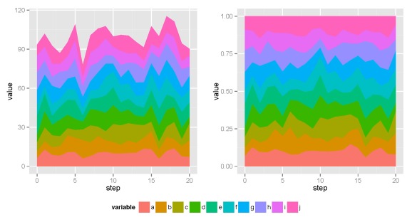
ggplot2 approach to plotting the data.Same plots, right? My function is practically useless given the tools in ggplot2. However, the plot.area function is completely independent, allowing for easy manipulation of the source code. I’ll leave it up to you to decide which approach is most useful.
-Marcus
1http://www.slate.com/blogs/the_vault/2013/08/12/the_1931_histomap_the_entire_history_of_the_world_distilled_into_a_single.html
2http://docs.ggplot2.org/current/geom_area.html

R-bloggers.com offers daily e-mail updates about R news and tutorials about learning R and many other topics. Click here if you're looking to post or find an R/data-science job.
Want to share your content on R-bloggers? click here if you have a blog, or here if you don't.