
Self-Organising Maps for Customer Segmentation using R
Want to share your content on R-bloggers? click here if you have a blog, or here if you don't.
Self-Organising Maps (SOMs) are an unsupervised data visualisation technique that can be used to visualise high-dimensional data sets in lower (typically 2) dimensional representations. In this post, we examine the use of R to create a SOM for customer segmentation. The figures shown here used use the 2011 Irish Census information for the greater Dublin area as an example data set. This work is based on a talk given to the Dublin R Users group in January 2014.
If you are keen to get down to business:
 The slides from a talk on this subject that I gave to the Dublin R Users group in January 2014 are available here
- The code for the Dublin Census data example is available for download from here.(zip file containing code and data – filesize 25MB)

SOMs were first described by Teuvo Kohonen in Finland in 1982, and Kohonen’s work in this space has made him the most cited Finnish scientist in the world. Typically, visualisations of SOMs are colourful 2D diagrams of ordered hexagonal nodes.
The SOM Grid
SOM visualisation are made up of multiple “nodes”. Each node vector has:
- A fixed position on the SOM grid
- A weight vector of the same dimension as the input space. (e.g. if your input data represented people, it may have variables “age”, “sex”, “height” and “weight”, each node on the grid will also have values for these variables)
- Associated samples from the input data. Each sample in the input space is “mapped” or “linked” to a node on the map grid. One node can represent several input samples.
The key feature to SOMs is that the topological features of the original input data are preserved on the map. What this means is that similar input samples (where similarity is defined in terms of the input variables (age, sex, height, weight)) are placed close together on the SOM grid. For example, all 55 year old females that are appoximately 1.6m in height will be mapped to nodes in the same area of the grid. Taller and smaller people will be mapped elsewhere, taking all variables into account. Tall heavy males will be closer on the map to tall heavy females than small light males as they are more “similar”.
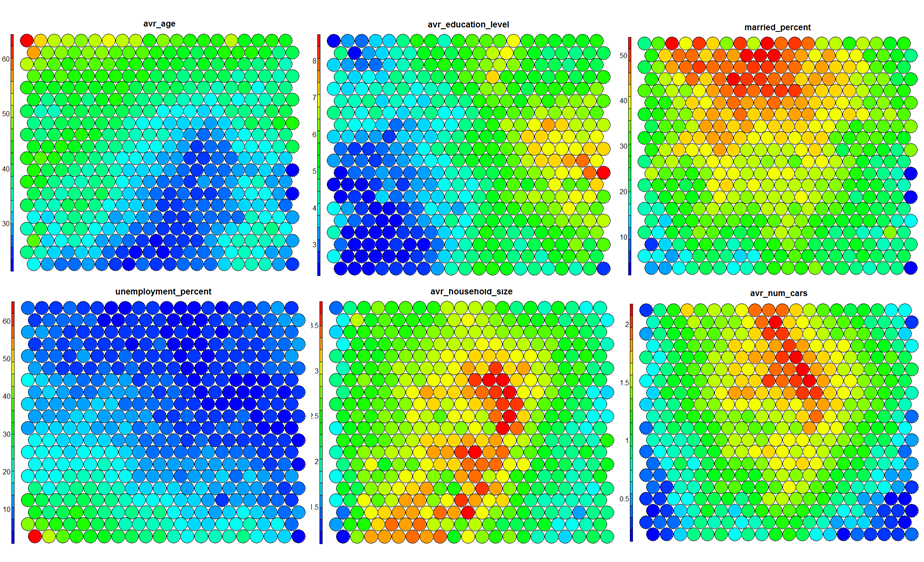
SOM Heatmaps
Typical SOM visualisations are of “heatmaps”. A heatmap shows the distribution of a variable across the SOM. If we imagine our SOM as a room full of people that we are looking down upon, and we were to get each person in the room to hold up a coloured card that represents their age – the result would be a SOM heatmap. People of similar ages would, ideally, be aggregated in the same area. The same can be repeated for age, weight, etc. Visualisation of different heatmaps allows one to explore the relationship between the input variables.
The figure below demonstrates the relationship between average education level and unemployment percentage using two heatmaps. The SOM for these diagrams was generated using areas around Ireland as samples.

SOM Algorithm
The algorithm to produce a SOM from a sample data set can be summarised as follows:
- Select the size and type of the map. The shape can be hexagonal or square, depending on the shape of the nodes your require. Typically, hexagonal grids are preferred since each node then has 6 immediate neighbours.
- Initialise all node weight vectors randomly.
- Choose a random data point from training data and present it to the SOM.
- Find the “Best Matching Unit” (BMU) in the map – the most similar node. Similarity is calculated using the Euclidean distance formula.
- Determine the nodes within the “neighbourhood” of the BMU.
– The size of the neighbourhood decreases with each iteration. - Adjust weights of nodes in the BMU neighbourhood towards the chosen datapoint.
– The learning rate decreases with each iteration.
– The magnitude of the adjustment is proportional to the proximity of the node to the BMU. - Repeat Steps 2-5 for N iterations / convergence.
Sample equations for each of the parameters described here are given on Slideshare.
SOMs in R
Training
The “kohonen” package is a well-documented package in R that facilitates the creation and visualisation of SOMs. To start, you will only require knowledge of a small number of key functions, the general process in R is as follows (see the presentation slides for further details):
# Load the kohonen package
require(kohonen)

# Create a training data set (rows are samples, columns are variables
# Here I am selecting a subset of my variables available in "data"
data_train <- data[, c(2,4,5,8)]

# Change the data frame with training data to a matrix
# Also center and scale all variables to give them equal importance during
# the SOM training process.
data_train_matrix <- as.matrix(scale(data_train))

# Create the SOM Grid - you generally have to specify the size of the
# training grid prior to training the SOM. Hexagonal and Circular
# topologies are possible
som_grid <- somgrid(xdim = 20, ydim=20, topo="hexagonal")

# Finally, train the SOM, options for the number of iterations,
# the learning rates, and the neighbourhood are available
som_model <- som(data_train_matrix,
		grid=som_grid,
		rlen=100,
		alpha=c(0.05,0.01),
		keep.data = TRUE,
		n.hood=“circular” )
Visualisation
The kohonen.plot function is used to visualise the quality of your generated SOM and to explore the relationships between the variables in your data set. There are a number different plot types available. Understanding the use of each is key to exploring your SOM and discovering relationships in your data.
- Training Progress:
As the SOM training iterations progress, the distance from each node’s weights to the samples represented by that node is reduced. Ideally, this distance should reach a minimum plateau. This plot option shows the progress over time. If the curve is continually decreasing, more iterations are required.
plot(som_model, type="changes")

- Node Counts
The Kohonen packages allows us to visualise the count of how many samples are mapped to each node on the map. This metric can be used as a measure of map quality – ideally the sample distribution is relatively uniform. Large values in some map areas suggests that a larger map would be benificial. Empty nodes indicate that your map size is too big for the number of samples. Aim for at least 5-10 samples per node when choosing map size.
plot(som_model, type="count")

- Neighbour Distance
Often referred to as the “U-Matrix”, this visualisation is of the distance between each node and its neighbours. Typically viewed with a grayscale palette, areas of low neighbour distance indicate groups of nodes that are similar. Areas with large distances indicate the nodes are much more dissimilar – and indicate natural boundaries between node clusters. The U-Matrix can be used to identify clusters within the SOM map.
plot(som_model, type="dist.neighbours")

- Codes / Weight vectors
The node weight vectors, or “codes”, are made up of normalised values of the original variables used to generate the SOM. Each node’s weight vector is representative / similar of the samples mapped to that node. By visualising the weight vectors across the map, we can see patterns in the distribution of samples and variables. The default visualisation of the weight vectors is a “fan diagram”, where individual fan representations of the magnitude of each variable in the weight vector is shown for each node. Other represenations are available, see the kohonen plot documentation for details.
plot(som_model, type="codes")

- Heatmaps
Heatmaps are perhaps the most important visualisation possible for Self-Organising Maps. The use of a weight space view as in (4) that tries to view all dimensions on the one diagram is unsuitable for a high-dimensional (>7 variable) SOM. A SOM heatmap allows the visualisation of the distribution of a single variable across the map. Typically, a SOM investigative process involves the creation of multiple heatmaps, and then the comparison of these heatmaps to identify interesting areas on the map. It is important to remember that the individual sample positions do not move from one visualisation to another, the map is simply coloured by different variables.
The default Kohonen heatmap is created by using the type “heatmap”, and then providing one of the variables from the set of node weights. In this case we visualise the average education level on the SOM.
plot(som_model, type = "property", property = som_model$codes[,4], main=names(som_model$data)[4], palette.name=coolBlueHotRed)

It should be noted that this default visualisation plots the normalised version of the variable of interest. A more intuitive and useful visualisation is of the variable prior to scaling, which involves some R trickery – using the aggregate function to regenerate the variable from the original training set and the SOM node/sample mappings. The result is scaled to the real values of the training variable (in this case, unemployment percent).
var <- 2 #define the variable to plot
var_unscaled <- aggregate(as.numeric(data_train[,var]), by=list(som_model$unit.classif), FUN=mean, simplify=TRUE)[,2]
plot(som_model, type = "property", property=var_unscaled, main=names(data_train)[var], palette.name=coolBlueHotRed)

It is noteworthy that these two heatmaps immediately show an inverse relationship between unemployment percent and education level in the areas around Dublin. Further heatmaps, visualised side by side, can be used to build up a picture of the different areas and their characteristics.


Clustering
Clustering can be performed on the SOM nodes to isolate groups of samples with similar metrics. Manual identification of clusters is completed by exploring the heatmaps for a number of variables and drawing up a “story” about the different areas on the map. An estimate of the number of clusters that would be suitable can be ascertained using a kmeans algorithm and examing for an “elbow-point” in the plot of “within cluster sum of squares”. The Kohonen package documentation shows how a map can be clustered using hierachical clustering. The results of the clustering can be visualised using the SOM plot function again.
mydata <- som_model$codes
wss <- (nrow(mydata)-1)*sum(apply(mydata,2,var))
for (i in 2:15) {
  wss[i] <- sum(kmeans(mydata, centers=i)$withinss)
}
plot(wss)
## use hierarchical clustering to cluster the codebook vectors som_cluster <- cutree(hclust(dist(som_model$codes)), 6) # plot these results: plot(som_model, type="mapping", bgcol = pretty_palette[som_cluster], main = "Clusters") add.cluster.boundaries(som_model, som_cluster)

Ideally, the clusters found are contiguous on the map surface. However, this may not be the case, depending on the underlying distribution of variables. To obtain contiguous cluster, a hierachical clustering algorithm can be used that only combines nodes that are similar AND beside each other on the SOM grid. However, hierachical clustering usually suffices and any outlying points can be accounted for manually.
The mean values and distributions of the training variables within each cluster are used to build a meaningful picture of the cluster characteristics. The clustering and visualisation procedure is typically an iterative process. Several SOMs are normally built before a suitable map is created. It is noteworthy that the majority of time used during the SOM development exercise will be in the visualisation of heatmaps and the determination of a good “story” that best explains the data variations.
Conclusions
Self-Organising Maps (SOMs) are another powerful tool to have in your data science repertoire. Advantages include: –
- Intuitive method to develop customer segmentation profiles.
- Relatively simple algorithm, easy to explain results to non-data scientists
- New data points can be mapped to trained model for predictive purposes.
Disadvantages include:
- Lack of parallelisation capabilities for VERY large data sets since the training data set is iterative
- Difficult to represent very many variables in two dimensional plane
- Requires clean, numeric data
Please do explore the slides and code (2014-01 SOM Example code_release.zip) from the talk for more detail. Contact me if you there are any problems running the example code etc.
R-bloggers.com offers daily e-mail updates about R news and tutorials about learning R and many other topics. Click here if you're looking to post or find an R/data-science job.
Want to share your content on R-bloggers? click here if you have a blog, or here if you don't.