
Results of the Readers’ Survey
[This article was first published on Fear and Loathing in Data Science, and kindly contributed to R-bloggers]. (You can report issue about the content on this page here)
Want to share your content on R-bloggers? click here if you have a blog, or here if you don't.
Want to share your content on R-bloggers? click here if you have a blog, or here if you don't.

The pleasant diversions of summer and the exigencies of work have precluded any effort on my part to work on the blog, but indeed there is no rest for the wicked and I feel compelled get this posted.
As a review, the questionnaire consisted of just 13 questions:
- Age
- Gender
- Education Level
- Employment Status
- Country
- Years of Experience Using R
- Ranking of Interest to See Blog Posts on Various Analysis Techniques (7-point Likert Scale)
- Feature Selection
- Text Mining
- Data Visualization
- Time Series
- Generalized Additive Models
- Interactive Maps
- Favorite Topic (select from a list or write in your preference)
Keep in mind that the questions were designed to see what I should focus on in future posts, not to be an all inclusive or exhaustive list of topics/techniques.
My intent is with this post is not to give a full review of the data, but to hit some highlights and to make the raw data available to anyone who wants to subject it to their own analysis. I hope to see other analyst’s thoughts and code.
The bottom line is that the clear winner for what readers want to see in the blog is Data Visualization. The other thing that both surprised and pleased me at the same time, is how global the blog readers are. The survey respondents were from 50 different countries! So, what I want to present here are some simple graphs and yes, visualizations, of the data I collected.
I will start out with the lattice package, move on to ggplot2, and conclude with some static maps. I’m still struggling with my preference over lattice and ggplot2. Maybe preference is not necessary and we can all learn to coexist? I’m leaning towards lattice with simple summaries and I think the code is easier overall. However, ggplot2 seems to be a little more flexible and powerful.
> library(lattice)
> attach(survey)
> table(gender) #why can’t base R have better tables?
gender
Female   Male
    28    329
> barchart(education, main="Education", xlab="Count") #barchart of education level
This basic barchart in lattice needs a couple of improvements, which is simple enough.  I want to change the  color of the bars to black and to sort the bars from high to low.  You can use the table and sort functions to    accomplish it.
> barchart(sort(table(education)), main="Education", xlab="Count", col="black")

There are a number of ways to examine a Likert  Scale.  It is quite common in market research to treat a Likert   Scale as continuous data instead of ordinal.  Another technique is to report the “top-two box”, coding the      data as a binary variable.  Below, I just look at the frequency bars of each of the questions in one plot using   ggplot2 and a function I copied from the excellent ebook by Winston Chang,
Cookbook for R, http://www.cookbook-r.com/ .
You can easily build a multiplot, first creating the individual plots:
> library(ggplot2)

> p1 = ggplot(survey, aes(x=feature.select)) + geom_bar(binwidth=0.5) + ggtitle("Feature Selection")               + theme(axis.title.x = element_blank()) + ylim(0,225)
> p2 = ggplot(survey, aes(x=text.mine)) + geom_bar(binwidth=0.5) + ggtitle("Text Mining")                                + theme(axis.title.x = element_blank()) + ylim(0,225)
> p3 = ggplot(survey, aes(x=data.vis)) + geom_bar(binwidth=0.5, fill="green") + ggtitle("Data Visualization)    + theme(axis.title.x = element_blank()) + ylim(0,225)
> p4 = ggplot(survey, aes(x=tseries)) + geom_bar(binwidth=0.5) + ggtitle("Time Series")                                     + theme(axis.title.x = element_blank()) + ylim(0,225)
> p5 = ggplot(survey, aes(x=gam)) + geom_bar(binwidth=0.5) + ggtitle("Generalized Additive Models")           + theme(axis.title.x = element_blank()) + ylim(0,225)
> p6 = ggplot(survey, aes(x=imaps)) + geom_bar(binwidth=0.5) + ggtitle("Interactive Maps")                             + theme(axis.title.x = element_blank()) + ylim(0,225)
Now, here is the function to create a multiplot:
> multiplot <- function(..., plotlist=NULL, file, cols=1, layout=NULL) {
+ require(grid)
+ # Make a list from the ... arguments and plotlist
+ plots <- c(list(...), plotlist)
+ numPlots = length(plots)
+ # If layout is NULL, then use 'cols' to determine layout
+ if (is.null(layout)) {
+ # Make the panel
+ # ncol: Number of columns of plots
+ # nrow: Number of rows needed, calculated from # of cols
+ layout <- matrix(seq(1, cols * ceiling(numPlots/cols)),
+ ncol = cols, nrow = ceiling(numPlots/cols))
+ }
+ if (numPlots==1) {
+ print(plots[[1]])
+ } else {
+ # Set up the page
+ grid.newpage()
+ pushViewport(viewport(layout = grid.layout(nrow(layout), ncol(layout))))
+ # Make each plot, in the correct location
+ for (i in 1:numPlots) {
+ # Get the i,j matrix positions of the regions that contain this subplot
+ matchidx <- as.data.frame(which(layout == i, arr.ind = TRUE))
+ print(plots[[i]], vp = viewport(layout.pos.row = matchidx$row,
+ layout.pos.col = matchidx$col))
+ }
+ }
+ }
And now, we can compare the 6 variables on one plot with one line of code with the clear winner data              visualization.
> multiplot(p1, p2, p3, p4, p5, p6, cols=3)
The last thing I will cover in this post is how to do maps of the data on a global scale and compare two packages: rworldmap and googleVis.
> library(rworldmap)
> #prepare the country data
> df = data.frame(table(country))
> #join data to map
> join = joinCountryData2Map(df, joinCode=”NAME”, nameJoinColumn=”country”, suggestForFailedCodes=TRUE) #one country observation was missing
> par(mai=c(0,0,0.2,0),xaxs=”i”,yaxs=”i”) #enables a proper plot
This code takes the log of the observations. Without the log values a map was produced that was of no value. It also adjusts the size of the Legend as the default seems too large in comparison with the map.
> map = mapCountryData( join, nameColumnToPlot=”Freq”, catMethod=”logFixedWidth”, addLegend=FALSE)
> do.call( addMapLegend, c(map, legendWidth=0.5, legendMar = 2))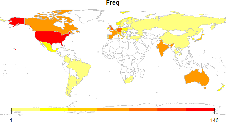

That's it for now. I absolutely love working with data visualization on maps and will continue to try and incorporate them in future analysis. I can't wait to brutally overindulge and sink my teeth into the ggmap package. Until next time, Mahalo.
To leave a comment for the author, please follow the link and comment on their blog: Fear and Loathing in Data Science.
R-bloggers.com offers daily e-mail updates about R news and tutorials about learning R and many other topics. Click here if you're looking to post or find an R/data-science job.
Want to share your content on R-bloggers? click here if you have a blog, or here if you don't.