
Visualizing the relationship between multiple variables
Want to share your content on R-bloggers? click here if you have a blog, or here if you don't.
Visualizing the relationship between multiple variables can get messy very quickly. This post is about how the ggpairs() function in the GGally package does this task, as well as my own method for visualizing pairwise relationships when all the variables are categorical.
For all the code in this post in one file, click here.
The GGally::ggpairs() function does a really good job of visualizing the pairwise relationship for a group of variables. Let’s demonstrate this on a small segment of the vehicles dataset from the fueleconomy package:
library(fueleconomy)
data(vehicles)
df <- vehicles[1:100, ]
str(df)
# Classes ‘tbl_df’, ‘tbl’ and 'data.frame':	100 obs. of  12 variables:
#     $ id   : int  27550 28426 27549 28425 1032 1033 3347 13309 13310 13311 ...
# $ make : chr  "AM General" "AM General" "AM General" "AM General" ...
# $ model: chr  "DJ Po Vehicle 2WD" "DJ Po Vehicle 2WD" "FJ8c Post Office" "FJ8c Post Office" ...
# $ year : int  1984 1984 1984 1984 1985 1985 1987 1997 1997 1997 ...
# $ class: chr  "Special Purpose Vehicle 2WD" "Special Purpose Vehicle 2WD" "Special Purpose Vehicle 2WD" "Special Purpose Vehicle 2WD" ...
# $ trans: chr  "Automatic 3-spd" "Automatic 3-spd" "Automatic 3-spd" "Automatic 3-spd" ...
# $ drive: chr  "2-Wheel Drive" "2-Wheel Drive" "2-Wheel Drive" "2-Wheel Drive" ...
# $ cyl  : int  4 4 6 6 4 6 6 4 4 6 ...
# $ displ: num  2.5 2.5 4.2 4.2 2.5 4.2 3.8 2.2 2.2 3 ...
# $ fuel : chr  "Regular" "Regular" "Regular" "Regular" ...
# $ hwy  : int  17 17 13 13 17 13 21 26 28 26 ...
# $ cty  : int  18 18 13 13 16 13 14 20 22 18 ...
Let’s see how GGally::ggpairs() visualizes relationships between quantitative variables:
library(GGally)
quant_df <- df[, c("cyl", "hwy", "cty")]
ggpairs(quant_df)
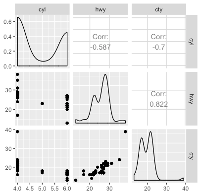
- Along the diagonal, we see a density plot for each of the variables.
- Below the diagonal, we see scatterplots for each pair of variables.
- Above the diagonal, we see the (Pearson) correlation between each pair of variables.
The visualization changes a little when we have a mix of quantitative and categorical variables. Below, fuel is a categorical variable while hwy is a quantitative variable.
mixed_df <- df[, c("fuel", "hwy")]
ggpairs(mixed_df)
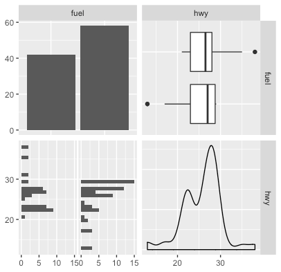
- For a categorical variable on the diagonal, we see a barplot depicting the number of times each category appears.
- In one of the corners (top-right), for each categorical value we have a boxplot for the quantitative variable.
- In one of the corners (bottom-left), for each categorical value we have a histogram for the quantitative variable.
The only behavior for GGally::ggpairs() we haven’t observed yet is for a pair of categorical variables. In the code fragment below, all 3 variables are categorical:
cat_df <- df[, c("fuel", "make", "drive")]
ggpairs(cat_df)
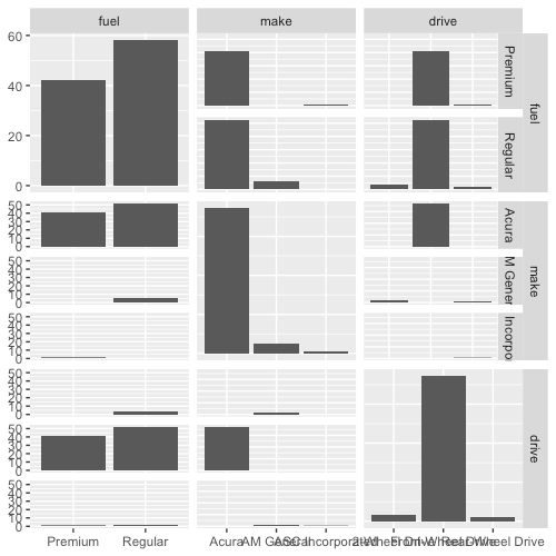
For each pair of categorical variables, we have a barplot depicting the number of times each pair of categorical values appears.
You may have noticed that the plots above the diagonal are essentially transposes of the plot below the diagonal, and so they don’t really convey any more information. What follows below is my attempt to make the plots above the diagonal more useful. Instead of plotting the transpose barplot, I will plot a heatmap showing the relative proportion of observations having each pair of categorical values.
First, the scaffold for the plot. I will use the gridExtra package to put several ggplot2 objects together. The code below puts the same barplots below the diagonal, variable names along the diagonal, and empty canvases above the diagonal. (Notice that I need some tricks to make the barplots with the variables as strings, namely the use of aes_string() and as.formula() within facet_grid().)
library(gridExtra)
library(tidyverse)
grobs <- list()
idx <- 0
for (i in 1:ncol(cat_df)) {
    for (j in 1:ncol(cat_df)) {
        idx <- idx + 1

        # get feature names (note that i & j are reversed)
        x_feat <- names(cat_df)[j]
        y_feat <- names(cat_df)[i]

        if (i < j) {
            # empty canvas
            grobs[[idx]] <- ggplot() + theme_void()
        } else if (i == j) {
            # just the name of the variable
            label_df <- data.frame(x = -0, y = 0, label = x_feat)
            grobs[[idx]] <- ggplot(label_df, aes(x = x, y = y, label = label),
                                   fontface = "bold", hjust = 0.5) +
                geom_text() +
                coord_cartesian(xlim = c(-1, 1), ylim = c(-1, 1)) +
                theme_void()
        }
        else {
            # 2-dimensional barplot
            grobs[[idx]] <- ggplot(cat_df, aes_string(x = x_feat)) +
                geom_bar() +
                facet_grid(as.formula(paste(y_feat, "~ ."))) +
                theme(legend.position = "none", axis.title = element_blank())
        }
    }
}
grid.arrange(grobs = grobs, ncol = ncol(cat_df))
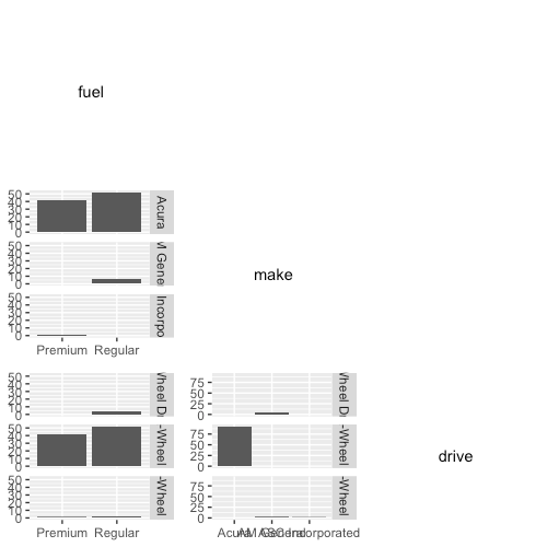
This is essentially showing the same information as GGally::ggpairs(). To add the frequency proportion heatmaps, replace the code in the (i < j) branch with the following:
# frequency proportion heatmap
# get frequency proportions
freq_df <- cat_df %>%
    group_by_at(c(x_feat, y_feat)) %>%
    summarize(proportion = n() / nrow(cat_df)) %>%
    ungroup()

# get all pairwise combinations of values
temp_df <- expand.grid(unique(cat_df[[x_feat]]),
                       unique(cat_df[[y_feat]]))
names(temp_df) <- c(x_feat, y_feat)

# join to get frequency proportion
temp_df <- temp_df %>%
    left_join(freq_df, by = c(setNames(x_feat, x_feat),
                              setNames(y_feat, y_feat))) %>%
    replace_na(list(proportion = 0))

grobs[[idx]] <- ggplot(temp_df, aes_string(x = x_feat, y = y_feat)) +
    geom_tile(aes(fill = proportion)) +
    geom_text(aes(label = sprintf("%0.2f", round(proportion, 2)))) +
    scale_fill_gradient(low = "white", high = "#007acc") +
    theme(legend.position = "none", axis.title = element_blank())

Notice that each heatmap has its own limits for the color scale. If you want to have the same color scale for all the plots, you can add limits = c(0, 1) to the scale_fill_gradient() layer of the plot.
The one thing we lose here over the GGally::ggpairs() version is the marginal barplot for each variable. This is easy to add but then we don’t really have a place to put the variable names. Replacing the code in the (i == j) branch with the following is one possible option.
# df for positioning the variable name
label_df <- data.frame(x = 0.5 + length(unique(cat_df[[x_feat]])) / 2,
                       y = max(table(cat_df[[x_feat]])) / 2, label = x_feat)
# marginal barplot with variable name on top
grobs[[idx]] <- ggplot(cat_df, aes_string(x = x_feat)) +
    geom_bar() +
    geom_label(data = label_df, aes(x = x, y = y, label = label),
               size = 5)

In this final version, we clean up some of the axes so that more of the plot space can be devoted to the plot itself, not the axis labels:
theme_update(legend.position = "none", axis.title = element_blank())

grobs <- list()
idx <- 0
for (i in 1:ncol(cat_df)) {
    for (j in 1:ncol(cat_df)) {
        idx <- idx + 1

        # get feature names (note that i & j are reversed)
        x_feat <- names(cat_df)[j]
        y_feat <- names(cat_df)[i]

        if (i < j) {
            # frequency proportion heatmap
            # get frequency proportions
            freq_df <- cat_df %>%
                group_by_at(c(x_feat, y_feat)) %>%
                summarize(proportion = n() / nrow(cat_df)) %>%
                ungroup()

            # get all pairwise combinations of values
            temp_df <- expand.grid(unique(cat_df[[x_feat]]),
                                   unique(cat_df[[y_feat]]))
            names(temp_df) <- c(x_feat, y_feat)

            # join to get frequency proportion
            temp_df <- temp_df %>%
                left_join(freq_df, by = c(setNames(x_feat, x_feat),
                                          setNames(y_feat, y_feat))) %>%
                replace_na(list(proportion = 0))

            grobs[[idx]] <- ggplot(temp_df, aes_string(x = x_feat, y = y_feat)) +
                geom_tile(aes(fill = proportion)) +
                geom_text(aes(label = sprintf("%0.2f", round(proportion, 2)))) +
                scale_fill_gradient(low = "white", high = "#007acc") +
                theme(axis.ticks = element_blank(), axis.text = element_blank())
        } else if (i == j) {
            # df for positioning the variable name
            label_df <- data.frame(x = 0.5 + length(unique(cat_df[[x_feat]])) / 2,
                                   y = max(table(cat_df[[x_feat]])) / 2, label = x_feat)
            # marginal barplot with variable name on top
            grobs[[idx]] <- ggplot(cat_df, aes_string(x = x_feat)) +
                geom_bar() +
                geom_label(data = label_df, aes(x = x, y = y, label = label),
                           size = 5)
        }
        else {
            # 2-dimensional barplot
            grobs[[idx]] <- ggplot(cat_df, aes_string(x = x_feat)) +
                geom_bar() +
                facet_grid(as.formula(paste(y_feat, "~ ."))) +
                theme(axis.ticks.x = element_blank(), axis.text.x = element_blank())
        }
    }
}
grid.arrange(grobs = grobs, ncol = ncol(cat_df))

R-bloggers.com offers daily e-mail updates about R news and tutorials about learning R and many other topics. Click here if you're looking to post or find an R/data-science job.
Want to share your content on R-bloggers? click here if you have a blog, or here if you don't.