
Visualizing Tennis Grand Slam Winners Performances
Want to share your content on R-bloggers? click here if you have a blog, or here if you don't.
Data visualization of sports historical results is one of the means by which champions strengths and weaknesses comparison can be outlined. In this tutorial, we show what plots flavors may help in champions performances comparison, timeline visualization, player-to-player and player-to-tournament relationships. We are going to use the Tennis Grand Slam Tournaments results as outlined by the ESP site at: ESPN site tennis history table and which has been made available as tab-delimited file at the following link: tennis-grand-slam-winners
Our analysis shall involve basic dataset manipulation as well. Overall, we are going to take advantage of the following R packages:
library(ggplot2) #for barplots
library(gplots) #for heatmaps
library(RColorBrewer) #for palettes
library(dplyr) #for dataset manipulation
library(knitr) #for neaty dataset printing
library(timelineS) #for timeline plot
library(circlize) #for chord-diagrams
library(fmsb) #for radar plots
Analysis
Loading R libraries and importing the Tennis Grand Slam Winners dataset.
library_toload <- c("dplyr", "knitr", "ggplot2", "gplots", "RColorBrewer", "timelineS", "circlize", "fmsb")
invisible(lapply(library_toload, function(x) {suppressPackageStartupMessages(library(x, character.only=TRUE))}))

url_file <- "https://datascienceplus.com/wp-content/uploads/2017/04/tennis-grand-slam-winners.txt"
slam_win <- read.delim(url(url_file), sep="\t", stringsAsFactors = FALSE)
kable(head(slam_win, 20))
| YEAR|TOURNAMENT      |WINNER         |RUNNER.UP      |
|----:|:---------------|:--------------|:--------------|
| 2017|Australian Open |Roger Federer  |Rafael Nadal   |
| 2016|U.S. Open       |Stan Wawrinka  |Novak Djokovic |
| 2016|Wimbledon       |Andy Murray    |Milos Raonic   |
| 2016|French Open     |Novak Djokovic |Andy Murray    |
| 2016|Australian Open |Novak Djokovic |Andy Murray    |
| 2015|U.S. Open       |Novak Djokovic |Roger Federer  |
| 2015|Wimbledon       |Novak Djokovic |Roger Federer  |
| 2015|French Open     |Stan Wawrinka  |Novak Djokovic |
| 2015|Australian Open |Novak Djokovic |Andy Murray    |
| 2014|U.S. Open       |Marin Cilic    |Kei Nishikori  |
| 2014|Wimbledon       |Novak Djokovic |Roger Federer  |
| 2014|French Open     |Rafael Nadal   |Novak Djokovic |
| 2014|Australian Open |Stan Wawrinka  |Rafael Nadal   |
| 2013|U.S. Open       |Rafael Nadal   |Novak Djokovic |
| 2013|Wimbledon       |Andy Murray    |Novak Djokovic |
| 2013|French Open     |Rafael Nadal   |David Ferrer   |
| 2013|Australian Open |Novak Djokovic |Andy Murray    |
| 2012|U.S. Open       |Andy Murray    |Novak Djokovic |
| 2012|Wimbledon       |Roger Federer  |Andy Murray    |
| 2012|French Open     |Rafael Nadal   |Novak Djokovic |
A minor fix to the tournaments data column is needed to have same naming for the Australian Open tournament.
slam_win[grep("Australian Open", slam_win$TOURNAMENT), "TOURNAMENT"] = "Australian Open"
Barplot
Grouping by winner and summarising the number of wins are preliminary steps in order to compute a table where each champion name is associated to his own number of Tennis Grand Slam wins.
slam_top_chart = slam_win %>% group_by(WINNER) %>% summarise(NUM_WINS=n()) %>% arrange(desc(NUM_WINS))
kable(head(slam_top_chart, 40))
|WINNER            | NUM_WINS|
|:-----------------|--------:|
|Roger Federer     |       18|
|Pete Sampras      |       14|
|Rafael Nadal      |       14|
|Novak Djokovic    |       12|
|Roy Emerson       |       12|
|Bjorn Borg        |       11|
|Rod Laver         |       11|
|William T. Tilden |       10|
|Andre Agassi      |        8|
|Fred Perry        |        8|
|Henri Cochet      |        8|
|Ivan Lendl        |        8|
|Jimmy Connors     |        8|
|Ken Rosewall      |        8|
|Max Decugis       |        8|
|William A. Larned |        8|
|John McEnroe      |        7|
|John Newcombe     |        7|
|Mats Wilander     |        7|
|Rene Lacoste      |        7|
|Richard D. Sears  |        7|
|William Renshaw   |        7|
|Boris Becker      |        6|
|Donald Budge      |        6|
|Stefan Edberg     |        6|
|Frank Sedgman     |        5|
|Jack Crawford     |        5|
|Jean Borotra      |        5|
|Laurie Doherty    |        5|
|Tony Trabert      |        5|
|Andre Vacherot    |        4|
|Anthony Wilding   |        4|
|Ashley J. Cooper  |        4|
|Frank Parker      |        4|
|Guillermo Vilas   |        4|
|Jim Courier       |        4|
|Lewis Hoad        |        4|
|Manuel Santana    |        4|
|Pat O'Hara Wood   |        4|
|Paul Ayme         |        4|
To graphically introduce such table, a barplot reporting winners ordered by their number of wins is suggestable. In that way, we can evaluate the players performance from the absolute perspective and relative to each other. Our barplot involves the champions who won at least four Tennis Grand Slam tournaments.
slam_top_chart$WINNER <- factor(slam_top_chart$WINNER, levels = slam_top_chart$WINNER[order(slam_top_chart$NUM_WINS)])
top_winners_gt4 = slam_top_chart %>% filter(NUM_WINS >= 4)
the_colours = c("#FF4000FF", "#FF8000FF", "#FFFF00FF", "#80FF00FF",
                "#00FF00FF", "#00FF80FF", "#00FFFFFF", "#0080FFFF",
                "#FF00FFFF", "#000000FF", "#0000FFFF")
ggplot(data=top_winners_gt4, aes(x=WINNER, y=NUM_WINS, fill=NUM_WINS)) +
  geom_bar(stat='identity') + coord_flip() + guides(fill=FALSE) +
  scale_fill_gradientn(colours = the_colours)
Please, click on the picture to enlarge.

Further, to facilitate comparison of champions’ performances for each specific tournament, the grouping by TOURNAMENT and WINNER is necessary.
slam_top_chart_by_trn = slam_win %>% filter(WINNER %in% top_winners_gt4$WINNER) %>% group_by(TOURNAMENT, WINNER) %>% summarise(NUM_WINS=n()) %>% arrange(desc(NUM_WINS))
slam_top_chart_by_trn$NUM_WINS <- factor(slam_top_chart_by_trn$NUM_WINS)
kable(head(slam_top_chart_by_trn, 10))
|TOURNAMENT      |WINNER            |NUM_WINS |
|:---------------|:-----------------|:--------|
|French Open     |Rafael Nadal      |9        |
|French Open     |Max Decugis       |8        |
|U.S. Open       |William A. Larned |8        |
|U.S. Open       |Richard D. Sears  |7        |
|U.S. Open       |William T. Tilden |7        |
|Wimbledon       |Pete Sampras      |7        |
|Wimbledon       |Roger Federer     |7        |
|Wimbledon       |William Renshaw   |7        |
|Australian Open |Novak Djokovic    |6        |
|Australian Open |Roy Emerson       |6        |
To obtain the required barplot flavor, we take specifically advantage of the discrete scale for y axis and the facet_grid based on the TOURNAMENT field.
ggplot(data=slam_top_chart_by_trn, aes(x=WINNER, y=NUM_WINS, fill=NUM_WINS)) +
  geom_bar(stat='identity') + coord_flip() + guides(fill=FALSE) + scale_y_discrete() +
  facet_grid(. ~ TOURNAMENT)
Please, click on the picture to enlarge.

Heatmap
To highlight how many times champions met each other on Grand Slam tournament finals, we may take advantage of an heatmap. The heatmap rows and columns entries are populated with champions names and each cell reports how many times such players met in the tournament final. A gradient colouring is used for better distinguishing the number of wins. We are going to take advantage of the heatmap.2() function made available by the gplots package which provides some more options with respect heatmap(). We consider the fifty most recent sport events.
tl_rec <- 1:50
winner_runnerup <- slam_win[tl_rec, c("WINNER", "RUNNER.UP")]
winner_runnerup_names <- unique(c(winner_runnerup[,1], winner_runnerup[,2]))

match_matrix <- matrix(0, nrow=length(winner_runnerup_names),
                       ncol=length(winner_runnerup_names))
colnames(match_matrix) <- winner_runnerup_names
rownames(match_matrix) <- winner_runnerup_names

for(i in 1:nrow(winner_runnerup)) {
  winner <- winner_runnerup[i, "WINNER"]
  runner_up <- winner_runnerup[i, "RUNNER.UP"]
  r <- which(rownames(match_matrix) == winner)
  c <- which(colnames(match_matrix) == runner_up)

  match_matrix[r,c] <- match_matrix[r,c] + 1
  match_matrix[c,r] <- match_matrix[c,r] + 1
}

diag(match_matrix) <- NA
That matrix reporting the counting of players’ pairs finals can be used as heatmap.2 function input.
my_palette <- colorRampPalette(c("green", "yellow", "red"))(n = 299)
col_breaks = c(seq(0, 0.99, length=100),  # for green
               seq(1, 5, length=100),     # for yellow
               seq(5.01, 10, length=100)) # for red
heatmap.2(match_matrix,
          cellnote = match_matrix,  # same data set for cell labels
          main = "Tennis Grand Slam Champions - Finals Match Heatmap", # heat map title
          notecol = "black",      # change font color of cell labels to black
          density.info = "none",  # turns off density plot inside color legend
          trace = "none",         # turns off trace lines inside the heat map
          margins = c(12,9),     # widens margins around plot
          col= my_palette,       # use on color palette defined earlier
          breaks = col_breaks,    # enable color transition at specified limits
          dendrogram = "none",     # only draw a row dendrogram
          Colv = "NA")
Please, click on the picture to enlarge.

Dendrogram plot
In case we would like to group champions based on some specific similarity metric and show the result, we can take advantage of the dendrogram plot. So, considering the first twenty champions of our top list as determined in previous steps, we get the following table:
ch_n <- 1:20
kable(slam_top_chart[ch_n,])
|WINNER            | NUM_WINS|
|:-----------------|--------:|
|Roger Federer     |       18|
|Pete Sampras      |       14|
|Rafael Nadal      |       14|
|Novak Djokovic    |       12|
|Roy Emerson       |       12|
|Bjorn Borg        |       11|
|Rod Laver         |       11|
|William T. Tilden |       10|
|Andre Agassi      |        8|
|Fred Perry        |        8|
|Henri Cochet      |        8|
|Ivan Lendl        |        8|
|Jimmy Connors     |        8|
|Ken Rosewall      |        8|
|Max Decugis       |        8|
|William A. Larned |        8|
|John McEnroe      |        7|
|John Newcombe     |        7|
|Mats Wilander     |        7|
|Rene Lacoste      |        7|
We specify an euclidean metrics distance for clustering based on champions’ wins. Groups are determined based on wins difference equal to two, (see h_value parameter).
wins <- slam_top_chart[ch_n, -1]
d_wins <- dist(wins, method = "euclidean")
hclust_fit <- hclust(d_wins)
h_value <- 2
groups <- cutree(hclust_fit, h = h_value)
plot(hclust_fit, labels = slam_top_chart$WINNER[ch_n], main = "Champions Dendrogram")
rect.hclust(hclust_fit, h = h_value, border = "blue")
Please, click on the picture to enlarge.

Timeline plot
The timeline plot may be the right choice to highlight how the wins sequence happened. Our timeline plot shows winners’ names together with tournaments and calendar dates. All that considering the twenty most recent results. The year column data is enhanced to match the date format.
year_to_date_trnm <- function(the_year, the_trnm) {
  the_date <- NULL
  if (the_trnm == "Australian Open") {
    the_date <- (paste(the_year, "-01-31", sep=""))
  } else if (the_trnm == "French Open") {
    the_date <- (paste(the_year, "-06-15", sep=""))
  } else if (the_trnm == "Wimbledon") {
    the_date <- (paste(the_year, "-07-15", sep=""))
  } else if (the_trnm == "U.S. Open") {
    the_date <- (paste(the_year, "-09-07", sep=""))
  }
  the_date
}

slam_win$YEAR_DATE <- as.Date(mapply(year_to_date_trnm, slam_win$YEAR, slam_win$TOURNAMENT), format="%Y-%m-%d")
tl_rec <- 1:20
timelineS(slam_win[tl_rec, c("WINNER", "YEAR_DATE")], line.color = "red", scale.font = 3,
          scale = "month", scale.format = "%Y", label.cex = 0.7, buffer.days = 100,
          labels = paste(slam_win[tl_rec, "WINNER"], slam_win[tl_rec, "TOURNAMENT"]))
Please, click on the picture to enlarge.

Chord Diagram
Suppose you want to highlight for relationship between champions and tournaments wins while having an idea of the reciprocal strength in that. The chord diagram may be a good solution for such purpose. Herein below, we filter out a dataset where champions with more than ten Grand Slam tournaments wins are encompassed.
top_winners_gt10 = slam_top_chart %>% filter(NUM_WINS > 10)
kable(head(top_winners_gt10))
|WINNER         | NUM_WINS|
|:--------------|--------:|
|Roger Federer  |       18|
|Pete Sampras   |       14|
|Rafael Nadal   |       14|
|Novak Djokovic |       12|
|Roy Emerson    |       12|
|Bjorn Borg     |       11|
We then take advantage of an inner join between the Grand Slam dataset we started with and the list above. Further, the grouping by tournament and winner and the computation of total wins per tournament gives the following table.
slam_win_cnt = inner_join(slam_win, top_winners_gt10) %>% select(TOURNAMENT, WINNER) %>%
  group_by(WINNER, TOURNAMENT) %>% summarise(NUM_WINS = n()) %>% arrange(TOURNAMENT, desc(NUM_WINS))
kable(slam_win_cnt)
|WINNER         |TOURNAMENT      | NUM_WINS|
|:--------------|:---------------|--------:|
|Novak Djokovic |Australian Open |        6|
|Roy Emerson    |Australian Open |        6|
|Roger Federer  |Australian Open |        5|
|Rod Laver      |Australian Open |        3|
|Pete Sampras   |Australian Open |        2|
|Rafael Nadal   |Australian Open |        1|
|Rafael Nadal   |French Open     |        9|
|Bjorn Borg     |French Open     |        6|
|Rod Laver      |French Open     |        2|
|Roy Emerson    |French Open     |        2|
|Novak Djokovic |French Open     |        1|
|Roger Federer  |French Open     |        1|
|Pete Sampras   |U.S. Open       |        5|
|Roger Federer  |U.S. Open       |        5|
|Novak Djokovic |U.S. Open       |        2|
|Rafael Nadal   |U.S. Open       |        2|
|Rod Laver      |U.S. Open       |        2|
|Roy Emerson    |U.S. Open       |        2|
|Pete Sampras   |Wimbledon       |        7|
|Roger Federer  |Wimbledon       |        7|
|Bjorn Borg     |Wimbledon       |        5|
|Rod Laver      |Wimbledon       |        4|
|Novak Djokovic |Wimbledon       |        3|
|Rafael Nadal   |Wimbledon       |        2|
|Roy Emerson    |Wimbledon       |        2|
The latter dataset is the input to the chordDiagram function.
chordDiagram(slam_win_cnt)
Please, click on the picture to enlarge.

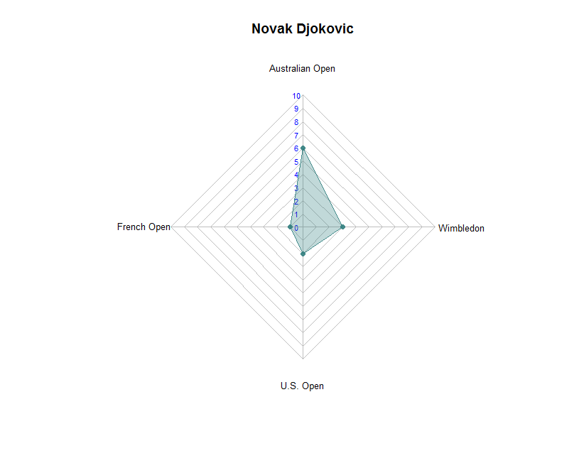
Radar plot
In case we want to highlight champions’ strengths and weaknesses in each specific Grand Slam tournament, a radar plot may be a good choice. Herein below, the radar plots associated to well known tennis champions are shown.
champion_radar_plot <- function(df, champion_name) {
  slam_win_cnt_chp = df %>% filter(WINNER == champion_name)
  chp_num_wins <- slam_win_cnt_chp$NUM_WINS
  l <- length(chp_num_wins)
  max_v <- 10 # choosing the same maximum value for all champions
  chp_df <- data.frame(rbind(max = rep(max_v, l), min = rep(0, l), chp_num_wins))
  colnames(chp_df) <- slam_win_cnt_chp$TOURNAMENT
  seg_n <- max_v
  radarchart(chp_df, axistype = 1, caxislabels = seq(0, max_v, 1), seg = seg_n,
             centerzero = TRUE, pcol = rgb(0.2, 0.5, 0.5, 0.9) , pfcol = rgb(0.2, 0.5, 0.5, 0.3),
             plwd = 1, cglcol = "grey", cglty = 1, axislabcol = "blue",
             vlcex = 0.8, calcex = 0.7, title = champion_name)

}

champion_radar_plot(slam_win_cnt, "Roger Federer")
Please, click on the picture to enlarge.

champion_radar_plot(slam_win_cnt, "Rafael Nadal")
Please, click on the picture to enlarge.

champion_radar_plot(slam_win_cnt, "Novak Djokovic")
Please, click on the picture to enlarge.
Conclusions
In this tutorial, we showed different flavors of plots capable to capture many insights of our Tennis Grand Slam tournaments dataset. By means of basic preliminary dataset manipulation and powerful plots, we obtained effective visualizations that can drive the audience attention right to the messages we want to deliver to.
If you have any questions, please feel free to comment below.
Related Post
- Plotting Data Online via Plotly and Python
- Using PostgreSQL and shiny with a dynamic leaflet map: monitoring trash cans
- Visualizing Streaming Data And Alert Notification with Shiny
- Metro Systems Over Time: Part 3
- Metro Systems Over Time: Part 2
R-bloggers.com offers daily e-mail updates about R news and tutorials about learning R and many other topics. Click here if you're looking to post or find an R/data-science job.
Want to share your content on R-bloggers? click here if you have a blog, or here if you don't.