
Visualizing classifier thresholds
Want to share your content on R-bloggers? click here if you have a blog, or here if you don't.
Lately I’ve been thinking a lot about the connection between prediction models and the decisions that they influence. There is a lot of theory around this, but communicating how the various pieces all fit together with the folks who will use and be impacted by these decisions can be challenging.
One of the important conceptual pieces is the link between the decision threshold (how high does the score need to be to predict positive) and the resulting distribution of outcomes (true positives, false positives, true negatives and false negatives). As a starting point, I’ve built this interactive tool for exploring this.
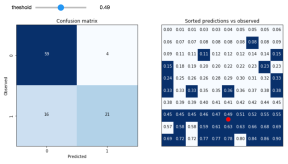
The idea is to take a validation sample of predictions from a model and experiment with the consequences of varying the decision threshold. The hope is that the user will be able to develop an intuition around the tradeoffs involved by seeing the link to the individual data points involved.
Code for this experiment is available here. I hope to continue to build on this with other interactive, visual tools aimed at demystifying the concepts at the interface between predictions and decisions.

R-bloggers.com offers daily e-mail updates about R news and tutorials about learning R and many other topics. Click here if you're looking to post or find an R/data-science job.
Want to share your content on R-bloggers? click here if you have a blog, or here if you don't.