
visualising bias and unbiasedness
Want to share your content on R-bloggers? click here if you have a blog, or here if you don't.

A question on X validated led me to wonder at the point made by Christopher Bishop in his Pattern Recognition and Machine Learning book about the MLE of the Normal variance being biased. As it is illustrated by the above graph that opposes the true and green distribution of the data (made of two points) against the estimated and red distribution. While it is true that the MLE under-estimates the variance on average, the pictures are cartoonist caricatures in their deviance permanence across three replicas. When looking at 10⁵ replicas, rather than three, and at samples of size 10, rather than 2, the distinction between using the MLE (left) and the unbiased estimator of σ² (right).
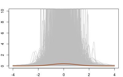
 When looking more specifically at the case n=2, the humongous variability of the density estimate completely dwarfs the bias issue:
 Even when averaging over all 10⁵ replications, the difference is hard to spot (and both estimations are more dispersed than the truth!):

R-bloggers.com offers daily e-mail updates about R news and tutorials about learning R and many other topics. Click here if you're looking to post or find an R/data-science job.
Want to share your content on R-bloggers? click here if you have a blog, or here if you don't.