Plotting lm and glm models with ggplot #rstats
Want to share your content on R-bloggers? click here if you have a blog, or here if you don't.
Update
I followed the advice from Tim’s comment and changed the scaling in the sjPlotOdds-function to logarithmic scaling. The screenshots below showing the plotted glm’s have been updated.
Summary
In this posting I will show how to plot results from linear and logistic regression models (lm and glm) with ggplot. As in my previous postings on ggplot, the main idea is to have a highly customizable function for representing data. You can download all my scripts from my script page.
The inspiration source
My following two functions are based on an idea which I saw at the Sustainable Research Blog. Actually, this was a kind of starting point for me to get started with R and learn more about its data visualization facilities. After playing around some time with ggplot, I built my own function based on the script posted at Sustainable Research.
Plotting odds ratios
Plotting odds ratios gives you mainly two display styles: bars or plots (dots). First, let me show you the dot-style. Assuming you have a glm-object (in my examples, it’s called logreg) and have loaded the function sjPlotOdds.R (see my script page for downloads), you can plot the results like this (I have used oddsLabels=lab , a vector with label-strings, which are used as axis-labels. If you leave out this parameter, the variable-names from the model will be taken.):
sjp.glm(logreg,
        axisLabels.y=lab,
        gridBreaksAt=0.4)
 1) in blue.” width=”300″ height=”214″ class=”size-medium wp-image-600″ />
Odds ratios as dots, with confidence intervals, “positive” effects (> 1) in blue.
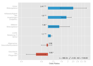
In the above example, if you do not specifiy axis limits, the boundaries will be calculated according to the lowest and highest confidence interval, thus fitting the diagram to the highest possible “zoom”. The next example demonstrates this with bar charts:
sjp.glm(logreg,
        axisLabels.y=lab,
        type="bars",
        gridBreaksAt=0.4)
Both diagrams contain model summaries in the lower right corner. You can change many visual parameters, for instance hiding the summary, changing bar colors, changing border or background colors, line and bar size etc.
If you dislike the grid bars to become narrower with increasing odds ratio values, you can use the transformTicks parameter, which uses exponential distances between the tick marks. This results in grid bars with (almost) equal distances. However, the tick values, of course, are accordingly set:
sjp.glm(logreg,
        axisLabels.y=lab,
        transformTicks=TRUE,
        gridBreaksAt=0.2,
        errorBarWidth=0,
        errorBarSize=1)
Plotting betas and standardized betas of linear regressions
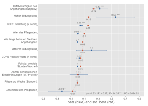
Quite similar is my function sjPlotLinreg.R which visualizes the results of linear regressions. Thus, it requires a lm-object.
sjp.lm(linreg,
       axisLimits=c(-0.5, 0.9),
       axisTitle.x="beta (blue) and std. beta (red)",
       sort="std",
       axisLabels.y=lab,
       axisLabelSize=1,
       breakLabelsAt=30)

Linear regression, with beta-values and confidence intervals (in blue) as well as standardized beta values (in red)
As you can see, I have used predictorLabelSize=1 and breakLabelsAt=30 due to the long variable labels. By default, each label at the left axis would break into more lines, thus being narrower and worse to read. Then I used sort=”std” to sort the predictors according to their standardized beta values (default would be ordering according to the beta values).
sjp.lm(linreg,
       axisLabels.y=lab,
       axisLabelSize=1,
       breakLabelsAt=30,
       showStandardBeta=FALSE)
The showStandardBeta=FALSE makes the red dots (standardized beta values) and their connecting line disappear.
sjp.lm(linreg,
        axisLabels.y=lab,
        axisLabelSize=1,
        breakLabelsAt=30,
        showValues=FALSE,
        showPValues=FALSE)
This last example shows how to hide the value labels inside the diagram, so you only have the dots for beta and standardized beta coefficients.
Last remark
In between I have also updated my other scripts. For instance, the sjPlotGroupFrequencies.R function can now also plot box plots or violin plots (see examples at the end of that posting). So make sure you have the latest version from my script page.
Tagged: ggplot, R, regression analysis, rstats, Statistik
R-bloggers.com offers daily e-mail updates about R news and tutorials about learning R and many other topics. Click here if you're looking to post or find an R/data-science job.
Want to share your content on R-bloggers? click here if you have a blog, or here if you don't.


