
Plotting individual observations and group means with ggplot2
Want to share your content on R-bloggers? click here if you have a blog, or here if you don't.
@drsimonj here to share my approach for visualizing individual observations with group means in the same plot. Here are some examples of what we’ll be creating:


I find these sorts of plots to be incredibly useful for visualizing and gaining insight into our data. We often visualize group means only, sometimes with the likes of standard errors bars. Alternatively, we plot only the individual observations using histograms or scatter plots. Separately, these two methods have unique problems. For example, we can’t easily see sample sizes or variability with group means, and we can’t easily see underlying patterns or trends in individual observations. But when individual observations and group means are combined into a single plot, we can produce some powerful visualizations.
General approach
Below is generic pseudo-code capturing the approach that we’ll cover in this post. Following this will be some worked examples of diving deeper into each component.
# Packages we need
library(ggplot2)
library(dplyr)

# Have an individual-observation data set
id

# Create a group-means data set
gd <- id %>%
        group_by(GROUPING-VARIABLES) %>%
        summarise(
          VAR1 = mean(VAR1),
          VAR2 = mean(VAR2),
          ...
        )

# Plot both data sets
ggplot(id, aes(GEOM-AESTHETICS)) +
  geom_*() +
  geom_*(data = gd)

# Adjust plot to effectively differentiate data layers
Tidyverse packages
Throughout, we’ll be using packages from the tidyverse: ggplot2 for plotting, and dplyr for working on the data. Let’s load these into our session:
library(ggplot2)
library(dplyr)
Group means on a single variable
To get started, we’ll examine the logic behind the pseudo code with a simple example of presenting group means on a single variable. Let’s use mtcars as our individual-observation data set, id:
id <- mtcars %>% tibble::rownames_to_column() %>% as_data_frame()
id
#> # A tibble: 32 × 12
#>              rowname   mpg   cyl  disp    hp  drat    wt  qsec    vs    am
#>                <chr> <dbl> <dbl> <dbl> <dbl> <dbl> <dbl> <dbl> <dbl> <dbl>
#> 1          Mazda RX4  21.0     6 160.0   110  3.90 2.620 16.46     0     1
#> 2      Mazda RX4 Wag  21.0     6 160.0   110  3.90 2.875 17.02     0     1
#> 3         Datsun 710  22.8     4 108.0    93  3.85 2.320 18.61     1     1
#> 4     Hornet 4 Drive  21.4     6 258.0   110  3.08 3.215 19.44     1     0
#> 5  Hornet Sportabout  18.7     8 360.0   175  3.15 3.440 17.02     0     0
#> 6            Valiant  18.1     6 225.0   105  2.76 3.460 20.22     1     0
#> 7         Duster 360  14.3     8 360.0   245  3.21 3.570 15.84     0     0
#> 8          Merc 240D  24.4     4 146.7    62  3.69 3.190 20.00     1     0
#> 9           Merc 230  22.8     4 140.8    95  3.92 3.150 22.90     1     0
#> 10          Merc 280  19.2     6 167.6   123  3.92 3.440 18.30     1     0
#> # ... with 22 more rows, and 2 more variables: gear <dbl>, carb <dbl>
Say we want to plot cars’ horsepower (hp), separately for automatic and manual cars (am). Let’s quickly convert am to a factor variable with proper labels:
id <- id %>% mutate(am = factor(am, levels = c(0, 1), labels = c("automatic", "manual")))
Using the individual observations, we can plot the data as points via:
ggplot(id, aes(x = am, y = hp)) +
  geom_point()

What if we want to visualize the means for these groups of points? We start by computing the mean horsepower for each transmission type into a new group-means data set (gd) as follows:
gd <- id %>%
        group_by(am) %>%
        summarise(hp = mean(hp))
gd
#> # A tibble: 2 × 2
#>          am       hp
#>      <fctr>    <dbl>
#> 1 automatic 160.2632
#> 2    manual 126.8462
There are a few important aspects to this:
- We group our individual observations by the categorical variable using
group_by(). - We
summarise()the variable as itsmean(). - We give the summarized variable the same name in the new data set. E.g.,
hp = mean(hp)results inhpbeing in both data sets.
We could plot these means as bars via:
ggplot(gd, aes(x = am, y = hp)) +
  geom_bar(stat = "identity")

The challenge now is to combine these plots.
As the base, we start with the individual-observation plot:
ggplot(id, aes(x = am, y = hp)) +
  geom_point()

Next, to display the group-means, we add a geom layer specifying data = gd. In this case, we’ll specify the geom_bar() layer as above:
ggplot(id, aes(x = am, y = hp)) +
  geom_point() +
  geom_bar(data = gd, stat = "identity")

Although there are some obvious problems, we’ve successfully covered most of our pseudo-code and have individual observations and group means in the one plot.
Before we address the issues, let’s discuss how this works. The main point is that our base layer (ggplot(id, aes(x = am, y = hp))) specifies the variables (am and hp) that are going to be plotted. By including id, it also means that any geom layers that follow without specifying data, will use the individual-observation data. Thus, geom_point() plots the individual points. geom_bar(), however, specifies data = gd, meaning it will try to use information from the group-means data. Because our group-means data has the same variables as the individual data, it can make use of the variables mapped out in our base ggplot() layer.
At this point, the elements we need are in the plot, and it’s a matter of adjusting the visual elements to differentiate the individual and group-means data and display the data effectively overall. Among other adjustments, this typically involves paying careful attention to the order in which the geom layers are added, and making heavy use of the alpha (transparency) values.
For example, we can make the bars transparent to see all of the points by reducing the alpha of the bars:
ggplot(id, aes(x = am, y = hp)) +
  geom_point() +
  geom_bar(data = gd, stat = "identity", alpha = .3)

Here’s a final polished version that includes:
- Color to the bars and points for visual appeal.
-
ggrepel::geom_text_repelto add car labels to each point. -
theme_bw()to clean the overall appearance. - Proper axis labels.
ggplot(id, aes(x = am, y = hp, color = am, fill = am)) +
  geom_bar(data = gd, stat = "identity", alpha = .3) +
  ggrepel::geom_text_repel(aes(label = rowname), color = "black", size = 2.5, segment.color = "grey") +
  geom_point() +
  guides(color = "none", fill = "none") +
  theme_bw() +
  labs(
    title = "Car horespower by transmission type",
    x = "Transmission",
    y = "Horsepower"
  )

Notice that, again, we can specify how variables are mapped to aesthetics in the base ggplot() layer (e.g., color = am), and this affects the individual and group-means geom layers because both data sets have the same variables.
Group means on two variables
Next, we’ll move to overlaying individual observations and group means for two continuous variables. This time we’ll use the iris data set as our individual-observation data:
id <- as_data_frame(iris)
id
#> # A tibble: 150 × 5
#>    Sepal.Length Sepal.Width Petal.Length Petal.Width Species
#>           <dbl>       <dbl>        <dbl>       <dbl>  <fctr>
#> 1           5.1         3.5          1.4         0.2  setosa
#> 2           4.9         3.0          1.4         0.2  setosa
#> 3           4.7         3.2          1.3         0.2  setosa
#> 4           4.6         3.1          1.5         0.2  setosa
#> 5           5.0         3.6          1.4         0.2  setosa
#> 6           5.4         3.9          1.7         0.4  setosa
#> 7           4.6         3.4          1.4         0.3  setosa
#> 8           5.0         3.4          1.5         0.2  setosa
#> 9           4.4         2.9          1.4         0.2  setosa
#> 10          4.9         3.1          1.5         0.1  setosa
#> # ... with 140 more rows
Let’s say we want to visualize the petal length and width for each iris Species.
Let’s create the group-means data set as follows:
gd <- id %>%
        group_by(Species) %>%
        summarise(Petal.Length = mean(Petal.Length),
                  Petal.Width  = mean(Petal.Width))
gd
#> # A tibble: 3 × 3
#>      Species Petal.Length Petal.Width
#>       <fctr>        <dbl>       <dbl>
#> 1     setosa        1.462       0.246
#> 2 versicolor        4.260       1.326
#> 3  virginica        5.552       2.026
We’ve now got the variable means for each Species in a new group-means data set, gd. The important point, as before, is that there are the same variables in id and gd.
Let’s prepare our base plot using the individual observations, id:
ggplot(id, aes(x = Petal.Length, y = Petal.Width)) +
  geom_point()

Let’s use the color aesthetic to distinguish the groups:
ggplot(id, aes(x = Petal.Length, y = Petal.Width, color = Species)) +
  geom_point()

Now we can add a geom that uses our group means. We’ll use geom_point() again:
ggplot(id, aes(x = Petal.Length, y = Petal.Width, color = Species)) +
  geom_point() +
  geom_point(data = gd)

Did it work? Well, yes, it did. The problem is that we can’t distinguish the group means from the individual observations because the points look the same. Again, we’ve successfully integrated observations and means into a single plot. The challenge now is to make various adjustments to highlight the difference between the data layers.
To do this, we’ll fade out the observation-level geom layer (using alpha) and increase the size of the group means:
ggplot(id, aes(x = Petal.Length, y = Petal.Width, color = Species)) +
  geom_point(alpha = .4) +
  geom_point(data = gd, size = 4)

Here’s a final polished version for you to play around with:
ggplot(id, aes(x = Petal.Length, y = Petal.Width, color = Species, shape = Species)) +
  geom_point(alpha = .4) +
  geom_point(data = gd, size = 4) +
  theme_bw() +
  guides(color = guide_legend("Species"),  shape = guide_legend("Species")) +
  labs(
    title = "Petal size of iris species",
    x = "Length",
    y = "Width"
  )

Repeated observations
One useful avenue I see for this approach is to visualize repeated observations. For example, colleagues in my department might want to plot depression levels measured at multiple time points for people who receive one of two types of treatment. Typically, they would present the means of the two groups over time with error bars. However, we can improve on this by also presenting the individual trajectories.
As an example, let’s examine changes in healthcare expenditure over five years (from 2001 to 2005) for countries in Oceania and the Europe.
Start by gathering our individual observations from my new ourworldindata package for R, which you can learn more about in a previous blogR post:
# Individual-observations data
library(ourworldindata)
id <- financing_healthcare %>%
        filter(continent %in% c("Oceania", "Europe") & between(year, 2001, 2005)) %>%
        select(continent, country, year, health_exp_total) %>%
        na.omit()
id
#> # A tibble: 275 × 4
#>    continent country  year health_exp_total
#>        <chr>   <chr> <int>            <dbl>
#> 1     Europe Albania  2001         198.2242
#> 2     Europe Albania  2002         225.1861
#> 3     Europe Albania  2003         236.3563
#> 4     Europe Albania  2004         263.5986
#> 5     Europe Albania  2005         276.6520
#> 6     Europe Andorra  2001        1432.2798
#> 7     Europe Andorra  2002        1564.6976
#> 8     Europe Andorra  2003        1601.0641
#> 9     Europe Andorra  2004        1661.5608
#> 10    Europe Andorra  2005        1793.9938
#> # ... with 265 more rows
Let’s plot these individual country trajectories:
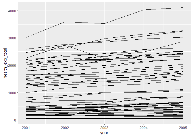
ggplot(id, aes(x = year, y = health_exp_total)) +
  geom_line()

Hmm, this doesn’t look like right. The problem is that we need to group our data by country:
ggplot(id, aes(x = year, y = health_exp_total, group = country)) +
  geom_line()
We now have a separate line for each country. Let’s color these depending on the world region (continent) in which they reside:
ggplot(id, aes(x = year, y = health_exp_total, group = country, color = continent)) +
  geom_line()

If we tried to follow our usual steps by creating group-level data for each world region and adding it to the plot, we would do something like this:
gd <- id %>%
        group_by(continent) %>%
        summarise(health_exp_total = mean(health_exp_total))

ggplot(id, aes(x = year, y = health_exp_total, group = country, color = continent)) +
  geom_line() +
  geom_line(data = gd)
This, however, will lead to a couple of errors, which are both caused by variables being called in the base ggplot() layer, but not appearing in our group-means data, gd.
First, we’re not taking year into account, but we want to! In this case, year must be treated as a second grouping variable, and included in the group_by command. Thus, to compute the relevant group-means, we need to do the following:
gd <- id %>%
        group_by(continent, year) %>%
        summarise(health_exp_total = mean(health_exp_total))
gd
#> Source: local data frame [10 x 3]
#> Groups: continent [?]
#>
#>    continent  year health_exp_total
#>        <chr> <int>            <dbl>
#> 1     Europe  2001        1196.7948
#> 2     Europe  2002        1311.2303
#> 3     Europe  2003        1375.2729
#> 4     Europe  2004        1465.5530
#> 5     Europe  2005        1550.2395
#> 6    Oceania  2001         398.1582
#> 7    Oceania  2002         414.7088
#> 8    Oceania  2003         448.6919
#> 9    Oceania  2004         475.8466
#> 10   Oceania  2005         501.5413
The second error is because we’re grouping lines by country, but our group means data, gd, doesn’t contain this information. Thus, we need to move aes(group = country) into the geom layer that draws the individual-observation data.
Now, our plot will be:
ggplot(id, aes(x = year, y = health_exp_total, color = continent)) +
  geom_line(aes(group = country)) +
  geom_line(data = gd)

It worked again; we just need to make the necessary adjustments to see the data properly. Here’s a polished final version of the plot. See if you can work it out!
ggplot(id, aes(x = year, y = health_exp_total, color = continent)) +
  geom_line(aes(group = country), alpha = .3) +
  geom_line(data = gd, alpha = .8, size = 3) +
  theme_bw() +
  labs(
    title = "Changes in healthcare spending\nacross countries and world regions",
    x = NULL,
    y = "Total healthcare investment ($)",
    color = NULL
  )

Final challenge
For me, in a scientific paper, I like to draw time-series like the example above using the line plot described in another blogR post. As a challenge, I’ll leave it to you to draw this sort of neat time series with individual trajectories drawn underneath the mean trajectories with error bars. Don’t hesitate to get in touch if you’re struggling. Even better, succeed and tweet the results to let me know by including @drsimonj!
Sign off
Thanks for reading and I hope this was useful for you.
For updates of recent blog posts, follow @drsimonj on Twitter, or email me at [email protected] to get in touch.
If you’d like the code that produced this blog, check out the blogR GitHub repository.
R-bloggers.com offers daily e-mail updates about R news and tutorials about learning R and many other topics. Click here if you're looking to post or find an R/data-science job.
Want to share your content on R-bloggers? click here if you have a blog, or here if you don't.