Multivariate Forecasting in Tableau with R
Want to share your content on R-bloggers? click here if you have a blog, or here if you don't.
Since version 8.0 it is very easy to generate forecasts in Tableau using exponential smoothing. But in some cases you may want to enrich your forecasts with external variables. For example you may have the government’s forecast for population growth, your own hiring plans, upcoming holidays*, planned marketing activities… which could all have varying levels of impact on your forecasts. Or sometimes you may just want to simulate different scenarios and ask “what if” questions e.g. what would my sales look like if I hired 10 more sales representatives? If interest rates went up by X percent, how would that impact my profits?
Let’s see how we can tackle both uses cases with the help of Autoregressive Integrated Moving Average with eXogenous variables (ARIMAX) models in R’s forecast package.
*In some cases seasonality may be sufficient to capture weekly cycles but not for moving events like Easter, Chinese New Year, Ramadan, Thanksgiving, Labor day etc.
Handling special events
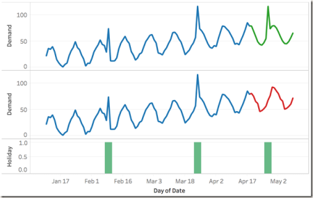
In the image below the observed/historical demand is shown in blue. At the bottom you can see the holidays as green bars with height of 1 and non-holidays as bars of height 0. This representation is often referred to as dummy encoding.
Our data contains 2 holidays that happened in the past and 1 upcoming holiday. One can clearly see that the holidays are causing noticeable spikes in demand. For a store owner who doesn’t want to miss the next holiday opportunity by running out of stock early, it is very valuable to incorporate this important piece of information in the demand forecast.

The formula for the forecast shown with the red line (which doesn’t take holidays into account) looks like the following:
SCRIPT_REAL("library(forecast);
append(.arg1[1:99],forecast(ts(.arg1[1:99], frequency=12), h=21)$mean)",AVG([Demand]))
First 99 points cover the historical data while last 21 are what’s being predicted. The data follows a 12 period cycle. Second line of R code appends the predicted values to the reported values to generate the full series.
The formula for the forecast shown with the green line (which incorporates the holidays) looks like the following:
SCRIPT_REAL("library(forecast);
data <- data.frame(demand=.arg1,holiday=.arg2);
training <-data[1:99,];
model<-auto.arima(training[,1],xreg=training[,2]);
append(training[,1],forecast(model,xreg=.arg2[100:120])$mean)", AVG([Demand]), ATTR([Holiday]))
In this script, exogenous regressors are passed to the function using the xreg argument. It can be clearly seen that both the spike due to holiday and the regular seasonality in demand are represented by this model. If there are multiple events with potentially different effects (positive vs. negative, different magnitudes etc.), they can be handled using the same method if added as separate variables.
What-If Analysis
Now that we covered handling events as additional regressors, let’s talk about we can apply the same methodologies to do what if analysis.
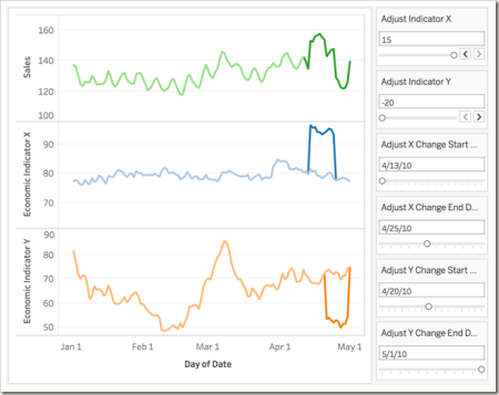
Below you can see three time series; Sales and 2 economic indicators. Assume that the two indicators contain the current best estimates of behavior for next few days but Sales for the same period is unknown however can be estimated using the two economic indicators.

What makes this visualization more interesting is that you can also adjust the value of economic indicators and the time frame these overrides apply. For example in the image below, indicator X has been increased by 15 units (dark blue peak) for the period April 13th and April 25th while indicatory Y has been reduced by 20 units (dark orange dip) for the period April 20th and May 1st. The impact can be clearly seen in the dark green portion of the line in the first chart. By adjusting the parameters in the dashboard one can perform what-if analysis and understand impact of likely future events, best/worst case scenarios etc.

Let’s take a look at the R script that is used to create this view.
SCRIPT_REAL("library(forecast);
training <- ts(data.frame(sales=.arg1,indX=.arg2,indY=.arg3)[1:100,],frequency=7);
model<-auto.arima(training[,1],xreg=training[,-1]);
whatifdata <- data.frame(indX=.arg2,indY=.arg3)[101:120,];
append(training[,1],forecast(model,xreg=whatifdata)$mean)",
AVG([Sales]),AVG([Economic Indicator X]),AVG([Economic Indicator Y]))
As you can see, the formula is very similar to earlier examples. In this demo dataset, the first 100 rows are used for model fitting while the last 20 contain the sales forecast as well as the inputs for the sales forecast that are the what-if values defined in Economic indicator X and Y fields as a function of parameter entries.
You can find all of these examples in the Tableau workbook published HERE.
In the sample workbook, I also provided a sheet that compares the ARIMAX result to multiple linear regression to give a better sense of what you’re getting out of applying this particular method.
R-bloggers.com offers daily e-mail updates about R news and tutorials about learning R and many other topics. Click here if you're looking to post or find an R/data-science job.
Want to share your content on R-bloggers? click here if you have a blog, or here if you don't.
