
Generating Meaningful Turaround Time Plots for Clinical Laboratory Medicine
Want to share your content on R-bloggers? click here if you have a blog, or here if you don't.
The Problem
It is standard practice in Clinical Laboratory Medicine to monitor turn around times (TATs) for high volume tests like potassium (K), Troponin (Tn) and Hemoglobin (Hb). The term TAT is typically understood to mean “the time elapsed from when the doctor orders the test to the time the result is available in the Laboratory Information System (LIS)”. This of course does not take into account the lag between the result availability and the time when the physician logs in to view it and respond, but let’s just say that we are not there yet.
Traditionally, some dedicated soul would take .csv extracts from the LIS and do laborious things in Excel to generate the median TAT for the month for each test and each lab location for which they were responsible. Not only is it impossible to automate such a process, it is entirely manual and produces fairly uninformative output since (at least at our site) only medians were generated.
What really frustrates physicians is not where the median goes each month, it is the behaviour of, say, the 90th percentile of TAT or the outliers. These are the ones they remember.
R allows us to produce a much more informative figure in an automatable fashion. I provide here an example of a TAT figure for Hb with some statistical metric included.
Look at the Data
Let’s start by reading in our data and looking at how it is structured.
myData<-read.csv(file = "Hb_TAT_data.csv",header = TRUE)
str(myData)
head(myData)
## 'data.frame':    4497 obs. of  6 variables:
##  $ specimenID: int  4221 5281 5308 5320 5356 5374 5375 5376 5241 5270 ...
##  $ ordered   : Factor w/ 4244 levels "2015-06-30 23:15",..: 4 68 86 92 115 126 127 128 46 61 ...
##  $ collected : Factor w/ 4245 levels "2015-07-01 00:02",..: 2 72 88 95 114 126 128 129 46 65 ...
##  $ received  : Factor w/ 4098 levels "2015-07-01 00:07",..: 2 69 81 88 107 119 120 122 45 62 ...
##  $ resulted  : Factor w/ 3765 levels "2015-07-01 00:11",..: 2 70 79 86 104 113 114 116 42 63 ...
##  $ result    : int  126 110 134 117 135 113 109 111 106 129 ...

## specimenID ordered collected received
## 1 4221 2015-06-30 23:28 2015-07-01 00:08 2015-07-01 00:29
## 2 5281 2015-07-01 14:12 2015-07-01 14:25 2015-07-01 14:30
## 3 5308 2015-07-01 15:56 2015-07-01 16:03 2015-07-01 16:10
## 4 5320 2015-07-01 16:57 2015-07-01 17:12 2015-07-01 17:20
## 5 5356 2015-07-01 20:00 2015-07-01 20:07 2015-07-01 20:18
##6 5374 2015-07-01 21:37 2015-07-01 21:40 2015-07-01 21:44
 resulted result
1 2015-07-01 00:37 126
2 2015-07-01 14:50 110
3 2015-07-01 16:16 134
4 2015-07-01 17:23 117
5 2015-07-01 20:23 135
6 2015-07-01 21:53 113
In this simplified anonymized data set we can see that we have 4497 observations with all of the necessary time points to calculate the turnaround times of the preanalytical and analytical processes. For the sake of this example, let’s focus on the order-to-file time.
We are going to need to handle the dates, for which there is only one package worth discussing, namely lubridate.
library(lubridate)
Basic Data Preparation
The first thing we need to do is to convert the order, collect, receive and result times to lubridate objects (i.e. time and date objects) so that we can do some algebra on them. We can see from the structure of myData that the order, collect, receive and result time points are in the format “YYYY-MM-DD HH:MM”. Therefore we can use the lubridate function ymd_hm() to perform the conversion.
myData$ordered<-ymd_hm(myData$ordered)
myData$collected<-ymd_hm(myData$collected)
myData$received<-ymd_hm(myData$received)
myData$resulted<-ymd_hm(myData$resulted)
Applying str() again to myData, you will see that the dates and times are now POSIXct, that is, they are now dates and times. This allows use to calculate the order-to-file TAT, we can do with the difftime() function exporting the result in minutes. We will also append the order-to-file (otf) TAT to the dataframe and do some quick sanity-checking.
Sanity Check
otf<-difftime(myData$resulted,myData$ordered,units = "min")
myData<-cbind(myData,otf)
summary(as.numeric(myData$otf))
hist(as.numeric(myData$otf), main = "Histogram of Hb TATs", breaks = 60, col = "darkred",xlim = c(0,200), xlab = "Order to File in Minutes")
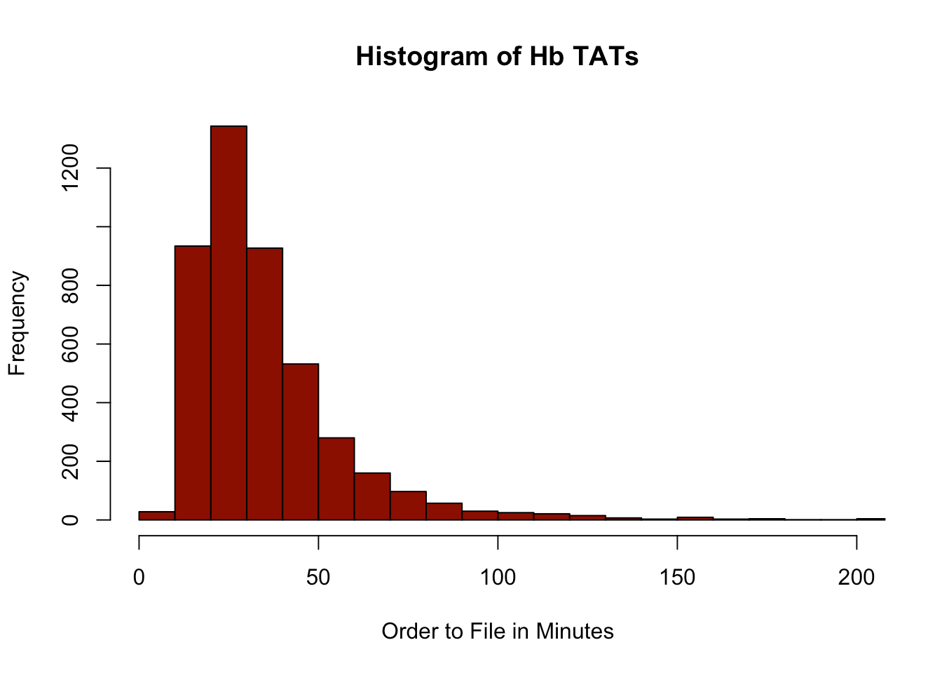
##    Min. 1st Qu.  Median    Mean 3rd Qu.    Max.
##    3.00   22.00   30.00   36.58   43.00  694.00
This looks reasonable, so we can proceed with a TAT scatterplot.
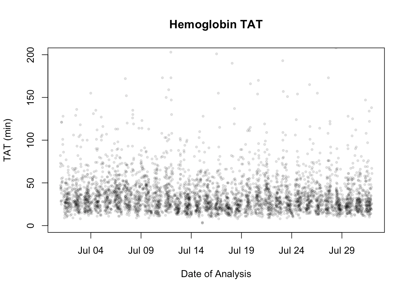
Scatterplot
plot(myData$ordered,myData$otf, pch = 19, main = "Hemoglobin TAT",xlab = "Date",ylab = "TAT (min)")

Beautifying
This is kind-of problematic because we really want to focus on results in the 0-200 minute range. There are some wild-outliers as occurs in real life because of instrument down-time, add-ons, etc. We can leave this matter for the present. Notice that I have displayed every day on the x-axis because this will allow us to investigate any problems we see. So we will adjust the ylim and we will also make the plot points semitransparent by using hexidecimal colour codes followed by a fractional transparency expressed in hexidecimal. Black is “#000000” and “20” is hexidecimal for 32 which is 32/256 or 12.5% opacity.
#make the points semistranparent and a little smaller
plot(myData$ordered,myData$otf, pch = 19, main = "Hemoglobin TAT",xlab = "Date of Analysis",ylab = "TAT (min)", ylim = c(0,200), col = "#00000020",cex = 0.5)
We’ll accept the fact that we know that there are a number of outliers. We could easily have a plot that displayed them or a tabular summary of them.
Now we will need to prepare the vector of daily medians, 10th and 90th percentiles to plot. We will loop through each day of the month and then calculate the statistics for that day.
#calculate the start and end date
#fist collection in the month's reporting is always collected in the previous month so ceiling forces startDate to be first day of the month we are interested in. Same is true for endDate.
startDate <- ceiling_date(min(myData$ordered),"day")
endDate <- ceiling_date(max(myData$ordered),"day")
days <- seq (from = startDate, to = endDate, by = 'days')
#when we plot stastics, we want them at mid day
middays <- days + hours(12)
tenth<-vector()
fiftieth<-vector()
ninetieth<-vector()

for ( i in seq_along(days) ) {
  daysData<-subset(myData,myData$ordered >= days[i]&myData$ordered<days[i+1])
  tenth[i]<-quantile(daysData$otf,probs = 0.10)
  fiftieth[i]<-median(daysData$otf)
  ninetieth[i]<-quantile(daysData$otf,probs = 0.90)
}

quantileData<-data.frame(middays,tenth,fiftieth,ninetieth)

plot(myData$ordered,myData$otf, pch = 19, main = "Hemoglobin TAT",xlab = "Date of Analysis", ylab = "TAT (min)", ylim = c(0,200), col = "#00000020",cex = 0.5)
lines(quantileData$middays,quantileData$tenth, col = "red")
lines(quantileData$middays,quantileData$ninetieth, col = "red")
lines(quantileData$middays,quantileData$fiftieth, col = "blue")
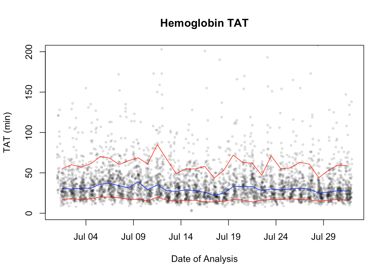
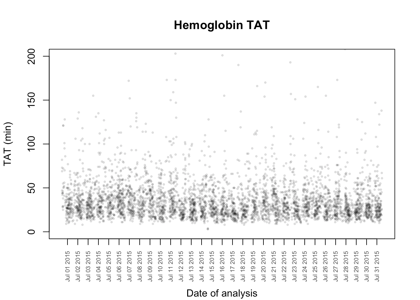
But this is not all that easy to look at. First, it’s kind-of ugly and second, if we find a problem date, we can’t read it from the figure. So let’s start by fixing the x-axis labels:
plot(myData$ordered,myData$otf, pch = 19, main = "Hemoglobin TAT", xlab = "", ylab = "TAT (min)", ylim = c(0,200), col = "#00000020",cex = 0.4,xaxt = "n")
#don't plot first day of next month on axis
axis.POSIXct(side = 1, quantileData$middays[1:length(quantileData$middays)-1],at = quantileData$middays[1:length(quantileData$middays)-1], las = 2, cex.axis = 0.6, col.axis = "gray30", format = "%b %d %Y")
#allows me to move the xlab down manually so as not to overwrite the dates.
mtext("Date of analysis", side = 1, line = 4)
To paint the central 80% as a band, we will need to use the polygon() function. I am going to write a function to which and x-vector and two y-vectors is supplied which then fills the area between then with a supplied color. Naturally, the three vectors must have the same length.
#colours in the space between two curves.
fillitin<-function(x,ymin,ymax,colour){
  for (i in 1:length(x)){
    #define the x coordinates of the vertices of the polygon
    xvert<-c(x[i],x[i],x[i+1],x[i+1])
    #define the y coordinates of the vertices of the polygon
    yvert<-c(ymin[i],ymax[i],ymax[i+1],ymin[i+1])
    polygon(xvert,yvert, col = colour, border = NA)
  }
}

#now add these effects to the existing figure
fillitin(middays,tenth,ninetieth,"#FF000020")
lines(quantileData$middays,quantileData$fiftieth, col = "blue")
lines(quantileData$middays,quantileData$tenth, col = "red")
lines(quantileData$middays,quantileData$ninetieth, col = "red")
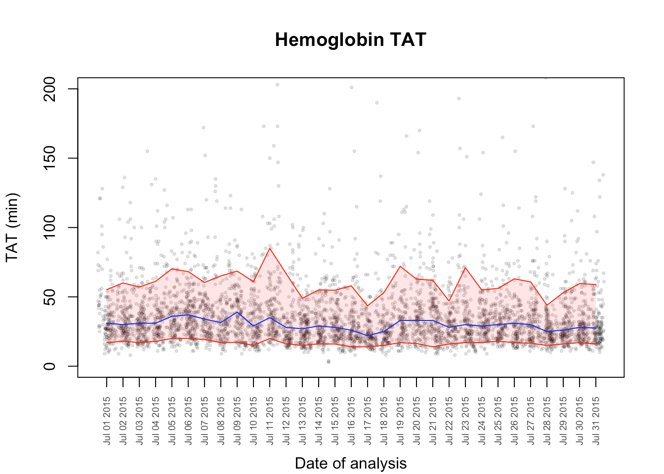
Final Product
Now we should just finish it off with a legend.
legend("topright",c("Median","Central 80%"),lty = c(1,1),col = c("blue","red"),inset = .05)
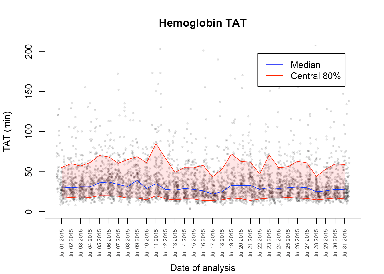
And that is a little more informative. There are many features you could add from this point – like smoothing, statistical analysis, outlier report. You could also loop over different tests, examine both the preanalytical and analytical processes at different locations, and produce a pdf report using MarkDown for all the institutions you look after.
-Dan
“The LORD detests dishonest scales, but accurate weights find favor with him.”
Proverbs 11:1
R-bloggers.com offers daily e-mail updates about R news and tutorials about learning R and many other topics. Click here if you're looking to post or find an R/data-science job.
Want to share your content on R-bloggers? click here if you have a blog, or here if you don't.