
Exploring, Clustering, and Mapping Toronto’s Crimes
Want to share your content on R-bloggers? click here if you have a blog, or here if you don't.
Motivation
I have had a lot of fun exploring The US cities’ Crime data via their Open Data portals. Because Toronto’s crime data was simply not available.
Not until the summer of this year, Toronto police launch a public safety data portal to increase transparency between the public and officers. I recently have had the chance to explore Toronto’s crimes via Toronto Police Service Public Safety Data Portal. I am particularly interested in Major Crime Indicators (MCI) 2016 which contains a tabular list of 32, 612 reports in 2016 (The only year that the data were made available).

Let’s take a look at the data using R and see if there’s anything interesting.
library(ggplot2)
library(ggthemes)
library(dplyr)
library(viridis)
library(tidyr)
library(cluster)
library(ggmap)
library(maps)
After a little bit of exploration, I found that there were many duplicated event_unique_id. Let’s drop them.
toronto <- read.csv('toronto_crime.csv')
toronto <- subset(toronto, !duplicated(toronto$event_unique_id))
unique(toronto$occurrenceyear)
unique(toronto$reportedyear)
> unique(toronto$occurrenceyear)
 [1] 2016 2015 2014 2012 2010 2013 2011 2003 2007 2008 2006 2002 2001   NA 2005
[16] 2009 2000
> unique(toronto$reportedyear)
[1] 2016
Find anything interesting? The occurrence year ranged from 2000 to 2016, but report year is only 2016. This means people came to police to report incidents happened 16 years ago. Let’s have a look how many late reported incidents in our data.
year_group <- group_by(toronto, occurrenceyear)
crime_by_year <- summarise(year_group,
                          n = n())
crime_by_year
# A tibble: 17 x 2
   occurrenceyear     n

 1           2000     2
 2           2001     2
 3           2002     3
 4           2003     2
 5           2005     1
 6           2006     1
 7           2007     5
 8           2008     1
 9           2009     1
10           2010    10
11           2011     3
12           2012     8
13           2013    21
14           2014    37
15           2015   341
16           2016 27705
17             NA     4
2 incidents occurred in 2000, 2 occurred in 2001 and so on. The vast majority of occurrences happened in 2016. So we are going to keep 2016 only. And I am also removing all the columns we do not need and four rows with missing values.
drops <- c("X", "Y", "Index_", "ucr_code", "ucr_ext", "reporteddate", "reportedmonth", "reportedday", "reporteddayofyear", "reporteddayofweek", "reportedhour", "occurrencedayofyear", "reportedyear", "Division", "Hood_ID", "FID")
toronto <- toronto[, !(names(toronto) %in% drops)]
toronto <- toronto[toronto$occurrenceyear == 2016, ]
toronto <- toronto[complete.cases(toronto), ]
Explore
What are the major crimes in 2016?
indicator_group <- group_by(toronto, MCI)
crime_by_indicator <- summarise(indicator_group, n=n())
crime_by_indicator <- crime_by_indicator[order(crime_by_indicator$n, decreasing = TRUE),]
ggplot(aes(x = reorder(MCI, n), y = n), data = crime_by_indicator) +
  geom_bar(stat = 'identity', width = 0.5) +
  geom_text(aes(label = n), stat = 'identity', data = crime_by_indicator, hjust = -0.1, size = 3.5) +
  coord_flip() +
  xlab('Major Crime Indicators') +
  ylab('Number of Occurrences') +
  ggtitle('Major Crime Indicators Toronto 2016') +
  theme_bw() +
  theme(plot.title = element_text(size = 16),
        axis.title = element_text(size = 12, face = "bold"))
Gives this plot:

Assault is the most prevalent form of violent crime in Toronto. What is assault? In criminal and civil law, assault is an attempt to initiate harmful or offensive contact with a person, or a threat to do so.
What are the different types of assault? Which type is the worst?
assault <- toronto[toronto$MCI == 'Assault', ]
assault_group <- group_by(assault, offence)
assault_by_offence <- summarise(assault_group, n=n())
assault_by_offence <- assault_by_offence[order(assault_by_offence$n, decreasing = TRUE), ]
ggplot(aes(x = reorder(offence, n), y = n), data = assault_by_offence) +
  geom_bar(stat = 'identity', width = 0.6) +
  geom_text(aes(label = n), stat = 'identity', data = assault_by_offence, hjust = -0.1, size = 3) +
  coord_flip() +
  xlab('Types of Assault') +
  ylab('Number of Occurrences') +
  ggtitle('Assault Crime Toronto 2016') +
  theme_bw() +
  theme(plot.title = element_text(size = 16),
        axis.title = element_text(size = 12, face = "bold"))
Gives this plot:

Not much information here, the top assault category is … assault. I eventually learned different types of assault through Attorneys.com.
Let’s look at the top offences then
offence_group <- group_by(toronto, offence)
crime_by_offence <- summarise(offence_group, n=n())
crime_by_offence <- crime_by_offence[order(crime_by_offence$n, decreasing = TRUE), ]
ggplot(aes(x = reorder(offence, n), y = n), data = crime_by_offence) +
  geom_bar(stat = 'identity', width = 0.7) +
  geom_text(aes(label = n), stat = 'identity', data = crime_by_offence, hjust = -0.1, size = 2) +
  coord_flip() +
  xlab('Types of Offence') +
  ylab('Number of Occurrences') +
  ggtitle('Offence Types Toronto 2016') +
  theme_bw() +
  theme(plot.title = element_text(size = 16),
        axis.title = element_text(size = 12, face = "bold"))
Gives this plot:

Assault being the most common offence followed by Break and Enter. According to Wikibooks, the most typical form of break and enter is a break into a commercial or private residence in order to steal property. This indicates that break and enter more likely to occur when there is no one at home or office.
How about crime by time of the day?
hour_group <- group_by(toronto, occurrencehour)
crime_hour <- summarise(hour_group, n=n())
ggplot(aes(x=occurrencehour, y=n), data = crime_hour) + geom_line(size = 2.5, alpha = 0.7, color = "mediumseagreen", group=1) +
  geom_point(size = 0.5) +
  ggtitle('Total Crimes by Hour of Day in Toronto 2016') +
  ylab('Number of Occurrences') +
  xlab('Hour(24-hour clock)') +
  theme_bw() +
  theme(plot.title = element_text(size = 16),
        axis.title = element_text(size = 12, face = "bold"))
Gives this plot:

The worst hour is around the midnight, another peak time is around the noon, then again at around 8pm.
Okay, but what types of crime are most frequent at each hour?
hour_crime_group <- group_by(toronto, occurrencehour, MCI)
hour_crime <- summarise(hour_crime_group, n=n())
ggplot(aes(x=occurrencehour, y=n, color=MCI), data =hour_crime) +
  geom_line(size=1.5) +
  ggtitle('Crime Types by Hour of Day in Toronto 2016') +
  ylab('Number of Occurrences') +
  xlab('Hour(24-hour clock)') +
  theme_bw() +
  theme(plot.title = element_text(size = 16),
        axis.title = element_text(size = 12, face = "bold"))
Gives this plot:

Assaults are the top crimes almost all the time, they happened more often from the late mornings till nights than the early mornings. On the other hand, break and enter happened more often in the mornings and at around the midnight (when no one at home or office) . Robberies and auto thefts are more likely to happen in the late evenings till the nights. They all make sense.
Where are those crimes most likely to occur in Toronto?
location_group <- group_by(toronto, Neighbourhood)
crime_by_location <- summarise(location_group, n=n())
crime_by_location <- crime_by_location[order(crime_by_location$n, decreasing = TRUE), ]
crime_by_location_top20 <- head(crime_by_location, 20)
ggplot(aes(x = reorder(Neighbourhood, n), y = n), data = crime_by_location_top20) +
  geom_bar(stat = 'identity', width = 0.6) +
  geom_text(aes(label = n), stat = 'identity', data = crime_by_location_top20, hjust = -0.1, size = 3) +
  coord_flip() +
  xlab('Neighbourhoods') +
  ylab('Number of Occurrences') +
  ggtitle('Neighbourhoods with Most Crimes - Top 20') +
  theme_bw() +
  theme(plot.title = element_text(size = 16),
        axis.title = element_text(size = 12, face = "bold"))
Gives this plot:

The most dangerous neighbourhood is … Waterfront. The sprawling downtown catch-all includes not only the densely packed condo but also the boozy circus that is the entertainment district. The result: a staggering number of violent crimes and arsons.
Let’s find out neighbourhoods vs. top offence types
offence_location_group <- group_by(toronto, Neighbourhood, offence)
offence_type_by_location <- summarise(offence_location_group, n=n())
offence_type_by_location <- offence_type_by_location[order(offence_type_by_location$n, decreasing = TRUE), ]
offence_type_by_location_top20 <- head(offence_type_by_location, 20)
ggplot(aes(x = Neighbourhood, y=n, fill = offence), data=offence_type_by_location_top20) +
  geom_bar(stat = 'identity', position = position_dodge(), width = 0.8) +
  xlab('Neighbourhood') +
  ylab('Number of Occurrence') +
  ggtitle('Offence Type vs. Neighbourhood Toronto 2016') + theme_bw() +
  theme(plot.title = element_text(size = 16),
        axis.title = element_text(size = 12, face = "bold"),
        axis.text.x = element_text(angle = 90, hjust = 1, vjust = .4))
Gives this plot:

I did not expect something like this. It is not pretty. However, it did tell us that besides assaults, Church-Yonge Corridor and Waterfront had the most break and enter(Don’t move there!). West Humber-Clairville had the most vehicle stolen crimes(Don’t park your car there!).
Let’s try something different
crime_count % group_by(occurrencemonth, MCI) %>% summarise(Total = n())
crime_count$occurrencemonth <- ordered(crime_count$occurrencemonth, levels = c('January', 'February', 'March', 'April', 'May', 'June', 'July', 'August', 'September', 'October', 'November', 'December'))
ggplot(crime_count, aes(occurrencemonth, MCI, fill = Total)) +
  geom_tile(size = 1, color = "white") +
  scale_fill_viridis()  +
  geom_text(aes(label=Total), color='white') +
  ggtitle("Major Crime Indicators by Month 2016") +
  xlab('Month') +
  theme(plot.title = element_text(size = 16),
        axis.title = element_text(size = 12, face = "bold"))
Gives this plot:

Much better!
Assault is the most common crime every month of the year with no exception. It appears that there were a little bit more assault incidents in May than the other months last year.
day_count % group_by(occurrencedayofweek, MCI) %>% summarise(Total = n())
ggplot(day_count, aes(occurrencedayofweek, MCI, fill = Total)) +
  geom_tile(size = 1, color = "white") +
  scale_fill_viridis()  +
  geom_text(aes(label=Total), color='white') +
  ggtitle("Major Crime Indicators by Day of Week 2016") +
  xlab('Day of Week') +
  theme(plot.title = element_text(size = 16),
        axis.title = element_text(size = 12, face = "bold"))
Gives this plot:

Saturdays and Sundays had more assaults than any other days, and had less theft over than any other days. Auto thieves are busy almost every day of the week equally.
I was expecting to find seasonal crime patterns such as temperature changes and daylight hours might be associated with crime throughout the year, or the beginning and end of the school year, are associated with variations in crime throughout the year. But this one-year’s worth of data is not enough to address my above concerns. I hope Toronto Police service will release more data via its open data portal in the soonest future.
Homicide
homicide <- read.csv('homicide.csv', stringsAsFactors = F)
homicide$Occurrence_Date <- as.Date(homicide$Occurrence_Date)
year_group <- group_by(homicide, Occurrence_year, Homicide_Type)
homicide_by_year <- summarise(year_group, n=n())
ggplot(aes(x = Occurrence_year, y=n, fill = Homicide_Type), data=homicide_by_year) +
  geom_bar(stat = 'identity', position = position_dodge(), width = 0.8) +
  xlab('Year') +
  ylab('Number of Homicides') +
  ggtitle('Homicide 2004-2016') + theme_bw() +
  theme(plot.title = element_text(size = 16),
        axis.title = element_text(size = 12, face = "bold"))
Gives this plot:

2005 is Toronto’s “Year of Gun”. Eleven years later in 2016, Toronto was experiencing another spike in gun-related homicide.
homicide$month <- format(as.Date(homicide$Occurrence_Date) , "%B")
homicide_count % group_by(Occurrence_year, month) %>% summarise(Total = n())
homicide_count$month <- ordered(homicide_count$month, levels = c('January', 'February', 'March', 'April', 'May', 'June', 'July', 'August', 'September', 'October', 'November', 'December'))
ggplot(homicide_count, aes(Occurrence_year, month, fill = Total)) +
  geom_tile(size = 1, color = "white") +
  scale_fill_viridis()  +
  geom_text(aes(label=Total), color='white') +
  ggtitle("Homicides in Toronto (2004-2016)") +
  xlab('Year') +
  theme(plot.title = element_text(size = 16),
        axis.title = element_text(size = 12, face = "bold"))
Gives this plot:

It is worrisome to see that there is a significant increase in the total number of homicides in Toronto in 2016 compared to 2015. I hope we will have a better 2017. However, when I read that Toronto ranked safest city in North America by the Economist, I felt much safer.
K-Means Clustering
K-Means is one of the most popular “clustering” algorithms. It is the process of partitioning a group of data points into a small number of clusters. As in our crime data, we measure the number of assaults and other indicators, and neighbourhoods with high number of assaults will be grouped together. The goal of K-Means clustering is to assign a cluster to each data point (neighbourhood). Thus we first partition datapoints (neighbourhoods) into k clusters in which each neighbourhood belongs to the cluster with the nearest mean, serving as a prototype of the cluster.
As one of the unsupervised learning algorithms,we use K-Mean to build models that help us understand our data better. It enables us to learn groupings of unlabeled data points.
To do clustering analysis, our data has to look like this:
by_groups <- group_by(toronto, MCI, Neighbourhood)
groups <- summarise(by_groups, n=n())
groups <- groups[c("Neighbourhood", "MCI", "n")]
groups_wide <- spread(groups, key = MCI, value = n)
Gives this table:

The fist column — qualitative data should be removed from the analysis
z <- groups_wide[, -c(1,1)]
The data cannot have any missing values
z <- z[complete.cases(z), ]
The data must be scaled for comparison
m <- apply(z, 2, mean)
s <- apply(z, 2, sd)
z <- scale(z, m, s)
Determine the number of clusters
wss <- (nrow(z)-1) * sum(apply(z, 2, var))
for (i in 2:20) wss[i] <- sum(kmeans(z, centers=i)$withiness)
plot(1:20, wss, type='b', xlab='Number of Clusters', ylab='Within groups sum of squares')
Gives this plot:

This plot shows a very strong elbow, based on the plot, we can say with confidence that we do not need more than two clusters (centroids).
Fitting a model
kc <- kmeans(z, 2)
kc
K-means clustering with 2 clusters of sizes 121, 10

Cluster means:
    Assault Auto Theft Break and Enter    Robbery Theft Over
1 -0.193042  -0.135490      -0.2176646 -0.1778607 -0.2288382
2  2.335808   1.639429       2.6337422  2.1521148  2.7689425

Clustering vector:
  [1] 1 1 1 2 1 1 2 1 1 1 1 1 1 1 1 1 1 1 1 1 1 2 2 1 1 1 1 1 1 1 1 1 1 1 1 1 1 1 1
 [40] 1 1 1 1 1 1 1 1 1 1 1 1 1 1 1 2 1 1 1 1 1 1 1 1 1 1 1 1 1 1 1 1 2 1 1 1 1 1 1
 [79] 1 1 1 1 1 1 1 1 1 1 1 1 1 1 1 1 1 1 1 1 1 1 1 2 1 1 1 1 1 1 1 1 1 1 1 2 1 2 1
[118] 1 1 1 1 1 1 1 1 1 1 1 1 2 1

Within cluster sum of squares by cluster:
[1] 183.3436 170.2395
 (between_SS / total_SS =  45.6 %)

Available components:

[1] "cluster"      "centers"      "totss"        "withinss"     "tot.withinss"
[6] "betweenss"    "size"         "iter"         "ifault"
Interpretation:
* First cluster has 121 neighbourhoods, and second cluster has 10 neighbourhoods.
* Cluster means: If the ranges of these numbers seem strange, it’s because we standardized the data before performing the cluster analysis. The negative values mean “lower than most” and positive values mean “higher than most”. Thus, cluster 1 are neighbourhoods with low assault, low auto theft, low break and enter, low robbery and low theft over. Cluster 2 are neighbourhoods with high assault, high auto theft, high break and enter, high robbery and high theft over. It is good that these two groups have a significant variance in every variable. It indicates that each variable plays a significant role in categorizing clusters.
* Clustering vector: The first, second and third neighbourhoods should all belong to cluster 1, the fourth neighbourhood should belong to cluster 2, and so on.
* A measurement that is more relative would be the withinss and betweenss.
withinss tells us the sum of the square of the distance from each data point to the cluster center. Lower is better. Betweenss tells us the sum of the squared distance between cluster centers. Ideally we want cluster centers far apart from each other.
* Available components is self-explanatory.
Plotting the k-Means results
z1 <- data.frame(z, kc$cluster)
clusplot(z1, kc$cluster, color=TRUE, shade=F, labels=0, lines=0, main='k-Means Cluster Analysis')
Gives this plot:

It appears that our choice of number of clusters is good, and we have little noise.
Hierarchical Clustering
For the hierarchical clustering methods, the dendrogram is the main graphical tool for getting insight into a cluster solution.
z2 <- data.frame(z)
distance <- dist(z2)
hc <- hclust(distance)
Now that we’ve got a cluster solution. Let’s examine the results.
plot(hc, labels = groups_wide$Neighbourhood, main='Cluster Dendrogram', cex=0.65)
Gives this plot:
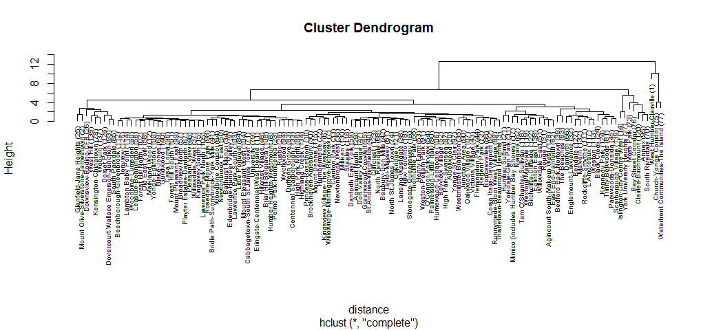
If we choose any height along the y-axis of the dendrogram, and move across the dendrogram counting the number of lines that we cross, each line represents a cluster. For example, if we look at a height of 10, and move across the x-axis at that height, we’ll cross two lines. That defines a two-cluster solution; by following the line down through all its branches, we can see the names of the neighbourhoods that are included in these two clusters. Looking at the dendrogram for the Toronto’s crimes data, we can see our datapoins are very imbalanced. From the top of the tree, there are two distinct groups; one group consists of brunches with brunches and more brunches, while another group only consists few neighbourhoods, and we can see these neighbourhoods are Toronto’s most dangerous neighbourhoods. However, I want to try many different groupings at once to start investigating.
counts = sapply(2:6,function(ncl)table(cutree(hc,ncl)))
names(counts) = 2:6
counts
> counts
$`2`

  1   2
128   3

$`3`

  1   2   3
128   2   1

$`4`

  1   2   3   4
121   7   2   1

$`5`

  1   2   3   4   5
121   5   2   2   1

$`6`

  1   2   3   4   5   6
112   5   2   9   2   1
Interpretation:
* With 2-cluster solution, we have 128 neighbourhoods in cluster 1, 3 neighbourhoods in cluster 2.
* With 3-cluster solution, we have 128 neighbourhoods in cluster 1, 2 neighbourhoods in cluster 2, and 1 neighbourhood in cluster 3. And so on until 6-cluster solution.
In practice, we’d like a solution where there aren’t too many clusters with just few observations, because it may make it difficult to interpret our results. For this exercise, I want to stick with 3-cluster solution, see what results I will obtain.
member <- cutree(hc, 3)
aggregate(z, list(member), mean)
aggregate(z, list(member), mean)
  Group.1     Assault  Auto Theft Break and Enter     Robbery Theft Over
1       1 -0.09969023 -0.08067526     -0.09425688 -0.09349632 -0.1042508
2       2  5.57040267  0.57693723      4.67333848  4.14398508  5.0024522
3       3  1.61954364  9.17255898      2.71820403  3.67955938  3.3392003
In cluster 1, all the crime indicators are on the negative side, cluster 1 has a significant distinction on each variable compare with cluster 2 and cluster 3. Cluster 2 is higher in most of the crime indicators than cluster 3 except Auto Theft.
plot(silhouette(cutree(hc, 3), distance))
Gives this plot:

The silhouette width value for cluster 3 is zero. The silhouette plot indicates that we really do not need the third cluster, The vast majority of neighbourhoods belong to the first cluster, and 2-cluster will be our solution.
Making a Map of Toronto’s Crimes
There are many packages for plotting and manipulating spatial data in R. I am going to use ggmap to produce a simple and easy map of Toronto’ crimes.
lat <- toronto$Lat
lon <- toronto$Long
crimes <- toronto$MCI
to_map <- data.frame(crimes, lat, lon)
colnames(to_map) <- c('crimes', 'lat', 'lon')
sbbox <- make_bbox(lon = toronto$Long, lat = toronto$Lat, f = 0.01)
my_map <- get_map(location = sbbox, maptype = "roadmap", scale = 2, color="bw", zoom = 10)
ggmap(my_map) +
  geom_point(data=to_map, aes(x = lon, y = lat, color = "#27AE60"),
             size = 0.5, alpha = 0.03) +
  xlab('Longitude') +
  ylab('Latitude') +
  ggtitle('Location of Major Crime Indicators Toronto 2016') +
  guides(color=FALSE)
Gives this map:

It’s clear to see where the major crimes in the city occur. A large concentration in the Waterfront area, South of North York is more peaceful than any other areas. However, point-stacking is not helpful when comparing high-density areas, so let’s optimize this visualization.
ggmap(my_map) +
  geom_point(data=to_map, aes(x = lon, y = lat, color = "#27AE60"),
             size = 0.5, alpha = 0.05) +
  xlab('Longitude') +
  ylab('Latitude') +
  ggtitle('Location of Major Crime Indicators Toronto 2016') +
  guides(color=FALSE) +
  facet_wrap(~ crimes, nrow = 2)
Gives this map:

This is certainly more interesting and prettier. Some crimes, such as Assaults, and Break and Enter occur all over the city, with concentration in the Waterfront areas. Other crimes, such as Auto Theft has a little more points in the west side than the east side. Robbery and Theft Over primarily have clusters in the Waterfront areas.
Summary
Not many more questions can be answered by looking at the data of Toronto Major crimes Indicators. But that’s okay. There’s certainly other interesting things to do with this data, such as creating a dashboard at MicroStrategy.

As always, all the code can be found on Github. I would be pleased to receive feedback or questions on any of the above.
Related Post
- Spring Budget 2017: Circle Visualisation
- Qualitative Research in R
- Multi-Dimensional Reduction and Visualisation with t-SNE
- Comparing Trump and Clinton’s Facebook pages during the US presidential election, 2016
- Analyzing Obesity across USA
R-bloggers.com offers daily e-mail updates about R news and tutorials about learning R and many other topics. Click here if you're looking to post or find an R/data-science job.
Want to share your content on R-bloggers? click here if you have a blog, or here if you don't.