Exploratory Data Analysis: Variations of Box Plots in R for Ozone Concentrations in New York City and Ozonopolis
Want to share your content on R-bloggers? click here if you have a blog, or here if you don't.
Introduction
Last week, I wrote the first post in a series on exploratory data analysis (EDA). I began by calculating summary statistics on a univariate data set of ozone concentration in New York City in the built-in data set “airquality” in R. In particular, I talked about how to calculate those statistics when the data set has missing values. Today, I continue this series by creating box plots in R and showing different variations and extensions that can be added; be sure to examine the details of this post’s R code for some valuable details. I learned many of these tricks from Robert Kabacoff’s “R in Action” (2011). Robert also has a nice blog called Quick-R that I consult often.
Recall that I abstracted a vector called “ozone” from the data set “airquality”.
ozone = airquality$Ozone
Box Plots – What They Represent
The simplest box plot can be obtained by using the basic settings in the boxplot() command. As usual, I use png() and dev.off() to print the image to a local folder on my computer.
png('INSERT YOUR DIRECTORY HERE/box plot ozone.png')
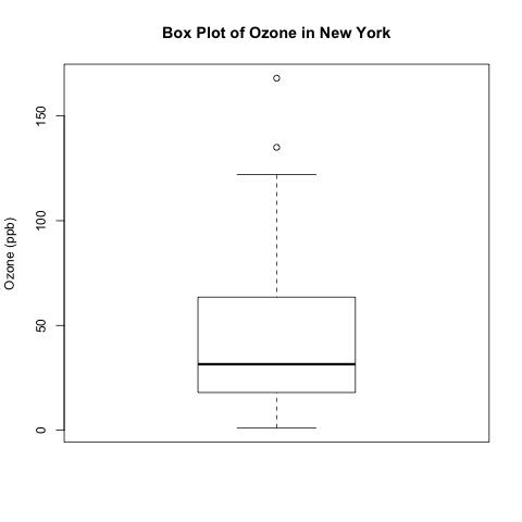
boxplot(ozone, ylab = 'Ozone (ppb)', main = 'Box Plot of Ozone in New York')
dev.off()
What do the different parts of this box plot mean?
- The top and bottom lines of the rectangle are the 3rd and 1st quartiles (Q3 and Q1), respectively. The length of the rectangle from top to bottom is the interquartile range (IQR).
- The line in the middle of the rectangle is the median (or the 2nd quartile, Q2).
- The top whisker denotes the maximum value or the 3rd quartile plus 1.5 times the interquartile range (Q3 + 1.5*IQR), whichever is smaller.
- The bottom whisker denotes either the minimum value or the 1st quartile minus 1.5 times the interquartile range (Q1 – 1.5*IQR), whichever is larger.
You can confirm some of these numbers by calculating the five-number summary. Notice how I applied summary() around fivenum(ozone) to get the column names.
> summary(fivenum(ozone))
   Min. 1st Qu.  Median    Mean 3rd Qu.    Max.
    1.0    18.0    31.5    56.4    63.5   168.0
In this example, the bottom whisker is the minimum value, 1. The maximum value (168.0) is not the top whisker because it is larger than Q3 + 1.5*IQR.
Q3 + 1.5*IQR = 63.5 + 1.5*(63.5 – 18.0) = 131.5 < 168.0
Parallel Box Plots for Comparing Different Populations
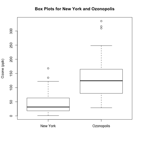
Box plots are useful for visually comparing the “centres” and “spreads” of multiple data sets. I simulated a second data set called ozone2; let’s pretend that it contains data for a very polluted city called Ozonopolis. Here is the code for plotting the parallel box plots with the labels of the cities using the ‘names‘ option.
png('INSERT YOUR DIRECTORY PATH HERE/box plots ozone New York Ozonopolis.png')
boxplot(ozone, ozone2, ylab = 'Ozone (ppb)', names = c('New York', 'Ozonopolis'), main = 'Box Plots for New York and Ozonopolis')
dev.off()
These box plots suggest that Ozonopolis has significantly more ozone than New York; not only is the centre higher for Ozonopolis, but the 2 IQRs (the 2 rectangles) do not overlap along the vertical axis, suggesting that the 2 population means differ beyond just random variation. To quantify this difference, you can use an independent 2-sample t-test, which I described in detail in a previous post regarding the discovery of argon by Lord Rayleigh and William Ramsay.
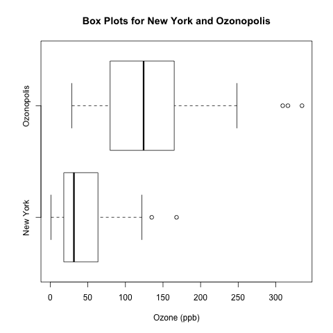
I prefer this above vertical orientation of the box plots, but it is possible to arrange them horizontally by specifying horizontal = T. Be sure to change ylab = ‘Ozone (ppb)’ to xlab = ‘Ozone (ppb)’.
boxplot(ozone, ozone2, xlab = 'Ozone (ppb)', names = c('New York', 'Ozonopolis'), main = 'Box Plots for New York and Ozonopolis', horizontal = T)
There is another way of specifying the axis labels in R, but it requires calling a separate function called axis(), and it requires different syntax for horizontal and vertical box plots.
boxplot(ozone, ozone2, ylab = 'Ozone (ppb)', xaxt = 'n', main = 'Box Plots for New York and Ozonopolis')
axis(1, at = c(1,2), labels = c('New York', 'Ozonopolis'))
xaxt = ‘n’ in boxplot() suppresses the x-axis labels that come with boxplot().
The first argument in axis(), “1“, specifies that the axis labels go on the bottom; see the documentation for further details.
Box Plots with Notches
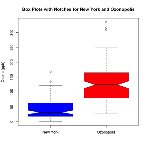
A nice addition to add to box plots is notches. According to Chambers et al. (Page 62, 1983), the 2 medians are significantly different with 95% confidence if the notches of 2 box plots do not overlap. Let’s plot the box plots with notches for our 2 cities’ ozone concentrations.
png('INSERT YOUR DIRECTORY PATH HERE/notched box plots ozone New York Ozonopolis.png')
boxplot(ozone, ozone2, notch = T, ylab = 'Ozone (ppb)', names = c('New York', 'Ozonopolis'), main = 'Box Plots with Notches for New York and Ozonopolis', col = c('blue', 'red'))
dev.off()
As you can see, the notches for the ozone concentrations in New York and Ozonopolis don’t overlap, so there is strong evidence to suggest that their medians are significantly different.
Stay Tuned for More!
Box plots are simple but effective tools for data visualization. In a future post, I will talk about kernel density plots, and I will introduce a type of box plot that incorporates a kernel density plot.
References
- Chambers, J. M., Cleveland, W. S., Kleiner, B. and Tukey, P. A. (1983) Graphical Methods for Data Analysis. Wadsworth & Brooks/Cole.
- Kabacoff, Robert. R in Action. Manning Publications Co., 2011.
Filed under: Descriptive Statistics, Plots, R programming, Uncategorized Tagged: axis(), box plot, boxplot(), descriptive statistics, dev.off(), notch, notches, plot, plots, plotting, PNG, R, R programming, statistics, summary()
R-bloggers.com offers daily e-mail updates about R news and tutorials about learning R and many other topics. Click here if you're looking to post or find an R/data-science job.
Want to share your content on R-bloggers? click here if you have a blog, or here if you don't.


