
Did Wages Detach from Productivity in 1973? An Investigation
Want to share your content on R-bloggers? click here if you have a blog, or here if you don't.
This is the third and final blog post in my series on income inequality (read the other two here and here). This post discusses the detachment of compensation from productivity that occurred around 1973. I look at the data and use R for exploring this break, along with why it may have occurred. R code is with the analysis, in the spirit of reproducible research.
This series on income inequality was originally inspired by this article by Stan Sorscher. We see this chart in the article:
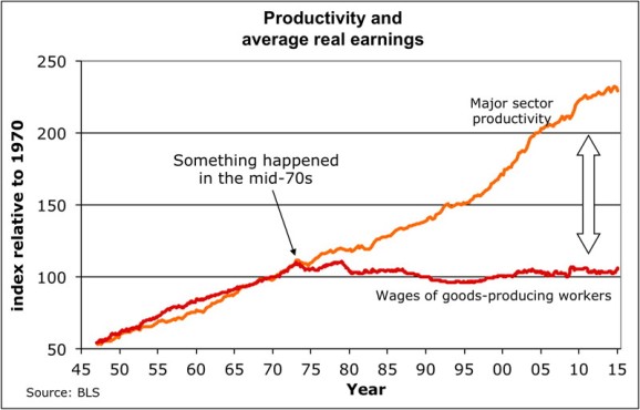
I was stunned when I first saw Dr. Sorscher’s 1 chart. It appears as if something big happened in 1973 to unhinge wages from productivity. The kink in the chart is the smoking gun. Workers from that point on are robbed of the fruit of their labor, yet the chart suggests that somehow this can be fixed, since something did this.
However, Dr. Sorscher claims that no such smoking gun exists. Instead of there being some economic explanation, he waxes on about the loss of shift of American values to a “greed is good” mentality, that the kink of 1973 reflects the point when this shift occurs, and ever since then, capitalists and policy makers simply found it easier and more acceptable to rob the working man of his wages. The fix? Shift the culture back to one where we cared about everyone.
I don’t necessarily disagree with the idea that a shift in the mentality of Americans has occured. Once, the United States was an egalitarian beacon that other nations sought to emulate. The Roosevelts did much to limit corporate power and establish a friendly environment for workers. Then Reagan escalated the Cold War and managed to link anything that would seem to inhibit the workings of free markets with COMMUNISM (gasp) and thus must be reviled. In the process of resisting Communism, we forgot the principles that made us the envy of the world and ensured the majority of Americans a decent living. And I hope someday we remember who we once were.
That said, I disagree with Dr. Sorscher. A kink like the one in 1973 suggests more than his explanation. First, values do not change overnight. Second, claiming a shift in values must be accompanied with some example, and if 1973 is the year the shift occured we should be able to find some event in 1973 that suggests the shift has occured. Finally, claiming that our problems are due to a change in just values is not actionable; values must translate to policy and practice in order to be of any effect, and if we are to fix the problem of stagnating wages and growing inequality, we must identify the policies and practices responsible for the problem in order to fix them.
Thus, I sought to replicate Dr. Sorscher’s results, but in doing so discovered some holes in his analysis, which suggest that perhaps this detachment of wages from productivity may not even have occured. We shall see why below.
(Throughout this post, I will be using R to analyze the datasets relevant to this topic, and the code will be intermixed through the text. For the R coders reading this post, enjoy. For the rest, there is a reason why I do this. I subscribe to the philosophy of reproducible research, which says results and code should be shown simultaneously for both checking and confirming results and also building upon them. If you don’t like code, ignore it. You may still find parts you like.)
Getting the data
Dr. Sorscher’s charts claim to use data from the Bureau of Labor Statistics, one of the most important sources for U.S. economic data. The series in his charts include major sector productivity and wages for workers in goods-producing industries. I did my best to find data matching that in his charts, but unfortunately I was able only to replicate the series on productivity, not the series for wages. That said, I do not feel it fair to use only workers in goods-producing industries and productivity in all major sectors, since this is an apples-to-oranges comparison. So I feel fine about the fact that I use real hourly wages for all major-sector workers rather than those in goods-producing industries.
Instead of just downloading the data directly from the BLS website, I decided to take advantage of the BLS data API and the R implementation of that API. See the code below for how to install the API from GitHub.
# devtools::install_github("mikeasilva/blsAPI")
# API for BLS website
library(blsAPI)
library(rjson)
library(dplyr)

# Because I want to concatenate strings like a python programmer, damnit!
`%s%` <- function(x,y) {paste(x,y)}
`%s0%` <- function(x,y) {paste0(x,y)}
The version of the BLS API I am using restricts the number of years for which you can get data in any given call (why they do this is beyond me). So I get data in batches of five years and create a data frame containing the data set.
series_df <- data.frame("quarter" = list(),"productivity" = list(),"compensation" = list())
for (year in (1947 + 5 * (0:((2016 - 1947)/5)))) {
payload <- list(
'seriesid' = c("PRS84006093","PRS84006153"), # Series ID's
# PRS84006093 is labor productivity (output per hour) in business sector
# PRS84006153 is real hourly compensation in business sector
"startyear" = year,
"endyear" = min(year + 4, 2016),
"registrationKey" = api_key
)
response <- blsAPI(payload, 2) %>% fromJSON # Parse response
# Update data frame with new information
series_df <- bind_rows(series_df, bind_rows(
# Make a data frame with each productivity value for a time point; this will be
# a row that will be joined together into a complete data frame
lapply(response$Results$series[[1]]$data, function(x)
list("quarter" = x$year %s0% x$period, "productivity" = x$value))
# Join with compensation data
) %>% full_join(bind_rows(
# Make a data frame with each compensation value for a time point; this will be
# a row that will be joined together into a complete data frame
lapply(response$Results$series[[2]]$data, function(x)
list("quarter" = x$year %s0% x$period, "compensation" = x$value))
)))
Sys.sleep(5) # Wait 5 seconds before next request
}
series_df <- arrange(series_df, quarter)
# Create a multivariate time series object
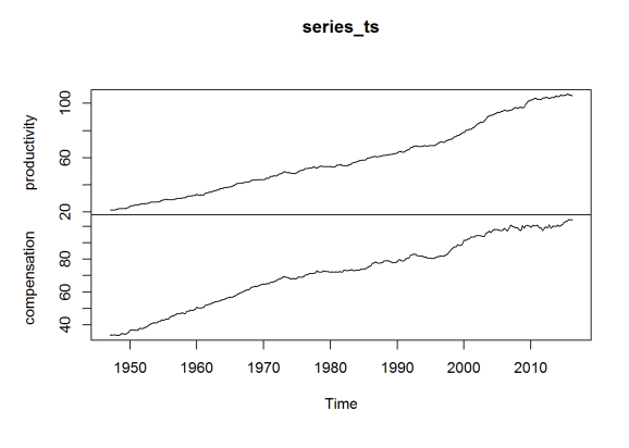
series_ts <- ts(series_df[c("productivity", "compensation")], start = c(1947,1),frequency = 4)
head(series_ts)
## productivity compensation
## [1,] 21.499 33.407
## [2,] 21.601 33.894
## [3,] 21.407 33.658
## [4,] 21.686 33.936
## [5,] 22.179 33.686
## [6,] 22.633 33.535
plot(series_ts)
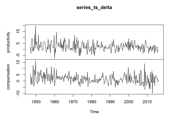
The data above is enough for me to recreate (as close as I can) Dr. Sorscher’s chart, but I will also want to look at the percentage change in these series between quarters. So I repeat the process with two other series, representing these percentage changes. (I would rather use the BLS data directly than compute this myself, to ensure some consistency.)
series_df_delta <- data.frame("quarter" = list(),"productivity" = list(),"compensation" = list())
for (year in (1947 + 5 * (0:((2016 - 1947)/5)))) {
    payload <- list(
        'seriesid' = c("PRS84006092","PRS84006152"), # Series ID's
        # PRS84006092 is % change in labor productivity (output per hour) in business sector since previous quarter
        # PRS84006152 is % change in real hourly compensation in business sector since previous quarter
        "startyear" = year,
        "endyear" = min(year + 4, 2016),
        "registrationKey" = api_key
    )
    response <- blsAPI(payload, 2) %>% fromJSON   # Parse response
    # Update data frame with new information
    series_df_delta <- bind_rows(series_df_delta, bind_rows(
        # Make a data frame with each productivity value for a time point; this will be
        # a row that will be joined together into a complete data frame
        lapply(response$Results$series[[1]]$data, function(x)
            list("quarter" = x$year %s0% x$period, "productivity" = x$value))
        # Join with compensation data
    ) %>% full_join(bind_rows(
        # Make a data frame with each compensation value for a time point; this will be
        # a row that will be joined together into a complete data frame
        lapply(response$Results$series[[2]]$data, function(x)
            list("quarter" = x$year %s0% x$period, "compensation" = x$value))
    )))
    Sys.sleep(5)  # Wait 5 seconds before next request
}
series_df_delta <- arrange(series_df_delta, quarter)

# Create a multivariate time series object
series_ts_delta <- ts(series_df_delta[c("productivity", "compensation")], start = c(1947,1),frequency = 4)
head(series_ts_delta)

##      productivity compensation
## [1,]          1.9          6.0
## [2,]         -3.5         -2.8
## [3,]          5.3          3.3
## [4,]          9.4         -2.9
## [5,]          8.4         -1.8
## [6,]         -1.9          4.1

plot(series_ts_delta)
The data is an index, with 2009 constituting 100. The year 1973 is of special interest, so I reindex to make 1970 the value 100 (for the average) for both series, as done in Dr. Sorscher’s chart.
means_70 <- apply(window(series_ts, start = c(1970,1), end = c(1970,4)),2,mean)
series_ts[,"productivity"] <- series_ts[,"productivity"] / means_70["productivity"] * 100
series_ts[,"compensation"] <- series_ts[,"compensation"] / means_70["compensation"] * 100
plot(series_ts)

Plotting the data
The charts I made earlier are only preliminary. I use ggplot2 to actually make a nice chart comparable to the one near the beginning of this post.
library(ggplot2)
library(ggthemes)   # Nice ggplot2 themes, like the Economist
library(reshape)

plot_df <- melt(series_ts) %>% arrange(X1)
plot_df$X1 <- rep(series_ts %>% time %>% as.vector, each = 2)
names(plot_df) <- c("Year", "Series", "Index")
ggplot(plot_df, aes(x = Year, y = Index, group = Series)) +
    geom_line(aes(color = Series), size = 1.4) +
    ggtitle("U.S. Business Sector Productivity and\nReal Compensation (1973 is 100)") +
    theme_economist_white() +
    scale_color_economist()
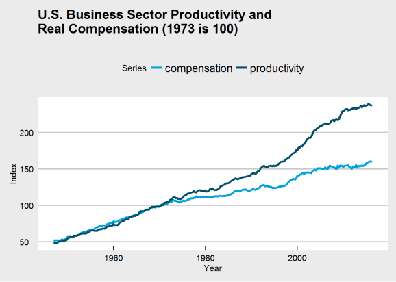
The break in my chart is not as dramatic in Dr. Sorscher’s, and I was unable to find a series for wages that does replicate that dramatic break. There is another problem, though: making 1970 the value 100 guarantees that the two charts will intersect there, which may distort the interpretation of the chart. Choosing that base year to be 100 may be distorting how we view the data. If we were to make 1947 (the beginning of the series) the index value 100, would the chart have the same dramatic break at 1973?
series_ts_47 <- series_ts
series_ts_47[,"productivity"] <- series_ts[,"productivity"] / series_ts[1,"productivity"] * 100
series_ts_47[,"compensation"] <- series_ts[,"compensation"] / series_ts[1,"compensation"] * 100

plot_df_47 <- melt(series_ts_47) %>% arrange(X1)
plot_df_47$X1 <- rep(series_ts_47 %>% time %>% as.vector, each = 2)
names(plot_df_47) <- c("Year", "Series", "Index")
ggplot(plot_df_47, aes(x = Year, y = Index, group = Series)) +
    geom_line(aes(color = Series), size = 1.4) +
    ggtitle("U.S. Business Sector Productivity and\nReal Compensation (1947 is 100)") +
    theme_economist_white() +
    scale_color_economist()

See the difference? It’s clear that the choice of base year was influencing perception of the chart and its data. There may still be a kink around 1973, but if it does exist, it does not appear quite so dramatic. Thus, we may need to rethink the problem and question:
- whether a change occured at all, and
- whether that change occured in 1973.
It’s here that I introduce change point analysis.
Change point analysis and the CUSUM test
Consider the model:

where 


In words, a series centers around a common mean up until an unknown point in time, when the series might suddenly change its mean.
We wish to test:


In words, we test the null hypothesis that no change occurs against the alternative hypothesis that states that the mean does change, though we don’t know where this change occurs.
The problem we have been discussing calls for a test like this. We neither can claim to know whether a change occured nor when it did (if we did know, we could simply use a two-sample t-test). Fortunately, change point analysis is a well-studied problem.
To perform this test, I use the CUSUM statistic:


The limiting distribution of the CUSUM distribution is the distribution of ![\sup_{t\in[0,1]}|B(t)|](https://s0.wp.com/latex.php?latex=%5Csup_%7Bt%5Cin%5B0%2C1%5D%7D%7CB%28t%29%7C&bg=ffffff&%23038;fg=444444&%23038;s=0 "\sup_{t\in[0,1]}|B(t)|")
 = \frac{\sqrt{2\pi}}{x}\sum_{k=1}^\infty e^{-(2k-1)^2\pi^2/(8x^2)}")
We thus reject the null hypothesis if ")
The functions below allow for implementing the CUSUM test for change in mean.
#include <Rcpp.h>
using namespace Rcpp;

// Function to be wrapped; to be used only in statVn; see a description
// there

// [[Rcpp::export]]
NumericVector statVn_cpp(NumericVector dat, double kn, double tau) {
    double n = dat.size();
    // Get total sum and sum of squares; this will be the "upper sum"
    // (i.e. the sum above k)
    double s_upper = 0, s_square_upper = 0;
    // The "lower sums" (i.e. those below k)
    double s_lower = 0, s_square_lower = 0;
    // Get lower sums
    // Go to kn - 1 to prevent double-counting in main
    // loop
    for (int i = 0; i < kn - 1; ++i) {
        s_lower += dat[i];
        s_square_lower += dat[i] * dat[i];
    }
    // Get upper sum
    for (int i = kn - 1; i < n; ++i) {
        s_upper += dat[i];
        s_square_upper += dat[i] * dat[i];
    }
    // The maximum, which will be returned
    double M = 0;
    // A candidate for the new maximum, used in a loop+
    double M_candidate;
    // Get the complete upper sum
    double s_total = s_upper + s_lower;
    // Estimate for change location
    int est = n;

    // Compute the test statistic
    for (int k = kn; k <= (n - kn); ++k) {
        // Update s and s_square for both lower and upper
        s_lower += dat[k-1];
        s_square_lower += dat[k-1] * dat[k-1];
        s_upper -= dat[k-1];
        s_square_upper -= dat[k-1] * dat[k-1];

        // Get estimate of sd for this k
        double sdk = std::sqrt((s_square_lower - s_lower * s_lower / k +
            s_square_upper - s_upper * s_upper / (n - k))/n);
        M_candidate = std::abs(s_lower - (k / n) * s_total) / sdk /
                        std::pow(k / n * (n - k) / n, tau);
        // Choose new maximum
        if (M_candidate > M) {
            M = M_candidate;
            est = k;
        }
    }
    // Final step; the maximum M should be normalized
    M /= std::sqrt(n);

    return NumericVector::create(M, est);
}


statVn <- function(dat, kn = function(n) {1}, tau = 0, estimate = FALSE) {
    ## Computes the Vn statistic
    ##
    ## :param dat: vector; The data vector
    ## :param kn: function; A function that corresponds to the k_n
    ##      function in the (trimmed) CUSUM variant; by default, is
    ##      a function returning 0 (no trimming)
    ##  :param tau: numeric; The weighting parameter for the
    ##      weighted CUSUM statistc; by default, is 0
    ##  :param estimate: integer; Whether to return the estimated
    ##      location of the change point
    ##
    ## :return: numeric; The resulting test statistic
    ##
    ## This function (written in C++) computes the CUSUM statistic, Vn,
    ## and returns the resulting statistic. Changing the parameters kn
    ## and tau allow for weighted and trimmed variants of the CUSUM
    ## statistic.

    # Here is equivalent (slow) R code
    # n = length(dat)
    # return(n^(-1/2)*max(sapply(
    #     floor(max(kn(n),1)):min(n - floor(kn(n)),n-1), function(k)
    #         (k/n*(1 - k/n))^(-tau)/
    #         sqrt((sum((dat[1:k] -
    #            mean(dat[1:k]))^2)+sum((dat[(k+1):n] -
    #            mean(dat[(k+1):n]))^2))/n)*
    #         abs(sum(dat[1:k]) - k/n*sum(dat))
    # )))

    res <- statVn_cpp(dat, kn(length(dat)), tau)
    names(res) <- c("statistic", "estimate")
    res[2] <- as.integer(res[2])
    if (estimate) {
        return(res)
    } else {
        return(res[[1]])
    }
}

pKolmogorov <- function(q, summands = 500) {
    ## A function for computing the distribution function of sup|B(t)|
    ##
    ## q: numeric; The quantile to compute the probability for
    ## summands: integer; The number of summands to include
    ##    in the sum
    ## (return): numeric; The probability associatecd with
    ##    the quantile.
    ##
    ## This function computes P(K < q), where K is
    ## sup_(0<t<1)|B(t)|. The formula for computing this
    ## is
    ## sqrt(2pi)/x sum_(i=1)^(infty) exp(-(2i-1)^2pi^2/
    ## (8x^2))

    return(sqrt(2*pi)*sapply(q, function(x) { if (x > 0) {
        return(sum(exp(-(2*(1:summands)-1)^2*pi^2/(8*x^2)))/x)
    } else {
        return(0)
    }}))
}

CUSUM.test <- function(x) {
    ## Cleanly performs the CUSUM test
    ##
    ## :param x: numeric; Data to test for changepoint
    ##
    ## :return: htest; List of class htest containing
    ##      test description and results.
    ##
    ## Performs a CUSUM test for change in mean.

    testobj <- list()
    testobj$method <- "CUSUM Test for Change in Mean"
    testobj$data.name <- deparse(substitute(x))

    res <- statVn(x, estimate = TRUE)
    stat <- res[[1]]
    est <- res[[2]]
    attr(stat, "names") <- "A"
    attr(est, "names") <- "t*"
    testobj$p.value <- 1 - pKolmogorov(res[1])
    testobj$estimate <- est
    testobj$statistic <- stat

    class(testobj) <- "htest"
    return(testobj)
}
Results
Since the data trends, we apply the CUSUM test for change in mean to the percentage change between quarters. Thus, we are testing whether the rate of increase of productivity and compensation changes during the period in question. The results of the test are below:
apply(series_ts_delta, 2, CUSUM.test)

## $productivity
##
##  CUSUM Test for Change in Mean
##
## data:  newX[, i]
## A = 1.7258, p-value = 0.005178
## sample estimates:
##  t*
## 104
##
##
## $compensation
##
##  CUSUM Test for Change in Mean
##
## data:  newX[, i]
## A = 2.154, p-value = 0.0001867
## sample estimates:
##  t*
## 104

time(series_ts_delta)[104]

## [1] 1972.75
It seems that the best estimate for the location of the change is Q3 1972, so we can say that the change occured around 1973. That said, notice that both productivity and compensation changed at that time, not just compensation.
I now estimate the growth rates of both series before and after the change
apply(series_ts_delta[1:103,], 2, mean)

## productivity compensation
##     3.311650     2.900971

apply(series_ts_delta[-c(1:103),], 2, mean)

## productivity compensation
##     1.847126     1.016667
Productivity growth dropped from 3.3% a quarter to 1.8% a quarter, and compensation (wage) growth dropped from 2.9% a quarter to 1% a quarter. A large drop for both series.
We can check for other change points by considering the data sets broken at the change point to be two separate data sets, and then reapply the test:
apply(series_ts_delta[1:103,], 2, CUSUM.test) # Changes before 1973?

## $productivity
##
##  CUSUM Test for Change in Mean
##
## data:  newX[, i]
## A = 0.50499, p-value = 0.9607
## sample estimates:
## t*
## 18
##
##
## $compensation
##
##  CUSUM Test for Change in Mean
##
## data:  newX[, i]
## A = 0.67167, p-value = 0.7577
## sample estimates:
## t*
## 52

apply(series_ts_delta[-c(1:103),], 2, CUSUM.test) # Changes after 1973?

## $productivity
##
##  CUSUM Test for Change in Mean
##
## data:  newX[, i]
## A = 0.88028, p-value = 0.4205
## sample estimates:
##  t*
## 148
##
##
## $compensation
##
##  CUSUM Test for Change in Mean
##
## data:  newX[, i]
## A = 0.5727, p-value = 0.8982
## sample estimates:
## t*
## 91
There is no evidence for other change points. 1973 is special.
It looks as if productivity growth dropped by half and compensation growth dropped to a third, but can we say that they detached, as Dr. Sorscher claims? To investigate this, I look at the series of differences between productivity growth and compensation growth.
CUSUM.test(series_ts_delta[,"productivity"] - series_ts_delta[,"compensation"])


##
##  CUSUM Test for Change in Mean
##
## data:  series_ts_delta[,"productivity"] - series_ts_delta[,"compensation"]
## A = 0.56933, p-value = 0.9021
## sample estimates:
## t*
## 92
The CUSUM test fails to reject the null hypothesis of no change, with no room for ambiguity. It does not appear that the two series detached.
Concluding discussion
Here is the new and improved chart with the location of the change highlighted by a red line.
ggplot(plot_df_47, aes(x = Year, y = Index, group = Series)) +
    geom_line(aes(color = Series), size = 1.4) +
    ggtitle("U.S. Business Sector Productivity and\nReal Compensation (1947 is 100)") +
    theme_economist_white() +
    scale_color_economist() +
    geom_vline(xintercept = time(series_ts_delta)[104], color = "red")
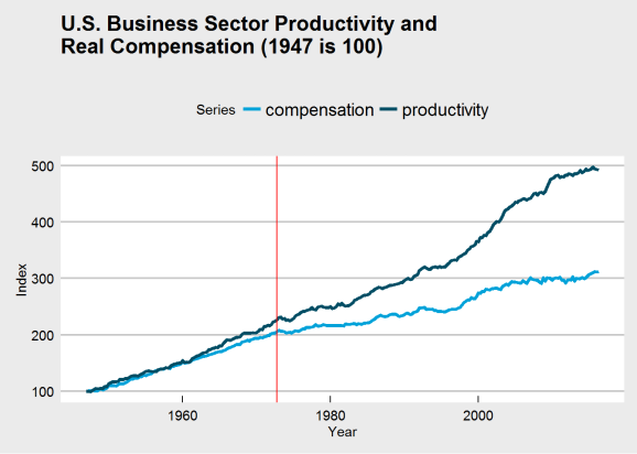
It’s difficult to see, but both series have changed after 1973, and the above analysis suggests they are both growing slower. Productivity growth was already growing faster than compensation, and even if the 1973 break had not occured, we would still likely see a large gap between the series at the end of the chart. A Marxist would tell you this is consistent with how capitalism operates; the capitalist class does not fully compensate its workers, never has, and never will. There will always be a discrepancy between productivity and compensation for as long as capitalism is our economic system.
That said, why did the break of 1973 (or Q3 1972, if you prefer) occur? Let’s first answer: did the break occur because of a drop in productivity growth, or because of a drop in compensation growth? Now there is a conundrum that I will not be able to answer in a blog post. There is, in all honesty, no way to tell.
Can we point to an event that might cause a break in either? Well, Richard Nixon was elected President that year. He was a Republican, so he must have done something to do with it. But not only did Nixon have to deal with a Democratically-run Congress throughout his administration, Nixon was an older generation of Republicans and a political era when ideology hardly defined political allegiance. Nixon wanted to end the war in Vietnam, opened relations with China, and, aside from wanting to delegate more decision-making power to the states, did not have an economic policy we would associate with Republicans today. In fact, Nixon supported the Equal Rights Amendment (intended to make gender equality a Constitutionally-guaranteed right) and created the Environmental Protection Agency so hated by Republicans today (along with other environmental reforms). Watergate had nothing to do with the economy; we can’t pin the blame on him.
What about GATT? 1973 saw a new round of GATT negotiations, the Tokyo round, that further liberalized trade, dropping nations tariffs. This might be closer to the cause, but I’m not convinced.
How about the wave of deregulation that began in the 1970s? Unfortunately, this started in the late 1970s, and didn’t escalate to full-blown dismantlement of regulatory structures until Ronald Regan took office. In fact, Regan is the best evidence of the shift Dr. Sorscher claims tood place, though this happens much later than Dr. Sorscher claim.
In truth, I don’t have an answer as to why this break occured in 1973. It could have been GATT, the conclusion of the Vietnam War, deregulation, or a number of other causes. That said, I do consider this an interesting question, hopefully one that will someday be answered with satisfaction. And perhaps in answering it we will find a solution to the growing inequality that continues to plague us.
- Dr. Sorscher has a PhD from UC Berkeley in biophysics, and is a board member of the Economic Opportunity Institute, for whom he wrote his article. ↩

R-bloggers.com offers daily e-mail updates about R news and tutorials about learning R and many other topics. Click here if you're looking to post or find an R/data-science job.
Want to share your content on R-bloggers? click here if you have a blog, or here if you don't.