
Creating figures like the paper ‘Completeness of Digital Accessible Knowledge of Plants of Ghana’ Part 1
Want to share your content on R-bloggers? click here if you have a blog, or here if you don't.
Recently I got to read the paper about Completeness of Digital Accessible Knowledge DAK by Alex Asase and A. Townsend Peterson. I really enjoyed reading the paper and liked the way the figures are presented. There is a lot of overlap of this with my work on package bdvis (of course under guidance of Town Peterson). So I thought I will share some code snippets to recreate figures similar to the ones in the paper using package bdvis.
Since I do not have the copy of the data in the paper, I am using data downloaded from GBIF website. I decided to use Birds data for India.
To create Figure 1a. Graph showing accumulation of records through time (years) we need to set the data in bdvis format and then use function distrigraph.
library(bdvis)

# Download GBIF data from data.gbif,org portal and
# extract occurrence.txt file in Data folder
occ <- read.delim( 'verbatim.txt',
                          quote='', stringsAsFactors=FALSE)
# Construct Date field form day, month, year
occ$Date_collected <- as.Date( paste( occ$year,
                                      occ$month ,
                                      occ$day , sep = "." ),
                               format = "%Y.%m.%d" )
# Set configuration variables to format data
conf <- list(Latitude='decimalLatitude',
             Longitude='decimalLongitude',
             Date_collected='Date_collected',
             Scientific_name='specificEpithet')
occ <- format_bdvis(occ, config=conf) occ_date=occ[occ$Date_collected > as.Date("1500-01-01") &
           occ$Date_collected < as.Date("2017-01-01") &
           !is.na(occ$Date_collected) ,]
distrigraph(occ_date, ptype="efforts", type="h")
Now this created the following graph:
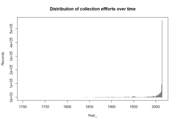
The graph shows what we wanted to show, but we would like to modify this a bit to look more that the Figure in the paper. So let us exclude some more data and change the color and width of the lines in the graph.
occ_date1 <- occ[occ$Date_collected > as.Date("1900-01-01") &
               occ$Date_collected < as.Date("2015-01-01") &
               !is.na(occ$Date_collected) ,]
distrigraph(occ_date1, ptype="efforts", col="red",
            type="h", lwd=3)
Now this created the following graph:

References
- Asase, Alex, and A Townsend Peterson. 2016. “Completeness of Digital Accessible Knowledge of Plants of Ghana.” Biodiversity Informatics, 1–11. doi:http://dx.doi.org/10.17161/bi.v11i0.5860.
- Barve, Vijay, and Javier Otegui. 2016. “Bdvis: Visualizing Biodiversity Data in R.” Bioinformatics. doi:http://dx.doi.org/10.1093/bioinformatics/btw333.

R-bloggers.com offers daily e-mail updates about R news and tutorials about learning R and many other topics. Click here if you're looking to post or find an R/data-science job.
Want to share your content on R-bloggers? click here if you have a blog, or here if you don't.