
Consultants’ Chart in ggplot2
Want to share your content on R-bloggers? click here if you have a blog, or here if you don't.
Excel Charts Blog posted a video tutorial of how to create a circumplex or rose or dougnut chart in Excel. Apparently this type of chart is very popular in the consulting industry, hence the “Consultants’ Chart”.
It is very easy to make this chart in Excel 2010, but it involves countless number of clicks and formulas to format both the source data and the chart itself.
In ggplot2 the same can be achieved with around 10 lines of code, as can be seen below.
Set up dummy dataframe
> set.seed(9876) > DF <- data.frame(variable = 1:10, value = sample(10, + replace = TRUE)) > DF variable value 1 1 9 2 2 4 3 3 2 4 4 6 5 5 5 6 6 3 7 7 5 8 8 7 9 9 6 10 10 2 |
Prepare the charts
> library(ggplot2) |
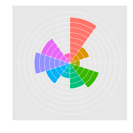
Dougnut chart is essentially a bar chart using a polar coordinate system, so we start off with a simple bar chart. And to make life a bit more colourful will fill each slice with a different colour.
> ggplot(DF, aes(factor(variable), value, fill = factor(variable))) + + geom_bar(width = 1) |

Next the coordinate system is changed and some of the plot elements are removed for a cleaner look.
> last_plot() + scale_y_continuous(breaks = 0:10) + + coord_polar() + labs(x = "", y = "") + opts(legend.position = "none", + axis.text.x = theme_blank(), axis.text.y = theme_blank(), + axis.ticks = theme_blank()) |

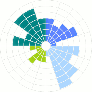
Adding gridlines
Update 17 August 2010
Several commentators asked how to draw gridlines on top of the slices as in the original example.
Putting the gridlines/guides on top of the plot is accomplished by adding a new variable that is purely used for drawing the borders of each slice element. Essentially, it stacks the required number of slices with a white border on top of each other.
> DF <- ddply(DF, .(variable), transform, border = rep(1, + value)) > head(DF, 10) variable value border 1 1 9 1 2 1 9 1 3 1 9 1 4 1 9 1 5 1 9 1 6 1 9 1 7 1 9 1 8 1 9 1 9 1 9 1 10 2 4 1 |
> ggplot(DF, aes(factor(variable))) + geom_bar(width = 1, + aes(y = value, fill = factor(variable))) + + geom_bar(aes(y = border, width = 1), position = "stack", + stat = "identity", fill = NA, colour = "white") + + scale_y_continuous(breaks = 0:10) + coord_polar() + + labs(x = "", y = "") + opts(legend.position = "none", + axis.text.x = theme_blank(), axis.text.y = theme_blank(), + axis.ticks = theme_blank()) |

R-bloggers.com offers daily e-mail updates about R news and tutorials about learning R and many other topics. Click here if you're looking to post or find an R/data-science job.
Want to share your content on R-bloggers? click here if you have a blog, or here if you don't.