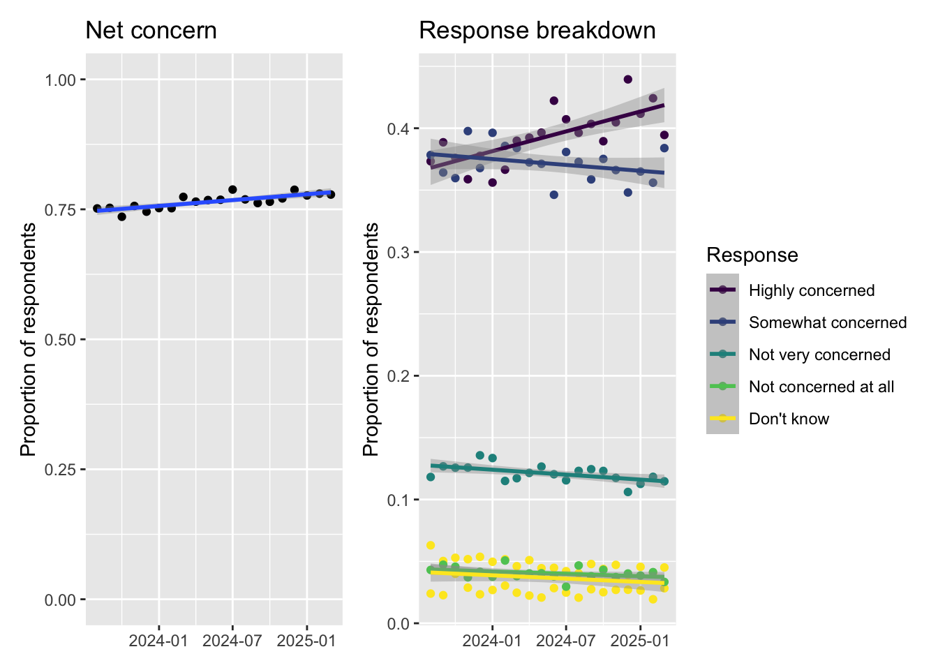
How to draw a pie chart on a map in R with ggplot2 and scatter pie? An example for Turkey
Pie Chart… The unloved boy of visualization family. However, it is getting popularity especially when it is in conjuction with maps. For example, the following chart was publised by to illustrate the vote distribution across the country.