
Animating goals in R using ggsoccer and gganimate.
Want to share your content on R-bloggers? click here if you have a blog, or here if you don't.
After seeing this blog post from Matt Dray, and this github repo from Devin Pleurer, I knew what my next blog post was going to be. My last post was my first foray into gganimate, and this will be my first look at the ggsoccer package. Let’s get started. Code for the finished product available on my github.
You’ll Need:
I’ve used a few libraries here, you’ll need:
- ggsoccer
- gganimate
- ggplot2
- dplyr
- lubridate
Optionally you can use the av library to save your animation as an mp4. You’ll also need to download the three datasets from this link. Finally, you’ll need a basic understanding of ggplot2 to understand some of the code below.
Football Data Types
There are three files in that github repo. One containing event data, and two containing tracking data. Event data is a chronological telling of the story of the game. It lists passes, tackles, fouls, and any other event you can imagine in a game of football. Tracking data on the other hand, typically uses hardware to get the position of each player on the pitch. Usually this isn’t obtainable for free, but thankfully Metrica has published some (thanks Metrica) . We’ll use the tracking data to plot our players on our animation, and the event data can tell help us find interesting moments in the game to plot.
Adapting the Data
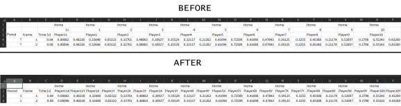
We’ll need to make some changes to the tracking data to make it easier to use. I copied and pasted the raw values into excel and used Text-To-Columns to create a spreadsheet. I altered some column headings to make the data a bit clearer once we take it into R. X and Y values are presented side by side but the column for Y values does not have a title. By default, R will call this X1, X2, etc. So while you can leave this step undone, having columns named X that represent your Y values is asking for trouble down the line.
Choosing an Event and Preparing the Data.
I searched the event file for a goal and found one at around the 90 second mark. Taking the previous set piece as the start and the goal itself as the end, we’ll make our animation around this goal. So let’s load in all three of our datasets.
# Read in data
# Tracking Data
awayTrack <- read.csv("AwayTracking.csv", stringsAsFactors = F, skip = 1)
homeTrack <- read.csv("HomeTracking.csv", stringsAsFactors = F, skip = 1)
events <- read.csv("Event.csv", stringsAsFactors = F)
Our set piece takes place at 85.72 seconds and our goal at 92.36 seconds (according to the Time [s] column), so let’s create a new variable containing only the data between these times.
# Away tracking data
oneNilA <- subset(awayTrack, Time..s. > 85.72 & Time..s. < 92.36)
# Home tracking data
oneNilH <- subset(homeTrack, Time..s. > 85.72 & Time..s. < 92.36)
# All tracking data
oneNil <- dplyr::full_join(oneNilA, oneNilH)
Using head(oneNil) we can see that we have a lot of missing data. Players who were on the bench have their coordinate data as NaN (Not a Number). Let’s remove any players with this value to ensure it doesn’t cause problems down the line. Alternatively you could hard code values for where the bench might be, but I prefer just to remove these.
# drop colums for players  who are not on the pitch
subs <- oneNil[1,] == "NaN"                      # Returns boolean for if their coordinates are not a number
oneNil <- oneNil[, !subs, drop = FALSE]          # in oneNil, for every row, if subs is FALSE, remove
Before we can use the data in our animation, we have a change to make. Metrica stores the X/Y values between 0 and 1. ggsoccer uses a scale of 0-100. So we just need to multiply the values in each co-ordinate column by 100 to get the right positions on our chart.
# Metrica values are between 0 and 1. We need between 0 and 100. Multiply co-ordinate values by 100 to get right scale
oneNil[,4:49] <- oneNil[,4:49] * 100
Now we can look at our event data to see who’s involved in the goal. I’ll subset the event dataframe to the same time period as we did the tracking data. The To and From columns show the players involved in each part of play, so we’ll note that these are players we need to include in our animation.
# check event data for time period
oneNilEvent <- subset(events, Start.Time..s. > 84 & End.Time..s. < 93)
# We can see which players we need by looking at the event
unique(oneNilEvent$From)
unique(oneNilEvent$To)
# Players 1-14 are home, 15+ are away

Here we can see that we only have three players involved in this goal. Due to the shape of the dataset, the easiest way for us to plot the players is to give each one a geom_point() part in our plot. Let’s get to plotting
Plotting the Data
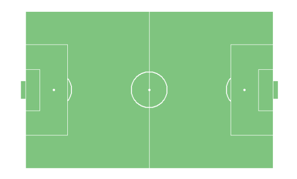
ggsoccer makes it easy to plot data on a pitch. Simply call ggplot and use the pitch annotation and theme to draw a pitch
plot <-
  ggplot(oneNil) +

  annotate_pitch(
    colour = "white",             # Pitch lines
    fill = "#7fc47f"              # Pitch colour
  ) +

  theme_pitch()                   # removes xy labels
The output for the above code looks like this:
Let’s add some limits to crop the pitch to the action area, and add in the location of the ball.
plot <-
  ggplot(oneNil) +

  annotate_pitch(
    colour = "white",                         # Pitch lines
    fill = "#7fc47f"                          # Pitch colour
  ) +

  theme_pitch() +                             # removes xy labels

  coord_cartesian(                            # crop pitch to limits, works best inside coord_cartesian rather than
    xlim = c(45, 103),                        # just using xlim and ylim, not sure why
    ylim = c(-3, 103)
  ) +

# add ball location data
  geom_point(
    aes(x = BallX, y = BallY),
    colour = "black", fill = "white", pch = 21, size = 4
  )
Now we can see the path the ball follows on its way to the goal. Here, we’re plotting every x/y for the ball, so we see a lot of points, but don’t worry, this is right.

Next thing to add is the position for each of the players. Above we saw that players 6, 9, and 10 are the only ones involved in the play – so we’ll start by plotting only them.
plot <- ggplot(oneNil) +

  annotate_pitch(
    colour = "white",                         # Pitch lines
    fill = "#7fc47f"                          # Pitch colour
  ) +

  theme_pitch() +                             # removes xy labels

  coord_cartesian(                            # crop pitch to limits, works best inside coord_cartesian rather than
    xlim = c(45, 103),                        # just using xlim and ylim, not sure why
    ylim = c(-3, 103)
  ) +

# add ball location data
  geom_point(
    aes(x = BallX, y = BallY),
    colour = "black", fill = "white", pch = 21, size = 4
  ) +

  # HOME players
  # add player6 location data
  geom_point(
    aes(x = Player6X, y = Player6Y),
    colour = "black", fill = "red", pch = 21, size = 4
  ) +

  # add player9 location data
  geom_point(
    aes(x = Player9X, y = Player9Y),
    colour = "black", fill = "red", pch = 21, size = 4
  ) +

  # add player10 location data
  geom_point(
    aes(x = Player10X, y = Player10Y),
    colour = "black", fill = "red", pch = 21, size = 4
  )
Which gives us:
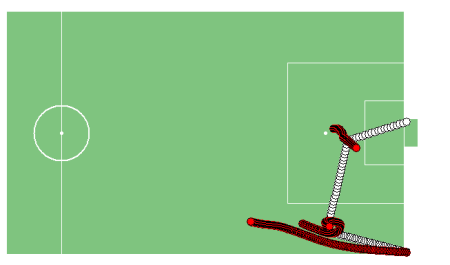
Perfect, now we can just add some titles and we’re good to go. I’ve also added a clock variable to the data to show the match time using geom_label.
# change time using lubridate package to get clock for animation
oneNil$clock <- floor(oneNil$Time..s.)
oneNil$clock <- seconds_to_period(oneNil$clock)
oneNil$clock <- paste0(as.character(minute(oneNil$clock)), ":", as.character(second(oneNil$clock)))


plot <-
  ggplot(oneNil) +

  annotate_pitch(
    colour = "white",                         # Pitch lines
    fill = "#7fc47f"                          # Pitch colour
  ) +

  theme_pitch() +                             # removes xy labels

  coord_cartesian(                            # crop pitch to limits, works best inside coord_cartesian rather than
    xlim = c(45, 103),                        # just using xlim and ylim, not sure why
    ylim = c(-3, 103)
  ) +

  geom_point(                                 # add ball location data
    aes(x = BallX, y = BallY),
    colour = "black", fill = "white", pch = 21, size = 4
  ) +

  # HOME players
  # add player6 location data
  geom_point(
    aes(x = Player6X, y = Player6Y),
    colour = "black", fill = "red", pch = 21, size = 4
  ) +

  # add player9 location data
  geom_point(
    aes(x = Player9X, y = Player9Y),
    colour = "black", fill = "red", pch = 21, size = 4
  ) +

  # add player10 location data
  geom_point(
    aes(x = Player10X, y = Player10Y),
    colour = "black", fill = "red", pch = 21, size = 4
  ) +

  # add title/subtitle/caption
  labs(
    title = "Home [1] - 0 Away",
    subtitle = "Player9 Goal - 1'",
    caption = "Made by @statnamara | Data source: Metrica"
  ) +

  # Add clock to top left
  geom_label(aes(x = 50,
                 y = 103,
                 label = clock),
             size = 7) +

  theme(title = element_text(face = "italic", size = 14),
        panel.border = element_rect(colour = "black", fill=NA, size=1),
  )
Now our plot is complete, all we need to do is add the gganimate functions and call animate().
plot <- plot  +
  transition_states(
    Frame,                    # variable used to change frame
    state_length = 0.01,      # duration of frame
    transition_length = 1,    # duration between frames
    wrap = FALSE              # restart, don't loop animation
  )
animate(plot,
        duration = 9,        # Clip is ~7 seconds long, end pause is 3 so should be right speed.
        fps = 30,
        detail = 30,
        width = 1000,
        height = 700,
        end_pause = 90
)
Voila!

And that’s it – you now have a goal fully animated just from data! I’ve added some more players below to make it a bit more interesting, but the techniques used are exactly the same. If you want to save your animation, you can use the code below, this will save to your working directory.
anim_save(filename = "goal.gif", animation = last_animation())
Have some fun with these datasets – add a score variable so you can add a scoreboard to your animation, use geom_text() to give the players shirt numbers, find a way to animate celebrations. Happy coding, football fans!

R-bloggers.com offers daily e-mail updates about R news and tutorials about learning R and many other topics. Click here if you're looking to post or find an R/data-science job.
Want to share your content on R-bloggers? click here if you have a blog, or here if you don't.