
Analyzing World Bank data with WDI, googleVis Motion Charts
Want to share your content on R-bloggers? click here if you have a blog, or here if you don't.
Recently I was surfing the web, when I came across a real cool post New R package to access World Bank data, by Markus Gesmann on using googleVis and motion charts with World Bank Data. The post also introduced me to Hans Rosling, Professor of Sweden’s Karolinska Institute. Hans Rosling, the creator of the famous Gapminder chart, the “Heath and Wealth of Nations” displays global trends through animated charts (A must see!!!). As they say in Hans Rosling’s hands, data dances and sings. Take a look at some of his Ted talks for e.g. Hans Rosling:New insights on poverty. Rosling developed the breakthrough software behind his visualizations in the Gapminder. The free software – which can be loaded with any data – was purchased by Google in March 2007.
In this post I recreate some of the Gapminder charts with the help of R packages WDI and googleVis. The WDI package provides a set of really useful functions to get the data based on the World Bank Data indicator.googleVis provides motion charts with which you can animate the data.
You can clone/download the code from Github at worldBankAnalysis which is in the form of an Rmd file.
library(WDI)
library(ggplot2)
library(googleVis)
library(plyr)
1.Get the data from 1960 to 2016 for the following
- Population – SP.POP.TOTL
- GDP in US $ – NY.GDP.MKTP.CD
- Life Expectancy at birth (Years) – SP.DYN.LE00.IN
- GDP Per capita income – NY.GDP.PCAP.PP.CD
- Fertility rate (Births per woman) – SP.DYN.TFRT.IN
- Poverty headcount ratio – SI.POV.2DAY
# World population total
population = WDI(indicator='SP.POP.TOTL', country="all",start=1960, end=2016)
# GDP in US $
gdp= WDI(indicator='NY.GDP.MKTP.CD', country="all",start=1960, end=2016)
# Life expectancy at birth (Years)
lifeExpectancy= WDI(indicator='SP.DYN.LE00.IN', country="all",start=1960, end=2016)
# GDP Per capita
income = WDI(indicator='NY.GDP.PCAP.PP.CD', country="all",start=1960, end=2016)
# Fertility rate (births per woman)
fertility = WDI(indicator='SP.DYN.TFRT.IN', country="all",start=1960, end=2016)
# Poverty head count
poverty= WDI(indicator='SI.POV.2DAY', country="all",start=1960, end=2016)
2.Rename the columns
names(population)[3]="Total population"
names(lifeExpectancy)[3]="Life Expectancy (Years)"
names(gdp)[3]="GDP (US$)"
names(income)[3]="GDP per capita income"
names(fertility)[3]="Fertility (Births per woman)"
names(poverty)[3]="Poverty headcount ratio"
3.Join the data frames
Join the individual data frames to one large wide data frame with all the indicators for the countries
j1 <- join(population, gdp)
j2 <- join(j1,lifeExpectancy)
j3 <- join(j2,income)
j4 <- join(j3,poverty)
wbData <- join(j4,fertility)
4.Use WDI_data
Use WDI_data to get the list of indicators and the countries. Join the countries and region
#This returns  list of 2 matrixes
wdi_data =WDI_data
# The 1st matrix is the list is the set of all World Bank Indicators
indicators=wdi_data[[1]]
# The 2nd  matrix gives the set of countries and regions
countries=wdi_data[[2]]
df = as.data.frame(countries)
aa <- df$region != "Aggregates"
# Remove the aggregates
countries_df <- df[aa,]
# Subset from the development data only those corresponding to the countries
bb = subset(wbData, country %in% countries_df$country)
cc = join(bb,countries_df)
dd = complete.cases(cc)
developmentDF = cc[dd,]
5.Create and display the motion chart
gg<- gvisMotionChart(cc,
                                idvar = "country",
                                timevar = "year",
                                xvar = "GDP",
                                yvar = "Life Expectancy",
                                sizevar ="Population",
                                colorvar = "region")
plot(gg)
cat(gg$html$chart, file="chart1.html")
Note: Unfortunately it is not possible to embed the motion chart in WordPress. It is has to hosted on a server as a Webpage. After exploring several possibilities I came up with the following process to display the animation graph. The plot is saved as a html file using ‘cat’ as shown above. The chart1.html page is then hosted as a Github page (gh-page) on Github.
Here is the ggvisMotionChart
Do give World Bank Motion Chart1 a spin. Here is how the Motion Chart has to be used

You can select Life Expectancy, Population, Fertility etc by clicking the black arrows. The blue arrow shows the ‘play’ button to set animate the motion chart. You can also select the countries and change the size of the circles. Do give it a try. Here are some quick analysis by playing around with the motion charts with different parameters chosen
The set of charts below are screenshots captured by running the motion chart World Bank Motion Chart1
a. Life Expectancy vs Fertility chart
This chart is used by Hans Rosling in his Ted talk. The left chart shows low life expectancy and high fertility rate for several sub Saharan and East Asia Pacific countries in the early 1960’s. Today the fertility has dropped and the life expectancy has increased overall. However the sub Saharan countries still have a high fertility rate

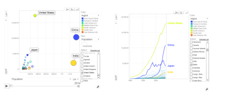
b. Population vs GDP
The chart below shows that GDP of India and China have the same GDP from 1973-1994 with US and Japan well ahead.

From 1998- 2014 China really pulls away from India and Japan as seen below
c. Per capita income vs Life Expectancy
In the 1990’s the per capita income and life expectancy of the sub -saharan countries are low (42-50). Japan and US have a good life expectancy in 1990’s. In 2014 the per capita income of the sub-saharan countries are still low though the life expectancy has marginally improved.

d. Population vs Poverty headcount

In the early 1990’s China had a higher poverty head count ratio than India. By 2004 China had this all figured out and the poverty head count ratio drops significantly. This can also be seen in the chart below.
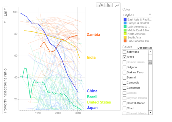
In the chart above China shows a drastic reduction in poverty headcount ratio vs India. Strangely Zambia shows an increase in the poverty head count ratio.
6.Get the data for the 2nd set of indicators
- Total population – SP.POP.TOTL
- GDP in US$ – NY.GDP.MKTP.CD
- Access to electricity (% population) – EG.ELC.ACCS.ZS
- Electricity consumption KWh per capita -EG.USE.ELEC.KH.PC
- CO2 emissions -EN.ATM.CO2E.KT
- Sanitation Access – SH.STA.ACSN
# World population
population = WDI(indicator='SP.POP.TOTL', country="all",start=1960, end=2016)
# GDP in US $
gdp= WDI(indicator='NY.GDP.MKTP.CD', country="all",start=1960, end=2016)
# Access to electricity (% population)
elecAccess= WDI(indicator='EG.ELC.ACCS.ZS', country="all",start=1960, end=2016)
# Electric power consumption Kwh per capita
elecConsumption= WDI(indicator='EG.USE.ELEC.KH.PC', country="all",start=1960, end=2016)
#CO2 emissions
co2Emissions= WDI(indicator='EN.ATM.CO2E.KT', country="all",start=1960, end=2016)
# Access to sanitation (% population)
sanitationAccess= WDI(indicator='SH.STA.ACSN', country="all",start=1960, end=2016)
7.Rename the columns
names(population)[3]="Total population"
names(gdp)[3]="GDP US($)"
names(elecAccess)[3]="Access to Electricity (% popn)"
names(elecConsumption)[3]="Electric power consumption (KWH per capita)"
names(co2Emissions)[3]="CO2 emisions"
names(sanitationAccess)[3]="Access to sanitation(% popn)"
8.Join the individual data frames
Join the individual data frames to one large wide data frame with all the indicators for the countries
j1 <- join(population, gdp)
j2 <- join(j1,elecAccess)
j3 <- join(j2,elecConsumption)
j4 <- join(j3,co2Emissions)
wbData1 <- join(j3,sanitationAccess)
9.Use WDI_data
Use WDI_data to get the list of indicators and the countries. Join the countries and region
#This returns  list of 2 matrixes
wdi_data =WDI_data
# The 1st matrix is the list is the set of all World Bank Indicators
indicators=wdi_data[[1]]
# The 2nd  matrix gives the set of countries and regions
countries=wdi_data[[2]]
df = as.data.frame(countries)
aa <- df$region != "Aggregates"
# Remove the aggregates
countries_df <- df[aa,]
# Subset from the development data only those corresponding to the countries
ee = subset(wbData1, country %in% countries_df$country)
ff = join(ee,countries_df)
## Joining by: iso2c, country
10.Create and display the motion chart
gg1<- gvisMotionChart(ff,
                                idvar = "country",
                                timevar = "year",
                                xvar = "GDP",
                                yvar = "Access to Electricity",
                                sizevar ="Population",
                                colorvar = "region")
plot(gg1)
cat(gg1$html$chart, file="chart2.html")
This is World Bank Motion Chart2 which has a different set of parameters like Access to Energy, CO2 emissions etc
The set of charts below are screenshots of the motion chart World Bank Motion Chart 2
a. Access to Electricity vs Population
 The above chart shows that in China 100% population have access to electricity. India has made decent progress from 50% in 1990 to 79% in 2012. However Pakistan seems to have been much better in providing access to electricity. Pakistan moved from 59% to close 98% access to electricity
b. Power consumption vs population
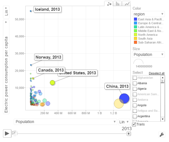
The above chart shows the Power consumption vs Population. China and India have proportionally much lower consumption that Norway, US, Canada
c. CO2 emissions vs Population

In 1963 the CO2 emissions were fairly low and about comparable for all countries. US, India have shown a steady increase while China shows a steep increase. Interestingly UK shows a drop in CO2 emissions
d. Access to sanitation

India shows an improvement but it has a long way to go with only 40% of population with access to sanitation. China has made much better strides with 80% having access to sanitation in 2015. Strangely Nigeria shows a drop in sanitation by almost about 20% of population.
The code is available at Github at worldBankAnalysys
Conclusion: So there you have it. I have shown some screenshots of some sample parameters of the World indicators. Please try to play around with World Bank Motion Chart1 & World Bank Motion Chart 2 with your own set of parameters and countries.
Also see
1. Introducing QCSimulator: A 5-qubit quantum computing simulator in R
2. Dabbling with Wiener filter using OpenCV
3. Designing a Social Web Portal
4. Design Principles of Scalable, Distributed Systems
5. Re-introducing cricketr! : An R package to analyze performances of cricketers
6. Natural language processing: What would Shakespeare say?
To see all posts Index of posts

R-bloggers.com offers daily e-mail updates about R news and tutorials about learning R and many other topics. Click here if you're looking to post or find an R/data-science job.
Want to share your content on R-bloggers? click here if you have a blog, or here if you don't.