Above Average: Analyzing Self-Rated Qualities in R
Want to share your content on R-bloggers? click here if you have a blog, or here if you don't.
Numerous psychological studies have demonstrated that people often have an inflated perception of their personal qualities. From work performance to driving skills, people report being above average in relation to others when it comes to many arenas. This extends to how people perceive their own physical attractiveness and intelligence levels. This begs the important question: Are most people delusional? Not being a psychologist or having an understanding of the intricate components of the brain, I don’t have an answer to that question. Regardless, I wanted to examine this phenomena in relation to factors that may drive such attitudes. Data was acquired from here, and contains survey responses from attendees to a series of speed dating events in which people were asked to rank their physical attractiveness and intelligence levels on a scale of one to ten.
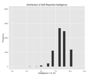
Of the 8,378 observations in the dataset, here are the summary statistics for the two response variables that are of interest. The survey asked respondents to rate themselves on a one to ten scale regarding how they would characterize their own attractiveness and intelligence. For both variables, we see that the average rating for intelligence is eight and seven for attractiveness. More shockingly, the first quartile for each variable is eight and six. Unless this samples is biased in some odd way, it would seem that most people did view themselves as being more attractive and intelligent than ‘other people.’
## Import Data, Bin Variables, and Clean Data:

d = read.csv("Speed Dating Data.csv", stringsAsFactors=FALSE)

dat = data.frame(attractive=c(d$attr3_1), intelligence=c(d$intel3_1), gender=c(d$gender),
                 age=c(d$age), field=c(d$field_cd), race=c(d$race), important=c(d$imprace),
                 date_freq=c(d$date), nightlife=c(d$go_out))

dat$attractive2[dat$attractive >= 1 & dat$attractive <= 5] <- "Avg or Below Avg"
dat$attractive2[dat$attractive >= 6 & dat$attractive <= 10] <- "Above Avg"
dat$attractive2 = as.factor(dat$attractive2)

dat$intelligence2[dat$intelligence >= 1 & dat$intelligence <= 5] <- "Avg or Below Avg"
dat$intelligence2[dat$intelligence >= 6 & dat$intelligence <= 10] <- "Above Avg"
dat$intelligence2 = as.factor(dat$intelligence2)

dat$gender2[dat$gender == 0] <- "F"
dat$gender2[dat$gender == 1] <- "M"
dat$gender2 = as.factor(dat$gender2)

dat$race2[dat$race == 1] <- "Black"
dat$race2[dat$race == 2] <- "White"
dat$race2[dat$race == 3] <- "Hispanic"
dat$race2[dat$race == 4] <- "Asian"
dat$race2 = as.factor(dat$race2)
dat <- dat[!is.na(dat$race2), ]

dat$age2[dat$age >= 18 & dat$age <= 22] <- "18 to 22"
dat$age2[dat$age >= 23 & dat$age <= 28] <- "23 to 28"
dat$age2[dat$age >= 29 & dat$age <= 33] <- "29 to 33"
dat$age2[dat$age >= 34] <- "34 and over"
dat$age2 = as.factor(dat$age2)
dat <- dat[!is.na(dat$age2), ]

## Response Variables:

> summary(dat$intelligence)
   Min. 1st Qu.  Median    Mean 3rd Qu.    Max.    NA's
  3.000   8.000   8.000   8.386   9.000  10.000      42

> summary(dat$attractive)
   Min. 1st Qu.  Median    Mean 3rd Qu.    Max.    NA's
  2.000   6.000   7.000   7.054   8.000  10.000      42
## Summarizing Data:

ddply(dat, .(date_freq), summarise, cnt=length(date_freq),
      FUN1=mean(attractive, na.rm=TRUE), FUN2=median(attractive, na.rm=TRUE))

ddply(dat, .(nightlife), summarise, cnt=length(nightlife),
      FUN1=mean(attractive, na.rm=TRUE), FUN2=median(attractive, na.rm=TRUE))

ddply(dat, .(gender), summarise, cnt=length(gender),
      FUN1=mean(attractive, na.rm=TRUE), FUN2=median(attractive, na.rm=TRUE))

ddply(dat, .(age), summarise, cnt=length(age),
      FUN1=mean(attractive), FUN2=median(attractive))

## Visualization:

library(ggplot2)
ggplot(dat, aes(as.numeric(intelligence))) +
  geom_histogram(lwd=1.05) + xlim(0,12) +
  ggtitle("Distribution of Self Reported Intelligence") +
  xlab("Intelligence (1 to 10)") + ylab("Frequency") + ylim(0,4000) +
  theme(axis.text.x=element_text(colour="black")) +
  theme(axis.text.y=element_text(colour="black"))

ggplot(dat, aes(as.numeric(intelligence))) +
  geom_histogram(binwidth=0.5) + xlim(0,12) +
  ggtitle("Distribution of Self Reported Intelligence") +
  xlab("Intelligence (1 to 10)") + ylab("Frequency") + ylim(0,2000) +
  theme(axis.text.x=element_text(colour="black")) +
  theme(axis.text.y=element_text(colour="black")) +
  facet_wrap(~ gender2, ncol=1)

ggplot(dat, aes(as.numeric(intelligence))) +
  geom_histogram(binwidth=0.5) + xlim(0,12) +
  ggtitle("Distribution of Self Reported Intelligence") +
  xlab("Intelligence (1 to 10)") + ylab("Frequency") + ylim(0,2000) +
  theme(axis.text.x=element_text(colour="black")) +
  theme(axis.text.y=element_text(colour="black")) +
  facet_wrap(~ race2, ncol=2)

ggplot(dat, aes(as.numeric(intelligence))) +
  geom_histogram(binwidth=0.5) + xlim(0,12) +
  ggtitle("Distribution of Self Reported Intelligence") +
  xlab("Intelligence (1 to 10)") + ylab("Frequency") + ylim(0,2000) +
  theme(axis.text.x=element_text(colour="black")) +
  theme(axis.text.y=element_text(colour="black")) +
  facet_wrap(~ age2, ncol=2)
We’ve cleaned the data and used ggplot2 to see how the data is distributed. That’s great, but what about my initial question regarding whether there are any social or demographic characteristics which explain survey respondents’ attitudes regarding their own attractiveness and intelligence. To answer that question, I’ve bucketed the attractiveness and intelligence variables into binomial response categories so that I can utilize logistic regression to model the data. I could have transformed each response into an ordinal variable and trained a proportional-odds model on that data, but I felt that the former was the better strategy.
library(car)

library(effects)

mod1 = glm(attractive2 ~ gender + age + race + important +
             date_freq + nightlife, family=binomial(link="logit"), data=dat)
summary(mod1)
plot(effect("date_freq", mod1), rescale.axis=FALSE)

mod2 = glm(intelligence2 ~ gender + age + race + important +
             date_freq + nightlife, family=binomial(link="logit"), data=dat)
summary(mod2)

plot(effect("important", mod2), rescale.axis=FALSE, ylim=c(0,0.10))
These models don’t provide any ‘earth shattering’ insights but the effects plots for the age, date_freq, and nightlife variables in model one are quite telling. Likewise, the effects plot for the important variable in model two is worth a look.
If you have any comments, corrections, or suggestions, please let me know.
R-bloggers.com offers daily e-mail updates about R news and tutorials about learning R and many other topics. Click here if you're looking to post or find an R/data-science job.
Want to share your content on R-bloggers? click here if you have a blog, or here if you don't.


