
Colorful R Plots with Wes Anderson Palettes – Pirate Ships
Want to share your content on R-bloggers? click here if you have a blog, or here if you don't.
Overview
Adding color to your plots is a great way to make them more visually appealing and informative. Not to mention the fun you can have playing with color palettes that have been made for ggplot2, like the Wes Anderson palette in the wesanderson R package by karthik.

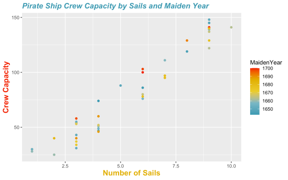
In this tutorial, we will discover how to create the above plot of Pirate Ship Crew Capacity by Sails and Maiden Year using ggplot2 and the Zissou1 color palette of the wesanderson R package.

This step-by-step tutorial is designed for novice R users with limited programming experience.
The code for each step of the following tutorial can be found on my GitHub -> here <-
The Data – Pirate Ships
We will be working with ship data from a fun pirates data set. The ship sheet of the pirates data table has the following columns:
- ShipID
- ShipName
- MaidenYear
- PortOfOrigin
- CrewCapacity
- Sails
A comma separated variable (CSV) file named PiratesShip.csv with the ship data that we will be plotting is provided -> here <-
Exploring the Data
First, let’s get the ship data loaded into R using the read.csv command. We will assign (store) the pirate ship data as a data frame in an object named ships using the <- assignment operator.
ships <- read.csv("PiratesShip.csv")
Now that the data is loaded, let’s look at the first few lines of the data frame using the head command.
head(ships)
While it is convenient to use the head command to get an idea of the contents of a data frame, we can check out the full data frame using the View command as follows.
View(ships)
We will be using data from the CrewCapacity, Sails, and MaidenYear columns of the ships data frame in this tutorial. As a first step, let’s take a look at the raw data for CrewCapacity.
ships$CrewCapacity

28 148 140  54  55  95  49  51  97 141  37  31  80  40  30  88 129 139  76  30  47 141  58 129 103 111  25
  43  46  40  34  43 100  76 122 137 145 140 119  53  78  74  60  86  52
Notice that we use the $ operator to specify the column we want to access from the ships data frame.
Next, print to the screen the raw data for Sails.
ships$Sails

1  9  9  3  3  7  4  4  7 10  3  3  6  2  1  5  8  9  6  1  4  9  3  9  6  7  2  3  4  3  3  3  6  6  9  9  9
  9  8  3  6  4  4  6  4
Finally, print the MaidenYear data to the screen.
ships$MaidenYear

1659 1651 1684 1685 1654 1679 1656 1660 1679 1663 1671 1652 1665 1682 1682 1650 1692 1659 1659 1654 1652 1700
 1697 1677 1698 1658 1660 1662 1688 1690 1673 1651 1700 1657 1663 1665 1647 1679 1646 1669 1678 1643 1689 1644
 1668
One Dimension
Before creating a plot with data from the CrewCapacity, Sails, and MaidenYear columns of the ships data frame, let’s use ggplot2 to create simple bar plots to visualize the data separately.
First remember to load the ggplot2 library, and install if necessary.
The ggplot2 package and library can be installed like so. Note that packages only need to be installed once to be used as needed on your computer.
install.packages("ggplot2")
Now the ggplot2 library can be loaded.
library(ggplot2)
We can next use the ggplot, aes, and geom_bar commands to create a bar plot of the CrewCapacity data as follows.
ggplot(data = ships, aes(x = CrewCapacity)) +
  geom_bar()

Note that we used the aes command to construct an aesthetic mapping that specifies the x values for plotting with the geom_bar command.
The geom_bar command refers to a ggplot geom (geometric object), which is a layer that is used to modify your plot. These geoms are fundamental to creating plots with ggplot2.
Similar to the previous CrewCapacity plot, we can create a simple bar plot of the Sails data.
ggplot(data = ships, aes(x = Sails)) +
  geom_bar()

And again to create a bar plot of the data from the MaidenYear column of the ships data frame like so.
ggplot(data = ships, aes(x = MaidenYear)) +
  geom_bar()

Two Dimensions
In order to visualize the relationship between pirate ship crew capacity and sail number, we will start with creating a basic scatter plot with the ggplot, aes, and geom_point commands.
ggplot(data = ships, aes(x = Sails, y = CrewCapacity)) +
  geom_point()

Notice that the aes function allows us to specify both the x and y values for plotting from our ships data frame.
Three Dimensions
It is possible to add a third dimension to your plots using color. In this case, let’s add MaidenYear as the third dimension to our plot of CrewCapacity and Sails.
ggplot(data = ships, aes(x = Sails, y = CrewCapacity, color = MaidenYear)) +
  geom_point()

The aes function allows us to specify how each data point should be colored. In this case, each point is colored by the maiden year of the ship based on the data from the MaidenYear column of the ships data frame.
Wes Anderson Palette
We can use the wesanderson library and color palette with ggplot2 to create cool plots with three dimensions from the pirate ship attributes (columns) of CrewCapacity, Sails, and MaidenYear.
First make sure to load the wesanderson library, and install if necessary.
The wesanderson package and library can be installed like so. Remember that packages only need to be installed once to be used as needed on your computer.
install.packages("wesanderson")
Now the wesanderson library can be loaded.
library(wesanderson)
Next, let’s check out the color palette options using the names command as follows.
names(wes_palettes)

"BottleRocket1"  "BottleRocket2"  "Rushmore1"      "Rushmore"       "Royal1"         "Royal2"        "Zissou1"        "Darjeeling1"    "Darjeeling2"    "Chevalier1"     "FantasticFox1"  "Moonrise1"     "Moonrise2"      "Moonrise3"      "Cavalcanti1"    "GrandBudapest1" "GrandBudapest2" "IsleofDogs1"   "IsleofDogs2"
In order to use the Wes Anderson color palette with our data, we need to use the wes_palette and scale_color_gradientn commands with ggplot, aes, and geom_point.
You can use the ? operator to look at the manual for the functions, for example with scale_color_gradientn.
?scale_color_gradientn
Note that we need to use the scale_color_gradientn version of the command since the MaidenYear data is continuous, and this is the data with which we are coloring our scatter plot points.
And we can check the documentation for the wes_palette command like so.
?wes_palette
Notice here that we need to specify “continuous” as the type argument for the wes_palette command to work with our continuous MaidenYear data.
After checking out the information for scale_color_gradientn and wes_palette functions, we see that they can be combined with ggplot, aes, and geom_point like so.
ggplot(data = ships, aes(x = Sails, y = CrewCapacity, color = MaidenYear)) +
  geom_point() +
  scale_color_gradientn(colors = wes_palette("Zissou1", type = "continuous"))

Adding Titles
It is typically a good idea to add informative axis and plot titles to your figures, especially if you plan to share them. We can add basic axis and plot titles using the labs command as follows.
ggplot(data = ships, aes(x = Sails, y = CrewCapacity, color = MaidenYear)) +
  geom_point() +
  scale_color_gradientn(colors = wes_palette("Zissou1", type = "continuous")) +
  labs(title = "Pirate Ship Crew Capacity by Sails and Maiden Year",
       x ="Number of Sails",
       y = "Crew Capacity")

We can also change the color of the axis and plot titles using the theme command.
First, let’s create a vector with the colors from the Zissou1 palette so that we can easily retrieve these colors to use in our titles.
(zis_colors <- wes_palette("Zissou1", type = "discrete"))

Notice that I wrapped the above line of code in the parentehses ( ) operators, which makes R display the assigned value to the screen as the zis_colors object is created.
The value assigned to the zis_colors object is the vector of color codes associated with the Zissou1 palette of the wesanderson package returned by the wes_palette function. Note that we are using the “discrete” palette type here since we only need three colors for our axis and plot titles.
Now that we have a neat object storing color codes for our desired Wes Anderson palette, let’s proceed with adjusting the colors of the axis and plot titles.
ggplot(data = ships, aes(x = Sails, y = CrewCapacity, color = MaidenYear)) +
  geom_point() +
  scale_color_gradientn(colors = wes_palette("Zissou1", type = "continuous")) +
  labs(title = "Pirate Ship Crew Capacity by Sails and Maiden Year",
       x ="Number of Sails",
       y = "Crew Capacity") +
  theme(
    plot.title = element_text(color = zis_colors[1], size = 14, face = "bold.italic"),
    axis.title.x = element_text(color = zis_colors[4], size = 14, face = "bold"),
    axis.title.y = element_text(color = zis_colors[5], size = 14, face = "bold")
  )
Notice that the plot title is not centered, and the default title placement is left adjusted. To center the plot title we can use the hjust argument of the element_text command for the plot.title argument of the theme command like so.
ggplot(data = ships, aes(x = Sails, y = CrewCapacity, color = MaidenYear)) +
  geom_point() +
  scale_color_gradientn(colors = wes_palette("Zissou1", type = "continuous")) +
  labs(title = "Pirate Ship Crew Capacity by Sails and Maiden Year",
       x ="Number of Sails",
       y = "Crew Capacity") +
  theme(
    plot.title = element_text(color = zis_colors[1], size = 14, face = "bold.italic", hjust = 0.5),
    axis.title.x = element_text(color = zis_colors[4], size = 14, face = "bold"),
    axis.title.y = element_text(color = zis_colors[5], size = 14, face = "bold")
  )

Saving Plots
Finally, it is possible to save our plots (figures) using the ggsave command. We can use the last_plot() function to save the last figure we created as follows.
Again we can use the ? operator to check out the documentation for the ggsave or last_plot commands like so.
?ggsave
In the simple use case the first argument of the ggsave command is the name of the file that the figure will be saved to, and the second plot argument is the figure to be saved.
Now let’s take a look at the information for the last_plot command.
?last_plot
So we see that the last_plot command can be combined with ggsave to save the last plot you created in R as follows.
ggsave("ship_plot_crew_sails_year_centerTitle.png", plot = last_plot())
Code & Data
The code for each step of the above tutorial is provided as a R script on my GitHub -> here <-
A comma separated variable (CSV) file named PiratesShip.csv with the ship data that we plotted is provided -> here <-
R-bloggers.com offers daily e-mail updates about R news and tutorials about learning R and many other topics. Click here if you're looking to post or find an R/data-science job.
Want to share your content on R-bloggers? click here if you have a blog, or here if you don't.