Little useless-useful R functions – Animating datasets
[This article was first published on R – TomazTsql, and kindly contributed to R-bloggers]. (You can report issue about the content on this page here)
Want to share your content on R-bloggers? click here if you have a blog, or here if you don't.
Want to share your content on R-bloggers? click here if you have a blog, or here if you don't.
I firmly believe that animation and transition between different data states can give end-users much better insights and understanding of the data, than a single table with data points or correlation metrics.
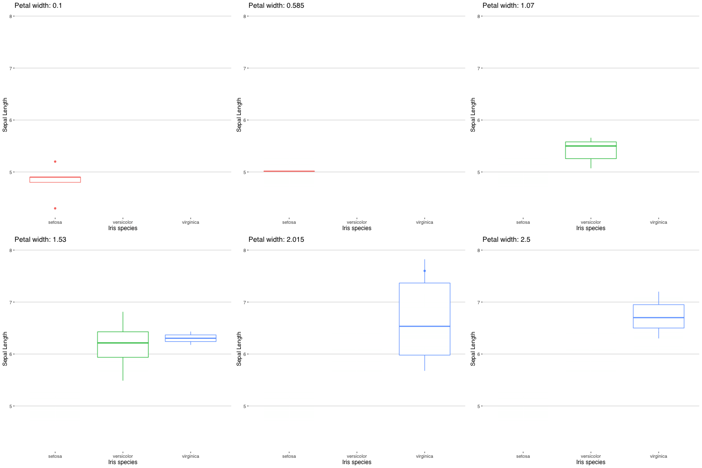
With help of ggplot, gganimate, you can quickly create an animation based on your needs. This is a simple IRIS dataset example.
And the useless function with the transitions between the data points:
ggplot(iris, aes(factor(Species), Sepal.Length, colour = Species)) +
  geom_boxplot(show.legend = FALSE) +
  labs(title = 'Petal width: {as.numeric(format(round(frame_time, 2), nsmall = 2))}', x= 'Iris species', y =  'Sepal Length') +
   # transition_time(as.numeric(Petal.Width)) +
  transition_time(as.numeric(Petal.Width)) +
  ease_aes('sine-in-out') +
  enter_fade() +
  theme_hc()
As always, code is available on the Github in the same Useless_R_function repository. Check Github for future updates.
Happy R-coding and stay healthy!“
To leave a comment for the author, please follow the link and comment on their blog: R – TomazTsql.
R-bloggers.com offers daily e-mail updates about R news and tutorials about learning R and many other topics. Click here if you're looking to post or find an R/data-science job.
Want to share your content on R-bloggers? click here if you have a blog, or here if you don't.

