
Beginner’s guide to machine learning in R (with step-by-step tutorial)
Want to share your content on R-bloggers? click here if you have a blog, or here if you don't.
If you’re a graduate of economics, psychology, sociology, medicine, biostatistics, ecology, or related fields, you probably have received some training in statistics, but much less likely in machine learning. This is a problem because machine-learning algorithms are much better capable to solve many real-world applications compared with the procedures we learned in statistics class (randomized experiments, significance tests, correlation, ANOVA, linear regression, and so on).
Examples:
- You have data on a patient (clinical data such as resting heart rate, laboratory values, etc.) and you want to predict whether this patient will likely suffer from a heart attack soon.
- You have sensor data from machines (e.g., temperature, oil pressure, battery charge level, current consumption…) and you want to forecast which machines are likely to fail in the near future in order to prevent these failures (predictive maintenance).
- You have data on a lot of customers and you want to predict which of the customer is likely interested in buying a certain new product (think “you might also like…”).
- You have images, audio, or video data from, say, satellite images of rainforest districts, X-ray scans of patients, photos of microorganisms, etc., and you want a machine to automatically classify what the images contain (e.g., illegal deforestation, bone fracture, subspecies of microorganisms, …). (For this type of use case, read also this tutorial).
- You have text data, e.g. from customer e-mails, transcripts of speeches, tweets by politicians, etc., and you want a machine to detect topics in these texts (if you have a case like this, see also this tutorial).
In all of these examples, statistical models are used to solve the problem, but in a different way than how you learned it in “Introduction to Statistics”.
In this post I want to give you a brief introduction what “machine learning” means, what the differences to “classical” statistical procedures are, and how you can train a machine learning model in R for your own use case in 8 simple steps.
What is “machine learning”?
Think of a facial-recognition app. How does the app know whether it’s John or rather Jane it’s looking at?
A conventional approach would be: Create an exhaustive list of features about John which can be quantitatively measured for the computer to memorize. E.g.: Look for short, brown hair, a three-day beard, a prominent nose, a scar on the left forehead, the distance between his eyes is 10.4 centimeters, he often wears a black hat, etc., that’s John.
The problems with this approach are obvious:
- Hard-coding these rules is tedious, especially if you want your app to be able to detect hundreds or thousands of different people.
- You might have left out one or more important features that differentiate John from others. You’re probably not a domain expert (e.g., a forensic scientist, a cosmetic surgeon, etc.) who has the time to study each face rigorously.
The machine-learning approach works differently: You feed a computer many pictures labelled “John” or “Jane”, and that’s it, you don’t provide any additional information – rather, you let the machine infer the important features which best discern John from Jane. It might be that the form of the cheek bones are actually a better predictor of whether or not it’s John on the image, rather than the hair color or the distance between the eyes. You don’t care, you let the machine figure it out.
Thus, this is a data-driven (inductive) approach, where a machine *learns* the rules how to classify faces (e.g., if X1 and X2 are present, then it’s likely John) from a set of training data. You don’t specify these rules manually. This is why machine learning is considered (a subfield of) artificial intelligence: The machine carries out tasks without being explicitly told what to do. We will discuss how this “learning” works later in this post. Importantly, to make sure that your program is good at detecting John in new and unseen pictures (e.g., John not wearing a hat, having shaved), you usually reserve a number of pictures of John which are not used during training in order to validate the model (see how accurate the machine can predict out-of-sample, i.e. data it hasn’t been trained on).
In sum, the essence of machine-learning is: A computer program learns from a set of training data which features are most important for the outcome you want to predict, and then the program can use the aquired skills to predict values in new data it hasn’t seen before. This is the most important difference to standard statistical approaches where most often, all available data are used to determine the statistical relationship under study (e.g., all respondents from a survey, all patients in a randomized control study… are used to determine whether a vaccine is effective; your main goal is not to leave aside a subset of the study participants to later test the model with unseen new data; rather, your goal is to report the relationships in all of the present data).
The difference between (inferential) statistics vs. machine-learning, and typical examples
Roughly speaking, there are two types of statistical models: Models to explain vs. models to predict (see, e.g., here for further reading, or this classic paper about the “two cultures” in statistics by Leo Breiman, pioneer of machine-learning models such as the random forest which we will use in this post). To keep it simple, I’m referring to the former as (inferential) “statistics” and to the latter as “machine-learning” (although machine-learning is a form of applied statistics as well, of course).
Here is an overview table with explanations following below:
| “Statistics” | “Machine learning” |
| Typical goal: Explanation | Typical goal: Prediction |
| Does X have an effect on Y? | What best predicts Y? |
| Example: Does a low-carb diet lead to a reduced risk of heart attack? | Example: Given various clinical parameters, how can we use them to predict heart attacks? |
| Task: Develop research design based on a theory about the data-generating process to identify the causal effect (via a randomized experiment, or an observational study with statistical control variables). Don’t try out various model specifications until you get your desired result (better: pre-register your hypothesized model). | Task: Try out and tune many different algorithms in order to maximize predictive accuracy in new and unseen test datasets. A theory about the true data-generating process is useful but not strictly necessary, and often not available (think of, e.g., image recognition). |
| Parameters of interest: Causal effect size, p-value. | Parameters of interest: Accuracy (%), precision/recall, sensitivity/specificity, … |
| DON’T: Throw all kinds of variables into the model which might mask/bias your obtained effect (e.g., “spurious correlation”, “collider bias”). | Use whatever features are available and prove to be useful in predicting the outcome. |
| Use all the data to calculate your effect of interest. After all, your sample was probably designed to be representative (e.g. a random sample) of a population. | DON’T: Use all data to train a model. Always reserve subsets for validation/testing in order to avoid overfitting. |
Statistical models – models to explain – are most prevalent in the fields of economics, psychology, medicine, ecology, and related fields. They typically seek to uncover causal relations, i.e. explain relationships observed in the real world.
Example: Does a low-carb diet, all other things being equal, lead to a lower risk of suffering from a heart attack? If you want to address this research question, you need a carefully designed study, either in the form of a randomized control trial, or observational data where you control for confounding factors (here is a tutorial on the difference between correlation and causation and what it means to control for confounding factors). The most important thing is thus to get a good research design. The statistical model, in the end, may be trivial, such as a simple significance test (what does this mean? –> cf. here) between the number of heart attacks observed in the experimental vs. the control group.
By contrast, in machine-learning you want to predict an outcome as accurately as possible. For instance, you want to predict whether a person suffers from a heart attack or not, based on various clinical parameters. “Prediction” here does not necessarily refer to things that happen in the future, but more importantly to data that were previously unseen to the algorithm. You thus want an algorithm that is able to accurately tell whether a person is about to suffer from a heart attack although the algorithm has not seen this particular person before.
In terms of X (cause) and Y (effect), therefore, most statistical studies are concerned with obtaining an estimate for X that is as unbiased as possible. For instance, eating 100 g fewer carbohydrates per day, by how much does this lower my risk of getting a heart attack in the next year. A machine-learning model, by contrast, is more concerned with predicting Y as accurately as possible (see, e.g., here).
Indeed – and this might come as a surprise to you – as this paper by Shmueli shows (in the Appendix), you can have a model with wrong causal specifications about X that has greater predictive accuracy regarding Y as opposed to a model that represents the true data generating process. This is because in big datasets, many features are often highly correlated (say, crime rate, unemployment rate, population density, education, income level etc. between counties) and if you have wrong assumptions but many, many variables highly correlated to the true predictors, you will end up with a model which is just as good or (for random reasons) even better at predicting your outcome under study. This has famously lead people to declare that scientific methods are obsolete, “correlation is causation”, and that big data and machine learning can replace classical statistics. But, we will soon learn the pitfall of this assumption.
In reality, the dichotomy of explanation (statistics) vs. prediction (machine-learning) is over-simplified. Many causal statistical studies also use their obtained model to predict new and unseen data. This is in general a good idea because failing to do so contributes to what is known as the replication crisis in science. Effects from over-fitted models (“I have found a statistically significant interaction between gender and state of origin affecting the probability to get a promotion within the next three years, but this effect only shows in certain industries and only for respondents younger than 30”) are reported in scientific papers, and subsequent studies fail to replicate these often random findings. Therefore it is always good to perform out-of-sample tests even in explanatory studies such as medical randomized control trials. If you claim to have found a causal relationship, but it cannot predict new data better than a random guess, then what is the real-world significance of your findings?
Conversely, machine-learning applications can benefit from considering causality, instead of dismissing it as unnecessary. An example: Survey researchers and political pundits famously failed to predict Donald Trump’s win at the 2016 US presidential elections. Why was that? The models they used were based on correlations, not causations. They were working with statistical models where for each election district, the proportion of Republican vs. Democrat votes was predicted based on the latest survey results enriched with regional parameters such as percentage of Black or White voters, average income, percentage highly educated voters, blue-collar workers, general region (Mid-West, South, New England, etc.). These were all factors that were correlated with voting Republican or Democrat in the past, so the predictive accuracy of these models had been good. But, it turned out that White male blue-collar workers from the Mid-West had not voted Democrat in the past because of their ethnicity, education, or region of residence. These were just correlations without causal implications. When during the 2016 electoral campaigns, Democrats increasingly focused on topics such as identity politics which appealed more to well-educated urban voters rather than to blue-collar workers from the “rust belt”, many working-class voters favored Trump over Clinton.
This is an example where the causal relations changed over time, and as a consequence, predictive models built on surrogate correlations stopped working. This is important, because in the same way, your machine-learning models predicting customer retention or machine failure may perform less well over time if the models disregard the true causal relations at work, and if these relationships change over time (e.g., your customer base gets older).
Alright, I apologize for the lengthy introduction. Hopefully, some of you are still following and this has made sense so far to you. The bottom line is:
- If you are concerned with identifying a causal effect (does my marketing campaign/ vaccine/ product design change/ illegal deforestation have an effect on my product’s sales/ patient survival rates/ social media likes/ athmospheric temperature…), then this is not the tutorial for you. Look e.g. here, instead.
- If you want to train an algorithm to accurately predict new data, and you have some basic knowledge of R, let’s get to it.
Step 1: Get data
We are using a small dataset here containing medical records of 303 patients, and we want to predict whether or not they have coronary heart disease. For you to follow this tutorial, you can download the dataset here. (If you don’t have a Kaggle account, there are many other places to find this dataset since it’s widely used as a training dataset).
You might recall from statistics or science classes that statistical studies usually start with a research question, theory, literature review, etc., so you might be confused why the first step is getting data rather than theoretical or conceptual considerations. While I’m not saying this is completely obsolete in a machine-learning project – see the example about the Trump vote above, and indeed it is good to have domain experts in your project team, as we will soon see -, it’s much less important compared with a causal research design. The more complex a dataset and the less meaningful the features (e.g., pixel values of an image, thousands of columns of IoT data from sensors…), the less likely you add value to your data-driven model with theoretical insights. Thus, keep in mind the point about changing underlying causal structures, but for now let’s focus on the data and modeling.
Download the file and move it to a folder of your choice, and then in R, run:
library(tidyverse)
library(caret)
library(party)


dat <- read.csv("C:/MyFolder/heart.xls")
names(dat)[[1]] <- "age"

dat$target <- dplyr::recode(dat$target, `0` = 1L, `1` = 0L)
Where you of course replace “MyFolder” with the path to where you stored the dataset. Also, you have to install the three packages via, e.g., install.packages(‘tidyverse’) if you don’t have them installed yet, which you will notice if R throws an error when executing the first three lines..
First, let’s clean the data and check for duplicates or missing values.
sapply(dat, function(x) table(is.na(x)))

table(duplicated(dat))
dat <- dat[!duplicated(dat),]
The first line gives us the number of missing cases for each column:

We see that missingness (is.na) is FALSE for all columns, which is great. The second line in the code chunk above tells us that there is one duplicated record, which we remove in line 3.
Step 2: Visual inspection / descriptive statistics
This is often the most important part, because it tells you most of what is going on in your data. Let’s start with a plot of histograms for all features. Note that if your data has 100 columns instead of only 14, you could divide your data into parts of, say, 25 columns each. Just start the following code chunk with, e.g., dat[,1:25] %>% …
dat %>% gather() %>%
  ggplot(aes(x=value)) +
  geom_histogram(fill="steelblue", alpha=.7) +
  theme_minimal() +
  facet_wrap(~key, scales="free")
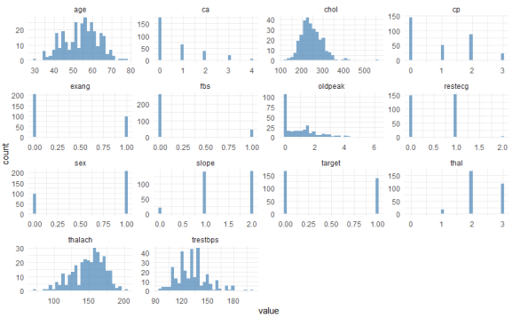
Here you see the univariate distributions – univariate because you’re looking at one variable at a time, not at bivariate correlations at this point. The most important variable to look at here is our Y, labeled “target”. This is coded 1 for patients with heart disease, and 0 for healthy patients. You can see that the data are not heavily imbalanced, there are only a few more healthy patients than patients with the disease. Regarding the other categorical features such as sex, you can also see from this graph whether they are imbalanced (1 = male, 0 = female here). With regard to the continuous variables such as age or maximum heart rate achieved (“thalach”), you can visually check whether they are more or less normally distributed (such as age), or whether they exhibit some distribution that might need some form of normalization or discretization (e.g., “oldpeak”).
You can also see that there are some categorical variables where certain values are represented only rarely among the patients. For instance, “restecg” has only very few instances of values == 2. We will deal with this in a minute.
Let’s move on to bivariate statistics. We are plotting a correlation matrix, in order to a) check if we have features that are highly correlated (which is problematic for some algorithms), and b) get a first feeling about which features are correlated with the target (heart disease) and which are not:
cormat <- cor(dat %>% keep(is.numeric))

cormat %>% as.data.frame %>% mutate(var2=rownames(.)) %>%
  pivot_longer(!var2, values_to = "value") %>%
  ggplot(aes(x=name,y=var2,fill=abs(value),label=round(value,2))) +
  geom_tile() + geom_label() + xlab("") + ylab("") +
  ggtitle("Correlation matrix of our predictors") +
  labs(fill="Correlation\n(absolute):")
This prints the following correlation matrix:
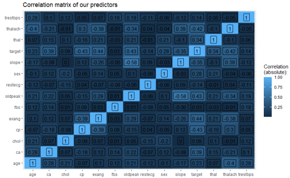
We can see that aside from the diagonal (correlation of a variable with itself, which is 1), we have no problematically strong correlations between our predictors (strong meaning greater than 0.8 or 0.9 here).
If you have many, many features and don’t want to look at 1,000 by 1,000 correlation matrices, you can also print a list of all correlations that are greater than, say, 0.8 with the following code:
highcorr <- which(cormat > .8, arr.ind = T)
paste(rownames(cormat)[row(cormat)[highcorr]],
      colnames(cormat)[col(cormat)[highcorr]], sep=" vs. ") %>%
  cbind(cormat[highcorr])
Now let’s look at the bivariate relations between the predictors and the outcome. For continuous predictors and a dichotomous outcome (heart disease or no heart disease), box plots are a good way of visualizing a bivariate association:
dat %>% select(-c(sex,cp,ca,thal,restecg,slope,exang,fbs)) %>%
  pivot_longer(!target, values_to = "value") %>%
  ggplot(aes(x=factor(target), y=value, fill=factor(target))) +
  geom_boxplot(outlier.shape = NA) + geom_jitter(size=.7, width=.1, alpha=.5) +
  scale_fill_manual(values=c("steelblue", "orangered1")) +
  labs(fill="Heart disease:") +
  theme_minimal() +
  facet_wrap(~name, scales="free")
I’ve de-selected the non-continuous variables in the first line here manually, because I haven’t transformed the categorical variables (say, “ca” or “restecg”) into factors yet, which is of course a bit lazy, but if you have hundreds of features, there are of course more flexible ways to keep only continuous variables for the following plot. This is what the chunk above returns:
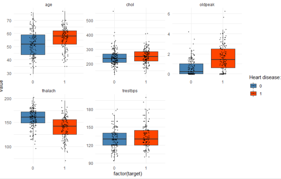
You can read this graph as follows: With regard to age, the patients with heart disease (red box) are on average older compared with the patients without heart disease (blue box). The thick horizontal line within each box denotes the median. The box encompasses 50% of all cases (i.e. from the 25 percentile to the 75 percentile). The jitter points show you where all of the patients are located within each group. So you see that, yes, heart disease patients are typically older, but you also have a couple of patients younger than 50 in the dataset who have coronary heart disease, and of course many older ones that are healthy. But comparing the medians, you can see that age, oldpeak, and thalach are better predictors of heart disease compared with chol or trestbps, where the median values are almost equal in both groups.
For our categorical variables, we just use simple stacked barplots to show the differences between healthy and sick patients:
dat %>% select(sex,cp,ca,thal,restecg,slope,exang,fbs,target) %>%
  pivot_longer(!target, values_to = "value") %>%
  ggplot(aes(x=factor(value), fill=factor(target))) +
  scale_fill_manual(values=c("steelblue", "orangered1")) +
  geom_bar(position="fill", alpha=.7)+
  theme_minimal() +
  labs(fill="Heart disease:") +
  facet_wrap(~name, scales="free")
Which gives us:

Again, you can see at a glance that “fbs” is obviously not a strong predictor of heart disease, whereas “exang” definitely is. We also see that males are overrepresented in sick patients compared with females.
So far, we have used very simple means to visualize the data. In my experience, in many applied business use cases, you already know most of what you wanted to know at this stage! A few simple descriptive graphs and indicators most often show you what are the most important predictors, what are the important sub-groups you need to focus on in greater detail, where do you have outliers or a lot of missing data which distorts the overall picture, and so on. Often, the complicated algorithm later on only confirms what we have seen so far. So it’s important not to skip this step and always do visual und descriptive inspection of your data.
You might ask, if in many cases bar charts and correlation coefficients is all we need to understand what is going on, why do we need the complicated machine-learning part? That is because while 80% of the explanation is often simple and can be inferred from looking at a graph or table, the other 20% is more complicated and requires domain knowledge and/or more sophisticated statistical analysis. Our example here perfectly illustrates this point: Older people suffer from heart disease more often than younger people; men are much more likely to get it compared with females; these findings are trivial and everyone can see that from the graphs, no PhD in statistics required. And these simple associations can already guide clinical practice to a significant degree. You’re an older male? You’re in a risk group. You’re a young female? You’re probably fine.
However, there are many more complex relationships at work. For instance, females often present themselves with different forms of chest pain compared with males. This is an example for an interaction effect that you couldn’t easily infer from the bivariate graphs above. Non-linearity, interaction effects, spurious correlations caused by third variables and multi-collinearity, complex data structures (e.g. time series, nested data…) – these are examples of aspects that cause descriptive inspections to be insufficient when we not only want to find out the most obvious things (older people are more at risk than young people), but also want to get behind the more complex relations.
Step 3: Partition data into training and test datasets
As you probably know, splitting data into training and test sets is of uttermost importance in order to avoid overfitting your model. “Overfit” is one of these ubiquitous terms in machine learning, let’s explain this briefly with two examples. Skip the next couple of paragraphs if this bores you.
Let’s consider the following simple algorithm: “Whenever a patient is male, predict ‘heart disease’, otherwise predict ‘no heart disease’.” This algorithm would have an accuracy of 61% in our dataset, which you can verify by running:
pred <- as.factor(ifelse(dat$sex==1,1,0))
confusionMatrix(pred,as.factor(dat$target))
This is better than nothing – always guessing “no heart disease” would be correct in 54% of cases, so the 61% of our “algorithm” are an improvement over this baseline (always check for class imbalance, i.e. the majority class’ percentage in your outcome, this is your baseline). This algorithm is often wrong – but we can be quite sure that it would be useful with new data to a similar degree (i.e. around 61% correct classifications), unless we have a very biased sample and in the total population, males are not suffering from heart disease more often than females.
Contrast this with the following algorithm: “If a person is 77 years old, predict ‘heart disease’. If the person is 76 or 71 years old, however, predict ‘no heart disease’. If the person is 69 years old, then it depends: If the serum cholesterol level is between 234 and 239 mg/dl, then predict ‘no heart disease’, but if it’s exactly 254 mg/dl, then predict ‘heart disease’.” And so on, until all of our 303 patients are captured by one of these very specific rules. You get the idea: We would get an accuracy of 100% in our data if we continued like this. (By the way, you can generate a full set of these rules by growing a full-size decision tree, see below for example code).
But while this very complex algorithm can correctly classify 100% of our patients in the present dataset, it would probably perform very poorly with new patients. This is because, for random reasons, all three patients aged 71 in our dataset were healthy whereas the one 77 year-old in our data was sick, but this can certainly not be generalized to a universal law: A new 71 year-old patient would always be classified as healthy by our algorithm, whereas all 77 year-olds would be predicted to have heart disease. This is obviously nonsense and as a result, despite a supposed accuracy of 100%, our algorithm might fare even worse than the very simple “if male, then sick” rule when applied to new patients.
This is overfitting: The algorithm is too specific and captures everything in our data, even the random noise and idiosyncrasies (for whatever reasons, we have two 40 year-olds with coronary heart disease in our data but only one healthy 40 year-old). On the one hand, thus, you should not “learn” from all this random noise and be too specific in your classification rules. On the other hand, of course, you don’t want the algorithm to be too crude (e.g., simply predict a linear increase in diseases with age and nothing else) because you want to capture the true existing associations and interactions that are likely more complex. This is ensured by judging your algorithm’s performance against an unseen new test dataset, i.e. out-of-sample.
We create a sequence of random numbers which encompass 70% of our dataset, designate this as “training”, and the rest as a test dataset which will not be touched again until the very end of the analysis:
set.seed(2022)
split <- sample(1:nrow(dat), as.integer(0.7*nrow(dat)), F)

train <- dat[split,]
test <- dat[-split,]
Step 4: Pre-processing and feature engineering
Pre-processing means that you apply transformations to some or all variables in order to better be able to use them in your models. Examples: Some models such as neural networks work better if all variables are scaled to mean = 0 and standard deviation = 1. Or, if a feature has a very skewed distribution (e.g. monthly income, where you have a few millionaires and an otherwise poor population), it might make sense to take the logarithm to normalize the variable. Or discretize, e.g. create 10 bins from “poorest percentile” to “richest percentile”. This makes sense if theoretically, the difference between earning 1 Million per year and 2 Million per year is less important compared to the difference between earning 30,000 or 60,000 per year. Because linear models (e.g., linear regression) give you estimates à la “earning one Euro more translates into an effect on Y the size of beta”, these estimates would be heavily influenced by the large numbers of the earners of 1M and 2M where not much changes between these numbers with regard to your Y.
In general, you get a good idea of what you have to do at this step by looking at the graph with the histograms above. We saw that “age” or “thalach” were pretty much normally distributed, so there’s nothing to do here. By contrast, “oldpeak” (which measures the S-T depression in an ecg under exercise relative to resting levels) has a skewed distribution: A significant number of patients don’t have any S-T depression, so it might make sense to transform the variable into a dichotomous or otherwise discretiziced variable.
We also want to transform nominal variables with multiple categories (e.g., ethnicity, blood type, etc.) into binary variables for each outcome (also called one-hot encoding, or “dummy variables”). So instead of one variable with values 1 = Black, 2 = White, 3 = Asian, etc. you would create several variables “ethnicity_black” (1 or 0), “ethnicity_white” (1 or 0), and so on. In our dataset at hand, for instance, “cp” refers to 4 different chest pain types. Some algorithms such as tree-based models can deal with nominal variables, but others such as linear regression or neural networks usually cannot.
There are also a few outliers and data errors. For instance, the description of the dataset notes that variable “ca” (number of major vessels colored by flouroscopy) has valid values 0 to 3, but we have one observation in the dataset where the value is 4. We take this and a few other outliers and assign them the modal value (i.e. the one that is most prevalent). Different strategies would be listwise deletion (i.e. drop the whole patient as a case if one value seems suspicious) or multiple imputation (where you replace the value not with the modal value, as we do it here, but a bit more sophisticated based on a model that consideres the other variables as well).
Besides pre-processing we could also do feature engineering at this point – that is, if we have enough domain knowledge to do so. I don’t. But for the sake of demonstration, let’s just make something up. Feature engineering means that you create new variables out of the existing ones because of your knowledge about the data-generating process. For instance, we have the maximum heart rate achieved in the dataset. But we know that this is not only a function coronary heart disease, but is also affected by age. So we could calculate the age-standardized heart rate by simply dividing the heart rate by the patient’s age. Here, too, it’s important for you to know that some algorithms (e.g. tree-based models) can map these type of interactions automatically (if given enough data) whereas others such as linear regression do not. Thus, depending on the model, feature engineering is sometimes not needed at all (e.g., image recognition with convoluted neural networks which capture all interactions (e.g., neighboring pixel color values)), but in other applications it will affect your end result if you do meaningful transformations and interactions with your variables.
We create a function where we apply all of the pre-processing steps. This allows us to later apply the same function to new data. For instance, if in the end, you want to deploy your algorithm in an app for doctors to use, you take the new data, apply the pre-processing function we built here, and then let the model (which we will train in a minute) predict the data:
preprocess_data <- function(df){

  #ROutliers are assigned the modal value
  df <- df %>% mutate(restecg = recode(restecg, `2`=1L),
                      thal = recode(thal, `0`=2L),
                      ca = recode(ca, `4`=0L))

  #Nominal variables
  nomvars <- c("cp", "ca", "thal", "restecg", "slope")
  df[,names(df) %in% nomvars] <- sapply(df[,names(df) %in% nomvars], as.character)
  dummies <- dummyVars(~ ., df)
  df <- predict(dummies, newdata = df) %>% as.data.frame

  #Age-standardized variables
  df$hr_age <- df$thalach / df$age
  df$chol_age <- df$chol / df$age


  #Oldpeak: Is there any ST depression
  df$st <- ifelse(df$oldpeak>0,1,0)

  return(df[,names(df)!="target"])
}
We then apply the function to both our training and test datasets. We also create vectors y_train and y_test which consist of only the target (heart disease 1 or 0). This is not strictly necessary but the clear separation of predictors (x_…) and outcome (y_…) as well as the separation of train and test sets reduces the risk that you accidentally, say, train a model with the target included in the list of predictors, or apply some pre-processing function to your target, etc.
x_train <- preprocess_data(train)
x_test <- preprocess_data(test)

y_train <- factor(train[,"target"], levels=c(1,0))
y_test <- factor(test[,"target"], levels=c(1,0))
Step 5: Visualize exemplary algorithm
This step is optional but it greatly helps you understand what is going on when you subsequently train a more complex algorithm on your data. We are running and then plotting a simple algorithm, and in my opinion this is also great for presentation slides (e.g. for management who don’t want to be bothered with the more technical details). We choose a decision tree here, because this is the foundation of more complex algorithms such as random forests which are widely used with tabular data (3D or 4D data, e.g. image recognition, is usually done with neural networks only).
Train a simple decision tree on our training data and plot the results:
set.seed(2022)
tree1 <- party::ctree(y_train ~ ., data=cbind(x_train, y_train),
                      controls = ctree_control(minsplit=10, mincriterion = .9))
plot(tree1)
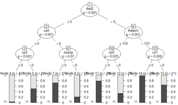
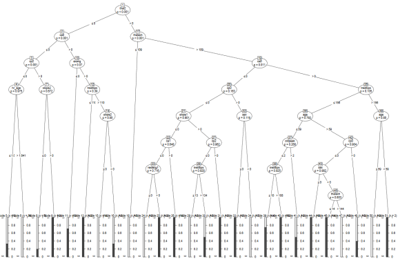
How do you read this tree? Starting from the top, the most important feature that can split the data in two most dissimilar subsets (with regard to how often heart disease occurs) is “thal2”, i.e. wether the patient has a normal blood flow as opposed to a defect from a blood disorder called thalassemia. If the patient has a normal blood flow (value > 0 , i.e. 1), then we continue to the right branch of the tree, if not, continue to the left. If the blood flow is normal, then the next most important variable is “thalach”, i.e. the maximum heart rate achieved during exercise. You can see that if this is greater than 155 bpm, then we continue to the right where we then check for “ca1”, i.e. whether one major vessel was colored by flouroscopy. I’m just pretending here to understand what any of this means, but recall the bar chart above where we saw that 0 vessels colored by flouroscopy was associated with the lowest proportion of patients with coronary heart disease, whereas those with 1, 2 or 3 colored vessels were predominantly diagnosed with heart disease. In our tree, if ca1 == 0, i.e. not one major vessel colored, we continue to the left where we reach the end note 14 (second bar from the right).
What do the bars on the bottom of the chart mean? They show the proportion of patients in each bucket with (light grey) vs. without (dark grey) heart disease. Meaning that end node 14 (second bar from the right) is the group of patients with the lowest risk of having coronary heart disease. Thus, our algorithm here finds that if you:
- don’t have thalassemia,
- can achieve a heart rate of more than 155 bpm while exercising, and
- don’t have one major vessel colored by flouroscopy,
then we predict “no heart disease” with a 98% probability (i.e. the proportion of healthy patients in the respective bucket). If, by contrast, you do have thalassemia, there are 1 or more colored major vessels, and your chest pain type (cp) is not “2” (2 standing for non-anginal pain), then the algorithm predicts “heart disease” with a high confidence.
You can also see that there are several end node buckets (e.g., node 5, node 15) which are quite mixed. Patients with these combinations of features are not well understood by the algorithm and the predictions are often wrong for these groups. Now, recall what we discussed about overfitting: Of course we could go into these groups and find more features that separated the healthy from the sick patients. In fact, if you set the values “minsplit” (minimum number of cases separated at a split) to 1, “minbucket” (minimum number of patients in an endnote) to 0, and “mincriterion” to a small value (p-value to determine if a split is significant), you get a vastly overfitted tree. Let’s try it out:
set.seed(2022)
tree2 <- party::ctree(y_train ~ ., data=cbind(x_train, y_train),
                      controls = ctree_control(minsplit=1, mincriterion = 0.01,minbucket = 0))
plot(tree2)
As you can see, just like we discussed above when we were warning against the dangers of overfitting, the algorithm has come up with very specific rules that often only apply to 2 or 3 people in the dataset. For instance, if the maximum heart rate achieved is above 109, but below 144, and the patient is male, older than 59 and does not suffer from thalassemia, the algorithm always predicts heart disease. You can see why this type of algorithm would perform poorly with new, unseen data. We would want to “prune” this tree of nodes that introduce classification rules that are too idiosyncratic/specific to the training data. But of course we don’t want to prune nodes that reflect true causal relations, i.e. the actual data-generating process (which is obviously unknown to us). Thus, the challenge in any machine-learning model is to get an algorithm that classifies the data with as specific rules as necessary, but without getting too specific and overfit to the training data.
In your real-world application, of course, you don’t grow the second (overfitted) tree, but you can use the first one for presentation slides and as a benchmark for the models which we are about to train.
Step 6: Model training
We now have a pretty good idea about how the data look like, which factors are associated with the outcome, and thus what to expect from a more complex algorithm. Let’s start with a random forest which is basically an ensemble of many trees as the one we built in the previous section. The trick is that each tree is grown with only a random subset of all features considered at each node, and in the end all trees take a vote how to classify a specific patient. Taking a subset of all features at each run ensures that the trees are less correlated, i.e. not all of them use the same rules as the example tree shown above. If there are a few dominant features (such as thalassemia or maximum heart rate in our data), then there will be some trees in our forest grown without these dominant features. These trees will be better able to classify the subgroup of our patients for whom, for whatever reasons, thalassemia and maximum heart rate are not good predictors of heart disease. Imagine that for some patients with a specific genetic make-up or a specific pre-existing condition (which we don’t have as information in our dataset so our algorithms cannot use it for classification), factors other than thalassemia and maximum heart rate are important to classify heart disease. Our first tree in the previous section would be confused about what to predict for these patients. In our forest, however, there are trees that understand these patients as well. Thus, an ensemble of learners such as a random forest most often outperforms a single learner.
We use the wrapper function train() from the caret package to train a random forest on our data. Note that the author of the caret package, Max Kuhn, has moved on to developing the tidymodels package. I haven’t adapted my workflow to the new package family yet, but for this example here, it doesn’t really matter which package you are using, caret still works just fine (especially since it only provides the wrapper function here which calls the randomforest package).
set.seed(2022)
mod <- caret::train(x_train, y_train, method="rf",
                    tuneGrid = expand.grid(mtry = seq(5,ncol(x_train),by=5)),
                    trControl = trainControl(method="cv", number=5, verboseIter = T))
mod
With “method = ‘rf'” we tell the train() function to use a random forest. The tuneGrid argument tells the function which values to try out for tuning parameter “mtry”. This is a so-called hyperparamter. As we just discussed, a random forest takes a subset of all features (variables) at each tree node. The “mtry” parameter specifies how many of the features to consider at each split. We have 27 features in our training dataset, so if you set mtry == 27, then it’s not a random forest any more, because all features are used and no random selection is applied. If you set mtry == 1, then the trees will be totally different from each other, but most ones will perform poorly because they are forced to use certain variables at the top split which are maybe not useful. The lower mtry, the more decorrelated the trees are, and the higher the value, the more features each tree can consider and thus the better the performance of a single tree. Somewhere between 1 and 27 is the optimal value, and there is no theoretical guidance as to which value should be taken. It depends on your data at hand, how correlated the features are, whether there are distinct sub-groups where the causal structure of the features works differently, and so on.
The point is: You cannot determine this with “theory” or with general methodological knowledge. Therefore you have to “tune” these hyperparameters, i.e. try out different values and see which one works best. Note the difference to the classical statistical approach. In a vaccine effectiveness study, you wouldn’t expect to read that the author tried out different models (logit, probit, linear probability, and whatnot) and different parameters until the coefficient of interest (effectiveness of the vaccine) was maximized, this would be considered a violation of academic integrity. Machine learning, by contrast, in the words of deep learning pioneer Francois Chollet, “isn’t mathematics or physics, where major advances can be done with a pen and a piece of paper. It’s an engineering science” (Deep Learning with R, 2018, Manning). You try out different things and use what works best. Just remember that since you’re optimizing a prediction of Y, you cannot infer causal statements about X. Hyperparameter tuning is done in the train() function with the tune.grid parameter, where we tell the function to try out values between 5 and the number of our variables (ncol(x_train)).
Finally, note that in the “trainControl” function passed to train(), we specified “method = ‘cv'”. CV stands for “cross validation”. Above we stressed the importance of separating training and test datasets. But inside our training routine, where we try out multiple varations of the random forest algorithm with different values for the parameter “mtry”, how does the function determine which of the specifications “works best”? We don’t touch the test dataset so far. Which means we have to create another random split, splitting the training data into training and validation sets for the purpose of determining which algorithm works best on the training data. Since we set “number = 5”, the function creates a validation set of size 1/5 of x_train and takes 4/5 of the data for training. Now, this would mean we would lose more cases, from 211 patients in our training data we would only use 169 for the actual training. “Cross validation” therefore repeats this training process and changes the validation set to another fifth of the data. This is done 5 times in total, so that all parts of the data served as validation set once, and then the results are averaged. This routine thus lets you use all of your training data and still have train/validation splits in order to avoid overfitting.
Running the code chunk above gives us the following output:
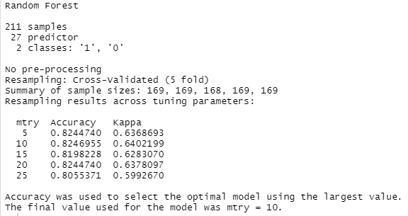
What does this mean? From the summary we can verify that we set up our dataset correctly. There are 27 features, 211 patients, and two outcomes (1 = heart disease, 0 = no heart disease). Then you see that five values were tried for the hyperparameter “mtry”. With each of the values, 5-fold cross validation was performed. If you look at the accuracy values, you can see that mtry = 10 worked best with our data. On average (of the five runs using cross-validation), 82.4% of the validation sets (= 42 patients during each run) were classified correctly. Although this accuracy was obtained with a train/validation split, we still have yet to judge the final evaluation score of the algorithm against the unseen test dataset, because all the patients in the training data were used to train the model at some point, so technically it’s not an “out-of-sample” accuracy. But before the final evaluation, we want to try out a few more algorithms.
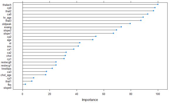
With a random forest, you can obtain a feature importance plot which tells you which of the variables were most often used as the important splits at the top of the trees. Just run:
plot(varImp(mod), main="Feature importance of random forest model on training data")

You can see that, unlike our single decision tree on all of the training data, where “thal2” was the most important feature before “ca0”, across an ensemble of 500 different trees, it’s actually “ca0” (= zero major vessels colored by flouroscopy, whatever that means) that ends up the most important predictor, tied with “cp0” (chest pain type 0 = asymptomatic). Recall that a machine-learning model tuned for prediction such as a random forest cannot be interpreted as revealing causal associations between the predictors and the outcome. Nevertheless, it can guide clinical practice knowing which features are the most useful for predicting heart disease. This best works when enriched with domain knowledge about mechanisms and causality.
Next, let’s try out a neural network, simply because many of you will probably associate machine-learning or artificial intelligence in general with artificial neural networks, or deep learning. In general, it is true that neural networks outperform all other machine-learning algorithms when it comes to the classification of abstract data such as images or videos. For a more detailed tutorial about how you can build a deep learning algorithm in R, see here. In cases with classical flat data files such as ours, on the other hand, other algorithms often work equally well or better. Here, let’s use a simple network with as few lines of code as necessary:
set.seed(2022)
mod2 <- caret::train(x_train, y_train, method="avNNet",
                     preProcess = c("center", "scale", "nzv"),
                     tuneGrid = expand.grid(size = seq(3,21,by=3), decay=c(1e-03, 0.01, 0.1,0),bag=c(T,F)),
                    trControl = trainControl(method="cv", number=5, verboseIter = T),
                    importance=T)
mod2
Here we use the pre-processing steps of centering and scaling the data because, as noted above, neural networks are optimized more easily if the features have similar numerical ranges, instead of, say, maximum heart rate being in the range of 140-200 whereas other features having values bounded by 0 and 1. Near-zero variance (“nzv”) means that we disregard features where almost all patients have the same value. Tree-based methods such as random forests are not as sensitive to these issues.
We have a few more tuning parameters here. “Size” refers to the number of nodes in the hidden layer. Our network has an input layer of 27 nodes (i.e. the number of features) and an output layer with one node (the prediction of 1 or 0) and in between, a hidden layer where interactions between the features and non-linear transformations can be learned. As with other hyperparameters, the optimal size of the hidden layer(s) depend on the data at hand, so we just try out different values. Decay is a regularization parameter that causes the weights of our nodes to decrease a bit after each round of updating the values after backpropagation (i.e. the opposite of what the learning rate does wich is used in other implementations of neural networks). What this means is, roughly speaking, we don’t want the network to learn too ambitiously with each step of adapting its parameters to the evidence, in order to avoid overfitting. Anyway, as you can see from the code, we have passed 7 different values for “size” to consider, 4 values for “decay”, and two for “bag” (true or false, specifying how to aggregate several networks’ predictions with various random number seeds, which is what the avNNet classifier does, bagging = bootstrap aggregating), so we have 7*4*2 = 56 combinations to try out.
The result:

Thus, our best-performing model yields 85.3% accuracy, which is a slight improvement over the random forest. Again, we can look at a feature importance plot:
plot(varImp(mod2), main="Feature importance of neural network classifier on training data")
It’s slightly different than the plot before, but the top five features are the same, just in a different order. Note that with “unstable” methods such as neural networks, if you run the same code 10 times, you can end up with ten (slightly) different feature importance lists, but the general pattern of which features are important and which aren’t will be the same.
Let’s try out one last algorithm. The popular “(extreme) gradient boosted machines” (xgboost) work similar to a random forest, except they proceed sequentially: A first tree is grown, then more weight is put on the badly predicted samples before the next tree is grown. As a result, in many cases, xgboost outperforms random forests. Let’s see if this is the case here as well:
set.seed(2022)
mod3 <- caret::train(x_train, y_train, method="xgbTree",
                    tuneGrid = expand.grid(nrounds=c(50,100),max_depth=c(5,7,9),
                                           colsample_bytree=c(0.8,1),subsample=c(0.8,1),
                                           min_child_weight=c(1,5,10),eta=c(0.1,0.3),gamma=c(0,0.5)),
                    trControl = trainControl(method="cv", number=5, verboseIter = T))
mod3

plot(varImp(mod3), main="Feature importance of XGBoost model on training data")
Here we have more tuning parameters compared with the random forest; I just inserted a few values that I deemed plausible into the tuning grid, but if you want to do serious hyperparameter tuning, you can of course spend a bit more time here determining which combination of parameters works best. Xgboost is in general quite fast so even though we try out 2*3*2*2*3*2*2 = 288 parameter combinations, running this code should only take a minute at most even on a local machine. Which means that you could tune even more.
Compare the performance of the three algorithms:
results <- data.frame(Model = c(mod$method,mod2$method, mod3$method),
                      Accuracy = c(max(mod$results$Accuracy), max(mod2$results$Accuracy), max(mod3$results$Accuracy)))
results %>% ggplot(aes(x=Model, y=Accuracy, label=paste(round(100*Accuracy,1),"%"))) +
  geom_col(fill="steelblue") + theme_minimal() + geom_label() +
  ggtitle("Accuracy in the training data by algorithm")
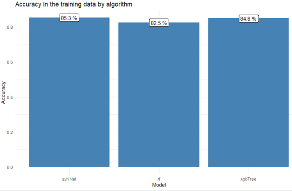
The neural network actually performed slightly better than the xgboosted tree, although the values are quite similar and if you repeat the model training a couple of times, you might get different results. With use cases like this, I prefer to go with tree-based models such as random forests or xgboost over neural networks because with the former, I can understand better how the algorithm arrives at its predictions (see our example tree in the previous section). You could also, of course, visualize a neural network with all the weights obtained during training displayed next to the nodes, it’s not alchemy, but it’s less easily interpreted when you want to reconstruct how the network processes a certain patient. Anyways, let’s decide at this point that our neural network (“mod2”) was the best model and we want to move forward with it.
Step 7: Model evaluation against the test data
We now compare our model’s prediction against the reserved test dataset. These are patients our algorithm has not seen before. We use the neural network to predict the test data, and then compare the predictions against the actual outcomes:
predictions <- predict(mod2, newdata = x_test)
confusionMatrix(predictions, y_test)
Which gives us:
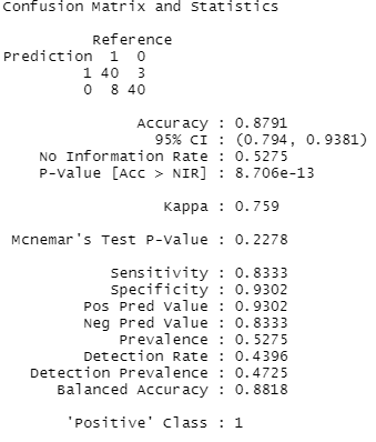
As you can see, our out-of-sample predictive accuracy was 87.9%. The confusion matrix tells us that 40 patients with heart disease were correctly classified, and 40 healthy patients were also correctly classified, but there were 3 patients where our model thought they had heart disease but in reality they didn’t, and, conversely, we overlooked coronary heart disease in 8 patients.
In addition to accuracy, other metrics are often used to evaluate the goodness of a machine-learning algorithm. Keep in mind that our sample was balanced (47% have heart disease, 53% don’t), whereas in many other use cases, you often have a severe class imbalance (e.g., 99% of customers won’t buy, 1% do buy, or 99% of patients won’t die vs. 1% die), so “99% accuracy” is useless to you as an indicator in these cases. You can resort to using sensitivity/specificity which are also given in the output (specificity = how many of the true positive cases are detected, which is a useful indicator if the positive cases are rare, and specificity = how many true negatives are correctly classified).
Which of these metrics is more important to you depends on your case, i.e. your cost function. In this case, I’d say it’s better to detect all true cases who have the disease, and we can live with a few false positives, so I’d look at sensitivity rather than specificity. In other cases, you want to avoid many false positives (e.g., spam detection, it’s much more annoying if many of your important work e-mails disappear in the spam folder), so sensitivity is maybe more important. In addition to these metrics, you also often find precision (proportion of true positive predictions relative to all “positive” predictions), and recall (proportion of true positive predictions relative to all actual positives), and F1 (harmonic mean of precision and recall). You can get these as well with
precision(predictions, y_test)
recall(predictions, y_test)
F_meas(predictions, y_test)
Step 8: Model deployment
We don’t cover this step here in great detail, you can refer here for an example of how you can build a shinyapp which you can access from your computer or phone to send new data to your machine-learning model. This type of app could be used by a doctor to enter a patient’s new values and get the prediction of whether or not coronary heart disease is present (I guess a doctor would be able to figure that out without a machine-learning model with the clinical diagnostics used to get the data, but you get the idea. For instance, if you were to build a model that does not rely on data that you can only gather in a hospital, such as results from flouroscopy, but rather on data that come solely from standard instruments that every ambulance is carrying, such as ECG, blood pressure, etc., or maybe even recorded by the patients at home themselves, then the whole thing might make more sense. But again, this is just an example for demonstration purposes).
Let’s just quickly show how you would process new data. Imagine you have an app, or a spreadsheet, etc., where a doctor can input new data for a new patient. You read in the spreadsheet, or collect the input data from the app, but here for the sake of demonstration we just enter a new patient’s information like this:
newpatient <- data.frame(age=62,sex=1,cp=0,trestbps =130,chol=220, fbs=0, restecg=0,
                         thalach=161, exang=0, oldpeak=0, slope=0, ca=0, thal=2)
Now unfortunately we cannot just use the preprocessing function we created earlier, because the new dataset does not have all the values for all our dummy variables (e.g., there is only cp == 0 in the new dataset and no instances of 1, 2 or 3). Which is why we copy the function from above but insert a bit of new code to ensure that all dummy variables are present in the new dataset. It’s an ugly nested for-loop but whatever works….
preprocess_new_data <- function(df){

  #Convert features to int like the original dataset
  df[,names(df) != "oldpeak"] <- purrr::map_df(df[,names(df) != "oldpeak"], as.integer)

  df <- df %>% mutate(restecg = recode(restecg, `2`=1L),
                      thal = recode(thal, `0`=2L),
                      ca = recode(ca, `4`=0L))

  #Nominal variables - attention: we don't have all the values for the dummies in the new dataset!
  existing_cols <- names(x_train)[names(x_train) %in% names(df)]
  new_cols <- names(x_train)[!names(x_train) %in% names(df)]
  df[new_cols] <- 0
  nomvars <- c("cp", "ca", "thal", "restecg", "slope")

  for (i in 1:nrow(df)){
    for(j in 1:length(nomvars)){
      df[i,paste0(nomvars[j],df[nomvars[j]][i])] <- 1
    }
  }

  df <- df[,names(df) %in% c(existing_cols, new_cols)]

  df$hr_age <- df$thalach / df$age
  df$chol_age <- df$chol / df$age
  df$st <- ifelse(df$oldpeak>0,1,0)

  return(df)
}

save(mod2, x_train, preprocess_new_data, file="Heart_disease_prediction.RData")
We saved our trained model and the two other objects needed to pre-process new data. From now on, when in a new session (or an interactive app etc.), you just need to load the RData file and the libraries (caret, tidyverse), and you can then predict new data as follows:
predict(mod2, newdata = preprocess_new_data(newpatient))

predict(mod2, newdata = preprocess_new_data(newpatient), type="prob")
Result:
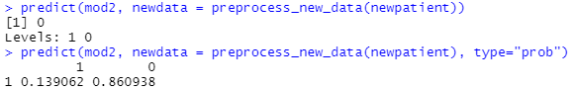
The first command just predicts yes or no. For this new patient, we predict “no heart disease”. With the second command, we also get the probabilities to belong in each class. We see that the new patient has a 86% probability of being healthy and a 13.9% probability of having coronary heart disease according to our algorithm. Especially with new data I find it helpful to get the predicted probabilities to get a sense for how certain the algorithm is in assigning this prediction.
Next steps
After a model is deployed, you often might want to monitor its performance, maybe re-train with new training data when you have collected more real data over time, or when you have learned more things about the causal structure behind your predictions, or when there’s a new fancy algorithm which could improve accuracy compared to your current best model.
Some final remarks: In my experience, the two steps that take up most of the time in a real-world use case are the first and the last one. In the toy examples used to teach machine learning (such as this one), “get data” just means read in a csv file which is readily available at some url. In reality, you often have to find a way to get your data from, say, an old SQL server located somewhere in a production plant, or a cloud storage (e.g. AWS S3), or worse, from various physical machines (e.g. ECG devices in a hospital).
Thus, the most complicated part of the whole project is often to get access to the data (e.g., query an API with the httr package, or get credentials for a SQL server and then connect to the server with the DBI package), write queries to retrieve the data (e.g. via SQL code which you can write in R with, e.g., the dbplyr package), schedule your queries so that you regularly get the latest data (e.g., daily cronjob for your R script on a Linux server), merge the data with other relevant datasets – what are we even looking for, what do we need? – and store it somewhere were you can access it for your model training.
Similarly, in the end, you want to deploy your model which might mean setting up a pipeline where new data from the source systems (ECG devices, SQL servers in plants, IoT sensors, etc.) run through your model and the output can be accessed via some app, or is integrated into your company’s BI solution, etc. This can get complicated in many ways as well.
By contrast, the whole model training is easy in comparison, especially with packages such as tidymodels, caret, keras/tensorflow, Python’s scikit-learn, or various auto-ML packages which make the whole process of pre-processing, feature selection, hyperparameter tuning etc. very easy. I’ve read somewhere that it’s the best kept secret among data scientists and machine-learning engineers that they actually just run “import scikit-learn as sklearn” or “library(caret)” and then something such as “train(x,y,model = “fancy_algorithm”) rather than hand-crafting complicated models which many people outside of data science probably think they are doing.

In my view, thus, the most important skill for you to bring to the table as an aspiring data scientist/machine-learning engineer isn’t so much the ability to write down tensorflow code from scratch. Rather, it’s the ingenuity to come up with new ideas for how to use existing data to solve business problems or scientific research questions. This kind of skill will hardly get automated in the near future.
I hope this post was of help to a few of you, let me know in the comments if you have any questions or if you feel I forgot/misrepresented something. Thanks!
R-bloggers.com offers daily e-mail updates about R news and tutorials about learning R and many other topics. Click here if you're looking to post or find an R/data-science job.
Want to share your content on R-bloggers? click here if you have a blog, or here if you don't.