
Dynamic Regression with ARIMA Errors: The Students on the Streets
Want to share your content on R-bloggers? click here if you have a blog, or here if you don't.
The higher education students have had trouble being housing in Turkey in recent days. There have been people who even sleep on the streets like a homeless. The government has been accused of investing inadequate dormitories for sheltering the students. Let’s examine the ongoing sheltering problem of students.
The dataset we have built for this article consists of the number of formal education students and the housing capacity provided by Higher Education Loans and Dormitories Institution(KYK), which is a state organization.
We will determine whether there is a capacity shortage this year based on historical data. The model we are going to use is the dynamic regression model with ARIMA errors; Because we will model the dormitories’ capacity in terms of the number of students by the historical data between 1992-2020.
First of all, we will check the stationary of the variables. If one of them is not stationary, all the variables have to be differenced. This modeling process is called model in differences.
#Creating the tsibble variables and examining the stationary
library(tidyverse)
library(fable)
library(feasts)
library(tsibble)
library(readxl)

df <- read_excel("kyk.xlsx")

df_ts <- df %>%
  as_tsibble(index = date)

train <- df_ts %>% filter_index(.~ "2020")
test <- df_ts %>% filter_index("2021"~.)

train %>%
  pivot_longer(c(capacity, students),
               names_to = "var", values_to = "value") %>%
  ggplot(aes(x = date, y = value)) +
  geom_line(size=1.5, color="blue") +
  facet_grid(vars(var), scales = "free_y") +
  scale_x_continuous(breaks = seq(1990,2020,5))+
  scale_y_continuous(labels = scales::label_number_si()) +
  labs(title = "The Number of Capacity and Students",y = "",x="") +
  theme_minimal() +
  theme(plot.title=element_text(face = "bold.italic",hjust = 0.5),
        panel.background = element_rect(fill = "#f0f0f0", color = NA))
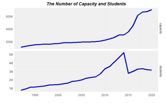
When we examine the above plots, it seems like the two variables need differencing as well. After we fit the model, we will check the residuals for stationary by drawing the innovations residuals.
#Modeling
fit <- train %>%
  model(ARIMA(capacity ~ students + pdq(d=1)))

#Checking residuals for stationary
fit %>%
  gg_tsresiduals()
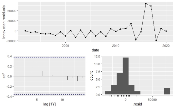
In the ACF graph, we can clearly see that the spikes are within the thresholds which means the residuals are white noise. In the below code block, we have confirmed that the residuals have no patterns by using the Ljung-Box test in which we saw the p-value greater than 0.05 at %5 significance level.
#Ljung-Box independence test for white noise
augment(fit) %>%
  features(.innov, ljung_box)

#.model                                  lb_stat
#  <chr>                                     <dbl>
#1 ARIMA(capacity ~ students + pdq(d = 1))    1.32
#  lb_pvalue
#      <dbl>
#1     0.251
We are writing the below command to examine the components of the model.
report(fit)

#Series: capacity
#Model: LM w/ ARIMA(0,1,1) errors

#Coefficients:
#         ma1  students  intercept
#      0.8672    -0.022  22964.621
#s.e.  0.1177     0.006   8369.892
The differenced model is shown as: 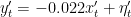

Before finding the expected value of the model, we will take a look at the relation between the number of capacity and students over time.
#Comparing students and capacity
ggplot(df_ts,aes(x=date))+
  geom_bar(aes(y=students),stat = "identity",fill="skyblue")+
  geom_line(aes(y=students),size=1.5,color="orange")+
  geom_line(aes(y=(capacity/students)*10^7),size=1.5,color="red")+
  scale_x_continuous(breaks = seq(1991,2021,5))+
  scale_y_continuous(labels = scales::label_number_si(),
                     sec.axis = sec_axis(~./10^7,
                                         labels = scales::percent_format(accuracy = 1),
                                         name = "The rate of capacity per student"))+
  xlab("")+ylab("The number of students")+
  theme_minimal()+
  theme(panel.background = element_rect(fill = "#f0f0f0", color = NA),
        #Main y-axis
        axis.title.y = element_text(color = "skyblue",
                                    #setting positions of axis title
                                    margin = margin(r=0.5,unit = "cm"),
                                    hjust = 1),


        #Second y-axis
        axis.title.y.right = element_text(color = "red",
                                          #setting positions of second axis title
                                          margin = margin(l=0.5,unit = "cm"),
                                          hjust = 0.01))
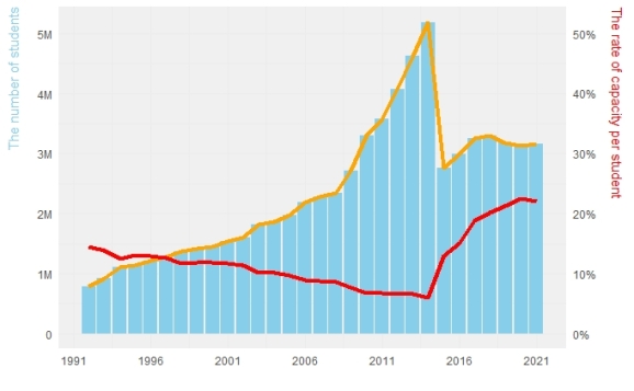
We have to keep in mind that approximately half of the higher education students study out of their hometown, according to the common opinion before the analyze the above graph. The orange line shows the trend of the number of students.
It is understood that while the number of students increased, the capacity per student decreased until 2014. Although the capacity rate has increased after this year, it is clear that the reason for this is the decrease in the number of students. However, it is still seen well below 50%.
Now that we’ve found our model, we can predict this year’s capacity value and see whether the government falls short of this expected value.
#Forecasting the current year
capacity_fc<- forecast(fit, new_data = test)

#Setting legends for separate columns for the plot
colors <- c("Actual"="red","Predicted"="blue")

#Plotting predicted and the actual value
ggplot(train,mapping=aes(x=date,y=capacity))+
  geom_line(size=1.5)+
  geom_point(capacity_fc,mapping=aes(x=date,y=.mean,color="Predicted"))+
  geom_point(test,mapping=aes(x=date,y=capacity,color="Actual"))+
  scale_x_continuous(breaks = seq(1991,2021,5))+
  scale_y_continuous(breaks = seq(200000,750000,100000),
                     labels = scales::label_number_si())+
  scale_color_manual(values = colors,name="Points")+
  theme_minimal() +
  theme(axis.title.y=element_text(vjust = 2),
        panel.background = element_rect(fill = "#f0f0f0", color = NA))

To the above plot, the number provided by the government falls short than the expected value of the model. They seem right to complain about the capacity of dormitories considering the half of the students study out of their hometown.
R-bloggers.com offers daily e-mail updates about R news and tutorials about learning R and many other topics. Click here if you're looking to post or find an R/data-science job.
Want to share your content on R-bloggers? click here if you have a blog, or here if you don't.