Click to see R set-up code
# Libraries
if(!require("pacman")) {
  install.packages("pacman")
}
pacman::p_load(
  data.table,
  re2,
  scales,
  ggplot2,
  plotly,
  DT,
  patchwork,
  survival,
  ggfortify,
  scales)

# Set knitr params
knitr::opts_chunk$set(
  comment = NA,
  fig.width = 12,
  fig.height = 8,
  out.width = '100%'
)
NOTE: The read time for this post is overstated because of the formatting of the Plotly code. There are ~2,500 words, so read time should be ~10 minutes.
Click to see R code generating plot
# Load function to plot dual y-axis plot
source("train_sec.R")

# Get data series from FRED
symbols <- c("CP", "GDP", "WASCUR")
start_date <- '1947-01-01'
end_date <- '2021-07-30'
quantmod::getSymbols(
  Symbols = symbols,
  src = "FRED",
  start_date = start_date,
  end_date = end_date
)
[1] "CP" "GDP" "WASCUR"
# Merge series and convert to dt
d <- as.data.table(merge(WASCUR/GDP, CP/GDP, join = "inner"))
# Build superimposed dual y-axis line plot
sec <- with(d, train_sec(CP, WASCUR))
p <-
ggplot(d, aes(index)) +
geom_line(aes(y = CP),
colour = "blue",
size = 1) +
geom_line(aes(y = sec$fwd(WASCUR)),
colour = "red",
size = 1) +
scale_y_continuous(
"Corporate Profits to GDP",
labels = scales::percent,
sec.axis = sec_axis(
~ sec$rev(.),
name = "Compensation of Employees to GDP",
labels = scales::percent)
) +
scale_x_date(date_breaks = "10 years",
date_labels = "%Y") +
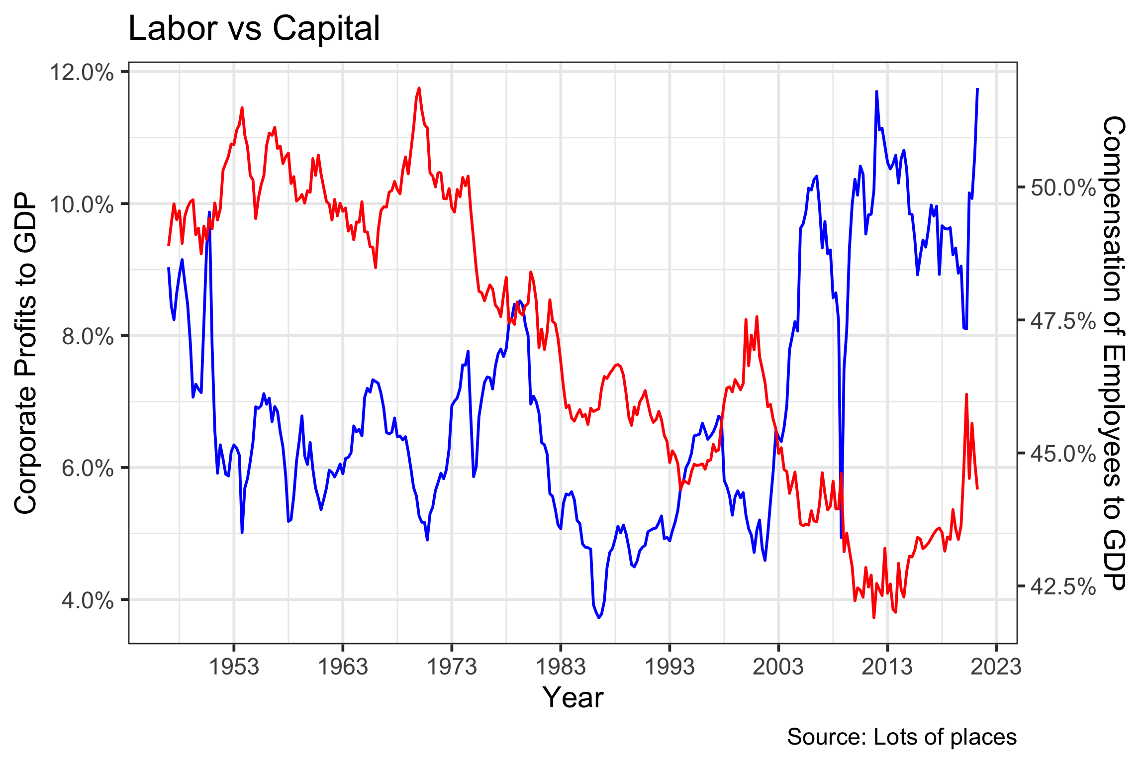
labs(title = "Labor vs Capital",
x = "Year",
caption = "Source: Lots of places") +
theme_bw(base_size = 22)
Introduction
The rise in monopoly power particularly ...