
ggforce: Make a Hull Plot to Visualize Clusters in ggplot2
Want to share your content on R-bloggers? click here if you have a blog, or here if you don't.
The ggforce package is a ggplot2 extension that adds many exploratory data analysis features. In this tutorial, we’ll learn how to make hull plots for visualizing clusters or groups within our data.
R-Tips Weekly
This article is part of R-Tips Weekly, a weekly video tutorial that shows you step-by-step how to do common R coding tasks.
Here are the links to get set up. ?
Video Tutorial
Follow along with our Full YouTube Video Tutorial.
Learn how to use ggforce in our 7-minute YouTube video tutorial.

What is a Hull Plot?
The Hull Plot is a visualization that produces a shaded areas around clusters (groups) within our data. It gets the name because of the Convex Hull shape. It’s a great way to show customer segments, group membership, and clusters on a Scatter Plot.

Hull Plot (We’ll make in this tutorial)
We’ll go through a short tutorial to get you up and running with ggforce to make a hull plot.
Hull plots with ggforce [Tutorial]
This tutorial showcases the awesome power of ggforce for visualizing distributions.
Tutorial Credits
This tutorial wouldn’t be possible without the excellent work of Thomas Lin Pedersen, creator of ggforce. Check out the ggforce package here.
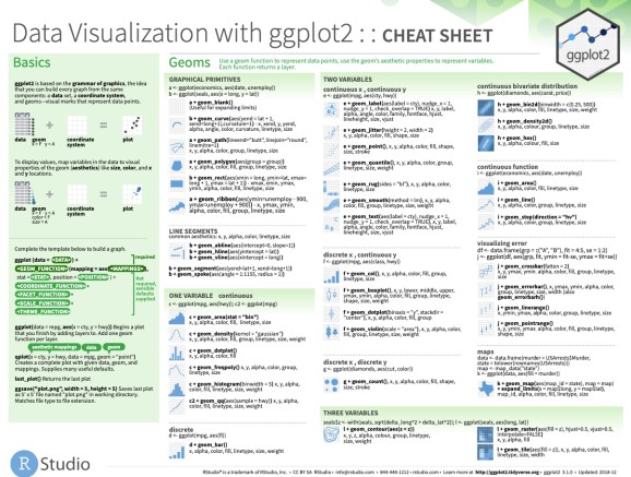
Before we get started, get the R Cheat Sheet
ggforce is great for extending ggplot2 with advanced features. But, you’ll need to learn ggplot2 to take full advantage. For these topics, I’ll use the Ultimate R Cheat Sheet to refer to ggplot2 code in my workflow.
Quick Example:
Download the Ultimate R Cheat Sheet. Then Click the “CS” hyperlink to “ggplot2”.

Now you’re ready to quickly reference the ggplot2 cheat sheet. This shows you the core plotting functions available in the ggplot library.
Onto the tutorial.
Load the Libraries and Data
First, run this code to:
- Load Libraries: Load
ggforce,tidyquant, andtidyverse. - Import Data: We’re using the
mpgdataset that comes withggplot2.

Here’s the mpg dataset. We’ll focus on “hwy” (fuel economy in Miles Per Gallon), “displ” (engine displacement volume in liters), and “cyl” (number of engine cylinders).

hull plot: Using ggplot
Next, we’ll make a hull plot that highlights the Vehicle Fuel Economy (MPG) for Engine Size (Number of Cylinders and Engine Displacement). It helps if you have ggplot2 visualization experience. If you are interested in learning ggplot2 in-depth, check out our R for Business Analysis Course (DS4B 101-R) that contains over 30-hours of video lessons on learning R for data analysis.
Step 1: Make the Base Scatter Plot
The first step is to make the scatter plot using ggplot2. We:
-
Prep the Data: Using
mutate()to add a descriptive Engine Size column that will display the Number of Cylinders. -
Map the columns: Using
ggplot(), we map the displ and hwy column. -
Make the scatter points: Using
geom_point(), we add scatter plot points to our base plot. Refer to the Ultimate R Cheat Sheet and ggplot2 “CS” for more geoms.

This produces our base plot, which is a scatter plot of displacement vs highway fuel economy.

Step 2: Add the Hull Plot with geom_mark_hull()
Next, we add our hull plot geometry layer using ggforce::geom_mark_hull(). This produces the hull plot shaded regions indicating the groups. We map the descriptive engine size column to the fill and label aesthetics. We adjust the concavity to smooth out the concavity.

And here’s the output. We can see that the hull plot shows the cylinder class membership for the vehicles scatter points.

Step 3: Make the plot look professional
It’s a good idea to spruce up our plot, especially if we are going to present to business stakeholders in a presentation or report. We’ll leverage tidyquant and ggplot for theme customization. Refer to the Ultimate R Cheat Sheet and ggplot2 documentation for more customizations.

And here’s the output. We have our final plot that tells the story of how highway fuel economy varies with the vehicle’s number of cylinders and engine displacement volume.
Summary
We learned how to make hull plots with ggforce. But, there’s a lot more to visualization.
It’s critical to learn how to visualize with ggplot2, which is the premier framework for data visualization in R.
If you’d like to learn ggplot2, data visualizations, and data science for business with R, then read on. ?
My Struggles with Learning Data Science
It took me a long time to learn data science. And I made a lot of mistakes as I fumbled through learning R. I specifically had a tough time navigating the ever increasing landscape of tools and packages, trying to pick between R and Python, and getting lost along the way.
If you feel like this, you’re not alone.
In fact, that’s the driving reason that I created Business Science and Business Science University (You can read about my personal journey here).
What I found out is that:
-
Data Science does not have to be difficult, it just has to be taught smartly
-
Anyone can learn data science fast provided they are motivated.
How I can help
If you are interested in learning R and the ecosystem of tools at a deeper level, then I have a streamlined program that will get you past your struggles and improve your career in the process.
It’s called the 5-Course R-Track System. It’s an integrated system containing 5 courses that work together on a learning path. Through 5+ projects, you learn everything you need to help your organization: from data science foundations, to advanced machine learning, to web applications and deployment.
The result is that you break through previous struggles, learning from my experience & our community of 2000+ data scientists that are ready to help you succeed.
Ready to take the next step? Then let’s get started.
? Top R-Tips Tutorials you might like:
- mmtable2: ggplot2 for tables
- ggdist: Make a Raincloud Plot to Visualize Distribution in ggplot2
- ggside: Plot linear regression with marginal distributions
- DataEditR: Interactive Data Editing in R
- openxlsx: How to Automate Excel in R
- officer: How to Automate PowerPoint in R
- DataExplorer: Fast EDA in R
- esquisse: Interactive ggplot2 builder
- gghalves: Half-plots with ggplot2
- rmarkdown: How to Automate PDF Reporting
- patchwork: How to combine multiple ggplots
- Geospatial Map Visualizations in R
Want these tips every week? Join R-Tips Weekly.
R-bloggers.com offers daily e-mail updates about R news and tutorials about learning R and many other topics. Click here if you're looking to post or find an R/data-science job.
Want to share your content on R-bloggers? click here if you have a blog, or here if you don't.