
NBA playoffs: Visualizing win percentage by seeding
Want to share your content on R-bloggers? click here if you have a blog, or here if you don't.
Background
With the NBA playoffs going on, I’ve been thinking about the following question:
A and B are about to play a game. We know that among all players, A has rank/seed 


On one hand, if the probability is always 0.5, it means that ranking is uninformative: the result of the game is like an unbiased coin flip. On the other hand, if the probability is 1, it means that ranking is perfectly informative: a higher-ranked player will always beat a lower-ranked player. Reality is probably somewhere in between.
Of course, there is no single correct answer for this. The answer could also vary greatly across sports and games, and within a single sport it could also vary from league to league. The idea is just to come up with something that can approximate reality somewhat closely.
Unfortunately I will not have an answer for this question in this post. I will, however, show you some data that I scraped for the NBA playoffs and some interesting data visualizations.
NBA playoffs: An abbreviated introduction
There are two conferences in the NBA. At the end of the regular season, the top 8 teams in each conference make it to the playoff round where they play best-of-7 series to determine who advances. The teams are ranked within each conference according to their win-loss records in the regular season. The image below is the playoff bracket for the 2019-2020 season, giving you an idea of how a team’s seeding affects which opponents it will face in different playoff rounds.

2020 Playoff bracket. Credit: https://bookieblitz.com/breaking-down-the-2020-nba-playoff-bracket-predictions/
Data scraping
My initial idea was the following: scrape NBA playoff data, keeping track of how many times seed
Since the seedings only make sense within each conference, for each playoff year, I excluded the NBA final (where the winner of each conference faces the other). I was fortunate to find that Land of BasketBall.com presents the information I need in a systematic manner, making it easy to scrape. The R scraping script and RDS data files I saved are available here.
Determining how many years of playoff data should go into my dataset was a surprisingly difficult question. See this wikipedia section for a full history of the NBA playoff format. I was surprised to find out that ranking by win-loss record within each conference was only instituted from the 2016 playoffs onwards. There were more complicated seeding rules before that, meaning that teams could have higher rank than other teams which had better win-loss records than them. Thus, if I wanted ranking to be as pure as possible, I could only use data from 2016-2020 (the latest playoffs with data at time of writing). As you will see in the rest of this post, this is not enough data to do good estimation. On the other hand, going back further means that the idea of ranking could be diluted.
The rest of the post is based on just 2016-2020 data. You can download data for 1984-2020 (1984 was when the playoffs first went from 12 teams to 16 teams) here, rerun the analysis and compare. (You could even try to go back further to 1947, when the playoffs first started!)
Data visualization
Let’s have a look at the raw data:
library(tidyverse)
readRDS("nba_playoffs_data_2016-2020.rds") %>% head()
#   year    team1 wins1        team2 wins2 seed1 seed2
# 1 2016 Warriors     4      Rockets     1     1     8
# 2 2016 Clippers     2 TrailBlazers     4     4     5
# 3 2016  Thunder     4    Mavericks     1     3     6
# 4 2016    Spurs     4    Grizzlies     0     2     7
# 5 2016 Warriors     4 TrailBlazers     1     1     5
# 6 2016  Thunder     4        Spurs     2     3     2
Each row corresponds to one best-of-7 series. Let’s add some more columns that will be useful:
results_df <- readRDS("nba_playoffs_data_2016-2020.rds") %>%
  mutate(higher_seed = pmin(seed1, seed2),
         lower_seed = pmax(seed1, seed2),
         n_games = wins1 + wins2) %>%
  mutate(seed_diff = lower_seed - higher_seed,
         higher_seed_wins = ifelse(higher_seed == seed1, wins1, wins2),
         lower_seed_wins = ifelse(higher_seed == seed1, wins2, wins1)) %>%
  mutate(series_winner = ifelse(wins1 > wins2, higher_seed, lower_seed))
In this first plot, we plot the number of series played between each pair of seeds (we always order the seeds so that the higher seed is first/on the x-axis).
theme_set(theme_bw())
results_df %>%
  group_by(higher_seed, lower_seed) %>%
  summarize(n_games = n()) %>%
  ggplot(aes(x = higher_seed, y = lower_seed)) +
  geom_tile(aes(fill = n_games)) +
  geom_text(aes(label = n_games), col = "white") +
  scale_x_continuous(breaks = 1:8) +
  scale_y_continuous(breaks = 1:8) +
  coord_fixed(ratio = 1) +
  scale_fill_gradient(low = "red", high = "blue", name = "# games") +
  labs(x = "Higher seed", y = "Lower seed",
       title = "# series played between seeds") +
  theme(panel.grid.major = element_blank())

Note that the x-axis starts with the first seed while the y-axis starts with the second seed, since the first seed can never be the lower seed in any matchup. We also won’t have any data in the bottom-right half of the plot since we always put the higher seed on the x-axis. Notice that we always have 10 matches between seeds 1-8, 2-7, 3-6 and 4-5: these are the first round matchups that will always happen. Notice also that some matches have never happened (e.g. 3-4, and anything involving two of 5, 6, 7 and 8).
Next, we plot the number of games played between each pair of seeds:
results_df %>%
  group_by(higher_seed, lower_seed) %>%
  summarize(n_games = sum(n_games)) %>%
  ggplot(aes(x = higher_seed, y = lower_seed)) +
  geom_tile(aes(fill = n_games)) +
  geom_text(aes(label = n_games), col = "white") +
  scale_x_continuous(breaks = 1:8) +
  scale_y_continuous(breaks = 1:8) +
  coord_fixed(ratio = 1) +
  scale_fill_gradient(low = "red", high = "blue", name = "# games") +
  labs(x = "Higher seed", y = "Lower seed",
       title = "# games played between seeds") +
  theme(panel.grid.major = element_blank())
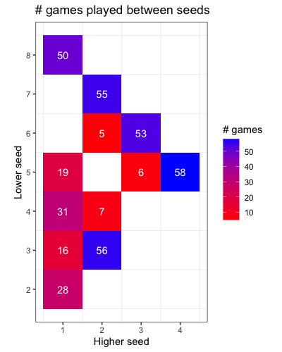
From these numbers, it is clear that we won’t be able to get good estimates for the win probability between pairs of seeds due to small sample size, except possibly for the 1-8, 2-7, 3-6, 4-5 and 2-3 matchups.
Next, let’s look at the win percentage for the higher seed in each pair:
win_pct_df <- results_df %>%
  group_by(higher_seed, lower_seed) %>%
  summarize(higher_seed_wins = sum(higher_seed_wins),
            lower_seed_wins = sum(lower_seed_wins)) %>%
  mutate(higher_seed_win_pct = higher_seed_wins /
           (higher_seed_wins + lower_seed_wins)) %>%
  select(higher_seed, lower_seed, higher_seed_win_pct)

head(win_pct_df)
# # A tibble: 6 x 3
# # Groups:   higher_seed [2]
#   higher_seed lower_seed higher_seed_win_pct
#         <dbl>      <dbl>               <dbl>
# 1           1          2               0.5
# 2           1          3               0.75
# 3           1          4               0.645
# 4           1          5               0.684
# 5           1          8               0.8
# 6           2          3               0.554

ggplot(win_pct_df, aes(x = higher_seed, y = lower_seed)) +
  geom_tile(aes(fill = higher_seed_win_pct)) +
  geom_text(aes(label = round(higher_seed_win_pct, 2))) +
  scale_x_continuous(breaks = 1:8) +
  scale_y_continuous(breaks = 1:8) +
  coord_fixed(ratio = 1) +
  scale_fill_gradient2(low = "red", high = "blue", midpoint = 0.5,
                       name = "Higher seed win %") +
  labs(x = "Higher seed", y = "Lower seed",
       title = "Higher seed win percentage") +
  theme(panel.grid.major = element_blank())

We shouldn’t give these numbers too much credence because of the small sample size, but there are a couple of things of note:
- We would expect the higher seed to have more than a 50% chance to beat a lower seed. That’s not what we see here (2-4, 3-5).
- Fixing the higher seed, we would expect that the lower seeded the opponent, the higher the win percentage. That’s not what we see when we look down each column. For example, seed 1 beat seed 3 75% of the time, but only beat seed 4 65% of the time.
- A very simple win probability model would be to say that the win probability only depends on the difference between the ranks. If that is the case, then win probabilities along each northeast-southwest diagonal should be about the same. That is clearly not the case (especially 1-3, 2-4 and 3-5).
- The win probabilities for 1-8, 2-7, 3-6 and 4-5 make sense, and that’s probably because of the larger sample size.
I would have expected a win probability diagram that looked more like this:
expand.grid(higher_seed = 1:8, lower_seed = 1:8) %>%
  filter(higher_seed < lower_seed) %>%
  mutate(seed_diff = lower_seed - higher_seed,
         higher_seed_win_pct = 0.5 + seed_diff * 0.4 / 7) %>%
  ggplot(aes(x = higher_seed, y = lower_seed)) +
  geom_tile(aes(fill = higher_seed_win_pct)) +
  geom_text(aes(label = round(higher_seed_win_pct, 2))) +
  scale_x_continuous(breaks = 1:8) +
  scale_y_continuous(breaks = 1:8) +
  coord_fixed(ratio = 1) +
  scale_fill_gradient2(low = "red", high = "blue", midpoint = 0.5,
                       name = "Higher seed win %") +
  labs(x = "Higher seed", y = "Lower seed",
       title = "Expected higher seed win percentage") +
  theme(panel.grid.major = element_blank())

Having seen the data, what might you do next in trying to answer my original question?
R-bloggers.com offers daily e-mail updates about R news and tutorials about learning R and many other topics. Click here if you're looking to post or find an R/data-science job.
Want to share your content on R-bloggers? click here if you have a blog, or here if you don't.