
Is the EPL getting more unequal?
Want to share your content on R-bloggers? click here if you have a blog, or here if you don't.
I recently heard that Manchester City were so far ahead in the English Premier League (EPL) that the race for first was basically over, even though they were still about 6-7 more games to go (out of a total of 38 games). At the other end of the table, I heard that Sheffield United were so far behind that they are all but certain to be relegated. This got me wondering: has the EPL become more unequal over time? I guess there are several ways to interpret what “unequal” means, and this post is my attempt at quantifying it.
The data for this post is available here, while all the code is available in one place here. (I also have a previous blog post from 2018 on the histogram of points scored in the EPL over time.)
Let’s start by looking at a density plot of the points scored by the 20 teams and how that has changed over the last 12 years (note that the latest year is at the top of the chart):
library(tidyverse)
df <- read_csv("../data/epl_standings.csv")

theme_set(theme_bw())

# joy plot
library(ggridges)
ggplot(df, aes(x = Points, y = factor(Season))) +
    geom_density_ridges(scale = 3) +
    labs(y = "Season")

It looks like the spread for the more recent seasons is greater than that in earlier seasons, evidenced by the bulk of the distribution widening as we go from the bottom to the top of the chart.
Another way to view the data is to draw a boxplot for each season. In this view, it’s harder to see the spread that we saw in the joy plot.
# boxplot
ggplot(df, aes(x = Season, y = Points, group = Season)) +
    geom_boxplot() +
    labs(title = "Distribution of points by season")

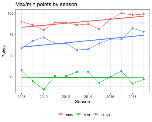
One possible way to define “unequal” is to look at the difference between the number of points the top team earned vs. that for the bottom team: the larger the difference, the more unequal the EPL is becoming. The plot below shows the maximum and minimum number of points earned by a team across the years, as well as the difference between the two. We also show the linear regression lines for each of these values. With the upward slopes, it looks like the gap between the best and the worst is certainly increasing.
# plot of maximum and minimum
df %>% group_by(Season) %>%
    summarize(max = max(Points), min = min(Points)) %>%
    mutate(range = max - min) %>%
    pivot_longer(max:range) %>%
    ggplot(aes(x = Season, y = value, col = name)) +
    geom_line() +
    geom_point() +
    geom_smooth(method = "lm", se = FALSE) +
    scale_x_continuous(breaks = seq(min(df$Season), max(df$Season), by = 2)) +
    labs(title = "Max/min points by season", y = "Points") +
    theme(legend.title = element_blank(), legend.position = "bottom")
The problem with using range is that it only tracks the difference between the best and the worst teams while ignoring all the teams in the middle. A measure that takes the middle into account is variance. Note that the number of points that a team can score lies in the range 0 to 
![[0, 114]](https://s0.wp.com/latex.php?latex=%5B0%2C+114%5D&bg=ffffff&%23038;fg=333333&%23038;s=0&%23038;c=20201002)

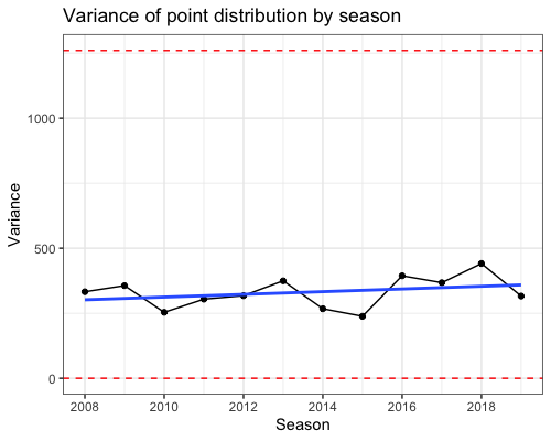
Here is a plot of point variance over time along with the linear regression line:
df %>% group_by(Season) %>%
    summarize(var = var(Points)) %>%
    ggplot(aes(x = Season, y = var)) +
    geom_line() +
    geom_point() +
    geom_smooth(method = "lm", se = FALSE) +
    scale_x_continuous(breaks = seq(min(df$Season), max(df$Season), by = 2)) +
    labs(title = "Variance of point distribution by season", y = "Variance")

There’s quite a lot of fluctuation from year to year, but there seems to be an increasing trend. However, notice that the 
Before doing that, note that it’s actually not possible for half the teams to score maximum points. In the EPL, every team plays every other team exactly twice. Hence, only one team can have maximum points, since it means that everyone else loses to this team. I don’t have a proof for this, but I believe maximum variance happens when team 1 beats everyone, team 2 beats everyone except team 1, team 3 beats everyone except teams 1 and 2, and so on. With this configuration, the variance attained is just 1260.
Here’s the same line plot but with the
max_var_dist <- seq(0, 38 * 3, by = 6)
max_var <- var(max_var_dist)
df %>% group_by(Season) %>%
    summarize(var = var(Points)) %>%
    ggplot(aes(x = Season, y = var)) +
    geom_line() +
    geom_point() +
    geom_smooth(method = "lm", se = FALSE) +
    geom_hline(yintercept = c(0, max_var), col = "red", linetype = "dashed") +
    scale_x_continuous(breaks = seq(min(df$Season), max(df$Season), by = 2)) +
    labs(title = "Variance of point distribution by season", y = "Variance")
Which is the correct interpretation? Is the change in variance over time important enough that we can say the EPL has become more unequal, or is it essentially the same over time? This is where I think domain expertise comes into play. 1260 is a theoretical maximum for the variance, but my guess is that the layperson looking at two tables, one with variance 300 and one with variance 900, would be able to tell them apart and say that the latter is more unequal. Can the layperson really tell the difference between variances of 250 and 450? I would generate several tables having these variances and test if people could tell them apart.
Finally, the Gini coefficient is one other measure of inequality, with 0 being the most equal and 1 being the most unequal.
# plot of Gini
library(DescTools)
df %>% group_by(Season) %>%
    summarize(gini = DescTools::Gini(Points)) %>%
    ggplot(aes(x = Season, y = gini)) +
    geom_line() +
    geom_point() +
    geom_smooth(method = "lm", se = FALSE) +
    geom_hline(yintercept = c(0, 1), col = "red", linetype = "dashed") +
    scale_x_continuous(breaks = seq(min(df$Season), max(df$Season), by = 2)) +
    labs(title = "Gini coefficient of point dist by season",
         y = "Gini coefficient")
Here are the plots with different scales for the


As with variance, the different scales give very different interpretations. It will require some research to figure out if a change of Gini coefficient from 0.17 to 0.22 is perceptible to the viewer.
R-bloggers.com offers daily e-mail updates about R news and tutorials about learning R and many other topics. Click here if you're looking to post or find an R/data-science job.
Want to share your content on R-bloggers? click here if you have a blog, or here if you don't.